• Hey Guest. Check out your NeoGAF Wrapped 2025 results here!

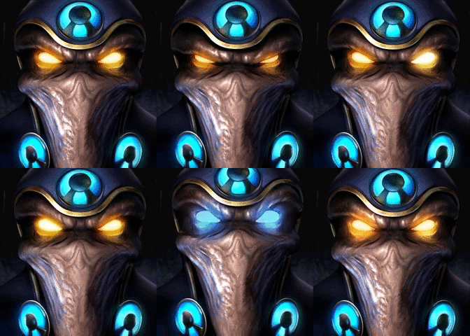
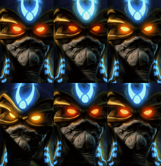
StarCraft: Remastered - New vs Old Character Portraits Comparison Videos

The old terran portaits, while having tons of personality, were also fulla old jank and it's good that they did away with it. The atmospheric lighting and haze effects are a minor loss by comparison. Tthe portrait quality is uniformly better across the board.
Some of the victory/loss screens have weird changes in them though. Completely different poses for the Terrans is inexplicable.
 
The Infested Terran portrait went from crazy looking human to terrifying monster. Especially now that I can see where the face and vine fully connect.
 
OMG I've seen the Dark Archon portrait wrong all this time!!

NrRgR1Z.png
 
OMG I've seen the Dark Archon portrait wrong all this time!!

NrRgR1Z.png

It took me a while, but I think I get you: the white text and arrows are what you used to think you were looking at. I almost thought you meant that's what the dark archon was actually doing. =P

That's pretty amazing! I didn't even know people could see things different and not seeing anything at all (like my not noticing the mutalisk's tongue looks like its own creature), but I never really thought about how low quality those portraits were.
 
Crap, I meant to edit, so sorry for the double post, but I've also looked at Fenix Dragoon incorrectly. This is what I thought I was seeing:

gI7T5GW.png


I mean, I figured since the body had to be saved and put it in a dragoon, that eyes that looked out of center with his head was normal considering he was mangled up. And I always thought his face was facing to the right. Don't know why I would have thought he was smiling considering there are no mouths, but he always seemed to be in a good mood, so I guess I just had quite the imagination, and that interpretation of his portrait stuck with me into adulthood.
 
Some uhh. interesting interpretations of unit portraits.

Also, everyone knows there's an actual man inside the wireframe for the Terran missile turret?
 
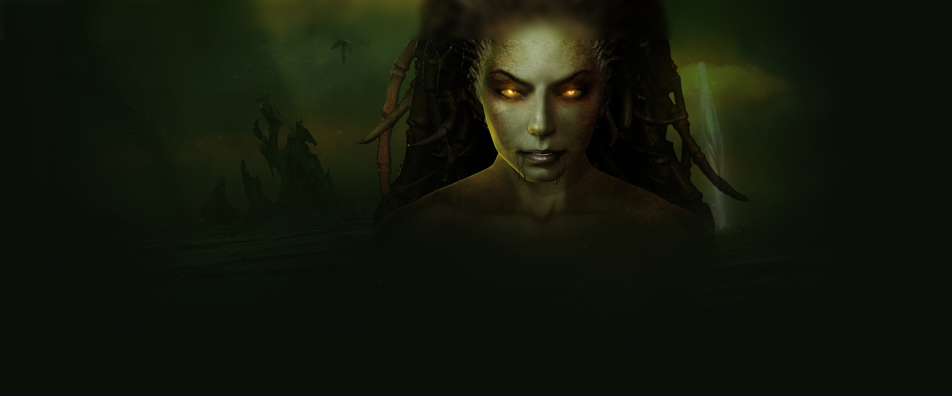
Ha, figured they'd update Kerrigan's design. I played some SC2 before SC1/BW, so it was interesting seeing what she looked like in the latter. I prefer the newer look. Lot of the new portraits are looking good all around.
 
Some uhh. interesting interpretations of unit portraits.

Also, everyone knows there's an actual man inside the wireframe for the Terran missile turret?

I actually knew that much, but years later when someone on some board brought it up.

Of course I'd know that but then get Fenix all wrong. >_>
 
It took me a while, but I think I get you: the white text and arrows are what you used to think you were looking at. I almost thought you meant that's what the dark archon was actually doing. =P

That's pretty amazing! I didn't even know people could see things different and not seeing anything at all (like my not noticing the mutalisk's tongue looks like its own creature), but I never really thought about how low quality those portraits were.

Yeah, exactly thats how I thought it was (up until today). It's obviously the other way around. A bit sad about that though, cause my version has a bit more character to it I think. In fact, I think across the board the zerg characters have a lot less unique character to them, even though they obviously look -better-.
 
The Infested Terran portrait went from crazy looking human to terrifying monster. Especially now that I can see where the face and vine fully connect.

See, this is interesting. The portraits are all technically well done, no doubt about that, but I really feel Zerg lost some scaryness, infested Terran included. Luckily he's one of the better ones, but the old one looks more sinister and abomination-like to me. Generally the fluids on the new ones look cartoony instead of disgusting.

Protoss look like the same guy from 15 angles. I totally. Get Liking the SC 2 esthetic, but I really think they could have more personality. Especially since of feel the Terran ones have that. The Valkyrie is amazing to me.
 
I don't like how inconsistent the interpretations are. Some are straight 1:1 ports of the SC1 portrait, others follow SC2's changes, and some are just, like, wtf, why not.

I'd prefer they either re-interpret all of them, SC2ify them, or stay faithful all the way through. Consistency is key. I haven't looked at the new models, but I don't see how they can avoid fundamentally changing some of them considering a few of these portrait changes.
The fuck did they do to Stukov I didn't even like the character but he looks like some undead zombie in this when he was clearly supposed to be the more charismatic and "good" member of the UED or at least that's how they potrayed him intially.

This right here.

Stukov, noooo! They stab you in the back every time! It's not fair.
 
A way to kinda fix the high templar:

That's Damn good, if the right one is the Fix?

I still remember the level you get your first templars on your way to save tassadar and Jimmy. Enigmatic fuckers.

Can't wait to replay my favorite level in all of starcraft, Protoss 3.6 : into the Darkness

Edit: Stukov was never consistent in Brood War. In the cinematic intro he looks way more like his remastered portrait.
 
Here's a comparison between Brood War cover Kerrigan and Remastered Kerrigan. Sorry for the wonky picture.
StarCraft-Broodwar-BettingTips.jpg

02.jpg


Holy crap I never saw it like that! But now I see it! Dang.

Wow, Kerrigan is sexy in the Remastered one :3

And I've always also seen the Dark Archon like you guys lol.
I was confused when I saw the remastered one and I was like "w8 why did they change the direction he's facing :S"
 
The only one I don't think is an improvement is Stukov, just because his design is completely different in a really stupid way. Legitimately makes him go from a suave looking captain america type to a fucking ghoul.
 
The only one I don't think is an improvement is Stukov, just because his design is completely different in a really stupid way. Legitimately makes him go from a suave looking captain america type to a fucking ghoul.

It's like they took his model from HotS and de-zerged him, while forgetting to de-age him as well.
 
I'm not sure but I really want this to happen as well. The remastered soundtrack is apparently from Heroes of the Storm and to be honest, the original music is way better.
What? They're using the old soundtrack but remastering the sound (I don't know how to explain that). Some of the blog posts mention that.
Do any of you know how they're handling the cutscenes?
No idea. Before it was mentioned that it might be more of a visual novel style.
 
My thoughts:

Terran
The ghost looks way less cool
The siege tank guy looks less cool
Valkyrie is dope as fuck
Raynor is bad
Terran Kerrigan is better
I like Stukov

Protoss
The probe is even cuter now
High Templar is laaaaaaaaaaame
Archon is basicly the SC2 one
Dark Archon is more defined and I like it
Don't like how much the Shuttle bounces around
I don't like how much of the ambient color they removed from the Scout and Corsair
The protoss heroes lost all their personality, except Zeratul, he still looks cool

Zerg
Larva is adorable
I like the more SC2 zergling
Hydralisk is awesome
Hunter Killer and Lurker are too similar to each other
I like how detailed the worm/tongue in the Muta's mouth is
The Devourer looks like he's smiling and I like that
I hate both queen portraits, they make me uncomfortable
Infested Terran looks badass
And I never like Kerrigan's old portrait so I'm glad they used the Brood War box art version instead

Ect.
Most of the loading screens/creatures look great, the protoss base with the blood red sky is a downgrade IMO

Overall there isn't as much personality and color as the old ones, but the use of some more starcraft 2 style designs makes me like them
 
What? They're using the old soundtrack but remastering the sound (I don't know how to explain that). Some of the blog posts mention that..

I prefer the old music to the new that we've heard. The new is way too clean and crisp where the instruments lose a lot of the synth and texture of the old one, imo.
 
On the cutscenes, this is what I've found so far:
Brian Sousa said:
All of the artwork in the game, all the menus are brand new and have been remade. And we're even going through the old cinematics and upscaling them, and remastering the sound and everything. So, we're doing a full pass on this. It's just not a small content patch.
Plus here's a look at the buildings!
Vid
I prefer the old music to the new that we've heard. The new is way too clean and crisp where the instruments lose a lot of the synth and texture of the old one, imo.
They've explained that much of the sound was lost on the old ones so they managed to bring the music to it's actual sound instead of the compressed one we got in the original but you do you.
 
New portraits looks more huh,,, comic style while the old ones were more industrial style.

I least I can see aldaris face like a protoss and not doing smiley face anymore
 
Considering how Blizzard has implemented microtransaction cosmetics into SC2 I wonder if they could do something similar here with the portraits.
 
Top Bottom