Kagoshima_Luke
Gold Member
Like many others, I've recently started my Final Fantasy XV play-through and it got me thinking about the design for each of the protagonists in the series. It's been pretty hit and miss over the years, but I'm curious to hear who everyone thinks is the best and worst three.
Here's mine:
Best three desgins:
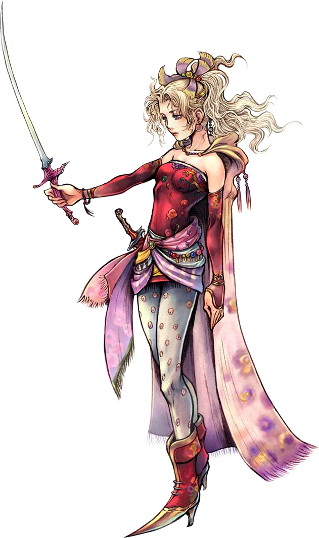
1) Terra Branford - just a wonderful all-around design - colorful and interesting, but not overly sexy or ridiculously overdone. One of the few protagonist designs that I would call fun.
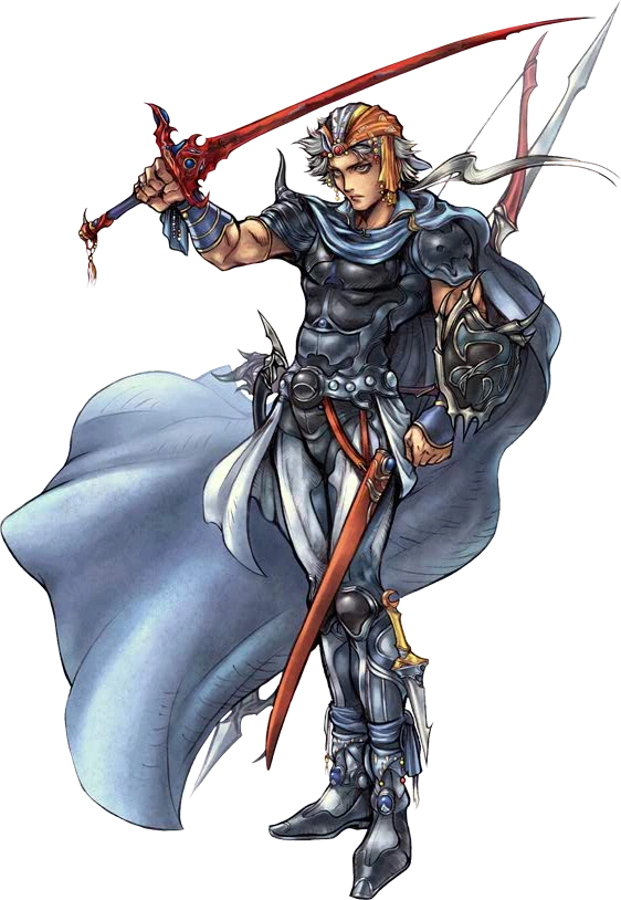
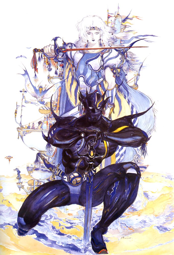
2) Cecil Harvey - both of his designs are excellent. As a dark knight, he looks like a bad ass. As a paladin, he looks more effeminate, but still maintains his imposing broad-shouldered, warrior appearance, even when depicted by Amano.
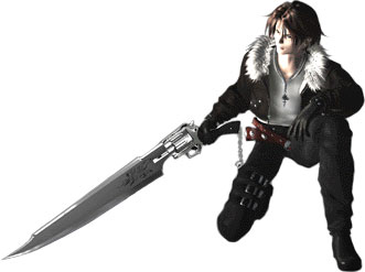
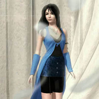
3) Squall Leonhart - I really dislike Squall as a character, but design-wise, he nails the edgy, brooding protagonist without being boring, awkward or overdone. Points for having a scar across his face, which I doubt Square would ever do again with a "pretty boy" protagonist.
Worst three designs:
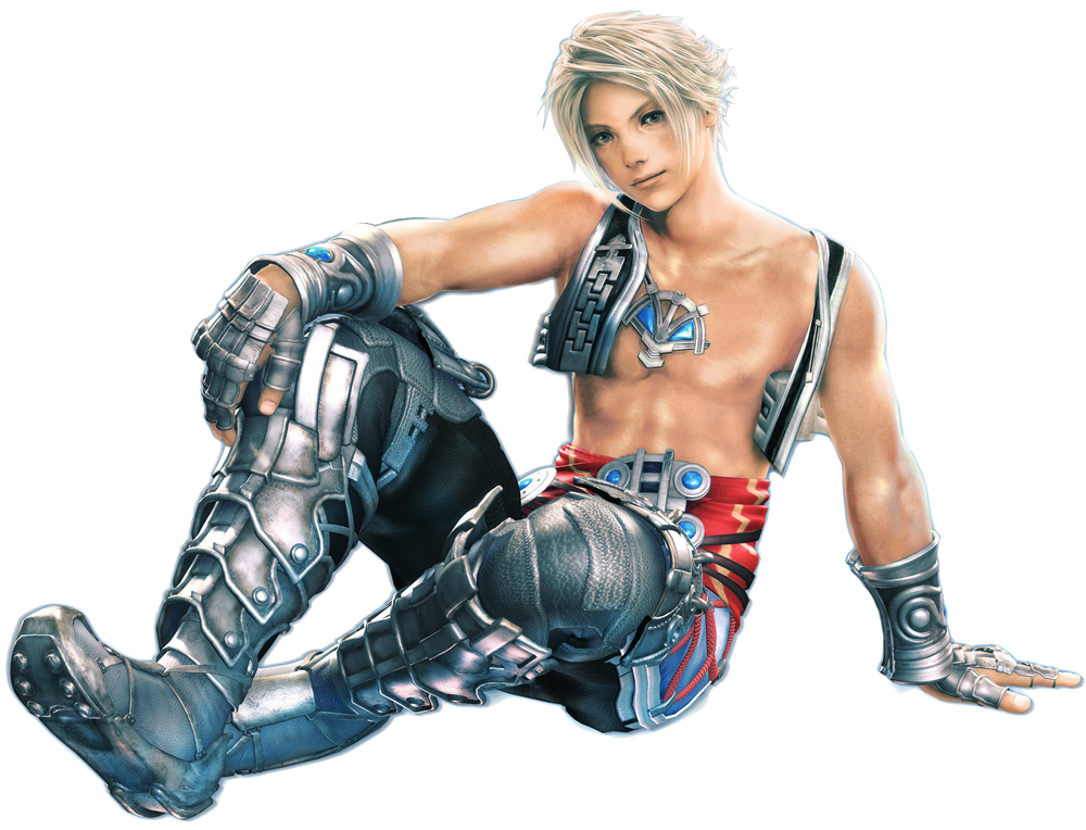
1) Vaan - the metal on his shinguards/greaves and gloves contrast horribly with his... vest? I guess that's a vest? Somehow, his design is both over AND underdone.
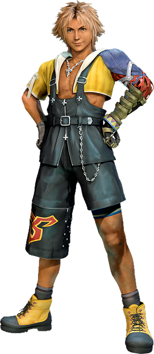
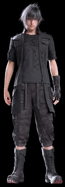
2) Noctis - looks like he was designed by a committee. I know it's been overstated, but he really does look like he came straight out of a JPOP boy band and his face is a very generic Japanese pretty boy look that almost looks like a male Lightning. Oh, and the gap between his pants and boots really bugs me.
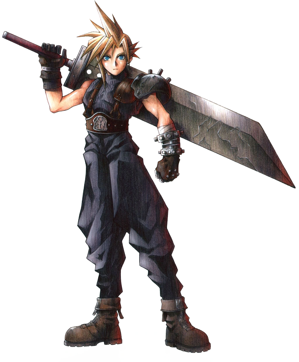
3) Cloud Strife - I guess we could start with the hair - it doesn't look good no matter how he is depicted. His outfit is actually really pretty boring and looks like it should be worn by a big warrior, not a thin man-boy. Also, what's up with the ginormous sword? It never really fit his character or design.
Here's mine:
Best three desgins:
1) Terra Branford - just a wonderful all-around design - colorful and interesting, but not overly sexy or ridiculously overdone. One of the few protagonist designs that I would call fun.
2) Cecil Harvey - both of his designs are excellent. As a dark knight, he looks like a bad ass. As a paladin, he looks more effeminate, but still maintains his imposing broad-shouldered, warrior appearance, even when depicted by Amano.
3) Squall Leonhart - I really dislike Squall as a character, but design-wise, he nails the edgy, brooding protagonist without being boring, awkward or overdone. Points for having a scar across his face, which I doubt Square would ever do again with a "pretty boy" protagonist.

Worst three designs:
1) Vaan - the metal on his shinguards/greaves and gloves contrast horribly with his... vest? I guess that's a vest? Somehow, his design is both over AND underdone.
2) Noctis - looks like he was designed by a committee. I know it's been overstated, but he really does look like he came straight out of a JPOP boy band and his face is a very generic Japanese pretty boy look that almost looks like a male Lightning. Oh, and the gap between his pants and boots really bugs me.
3) Cloud Strife - I guess we could start with the hair - it doesn't look good no matter how he is depicted. His outfit is actually really pretty boring and looks like it should be worn by a big warrior, not a thin man-boy. Also, what's up with the ginormous sword? It never really fit his character or design.