• Hey Guest. Check out your NeoGAF Wrapped 2025 results here!

Unaesthetically pleasing games?

The art of 343 games are really tragic. They use a weird pallet of every color in mind but in like drab faded paint versions. They don’t know how to establish a color scheme or aesthetic. The Anniversary remakes are artistically just “throw these other extra colors in. Needs some green and red and yellow”
 
Nidhogg 2 looks like steaming faeces.

hFbRl9p.png
mHM3DMk.gif


I know a lot of people have already commented on this, but damn, this is a shame. I had no idea there was a sequel coming. Granted, it looks good in motion now that's I've looked it up and is probably going to be tons of fun, but this particular screenshot makes it look like Nidhogg 2: Nekkid Burt vs. Ernie.

As for me, I'm not a fan of the "Flash animation" aesthetic. I'll probably get flak for it, but I don't like the look of Behemoth's games, such as Castle Crashers. Their games are still a joy to play, though!
 
More than anything, Super Mario World's roughly Earth-like environments feel out of place following how SMB1, SMB2 (US), and SMB3 each embraced their own distinct fantasy world.
 
mHM3DMk.gif


I know a lot of people have already commented on this, but damn, this is a shame. I had no idea there was a sequel coming. Granted, it looks good in motion now that's I've looked it up and is probably going to be tons of fun, but this particular screenshot makes it look like Nidhogg 2: Nekkid Burt vs. Ernie.
People could check out Nidhogg 2 in action here, not a significantly cropped picture:
https://www.youtube.com/watch?v=odhzSX60PWI
 
The art of 343 games are really tragic. They use a weird pallet of every color in mind but in like drab faded paint versions. They don’t know how to establish a color scheme or aesthetic. The Anniversary remakes are artistically just “throw these other extra colors in. Needs some green and red and yellow”

Sabre developed CE:A, but 343 really should have reined that shit in. However 2:A was a massive step up in this regard, so your statement of "the Anniversary remakes" is unfair.
 
Going purely on aesthetics:

ordon_villagers_by_avatarus_one-d5ezx0b.jpg

Twilight Princess has some seriously ugly character design, and everything looks like it's made of plastic. It's funny how it was praised for its art style when literally every other 3D Zelda was much more pleasing in this regard. The whole game is also permeated by an incredibly drab colour pallete. Even in broad daylight, Hyrule Field still manages to look like a gloomy and grimy place. It's not as bad in TPHD, which seems a little more saturated, but you can't fix ugly.

20070221-Morrowind.jpg

Morrowind was always pretty strange looking even for its time, between the endless sea of fog and the weird looking...water? Some of the character designs are hideous (though Oblivion would take that to a new level), and the janky animation only adds to the sheer strangeness of it all. The game is many things, and "pretty" has never been one of them.
 
Honestly, Yoshi's Wooly World. It's strange to me, because I remember liking it's look in trailers and such...but when I actually obtained the game...it's just...not easy on my eyes. A shame too, because the whole yarn theme opens up some great gameplay additions imo...the artstyle is now a major reason for me not continuing the game
 
Going purely on aesthetics:

ordon_villagers_by_avatarus_one-d5ezx0b.jpg

Twilight Princess has some seriously ugly character design, and everything looks like it's made of plastic. It's funny how it was praised for its art style when literally every other 3D Zelda was much more pleasing in this regard. The whole game is also permeated by an incredibly drab colour pallete. Even in broad daylight, Hyrule Field still manages to look like a gloomy and grimy place. It's not as bad in TPHD, which seems a little more saturated, but you can't fix ugly.
Yep. One of the many reasons TP fell completely flat for me as a Zelda fan. The first of the series to really disappoint me on release.
 
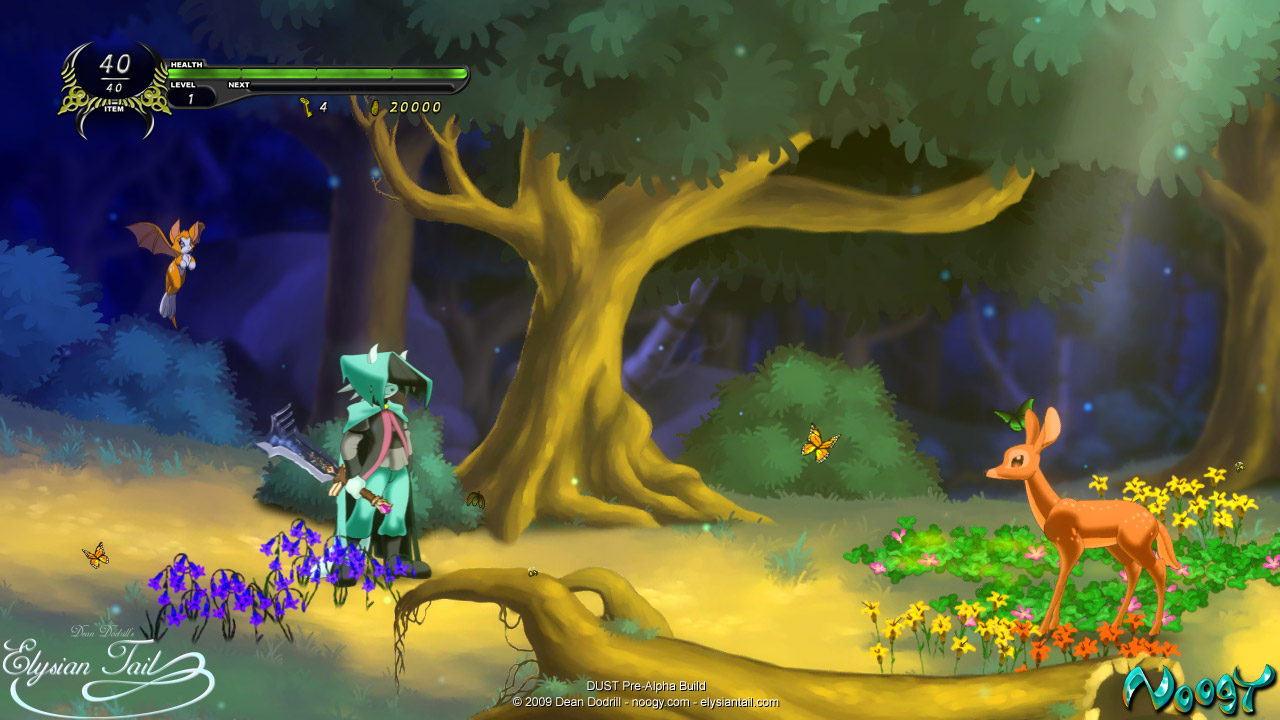
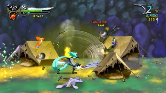
dust an elysian tail is super fun to play and looks great in motion. it's okay to dislike the anthropomorphic animal style but you're missing out on a great game if you skip out on it because of that alone.
 
mHM3DMk.gif


I know a lot of people have already commented on this, but damn, this is a shame. I had no idea there was a sequel coming. Granted, it looks good in motion now that's I've looked it up and is probably going to be tons of fun, but this particular screenshot makes it look like Nidhogg 2: Nekkid Burt vs. Ernie.

As for me, I'm not a fan of the "Flash animation" aesthetic. I'll probably get flak for it, but I don't like the look of Behemoth's games, such as Castle Crashers. Their games are still a joy to play, though!

I really don't get why they went for this style for the sequel; I get that they probably wanted to do enough new/more complicated things that they needed a new style that would be clearer to the player, but still. That being said, it definitely looks much better in motion and I'm sure will play well still.
 
Dust is a good answer
Game is even okay but the deviantart-ish graphics are a huge turnoff

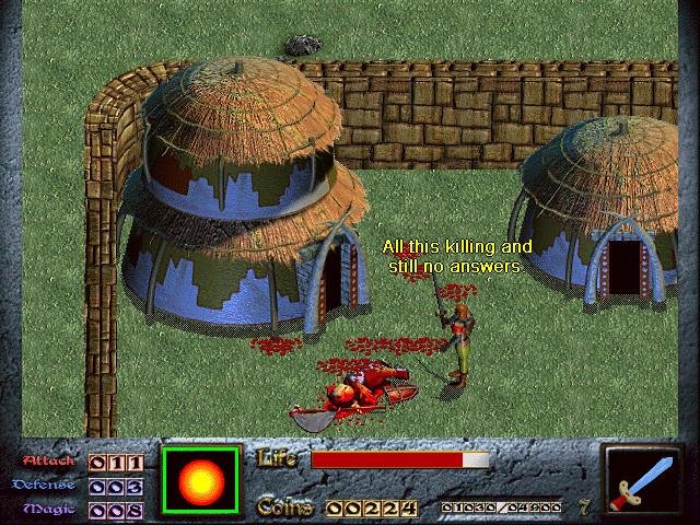
Dink Smallwood was a fairly fun game too but damn it looked like ass

Snap74_1.jpg
 
People could check out Nidhogg 2 in action here, not a significantly cropped picture:
https://www.youtube.com/watch?v=odhzSX60PWI

I'm incredibly dissapointed. The first had this neat minimalist approach where if you killed the other guy he dissolved into a puddle of his color, it was super stylish and got the point across that he died horribly in a cool way, but here they explode on death like organic Legos. The big eyes add more expression but it wasn't even needed. It's like he did the complete opposite of the original's "less is more approach" and it's really turning me off.
 
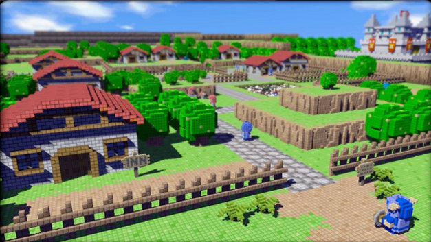
I HATE, HATE the Minecraft visuals. I know what they are going for but prefer this type visuals way more.
blus-30490-ss4
 
hoo boy, I've been triggered.

Can we not say that? Thank you.

Anyway...

Marvel Vs Capcom 3 (Which is a shame because I adore TvC's artstyle)
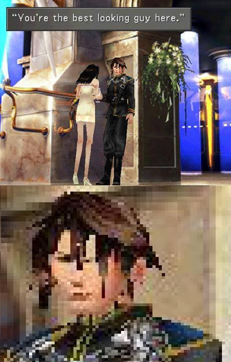
Isaac (I'm trying to force myself to get used to the artstyle-preordered it on the Switch)
Undertale
The more recent 3D Mortal Kombat games
Skullgirls
Excessive weeb shit. I'm fine with Disgaea but anything beyond that, like those scary-looking character models in one of the Xenoblades, Clannad, and all those dating sims on Steam, I can not stand to look at.

Also, I think saying Nidhogg 2 is practically cheating.
 
The characters in Super Smash Bros. Horribly distorted & low poly, esp. DK and Link 🙈

217.jpg


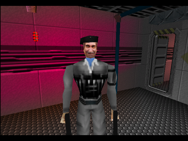
Most of the characters in Goldeneye. I think the bond model is the only satisfactory one.

This henchman 😦

latest


Natalya. Good gravy considering the actress in gorgeous. Poor effort. 😩

goldeneye-35.png
 
My friend in high school was addicted to Runescape and I never understood why. It's a fucking eyesore. It's not even a game that looked good for its time. Just dog shit ugly.

This is personally where I draw the line between an ugly game that's really good so it's still worth playing and a game so ugly that gameplay doesn't matter because I wouldn't be able to enjoy it because it's so fucking ugly.

hB17F4N.jpg


hCbsBL5.jpg


PhbmqCl.png
 
The art of 343 games are really tragic. They use a weird pallet of every color in mind but in like drab faded paint versions. They don’t know how to establish a color scheme or aesthetic. The Anniversary remakes are artistically just “throw these other extra colors in. Needs some green and red and yellow”

343 has no idea what they're doing with how Halo is supposed to look, they made Forerunner stuff look as generic as possible instead of how it used to be foreboding and ancient, made the armours look terrible, among other things.

One of the biggest examples is how awful the Elites in 5 are. Not only are they comically oversized and bizarrely proportioned, but are clumsy and unstable, despite being the smart and level-headed race among the Covenant.

Their mandible armour DOESN'T EVEN PROTECT THEIR MANDIBLES IN 5
 
I'm bummed to see people hating on Dragon's Crown. I can see that it doesn't click with some people, but I respect that it is different from the normal jrpg aesthetics. My vote is for skyrim and oblivion default graphics.
 
Going purely on aesthetics:

ordon_villagers_by_avatarus_one-d5ezx0b.jpg

Twilight Princess has some seriously ugly character design, and everything looks like it's made of plastic. It's funny how it was praised for its art style when literally every other 3D Zelda was much more pleasing in this regard. The whole game is also permeated by an incredibly drab colour pallete. Even in broad daylight, Hyrule Field still manages to look like a gloomy and grimy place. It's not as bad in TPHD, which seems a little more saturated, but you can't fix ugly.

At the time, we wanted a Lord of the Rings-looking Zelda, and at the time, this fit the bill. Now, certainly it doesn't hold up. But there are some pretty fun character designs in there, and they are animated to be pretty expressive and fun. I love how Link and the mayor (big fat guy with a mustache that looks like boar tusks) interact in the beginning of the game. They're very expressive characters. (and that pregnant lady...the way she looks at Link? That's definitely Link Jr in there.)
 
Going purely on aesthetics:

ordon_villagers_by_avatarus_one-d5ezx0b.jpg

Twilight Princess has some seriously ugly character design, and everything looks like it's made of plastic. It's funny how it was praised for its art style when literally every other 3D Zelda was much more pleasing in this regard. The whole game is also permeated by an incredibly drab colour pallete. Even in broad daylight, Hyrule Field still manages to look like a gloomy and grimy place. It's not as bad in TPHD, which seems a little more saturated, but you can't fix ugly.

4474624_f520.jpg
 
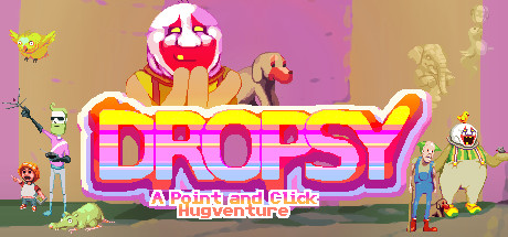
Probably unpopular opinion, but Dropsy.

header.jpg


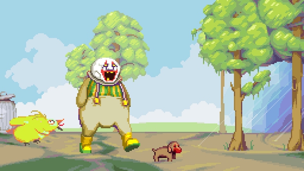
dropsy4.jpg


While the ugly aesthetics are on purpose - Ugly people, a crap depressing world, desaturated washed out colours - the real problem is the game resolution. For a modern game it is so low that in a 23" screen looks awful with pixels bloated to absurd extremes.

I suppose this is completely intentional to reflect the look of old advanture games, but it hurts the eyes. I have played a lot of other low res point and click adventure games like Gemini Rue, and they never felt as bad as Dropsy. Since the game uses some serious spritework and animation, it should have gone with a slightly higher resolution, like Owlboy or Jamestown.


So real quick:

I didn't go for ugly on purpose. I think the backgrounds in Dropsy are all really pretty, really. The city is definitely run-down, but most of the areas are desert or forest or farmland or whatever and I tried to make those nice looking.

That 'screenshot' is the bane of my existence because it was from the 2013 Kickstarter and not the 2015 final release. The resolution at the time was something incredibly low like 256x144 and we bumped it up to 320x180 mid-development. Press have used it for everything since you can't edit old Kickstarter campaigns and it comes up in google searches. :(

I agree that the res is quite distractingly low, though. Even I have to take breaks if I play it at any length. Thankfully, most people playing aren't on big honkin' monitors where each pixel is 2 feet long. This is why we bumped my current game up to 480x270 instead of 320 like Dropsy.
 
Top Bottom