• Hey Guest. Check out your NeoGAF Wrapped 2025 results here!

Unaesthetically pleasing games?

Binding of Isaac

Always thought it looked ugly with bland color scheme and a majority of monotonous monster design that were circles with a deformed look. I know the intent is to make an ugly and grotesque game, but you can still make it look interesting (e.g Clock Tower, Bloodborne).
I also vote for Skullgirls, the characther design and how it looks. Not my cup of tea.

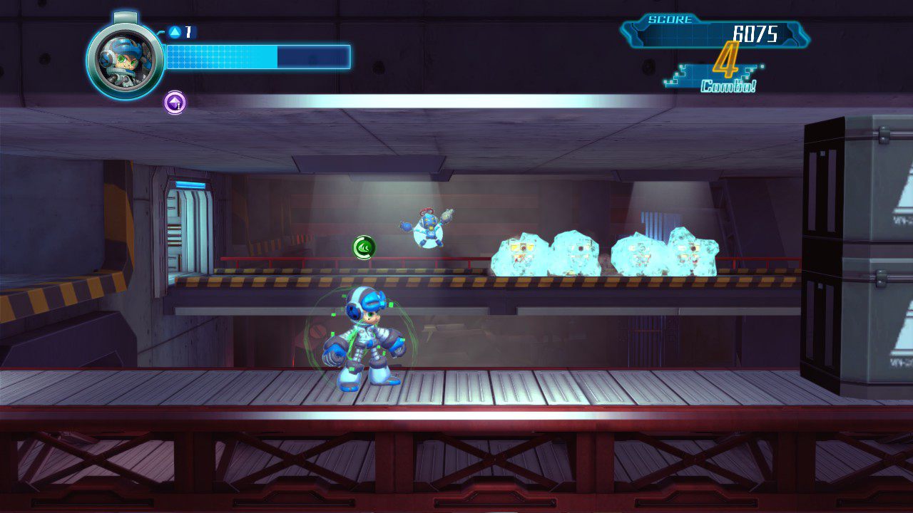
i watched a stream of this game and instantly noticed the character doesn't even go through the doors properly, the doors are just part of the background. you'd think for something that happens EVERY screen would have that detail correct. the game just looks like shit. heres what it should look like a game from 1987

ZZVIjni.gif
lnff6xi.gif
 
Nidhogg 2: The Thread

What the hell happened with Nidhogg 2?

The developers have incredibly bad taste. The amazing low-res pixelated look of the first game was apparently only arrived at through necessity, the devs themselves didn't like or want that incredible style.

Yes, that's right, Nidhogg 2 is what they always wanted it to look like. The mind boggles.
 
The only thing I've seen of Nidhogg 2 was the Giant Bomb look at it and I thought the style matched the humour of the gameplay quite well. Then again it could just be Vinny making feral noises while ducking in one spot that made it click, had me in stitches.
 
Nidhogg 2: The Thread


The developers have incredibly bad taste. The amazing low-res pixelated look of the first game was apparently only arrived at through necessity, the devs themselves didn't like or want that incredible style.

Yes, that's right, Nidhogg 2 is what they always wanted it to look like. The mind boggles.

It looks like a bootleg Simpsons game.
 
Nidhogg 2 looks like steaming faeces.

hFbRl9p.png

I felt these comments from an RPS news piece identified what made the original style work, in a comedic sense:

anon459 said:
In the first game I imagined [the characters] as skillful, trained combatants. In this game, they look like bumbling idiots. I’ll probably buy the game for the great gameplay, but I wish I didn’t have to play as a bumbling idiot.

Rizlar said:
Yeah, it spoils the comedy of awesome, acrobatic skill resulting in absurd death.

Could go on about how the more naturalistic figures plus absurd animation creates comedy in all sorts of ways that are missing from straight up cartoon buffoonery but will cut this short…
 
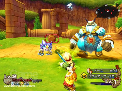
I like the game but I just cannot play Dawn of Mana for a long period of time because the colors hurt my eyes. Especially the mountain area part. I remember getting a headache because of it.

dawnmana_103120.jpg
 
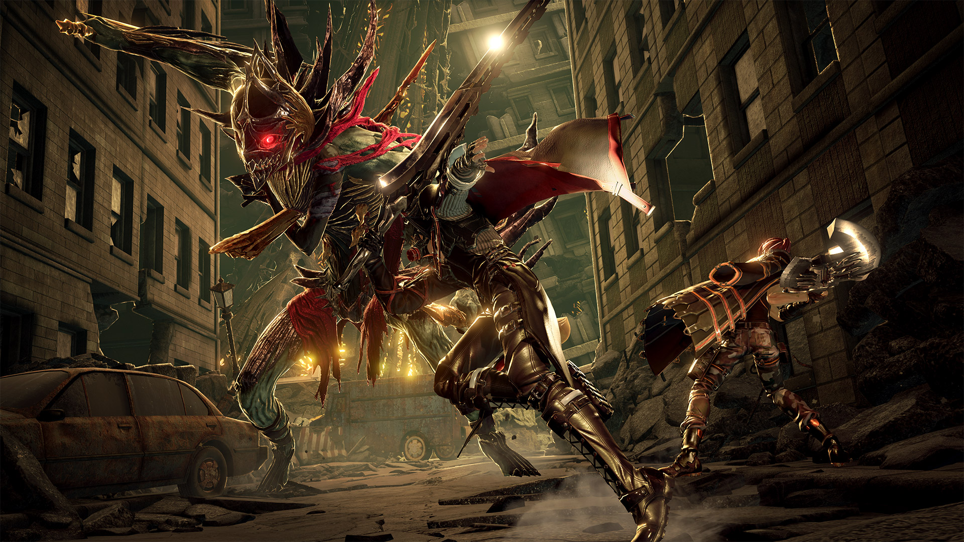
The upcoming Code Vein game that is supposedly Dark Souls-ish has an aesthetic only the worst edgelords can appreciate:

CV_Battle.jpg

j.jpg
 
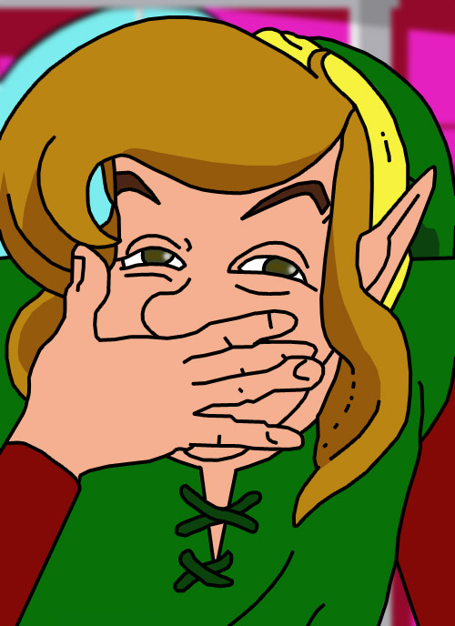
I know I'm not going to get a lot of support for this, but I think A Link to the Past is ugly and amateur-hour looking. It is inconsistent in perspective, has several different shading styles of which several of them are badly executed, things sometimes have thicker outlines for no reason, colour palettes are full of wasteful decisions, and it just features ugly, unmemorable design after ugly, unmemorable design. It's as clear as day that the visuals were made by designers and illustrators who did not really know what they were doing with pixel art. The only thing it has going for it, is that it is consistently poor, so you can relatively easily get used to it. Many of its issues are also present in Earthbound, which is another first party uggo.

bPffxrO.jpg
 
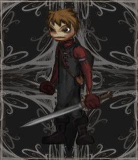
2736400-7063290277-Darke.png


I don't just or even mostly mean visual aesthetics, either. Lovecraftian aesthetic is supposed to be about inevitable decline, and realizing how powerless you are in the universe - which clashes strongly with an RPG's constant progression, even if that progression is leavened with difficulty and permadeath.

It's pretty dissonant to be feeling the triumph of beating a really difficult boss and then hear more of the narrator's over-the-top pessimism. The gameplay of DD is about succeeding against impossible odds, or at best winning a battle of attrition with a lot of casualties on your side, but the narrative side of it, such as it is, is about unrelenting pessimism and decay.

And, yeah, they don't succeed at the Lovecraftian aesthetic very well, either - the writing's terrible in most places, and the genuinely excellent voicework isn't given much to salvage the game with. If I wanted to parody DD's items descriptions I would probably come up with something like "Blue, like strangled dreams," but that's actually what they wrote for the Sapphire item description.

In order to be fully enjoyed, I had to shut off the narrarator, mute the music, and put on some fast techno music in the background, at which point it became a pretty damn good turn-based dungeon crawler.

I got confused, sad and a little angry half-way reading your post. This post set the new record of "how much I can disagree with any opinion". Then I saw the fast techno music in Darkest Dungeon and simply started laughing.

I think Darkest Dungeon has the best atmosphere and most impressive visual style of any game in 2010's. Over the top grim, sure, but that's the entire point.
 
I know I'm not going to get a lot of support for this, but I think A Link to the Past is ugly and amateur-hour looking. It is inconsistent in perspective, has several different shading styles of which several of them are badly executed, things sometimes have thicker outlines for no reason, colour palettes are full of wasteful decisions, and it just features ugly, unmemorable design after ugly, unmemorable design. It's as clear as day that the visuals were made by designers and illustrators who did not really know what they were doing with pixel art.

My god.
 
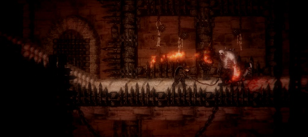
not entirely unpleasing but Salt and Sanctuary. The game looks good (for a 2d side scroller):

14867247367_017c24c562_b.jpg


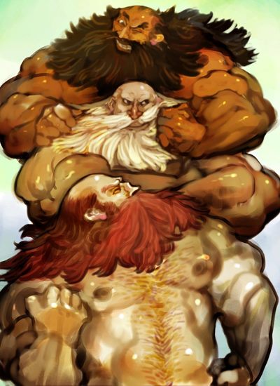
but what ruins it is the character faces:

OeN7hCo.jpg
 
Sin & Punishment: Successor of the Skies is probably my favourite game ever, it runs at 60fps and it has some nice environments at times but good lord, sometimes it's just too fucking brown or grey.

snp2-11.jpg
 
I know this will be controversial...but color splash. I don't like how literally everything im the environment is paper or cardboard. I liked that the first two games had full worlds that looked real, and just the characters looked paper due to them being like sprites. It's great graphics, but I don't like it aesthetically.

https://static3.gamespot.com/uploads/original/1365/13658182/3076780-papermariocolorsplash_wiiu_pmcs_scrn_02.jpg[/IMG

I love the first two games though, especially TTYD. It had more of a comicbook kind of feel.
[/QUOTE]

Sadly gotta disagree, I think color splashes artstyle is eye candy, the forest and beach levels were so nice on the eyes I wanted to just stay in and game and chill forever
 
I know I'm not going to get a lot of support for this, but I think A Link to the Past is ugly and amateur-hour looking. It is inconsistent in perspective, has several different shading styles of which several of them are badly executed, things sometimes have thicker outlines for no reason, colour palettes are full of wasteful decisions, and it just features ugly, unmemorable design after ugly, unmemorable design. It's as clear as day that the visuals were made by designers and illustrators who did not really know what they were doing with pixel art. The only thing it has going for it, is that it is consistently poor, so you can relatively easily get used to it. Many of its issues are also present in Earthbound, which is another first party uggo.

bPffxrO.jpg

tenor.gif


I never liked it either. It isn't ugly but it isn't good.
 
i think street fighter 5 looks odd and lacks style, and i think the slimy 3D effects look like garbage. sf4 looks a lot nicer and cooler imo

proportionally SF5 is a lot closer to say the third strike/marvel vs capcom 2 sprites. SF4 everyone just looked like bulgy eyed toads with a gash "drawn" texture added to everything. couldn't stand it. like ryu's hair and face in that game is a crime against humanity. he looks like a fish lol
 
proportionally SF5 is a lot closer to say the third strike/marvel vs capcom 2 sprites. SF4 everyone just looked like bulgy eyed toads with a gash "drawn" texture added to everything. couldn't stand it.
The new SSF4 models were vastly improved though, like Ibuki and Dudley.
 
This might be an unpopular opinion but I never really liked Marvel vs Capcom 3's style. Everyone always looked "too dark" for me, for lack of a better way to describe it. Then again, if it were up to me the whole thing would have been high-res sprites like KOF 13.


I suppose you could say that this style is retroactively amazing compared to Marvel vs Capcom Infinite, but I dunno. Don't really care for either of 'em.

I'm with you on that one. MvC3 just doesn't look good. It has those really big brush strokes but no flat shaders and in combination with the really dark asthetic it looks like one hot mess. It can't make up its mind if it wants to look like a 3D or a 2D game, colorful or dark.


As for my example, I'm taking part of a game: the cutscenes of SFV.


They're absolutely horrendous! I love the artstyle of SFV but these feel so out of place... I hate them, truly hate them.
 
i watched a stream of this game and instantly noticed the character doesn't even go through the doors properly, the doors are just part of the background. you'd think for something that happens EVERY screen would have that detail correct. the game just looks like shit. heres what it should look like a game from 1987

screenshot2017-08-10ayys6x.png


The fuck is this clipping through the doorframe shit? Lazy devs confirmed.
 
"Unaestethically pleasing" in the title made me think an Unaesthetic style that is Pleasing. (As opposed to Unpleasing)

So I was expecting getting game that are not concerned by beauty, but can highlight ugliness, Eg. Horror games, games with distorted characters or monsters but high artistic value, games that use disturbing or creepy, chaotic, dissymmetric imagery...

Edit: for example Spiderling and its use of creepy "Uncanny valley" faces on the Spiders mixed with realistic insect sprites, or Axiom Verge and its semi-organic world.
 
I know I'm not going to get a lot of support for this, but I think A Link to the Past is ugly and amateur-hour looking. It is inconsistent in perspective, has several different shading styles of which several of them are badly executed, things sometimes have thicker outlines for no reason, colour palettes are full of wasteful decisions, and it just features ugly, unmemorable design after ugly, unmemorable design. It's as clear as day that the visuals were made by designers and illustrators who did not really know what they were doing with pixel art. The only thing it has going for it, is that it is consistently poor, so you can relatively easily get used to it. Many of its issues are also present in Earthbound, which is another first party uggo.

bPffxrO.jpg

???

Aside from the thicker outlines on the trees (and I like it), none of what you describes is supported by that picture.
 
I actually stopped playing Skyward Sword becauseof the horrible mix between the painting style graphic and extreme depth of field.
 
Planescape Torment is a pretty good answer.
The Icewind Dale series had much prettier environments. Even Baldurs Gate had some nice areas too. PST seemed very brown and barren in comparison.
 
Top Bottom