• Hey Guest. Check out your NeoGAF Wrapped 2025 results here!

Unaesthetically pleasing games?

New Super Mario Bros series. Everything from the sound effects/music/animations/graphics is awful.

95590.jpg


It all looks and moves like bad CG from the early 90's or something.
Bright, colourful, vibrant. Very pleasing to the eye. NSMBU is a VERY good looking game, and that screenshot you chose looks gorgeous.
 
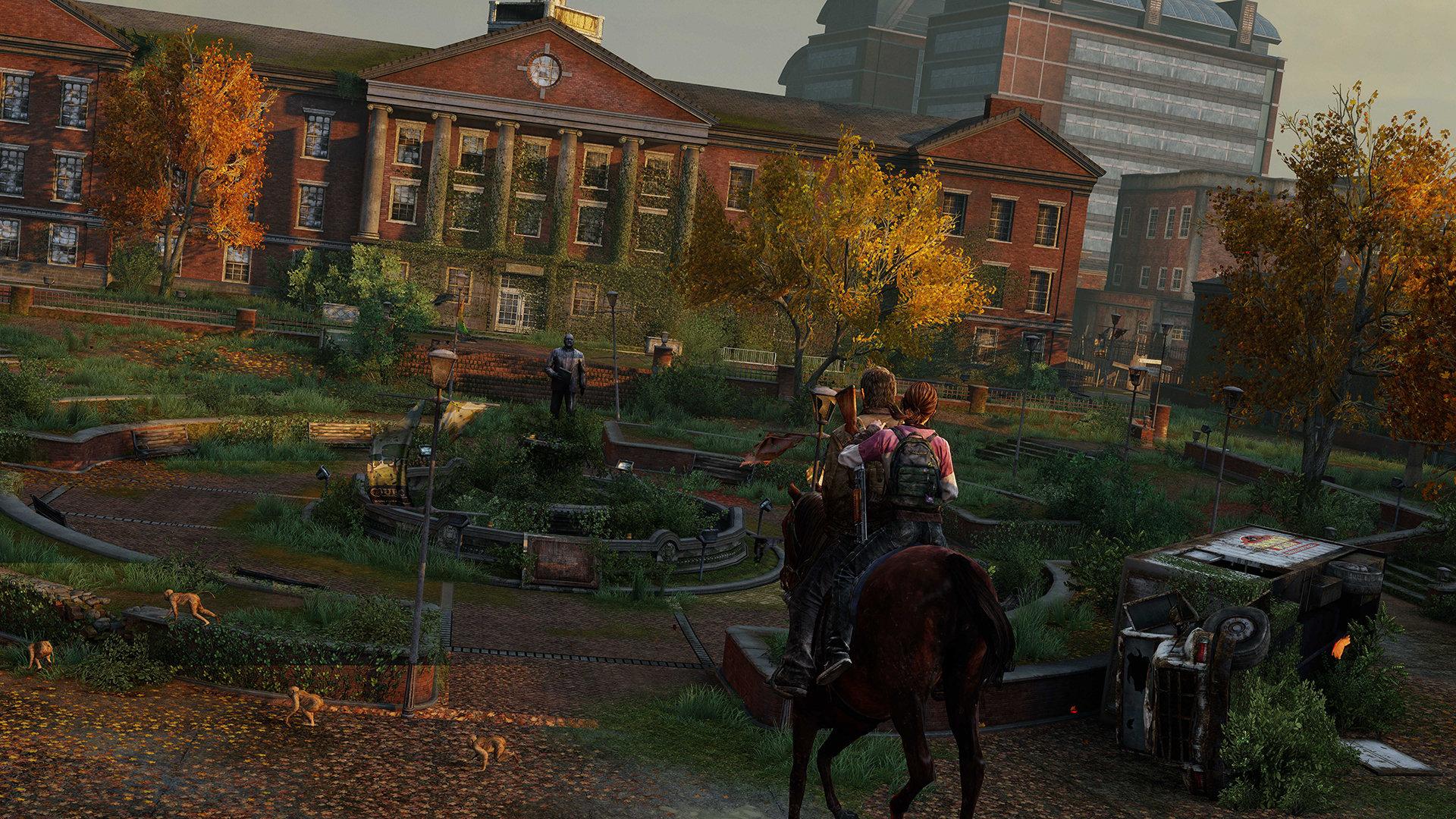
This thread got quickly derailed by the FFVIII, BOTW, and TLOU mentions.

I mean Nidhog is exactly the type of game that OP is looking for. The aesthetic is horrendous.

Yeah, there's a difference between personally not liking a style and a style that's viewed as poor by a majority of people. FFVII, BotW and TLOU are all the former.
 
Just played the game on my switch ĺooks just like it 🤔
Your Switch downsamples BOTW from a higher internal resolution to 1080p? Do you have a Switch 2 from the future? Mine only renders the game in 720p in handheld and 900p docked with poor texture filtering. 🤔
 
Your Switch downsamples BOTW from a higher internal resolution to 1080p? Do you have a Switch 2 from the future? Mine only renders the game in 720p in handheld and 900p docked with poor texture filtering. 🤔

Still looks good on my tv and i have a 4k tv.
I did however change some colour and other settings to make the colours pop out more and look more dynamic. And lessened the black filter to make the fog alot less.

I guess some people tolerate it better but still it's no ugly game.
 
Bright, colourful, vibrant. Very pleasing to the eye. NSMBU is a VERY good looking game, and that screenshot you chose looks gorgeous.

It's awful. It's like the laziest, most milquetoast translation of the Mario "style" that could exist. You look at how 3 and World built on and expanded the primitive style of SMB, Yoshi's Island getting even more unique, Paper Mario doing it's own thing, then you go to 64 and Sunshine, then you have stuff like the Galaxy games that are just stunning.

Then the New series comes along and seems to sap all the creativity out of the design with awkward, half-baked animation and sound on top of it.

I don't know why they would go to some ugly, faux 3D looking backgrounds with straightforward 3D characters for the return to 2D style games instead of just going all the way with beautifully animated 2D using the existing art style they already use all over the place:
25._mario.png
 
3675e8b4b8ac44403f4f9b29cabc51cdb4f275c5-1134528.jpg

Salt-and-Sanctuary-Download-For-Free.jpg


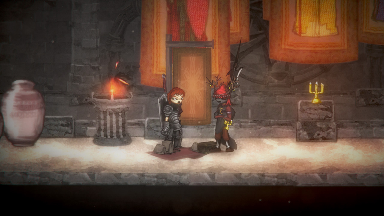
Its Salt and Sanctuary.

Makes my skin crawl. Looks like a game from addictinggames.com or just generally late 90's flash games.
 
A lot were mentioned but I'll go with Binding of Issac because I hate that game in it's entirety and the 'artstyle' didn't help.

Also may as well add Morrowind. The game and the area.
 
I never gonna understand the hate for Dragons Crowns art style.

Its funny that so many people are really intimated by buff people working out.

In a more realistic 3D model game its totally understandable why the weird proportions would look stupid but the game is so stylized and beautiful that it works.
 
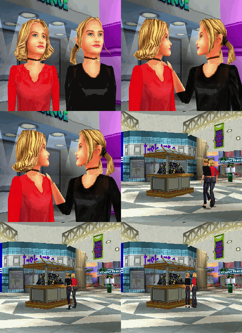
Mary Kate & Ashley: Magical Mystery Mall

132twins.gif

Nekketsu Kõha;245787954 said:
Looks real.

Wow I'm surprised what Unreal engine 4 can do you using the latest
GPU 900 protocol tera flop AMD core processor XMD
-inteleron chipset , reviewed by Digital foundry as the standard in computers used to power the latest Mavel cinematic universe movies.

Tully amazing how far we come as humanity and digital art.

Who needs cloning.
 
It's Drawn to Death, hands down.
I also personally can't stand Shinichi Kameoka's style he uses, mostly in his Brownie Brown work. Magical Starsign and the newly-released Egglia have character designs that make me feel ill.
 

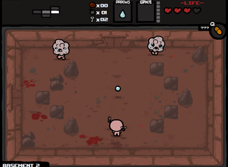
Binding of Isaac

Always thought it looked ugly with bland color scheme and a majority of monotonous monster design that were circles with a deformed look. I know the intent is to make an ugly and grotesque game, but you can still make it look interesting (e.g Clock Tower, Bloodborne).
I also vote for Skullgirls, the characther design and how it looks. Not my cup of tea.
 
latest


I do like the aesthetic for the world and absolutely love design for the Mechs but god damn i really hate look of the characters.

I own art book of it and characters looks great in had drawn but 3D models just doesn't look good to me.
 
I never gonna understand the hate for Dragons Crowns art style.

Its funny that so many people are really intimated by buff people working out.

In a more realistic 3D model game its totally understandable why the weird proportions would look stupid but the game is so stylized and beautiful that it works.

This.
I think the art style / art work is incredible through and through.
 
Binding of isaac the thread.

I bought the game but could not play it because the visuals were way too dusgusting for me.
 
Street Fighter V. While being graphically impressive, it lacks style compared to Street Fighter 4. The characters are too disproportioned and would look much better with some kind of cel shaded aesthetic. It just looks off to me.

street-fighter-5-screen-36-ps4-eu-8jul15
 
Street Fighter V. While being graphically impressive, it lacks style compared to Street Fighter 4. The characters are too disproportioned and would look much better with some kind of cel shaded aesthetic. It just looks off to me.

street-fighter-5-screen-36-ps4-eu-8jul15
I can't agree. I really loved the art style of SFV.
 
Honestly? This minecraft(and Classic) looks so much more appealing and soothing to me than MC has in a long time

Yep, this.
Ambient occlusion is fine, but everything else they added on top of that looks ugly and doesn't fit with the game's aesthetics at all.

Dragon's crown is gorgeous. Yes, there are gratuitous tits and asses and weirdly proportioned characters but the way it references Renaissance and baroque paintings is amazing, it has some of the finest traditional art I've seen in a game. But yes there's this sorceress with huge tits.
 
New Super Mario Bros series. Everything from the sound effects/music/animations/graphics is awful.

95590.jpg


It all looks and moves like bad CG from the early 90's or something.

Yup, it is an awful art style. It is so wretchedly ugly.

Just to think, how they had the style nailed down in the nes and snes days, then go to this shit.
 
Neptunia games. Basically any game where it's little anime girl who are all suffering from same faces. Especially ones with little girls having giant boobs.
 
I never gonna understand the hate for Dragons Crowns art style.

Its funny that so many people are really intimated by buff people working out.

In a more realistic 3D model game its totally understandable why the weird proportions would look stupid but the game is so stylized and beautiful that it works.

I think it looks very busy, especially with large parties in a dungeon with big ass dungeons.

Still a beautiful looking game.
 
maxresdefault.jpg


Po'ed.png


PO'ed - even when this game was new it was a hideous chud of a product. The level design was such a mess it made me feel sick after playing it for a few hours.
 
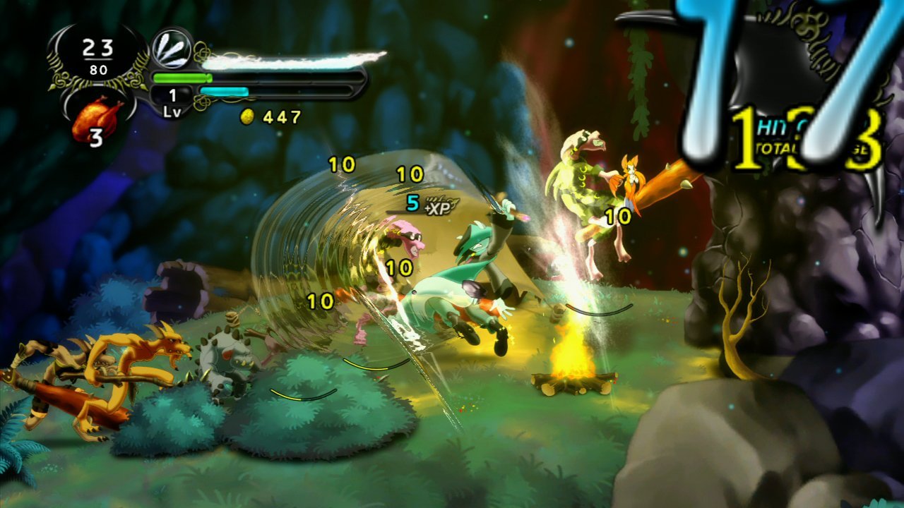
dust-an-elysian-tail-xbox-360-1345475788-017.jpeg

Dust: an Elysian Tail
*barf*

Yes.

3675e8b4b8ac44403f4f9b29cabc51cdb4f275c5-1134528.jpg

Salt-and-Sanctuary-Download-For-Free.jpg


Its Salt and Sanctuary.

Makes my skin crawl. Looks like a game from addictinggames.com or just generally late 90's flash games.

And yes.

These two immediately came to mind when I was scrolling through this thread.

Edit: Though if we are talking about games that are considered ugly yet still look good, I'll nominate Antichamber.
c21okY9.png


It can look extremely poor at times but it's also very striking quite often.
 
Top Bottom