• Hey Guest. Check out your NeoGAF Wrapped 2025 results here!

Unaesthetically pleasing games?

serveimage


I repulsed at Yoshi's Island GBA.
 
I always thought Dragon Age (Inquisition, esp) would be much, much bigger and successful if it didn't look like a generic Tolkien world. Great game, gameplay. Couldn't tell it apart from anything, though.
 
Super Mega Baseball. It's a great game, but the aesthetic turned off so many friends from giving it a chance. It's not that it's cartoony, it's just a type of cartoony that...doesn't work? Except that, when you name all the players after friends, then suddenly the deformed head, ugly characters suddenly become...charming?
 
The Borderlands games, I played a bit of the second one and I really enjoyed the gameplay but I couldn't deal with that art style.
 
I think people misunderstood the topic

it says "Unaesthetically pleasing" games, no "Aesthetically unpleasant" games, it's not about what games you hate how they look, it's about games that use an intentionally ugly aesthetic as part of the style.

My choice would be Psychonauts, they really got the "stylishly ugly" thing just right.
 
I think people misunderstood the topic

it says "Unaesthetically pleasing" games, no "Aesthetically unpleasant" games, it's not about what games you hate how they look, it's about games that use an intentionally ugly aesthetic as part of the style.

My choice would be Psychonauts, they really got the "stylishly ugly" thing just right.

idiocracy.jpg

I don't get it.
 
Nidhogg 2 looks like steaming faeces.

hFbRl9p.png

Yeah, I'm disappointed with this direction. :(

You could argue that this is the kind of thing they were going for all along, just lacking the detail, but in my view the original had somewhat serious looking fencers that got into ridiculous situations and do crazy moves like flying kick moves sometimes. The humor came partly from the fact that they looked and acted adept but the moves were bananas. This new style is just goofballs all the way down.
 
This thread got quickly derailed by the FFVIII, BOTW, and TLOU mentions.

I mean Nidhog is exactly the type of game that OP is looking for. The aesthetic is horrendous.
 
Kane & Lynch 2: Dog Days goes for a style I can only describe as visually disorienting.

The shaky dude-following-you-with-a-camcorder-or-some-shit setup seems believable until the player looks down and leaves the cameraman floating in midair.
 
I understood the thread to be about games with a poor aesthetic, or tdlr; bad/uninspired art.
I think that's partially correct. That's probably the OP's intention, going by the short, elaborative question in his post. But it is unaesthetically (ugly) pleasing games. I take that to mean ugly, but still pleasing for some reason.
 
Modern TES and Fallout games are all hideous until modded out the ass

New Vegas is one of my favourite games but god damn it looked like shit until I spent about 5 hours modding it, and even then it still wasn't good.
 
Or maybe the poster just finds the art style aesthetically unappealing and you're making asinine assumptions.

With zero context given, I made an assumption based on the most widespread criticism of the game at the time of release. It appears I was wrong.

What does morality have to do with aesthetics??? The game has a terrible art style.

No thank you. Looks awful.

Whether a link between morality and aesthetics exists has a long history. I fall into moderate moralism, but it isn't a settled question. I don't see the art style as terrible. I see it as a visually pleasing and occasionally immoral rendition of comically exaggerated people.
 
Fair, but I gotta nitpick and point out that Xrd's accomplishments are largely thanks to a ton of manual artist work and not fancy engine tech.

Yeah the term "tech" was too limiting. The presentation overall is insane and it's always good artists who pull that off (pure engine muscle alone never works), but the type of busy anime designs they've gone for are unappealing to me.
 
Xenoblade 2

I enjoy some portions of adventure but the games are so hard to look at.

eJrm4.png
If we were talking about the DX port, I would agree, but I personally (along with a great deal of other Sonic fans) love the look and atmosphere of the dreamcast original.
 
Evil within still looked like it was trying to run on RE4's engine

Goddamn fight me IRL.
I'll kinda give you SH1 because its a 3D PS1 game, but even then when you emulate the game it actually looks great art wise.
Don't get me started on you including SH2.

Actually, SH1 assets don't hold up well. You can notice there are funky perspective errors in some backgrounds that make environments look comically big.

I agree with you on SH2 though. Game is still beautiful for the most part.
 
No. I mean you can find the aesthetics offensive to your morality and then debate whether the two are necessarily linked, but if you don't include the characters that offend you, it is a damn good looking game. Look at this spread...
640
Wow I never noticed how not completely terrible and vomit inducing Dragons Crown could be. The whole game should be like that. But unfortunately those character designs ruin everything.
 
Kane & Lynch 2: Dog Days goes for a style I can only describe as visually disorienting.

I liked the idea of what they were going for, but it's probably the only game (barring some VR games) that made me feel sick. I couldn't cope with the amount of camera shake and artifacts when I played the demo. Thankfully you could turn it off but then I felt like I was missing out. Never played it outside of the demo though.
 
battleborn-1.jpg


Virtually everyone in Battleborn's cast is either hideously designed or completely forgettable. Or both.

I dunno, there's a handful of good designs in Battleborn.

Marquis and Oscar Mike are both interestingly designed but for different reasons. Marquis for his character design. Oscar Mike for his personality.

Marquis is something I could legitimately see in Overwatch. Hell, he's basically an omnic already but with a lot more personality. The combination of black and gold along with his fancy getup and cane rifle gives him a pretty clear design and I think it works pretty well. The holographic mustache is icing on the cake.

latest


Oscar Mike is designed to be the ultimate generic dude-bro soldier, and that's what his design reflects. He looks like a bizarre cross between Master Chief and the typical modern military FPS grunt. It's intentional. Oscar Mike is also...well...funny. Some of his one liners are brilliant...I actually find myself repeating them from time to time.

latest


The majority of the Battleborn cast is forgettable though, granted.
 
I find most of Twisted Pixel's catalog falls under this category for me. The lighting, textures, color palate and character designs always pushed me away, even if the games had neat concepts.

The Maw:
0lGDxhi.jpg


Splosion Man:
sYeu7xP.jpg


Lococycle:
fOojl40.jpg


Even Comic Jumper, which is probably their most inspired look, can be a bit rough:
ZdFYNoM.jpg
 
Thanks for the clarification, you really made a compelling case
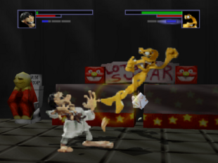
Not sure what you want from me. I'm not trying to convince anyone of anything. I didn't like the look of the game or art of an otherwise quality production. It felt too generic, lazy and I neither felt it was dark enough for what they were going for or light enough for being pleasant to look at.
 
Top Bottom