• Hey Guest. Check out your NeoGAF Wrapped 2025 results here!

Unaesthetically pleasing games?

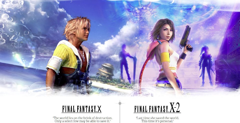
1463099409_final-fantasy-x_x-210_10-2-hd-remaster-glyuchit-frizit-tormozit-podvisaet-lagaet.jpg


Aka Christian Riese Lassen: the rpg
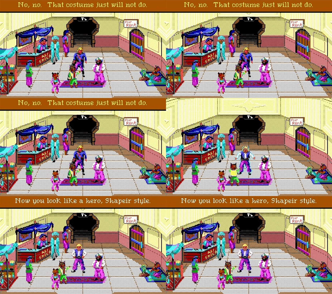
93ae24cb0b6fcd31dc1e1adfb1122050.jpg
 
PO'ed - even when this game was new it was a hideous chud of a product. The level design was such a mess it made me feel sick after playing it for a few hours.

Haha, that's a great choice. It also made me feel ill. Fucking ugly game.

Orb 3D on NES was pretty fugly.
 
Binding of Isaac

Always thought it looked ugly with bland color scheme and a majority of monotonous monster design that were circles with a deformed look. I know the intent is to make an ugly and grotesque game, but you can still make it look interesting (e.g Clock Tower, Bloodborne).

Oh yeah, seconded. One of the reasons I could never get into it even though theorethically it has a lot of gameplay elements I love. Not into the gross out aesthetic.

I saw this the other day. I was like cool, Nidhogg 2. I wonder how this looks....

... ew... why?

I have a feeling every single person that liked Nidhogg is positively disgusted by how Nidhogg 2 looks. I still don't know what the fuck are the devs thinking, and I think it's going to sell a quarter of what it could, solely due to that.
 
2736400-7063290277-Darke.png


I don't just or even mostly mean visual aesthetics, either. Lovecraftian aesthetic is supposed to be about inevitable decline, and realizing how powerless you are in the universe - which clashes strongly with an RPG's constant progression, even if that progression is leavened with difficulty and permadeath.

It's pretty dissonant to be feeling the triumph of beating a really difficult boss and then hear more of the narrator's over-the-top pessimism. The gameplay of DD is about succeeding against impossible odds, or at best winning a battle of attrition with a lot of casualties on your side, but the narrative side of it, such as it is, is about unrelenting pessimism and decay.

And, yeah, they don't succeed at the Lovecraftian aesthetic very well, either - the writing's terrible in most places, and the genuinely excellent voicework isn't given much to salvage the game with. If I wanted to parody DD's items descriptions I would probably come up with something like "Blue, like strangled dreams," but that's actually what they wrote for the Sapphire item description.

In order to be fully enjoyed, I had to shut off the narrarator, mute the music, and put on some fast techno music in the background, at which point it became a pretty damn good turn-based dungeon crawler.
 
Actually, SH1 assets don't hold up well. You can notice there are funky perspective errors in some backgrounds that make environments look comically big.

I agree with you on SH2 though. Game is still beautiful for the most part.

The assests yeah, no amount of emulation can fix those PS1 polygons. The art design itself is strong enough to project pass the snowy, blurry screen. When the game is in interiors that when its design is the strongest.
 
I hope you don't mean visuals at all. Darkest Dungeon looks great.


That's Quest for Glory 2, one of the best looking EGA games around. I suppose I understand if you just don't like the color and resolution limitations but you picked the worst screenshot of all time.

I'll concede the visuals are adequate in DD, with bonus points for using the Plague Doctor. They do what they need to do to reinforce the Lovecraftian aesthetic that they're going for. It's really the writing and the tone-gameplay dissonance that make it stand out.
 
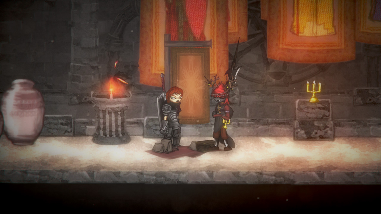
Zelda BotW's washed out foggy environment with low res blurry textures.

As much as I like the game, it's certainly not pleasing to look at.

For big-budget games, this is my recent pick. Everyone shares screenshots and it feels like they've already been heavily compressed and stuff has been smeared over the game camera.

I always found borderlands distractingly ugly. I love cel shading typically but something about its execution is really off putting

I know what you mean. I think the limitations/lack of excellent AA makes it feel a lot muddier and ugly than it would otherwise.
 
Warframe

I just started playing a few weeks ago, and I firmly believe that, as big as the game is already, it would be even more popular with even a hint of charm, character, atmosphere, sleek and interesting design.... idk something. The entire game looks like space fungus. How can the concept of "space ninjas" go so incredibly awry. It's all just a blob of biomech, but not in a grotesquely beautiful HR Giger way.

I have to agree. I played the hell out of it but hated the character art for bth enemies and player characters. Few skins looked great but most Tenno were just overdone.
 
2736400-7063290277-Darke.png


I don't just or even mostly mean visual aesthetics, either. Lovecraftian aesthetic is supposed to be about inevitable decline, and realizing how powerless you are in the universe - which clashes strongly with an RPG's constant progression, even if that progression is leavened with difficulty and permadeath.

It's pretty dissonant to be feeling the triumph of beating a really difficult boss and then hear more of the narrator's over-the-top pessimism. The gameplay of DD is about succeeding against impossible odds, or at best winning a battle of attrition with a lot of casualties on your side, but the narrative side of it, such as it is, is about unrelenting pessimism and decay.

And, yeah, they don't succeed at the Lovecraftian aesthetic very well, either - the writing's terrible in most places, and the genuinely excellent voicework isn't given much to salvage the game with. If I wanted to parody DD's items descriptions I would probably come up with something like "Blue, like strangled dreams," but that's actually what they wrote for the Sapphire item description.

In order to be fully enjoyed, I had to shut off the narrarator, mute the music, and put on some fast techno music in the background, at which point it became a pretty damn good turn-based dungeon crawler.
I've never played it but I love its art at least, easily identifiable.
 
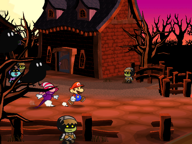
I know this will be controversial...but color splash. I don't like how literally everything im the environment is paper or cardboard. I liked that the first two games had full worlds that looked real, and just the characters looked paper due to them being like sprites. It's great graphics, but I don't like it aesthetically.

3076780-papermariocolorsplash_wiiu_pmcs_scrn_02.jpg


I love the first two games though, especially TTYD. It had more of a comicbook kind of feel.


latest
 
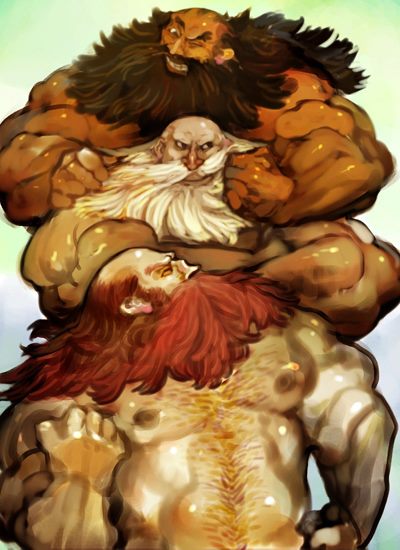
I never gonna understand the hate for Dragons Crowns art style.

Its funny that so many people are really intimated by buff people working out.

In a more realistic 3D model game its totally understandable why the weird proportions would look stupid but the game is so stylized and beautiful that it works.

Yes, because the hate was primarily directed at the muscular characters..
 
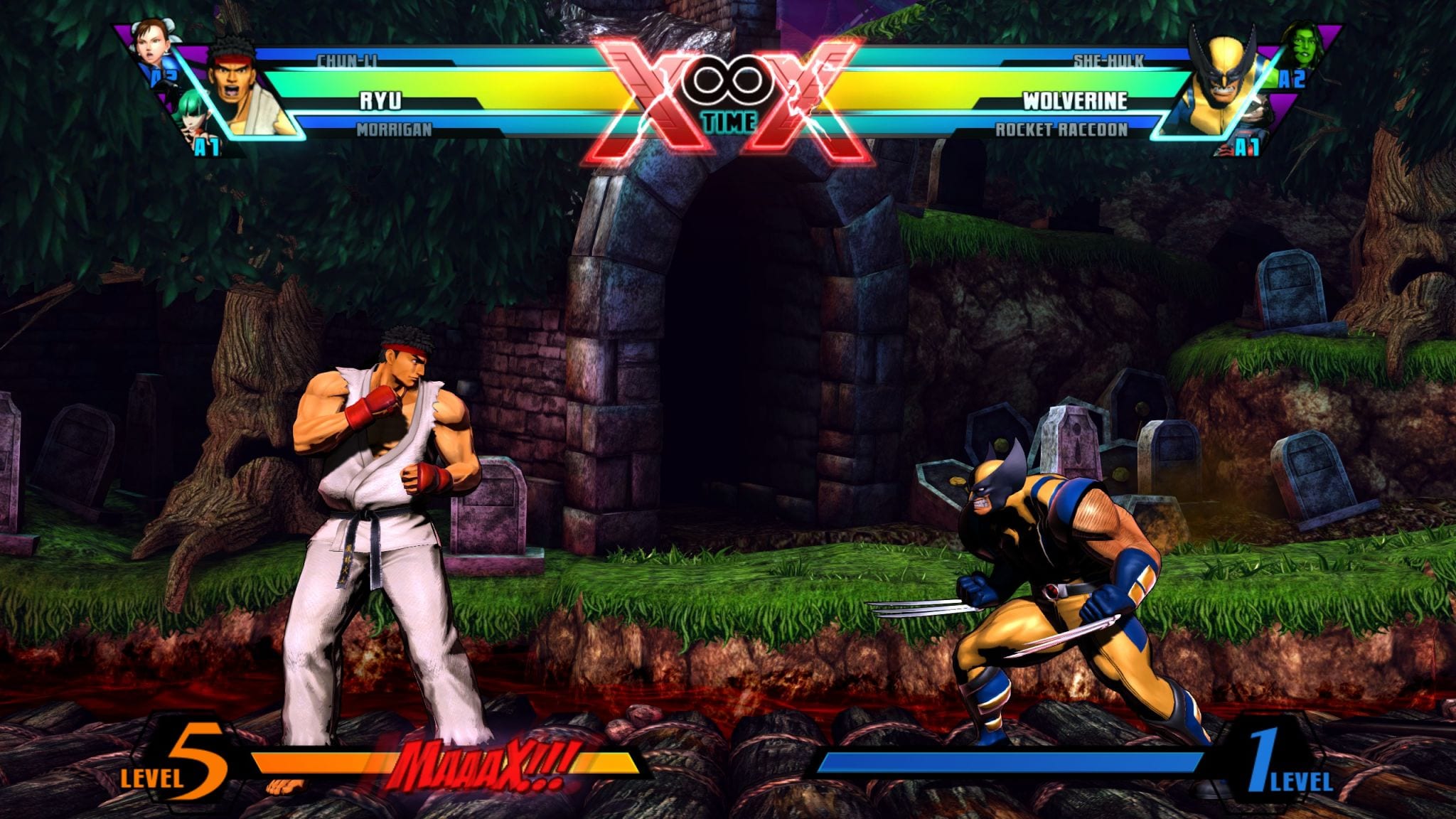
This might be an unpopular opinion but I never really liked Marvel vs Capcom 3's style. Everyone always looked "too dark" for me, for lack of a better way to describe it. Then again, if it were up to me the whole thing would have been high-res sprites like KOF 13.


I suppose you could say that this style is retroactively amazing compared to Marvel vs Capcom Infinite, but I dunno. Don't really care for either of 'em.
 
Nidhogg 2 looks like steaming faeces.

hFbRl9p.png

I've never seen an aesthetic destroy a game so much. Everything else in the game looks like fun. Hell, if it was simply mediocre looking, I'd be down for the gameplay alone. Love the original.

The aesthetics are simply so bad it outweighs the many positives for me.

I literally just don't want this on my TV. It's that visually repulsive. It's kind of amazing.
 
I think people misunderstood the topic

it says "Unaesthetically pleasing" games, no "Aesthetically unpleasant" games, it's not about what games you hate how they look, it's about games that use an intentionally ugly aesthetic as part of the style.

My choice would be Psychonauts, they really got the "stylishly ugly" thing just right.

Nope. "Uneasthetically pleasing" would imply that that OP wants you to list games that are pleasing for reasons other than the aesthetics. And if you want to be pedantic, you could argue that "unaesthetics" isn't even really a thing. If you like the aesthetics of Psychonauts - regardless of whether it's stylishly ugly or stylishly pretty - then it's aesthetically pleasing to you.

But OP isn't even really wanting games that are pleasing for reasons other than the aesthetics because the body of his post says

What are some characters and environments that are tough on the eye?

So clearly he's wanting people to list games that are difficult - or unpleasant - to look at either intentionally or unintentionally. The name of the thread should be "Aesthetically unpleasant games?", but whatevs. I don't know OP's background or familiarity with English. It's late and I just felt like responding to you. :p

edit: And personally I don't mind Nidhogg 2's art style in the least. Nidhogg 1 was nothing to look at really. At least 2 adds some amusingly ugly, but personal characterizations.
 
I really dislike Bayonetta as a character design. Puts me off the series. Yeah I know that's kinda dumb, I'll probably check out the first on GWG this month.
 
battleborn-1.jpg


Virtually everyone in Battleborn's cast is either hideously designed or completely forgettable. Or both.

I've always felt like every character in Battleborn was taken from the concept art from completely unrelated games in wildly differing genres.
Like they dredged up the scraps of a dozen different abandoned projects and pilfered them for character concepts.

Like just about everything else, Overwatch pulled this off better.
You've got "Call of Duty guy" "Unreal Tournament lady" and so on, but they all still feel like they mesh with eachother and the world.
 
No. I mean you can find the aesthetics offensive to your morality and then debate whether the two are necessarily linked, but if you don't include the characters that offend you, it is a damn good looking game. Look at this spread...
640
Lol, looks like someone got offended and it wasn't the user you quoted.
 
3675e8b4b8ac44403f4f9b29cabc51cdb4f275c5-1134528.jpg

Salt-and-Sanctuary-Download-For-Free.jpg


Its Salt and Sanctuary.

Makes my skin crawl. Looks like a game from addictinggames.com or just generally late 90's flash games.

I feel bad for not liking the art style, but yeah. Makes me not want to play the game, which I hear is quite good.
 
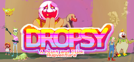
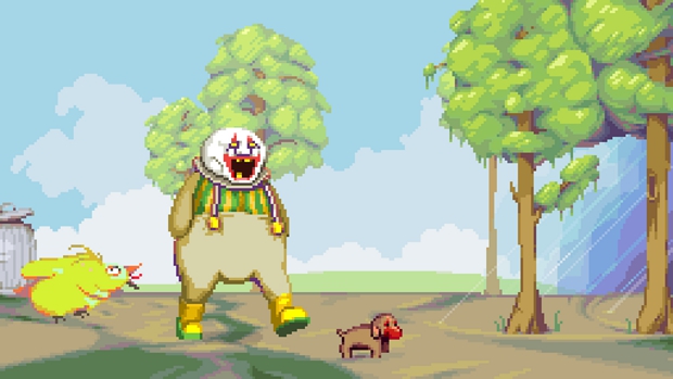
Probably unpopular opinion, but Dropsy.

header.jpg


dropsy4.jpg


While the ugly aesthetics are on purpose - Ugly people, a crap depressing world, desaturated washed out colours - the real problem is the game resolution. For a modern game it is so low that in a 23" screen looks awful with pixels bloated to absurd extremes.

I suppose this is completely intentional to reflect the look of old advanture games, but it hurts the eyes. I have played a lot of other low res point and click adventure games like Gemini Rue, and they never felt as bad as Dropsy. Since the game uses some serious spritework and animation, it should have gone with a slightly higher resolution, like Owlboy or Jamestown.


Other stuff on my list... Some of them are games I love despite the artstyle, others not so much:
- Final fantasy X
- Undertale
- Fallout 4
- Star Ocean IV
- Street Fighter V
 
Downwell. Hey I have fond memories of the Gameboy too, but those graphics were best left as a memory.

At the opposite end of the spectrum, 10 Second Ninja X looks too clean. I was going to say it looks like a mobile game but... I think it WAS a mobile game, so fair enough I guess?

Nidhogg 2 looks like steaming faeces.

hFbRl9p.png
Woah wtf. What was wrong with the original?
 
anything by Vanillaware, they make the garbiest of garbage
don't murdeer me I'm just kidding , but to be honest.........

I'm lenient on artstyles for games but when it comes to unaesthetically pleasing then I guess I don't like Ride to Hell, the models are good enough but something about the textures that looks so bad.

EDIT: Oh YeahI remember now! Persona Q why do they have to settle with chibi when the real character models are low poly enough to be imported


PersonaQBoxart.jpg


ARRGGHHHH It'S Just annoying!!
 
This.whoever thought this garish incomprehensible character design was a good idea should never be hired to do art for any consumer facing products ever again.

It's like they hired 12 years old from deviantart to each draw a character. They're all equally ugly but seem to be from completely different art styles.
 
Not since MKX, and Injustice 2 is the best looking fighter ever, but nice meme.

I think there is something off about the general aesthetic of the games. The lighting and textures just look dull and grey most of the time, kinda like at one point all movies tried to look gritty with desaturation applied.

As far as character models, they still don't know how to model shoulders. Every character seems to have square shoulders and the ones on male characters are as wide as a barn door. They all seem to be built the same too so they have male and female template models that were just altered for face, hair, clothing etc to make them distinct.
 
Top Bottom