

-
Hey Guest. Check out your NeoGAF Wrapped 2025 results here!
You are using an out of date browser. It may not display this or other websites correctly.
You should upgrade or use an alternative browser.
You should upgrade or use an alternative browser.
Video game series with the most disappointing graphical evolution?
- Thread starter Mineshaft_Gap
- Start date


Street Fighter.
SF1 is whatever. Super old, not going to be hard on it.
SF2 series is fine, so is Alpha
Ex was okay. Not the best, but not horrible.
SF3 still has one of my favorite aesthetics ever. Dat animation, style, everything.
Pretty sure the whole planet sighed when we saw pics/vids of 4 for the first time
5 is an improvement from 4, but style wise a little too similar to 4.
SF1 is whatever. Super old, not going to be hard on it.
SF2 series is fine, so is Alpha
Ex was okay. Not the best, but not horrible.
SF3 still has one of my favorite aesthetics ever. Dat animation, style, everything.
Pretty sure the whole planet sighed when we saw pics/vids of 4 for the first time
5 is an improvement from 4, but style wise a little too similar to 4.
WhiskeyKnight
Member
Monkey Island's visuals peaked at the third game and its been downhill ever since.
The Secret of Monkey Island
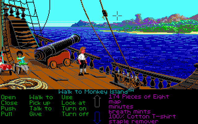
Monkey Island 2: LeChuck's Revenge

Curse of Monkey Island:

Escape from Monkey Island

Tales of Monkey Island:

The Secret of Monkey Island
Monkey Island 2: LeChuck's Revenge
Curse of Monkey Island:
Escape from Monkey Island
Tales of Monkey Island:
BlueBadger
Banned
Megaman Battle Network series recieved a nasty change from 3 to 4, 4 being the worst in the series.
I'd probably have to agree. I don't really know why they decided to take it in that direction, particularly for 4. :S.
However, I did love the graphics in 1-3.
Morrigan Stark
Arrogant Smirk
Holy shit this looks gorgeous. I want it, or a new MH that looks like this. PC or PS4, I don't care!If enough people show interest in a pc version we could get this.
I just want a good, non f2p bullshit MH on pc (like MH4U without the tutorials and slow pacing) wit hthe look of MHO.
King Gilga
Member
Gotta go with fire emblem.
Never touched the console games but the GBA ones looked great.
The DS ones were a fucking warcrime.
Awakening on the 3DS was better than the DS, but still a massive step down from the GBA ones with ugly psuedo chibi feetless models and boring battle animations.
Agree with pokemon as well.
Never touched the console games but the GBA ones looked great.
The DS ones were a fucking warcrime.
Awakening on the 3DS was better than the DS, but still a massive step down from the GBA ones with ugly psuedo chibi feetless models and boring battle animations.
Agree with pokemon as well.
Drakendodertje
Member
3rd strike was better animated than many of the most expensive anime motion pictures ever made. That game looked insanely good.
Even though i can appreciate 3rd strike for it's awesome animations, i can only chuckle at people putting Streetfighter IV down for it's graphics. I can only imagine those people being overly obsessed with sprites and nostalgia to appreciate IV's quality for what it is.
Streetfighter IV looks beautiful to this day, but looked absolutely revolutionary when it came it out. It lifted the entire genre out of it's niche-corner.

Haunted
Member
Monster Hunter is the first one that comes to mind. That the Chinese-only MMO made in CryEngine looks years ahead of the current mainline title is a bit of a disgrace.
Never played Pokemon, but I see what OP's talking about with those screens. Those are weak upgrades across two decades even considering it's a children's series that's only been on Nintendo handhelds.
 Yeah, point well made.
Definitely a series with disappointing graphical updates. Like many other Japanese B-series, they still seem firmly stuck in the PS2 era in terms of assets, polycount and character interaction, even now.
Never played Pokemon, but I see what OP's talking about with those screens. Those are weak upgrades across two decades even considering it's a children's series that's only been on Nintendo handhelds.
Shit, I got 6 and 7 reversed!Please order these Dynasty Warrior screenshots (2-8) in chronological order. Whoever succeeds wins an imaginary cookie!
Yeah, point well made. Definitely a series with disappointing graphical updates. Like many other Japanese B-series, they still seem firmly stuck in the PS2 era in terms of assets, polycount and character interaction, even now.
Curse of Monkey Island:
CoMI is too gorgeous. Lovely hand-drawn animation.
I think Streets of Rage 3 belongs in this thread as well.
Here's the first one:

While the sprites are rather small and simplistic compared to Final Fight (the game that served as the inspiration for Streets of Rage), I think overall the graphics still look pretty good. It's a vibrant and colourful game, yet there's a certain grittiness to it all that's quite pleasing to the eyes.
The second one is arguably the best looking game in the series, and perhaps even one of the most beautiful Mega Drive/Genesis games:

Large, well-defined sprites and a great variety of colourful, highly-detailed backgrounds. It's hard to deny this is a tremendous improvement graphics-wise.
After such a collossal upgrade from SOR 1 to SOR 2, the graphics of the final installment of the series are quite disappointing:

The grittiness is increased, but at the expense of the vibrancy and colourfulness that made the previous games so eye-catching. The sprites look grainier than their SOR 2 counterparts and most of the backgrounds are boring and lifeless. I still like the game, but it lacks the polish of the earlier games.
Here's the first one:
While the sprites are rather small and simplistic compared to Final Fight (the game that served as the inspiration for Streets of Rage), I think overall the graphics still look pretty good. It's a vibrant and colourful game, yet there's a certain grittiness to it all that's quite pleasing to the eyes.
The second one is arguably the best looking game in the series, and perhaps even one of the most beautiful Mega Drive/Genesis games:
Large, well-defined sprites and a great variety of colourful, highly-detailed backgrounds. It's hard to deny this is a tremendous improvement graphics-wise.
After such a collossal upgrade from SOR 1 to SOR 2, the graphics of the final installment of the series are quite disappointing:
The grittiness is increased, but at the expense of the vibrancy and colourfulness that made the previous games so eye-catching. The sprites look grainier than their SOR 2 counterparts and most of the backgrounds are boring and lifeless. I still like the game, but it lacks the polish of the earlier games.
You sure? Nintendo owns Pokemon so cant they do whatever they want with it?What the fuck? GameFreak made the series and they have joint ownership of it. Nintendo wouldn't, and can't toss them out because XY aren't great on the technical side.

Pokemaniac
Member
You sure? Nintendo owns Pokemon so cant they do whatever they want with it?
They have a 33% share of Pokemon. Game Freak and Creatures Inc. also have about 33% each.
Please order these Dynasty Warrior screenshots (2-8) in chronological order. Whoever succeeds wins an imaginary cookie!


I like the idea, but the resolution gives it away somewhat (as do the names of the photos (2, 3, 4, 5, 7).


Fiercedeity
Banned
I think fire emblem needs a huge update to the battle scape. I mean it's not even on par with final Fantasy tactics. The attack animations are nice.
Modest Mauser
Member
I think fire emblem needs a huge update to the battle scape. I mean it's not even on par with final Fantasy tactics. The attack animations are nice.
Awakening prettied them up quite nicely, and the way they better integrate into the map in FE:If looks even better.
Plus the animations have gotten so lovely, I've actually prefer them over the sprites these days.
Malitik Sabu
Banned
I'd probably have to agree. I don't really know why they decided to take it in that direction, particularly for 4. :S.
However, I did love the graphics in 1-3.
They did it to show more on screen. But that only really explains why they shrunk a few thugs, not why they blurred/pixelated the backgrounds ad sprites outside the battle system/.
Maybe it was a cost thing since Starforce used pretty much the same graphics as BN 4-6 just cleaner.
Fiercedeity
Banned
Awakening prettied them up quite nicely, and the way they better integrate into the map in FE:If looks even better.
Plus the animations have gotten so lovely, I've actually prefer them over the sprites these days.
It's still the same basic look though.
Malitik Sabu
Banned
You sure? Nintendo owns Pokemon so cant they do whatever they want with it?
No, Nintendo and Gamefreak own pokemon.
1) it looked cool 6 years ago, now it's fugly.1) Streetfighter IV looks beautiful to this day, but looked absolutely revolutionary when it came it out. 2) It lifted the entire genre out of it's niche-corner.
2) this is laughably untrue
Fiercedeity
Banned
Even though i can appreciate 3rd strike for it's awesome animations, i can only chuckle at people putting Streetfighter IV down for it's graphics. I can only imagine those people being overly obsessed with sprites and nostalgia to appreciate IV's quality for what it is.
Streetfighter IV looks beautiful to this day, but looked absolutely revolutionary when it came it out. It lifted the entire genre out of it's niche-corner.
Street fighter iv makes me want to vomit lol. I hate that look.
Breath of Fire 2:
Breath of Fire IV:
Breath of Fire Doo-Doo
So disappointing. III and IV in particularly really hit a distinct and amazing point with their artwork.
I was about to get really bummed out, thinking you would say BoFIV was worse than BoF2, but then I saw the third picture and I'm with you 100%.
I made this post last page lol.
I was afraid to use that first image though because of the deviant art thing. I didn't know if it was touched up...or a promotional picture or something.
But yeah I agree. That bloom...ugh
Yeah lol I went back and saw your post after. It'd be easier to compare if BL got a PC release. Or a sequel.
Why did BL never get a sequel. Isn't it the best selling 7th gen DBZ game by far?
Halo has always had an extremely serious case of compromization over the generation.
Halo 1 was an absolute beast in terms of dynamic lighting and effects; huge lights with specularity and normal-mapped everything, particle system that looks impressive to this day, lots of alpha and decals...
Halo 2 had a more refined authoring pipeline and a greatly expanded graphical toolset, but it lost so much of what made Halo 1's visuals special. Alpha was drastically reduced, decals are smaller and vanish faster and have fewer generators, particle counts are drastically reduced, very few lights use specularity, the game aggressively limits simultaneous light sources, and there's loads of pop-in.
Similar stuff happened on the 360, really. Halo 3 was similar to Halo 1 with regards to the extreme focus on expressive shading, and its successors compromised there (and with a few other things) as the generation progressed.
Interesting. I've never been able to pinpoint why I thought Halo 2 looked less appealing.
Zombegoast
Member
Dark Souls 2 graphics are bad. They like to put puke green textures everywhere.
Dark Souls 2 graphics are bad. They like to put puke green textures everywhere.
Dark Souls II looks awesome. Open world games often have problem spots. Everything in Dark Souls II isn't stellar, but for the most part the graphics themself are great.


I was going to say the Batman Arkham games. They don't look bad, but the thread is about disappointing graphical upgrades and I was never wowed by them, even with Arkham Knight. I would've loved to see them be made on a different engine. They've always had a waxy, bulky look with the same kind of character models I've never been a fan of, like in Mortal Kombat 9 and X.
I was GOING to say that, but then someone mentioned Street Fighter. That game's artstyle in SF4 and 5 feels like vomitting into my eyes. I can't stand it.
I was GOING to say that, but then someone mentioned Street Fighter. That game's artstyle in SF4 and 5 feels like vomitting into my eyes. I can't stand it.
Jo Shishido's Cheeks
Member
Sonic 1 and 2 were beautiful games and still are today, but Sonic 3 and Knuckles are definite downgrades.
Even the Sonic model looked worse in the later games.
Even the Sonic model looked worse in the later games.
KittenMaster
Member
I've only watched footage of MH for PS2, but I feel like the same can be said for that. I think because it looked like it had a much better framerate than the 3DS game.In MH4 defense and most 3DS games, they look better in motion
With that said, they've never actually NEEDED to develop a next gen engine for Monster Hunter because they went with the Wii (which was like the PS2.5) to save costs and the handheld entries let them continue using that engine even further.
Dark Souls 2 has this really consistent qurik of having extremely flat textures throughout the whole game, which is even more noticeable in areas that aren't given as much love and craftsmanship as those shots.Dark Souls II looks awesome. Open world games often have problem spots. Everything in Dark Souls II isn't stellar, but for the most part the graphics themself are great.

TheRedSnifit
Member
System Shock:
Not as much of an improvement you would expect, considering how SS2 came out five years later.
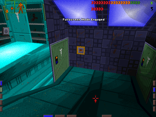


Not as much of an improvement you would expect, considering how SS2 came out five years later.
all these years of seeing the game cover and this is the first time I ever seen an actual gameplay screenshot
I had no idea there were gratuitous ass shots in this game too
hahaha my thoughts exactly
Spinosaurus
Member
Everything else aside from the models (especially framerate) is terrible though.I knew this would be about Pokémon. Yeah, the overworld graphics progression is glacially slow.
The battle graphics, on the other hand, have improved tremendously. I really like how X/Y made the battle models look faithful to the original art - the cel shading is spot-on.


Original art for comparison:

But the models are so good that I don't mind much.
EDIT: Street Fighter is a good one. I love SFIV but it's really ugly lol.
SFV looks nice tho.
Dark_castle
Junior Member
Not very impressed by Tales series in terms of graphical evolution, either fidelity wise or art direction. Xillia 2 looked kinda nice in town and certain other areas, but as soon as one steps out to the field map, ehh.
Only one Tales game so far is aesthetically pleasing to me, which is none other than Vesperia.
Only one Tales game so far is aesthetically pleasing to me, which is none other than Vesperia.
MvmntInGrn
Member
Absolutely. I think N&B is one of the most visually underrated games of last gen. Especially appreciate it as such a colorful 3D game with large environments, there weren't many last gen.What? Nuts and Bolts looked awesome.
Underrated in general sadly...
I think Streets of Rage 3 belongs in this thread as well.
I think 3 still has a few good backgrounds. I like the sunset in the first stage, and the aerial shot of the city in...the third stage, I think? But over all, I agree. My favourite thing about 2 was not only the backgrounds, but the real sense of progression the game had. 3 lacked that and had much duller backgrounds. I also hated how the final stage was some Metroid-esque robot factory. I know 2 had robots, but 3 just completely loses the vibe and goes way overboard with that shit.

eso76
Member
Almost every single series that went from 2D bitmaps to 2.5D in the early-ish polygon days. The tech was interesting, but obviously incapable of displaying the level of detail fine pixel art could.
And fighting games in general.
Their nature makes them perfect candidates to display amazing new tech, but besides the physiological bump in resolution and IQ they haven't evolved in the last few generations. This I feel is both the consequence AND the cause for them not being as popular as they once were.
And fighting games in general.
Their nature makes them perfect candidates to display amazing new tech, but besides the physiological bump in resolution and IQ they haven't evolved in the last few generations. This I feel is both the consequence AND the cause for them not being as popular as they once were.

![36502-Alundra_2_[U]-13.jpg](http://199.101.98.242/media/shots/36502-Alundra_2_[U]-13.jpg)
SpacePirate Ridley
Member
As the lp says pokemon is a piece of shit in thay regard. It always looks like is one gen behind the hardware is in.
Monkey Island is another sad victim of the early 3D craze, when everything HAD to be 3D because 2D looked "old".
You have to give Toru Hagihara and Koji Igarashi credit for sticking with 2D for Castlevania's transition to the next gen, at least on PSX.
DS2 graphics are really good especially if you max it on your PC.Dark Souls 2 graphics are bad. They like to put puke green textures everywhere.
Only a few areas like Shaded Woods are ass XD
Winterfang
Banned
Metal Slug gets a little uglier with each sequel.
Monster Hunter has looked like dog shit for 10 years
Graphical devolution if I've ever seen one. We only have Japanese gamers lack of taste and standards to thank. I can't even hate on Capcom when the sheep will just throw money at them for anything.
Save us Monster Hunter Online. The series is too good to look and control that bad in 2K15.
Graphical devolution if I've ever seen one. We only have Japanese gamers lack of taste and standards to thank. I can't even hate on Capcom when the sheep will just throw money at them for anything.
Save us Monster Hunter Online. The series is too good to look and control that bad in 2K15.
GKSilKamina
Member
Tales gets my vote.
They used to be good looking games, especially during the SNES/PS1 era. Sure, things were mixed in the PS2 era (Destiny looked phenomenal, Abyss like hot garbage), but then Vesperia came out and all was well.
And then the rest of the series happened.
They used to be good looking games, especially during the SNES/PS1 era. Sure, things were mixed in the PS2 era (Destiny looked phenomenal, Abyss like hot garbage), but then Vesperia came out and all was well.
And then the rest of the series happened.