SecretMoblin
Member
No way! Iceland's flag is the GOAT.
Yeah, the colors are gorgeous (Norway's, too).
No way! Iceland's flag is the GOAT.
All of those flags are great.All the flags that are just two or three stripes. Like:


Also these:

So lazy.
Heh, not the worst by far, but I wish to submit the German Coat of Arms. I mean, there's people in this very thread thinking our glorious country flag is dull. Well, chew on this for a change.
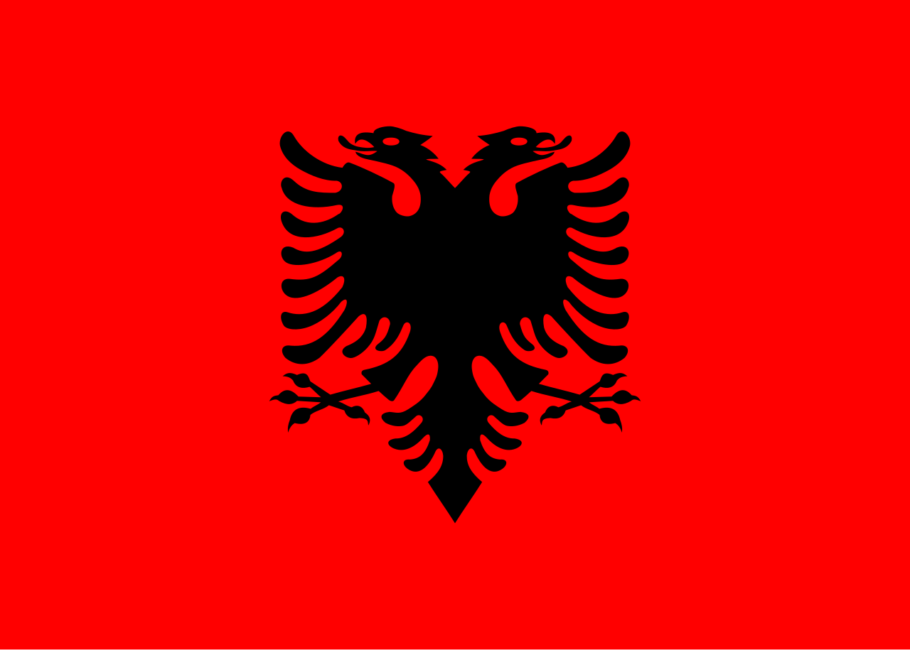
That tongue. ...and the facial expression. It's just... just... :lol
Has historical reasons for looking like it does, obviously. Heraldry and all that jazz.
Nonetheless, I still can't quite get over it. I always feel the need to draw in an x for the eye, etc.
Maryland, USA
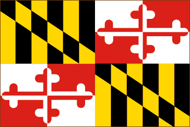
This is my favorite flag. True I grew up in Maryland and am probably brainwashed, but I think it looks great.
I thought everyone agreed this was the best looking flag of the states.
Might be the Best
Hey. You shall not defame the union of the House Calvert sigil and the House Crossland sigil.
Do you have something against quartering in heraldry because this is actually a nice flag.
Please, that's the best state flag in the union breh.
Provo, Utah

Actually, they're changing it this year. I'm assuming because it looks like 90's MS Office shit.
That's totally what I thought when I saw that flag.Reminds me of the centrum multivitamin box
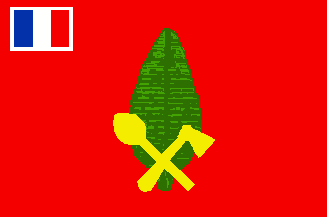
Most of the counties and districts of Liberia
Bomi:
River Gee:
Nimba:
Sexy AFMotherfucker, I live for bad flags
Zambia:

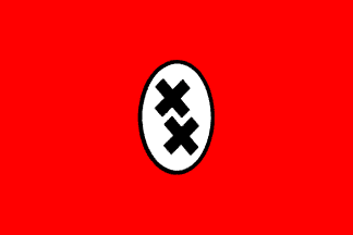
Alo Island, Wallis and Futuna

Let's put two complementary colours next to each other. That won't hurt the eyes at all.
Holy shit, that looks just like the Tomanian flag from The Great Dictator. That's messed up.

And that is Amsterdam's actual, official, current flag?


I checked out the Triskelion link someone posted, and the Afrikaner Weerstandsbeweging flag leaves no doubt to their inspiration as a group.
They are a South African white supremacist group. Goebbels would sue if he could.
Let's all just take a moment to marvel at the most badass flag on Earth, the flag of Zheleznogorsk, Russia:

That's bear standing in an atom and cracking open its nucleus.
Aside from looking like a Japan palette swap, I really don't see what's so bad about this one. The colors are pretty muted and aren't neon bright like Portugal's flag.
I think it works pretty well, tbh.
Let's all just take a moment to marvel at the most badass flag on Earth, the flag of Zheleznogorsk, Russia:
That's bear standing in an atom and cracking open its nucleus.

has literally a leaf on it


I think he means the particular tones used there, with nothing to break their contrast.Well, nature is disagree with you.
Please, that's the best state flag in the union breh.
All time best flag confirmed.Let's all just take a moment to marvel at the most badass flag on Earth, the flag of Zheleznogorsk, Russia:
That's bear standing in an atom and cracking open its nucleus.


.Motherfucker, I live for bad flags
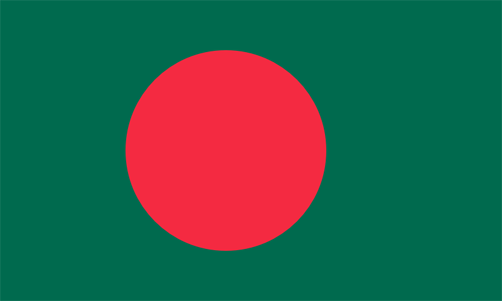
Bangladesh:
") ))
))Am I imagining things, or is that Småland lion, err, anatomically correct?

Buckinghamshire's flag makes me smile. The swan's like "Goddamn it, couldn't you get me a crown that fits? How am I meant to get this damn thing off my neck? FML."
Vetka, Belarus

It's Wario Land!
You kidding? It's awesome.That tongue. ...and the facial expression. It's just... just... :lol
Has historical reasons for looking like it does, obviously. Heraldry and all that jazz.
Nonetheless, I still can't quite get over it. I always feel the need to draw in an x for the eye, etc.
Edit: Again, not knocking the eagle. I'm just amused by his facial expression. And the tongue. What is it with heraldic animals and tongues, anyway.
This is by aesthetics. Leave current politics out of it.
A flag is an outward symbol of a place and its people, or a movement, or a peace of history. The history of flags goes back thousands of years.
Unfortunately, a lot of them are shit. Here are a few.
Irribarren, Venezuela

.
This flag actually symbolises the blood of soldiers on the green battlefield.
Context is central to the designs of flags. The meaning is as important as the way that meaning is conveyed.This is about design, not context.
All 40 of the recommended replacement New Zealand flags. They look like shit you'd put on a business card. Fuck that noise.
The black tribal Union Jack one is so badass. I really hope they pick it.Say what? The majority of those are fucking awesome.
Say what? The majority of those are fucking awesome.

Motherfucker, I live for bad flags
Pensacola, Florida:

The Münchner Kindl started out as a Monk. Nowadays, it's a kiddo. Actually, a girl, ever since around 1920.A mage. Probably.
Sounds like a mage to me.The Münchner Kindl started out as a Monk. Nowadays, it's a kiddo. Actually, a girl, ever since around 1920.
A transsexual age-regressed monk holding a beer mug. Or a bible. Or a radish. Heraldic stuff is deep, mang.
Let's put two complementary colours next to each other. That won't hurt the eyes at all.
I actually like it in an absurdly artsy kind of way. It went well with Gaddafi's green motif (The Green Book) as well as his impeccable sense of style.Flag of the Libyan Arab Jamahiriya