What the hell is this Nintendo...
what?
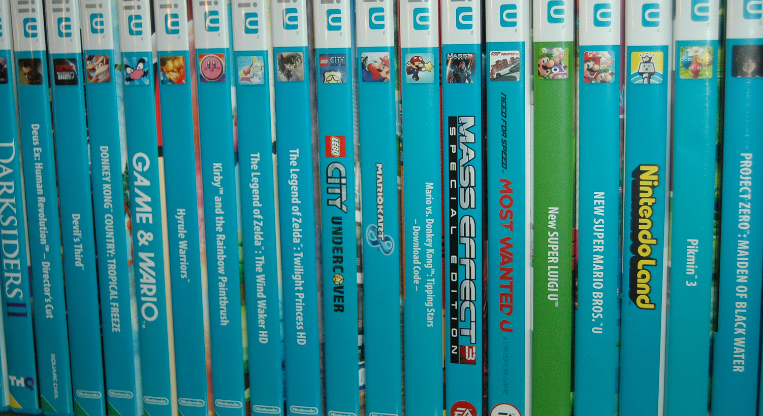
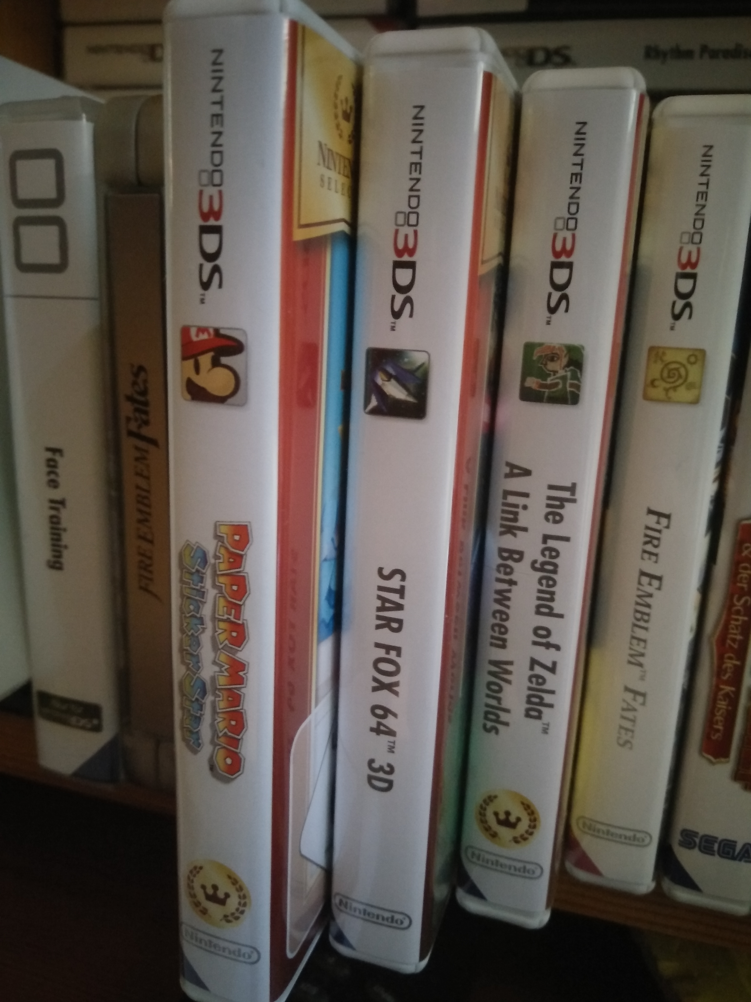
i'm not sure what box you got, but the splatoon box i have has the splatoon logo on it's spine, not this 'plain text' thing you have going…??
they're not custom cases either… they're bought straight from an EBgames store shelf.
the same goes for other wiiU games i have like bayonetta 2, W101, sm3dw, starfox, TMM:FE, MK8, Pikmin 3, LoZ:WWHD, & yoshis' woolly world etc.
the only boxes i have that are plain text are hyrule warriors, and captain toad.
")
Cliff hanger right here..
Anyways man you guys are picky about such a small thing.
lol. perhaps.
i also prefer game logos or 'art' on the spine.
i can't stand plain text spines. they're increibly boring and feel like a deliberate 'cost effective' decision.
actually, now that it's mentioned, i hate how some game cases have deliberate holes in the plastics. it just makes the entire package look/feel cheap.