• Hey, guest user. Hope you're enjoying NeoGAF! Have you considered registering for an account? Come join us and add your take to the daily discourse.

Women Characters Redesigned by Women SFF Artists

Pie and Beans

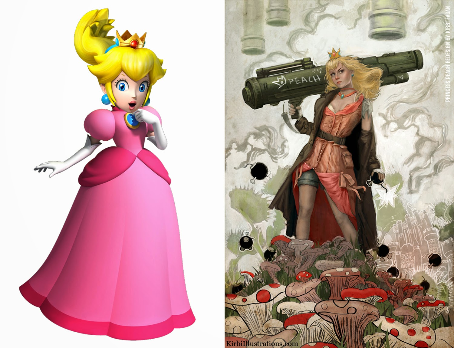
Look for me on the local news, I'll be the guy arrested for trying to burn down a Nintendo exec's house.
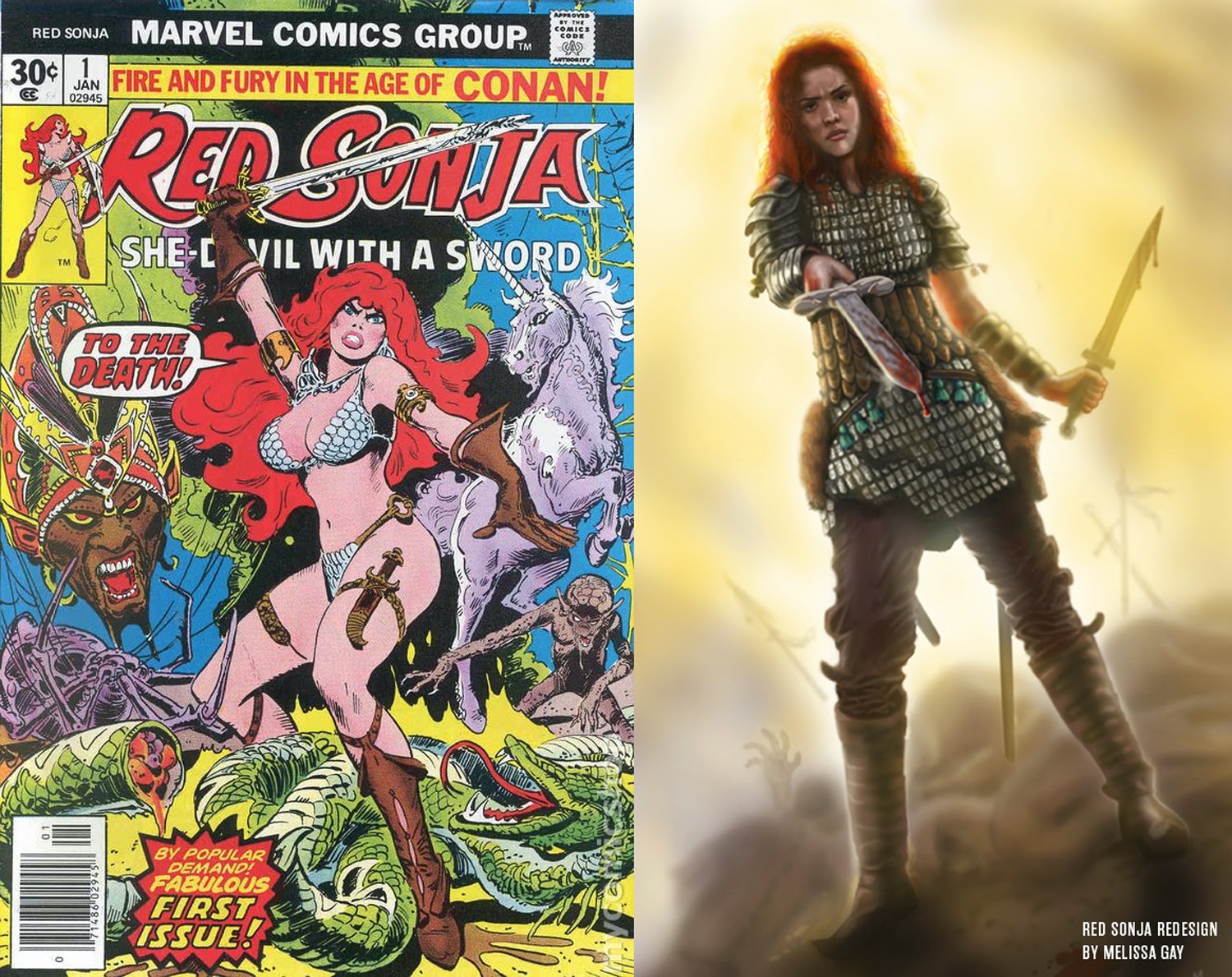
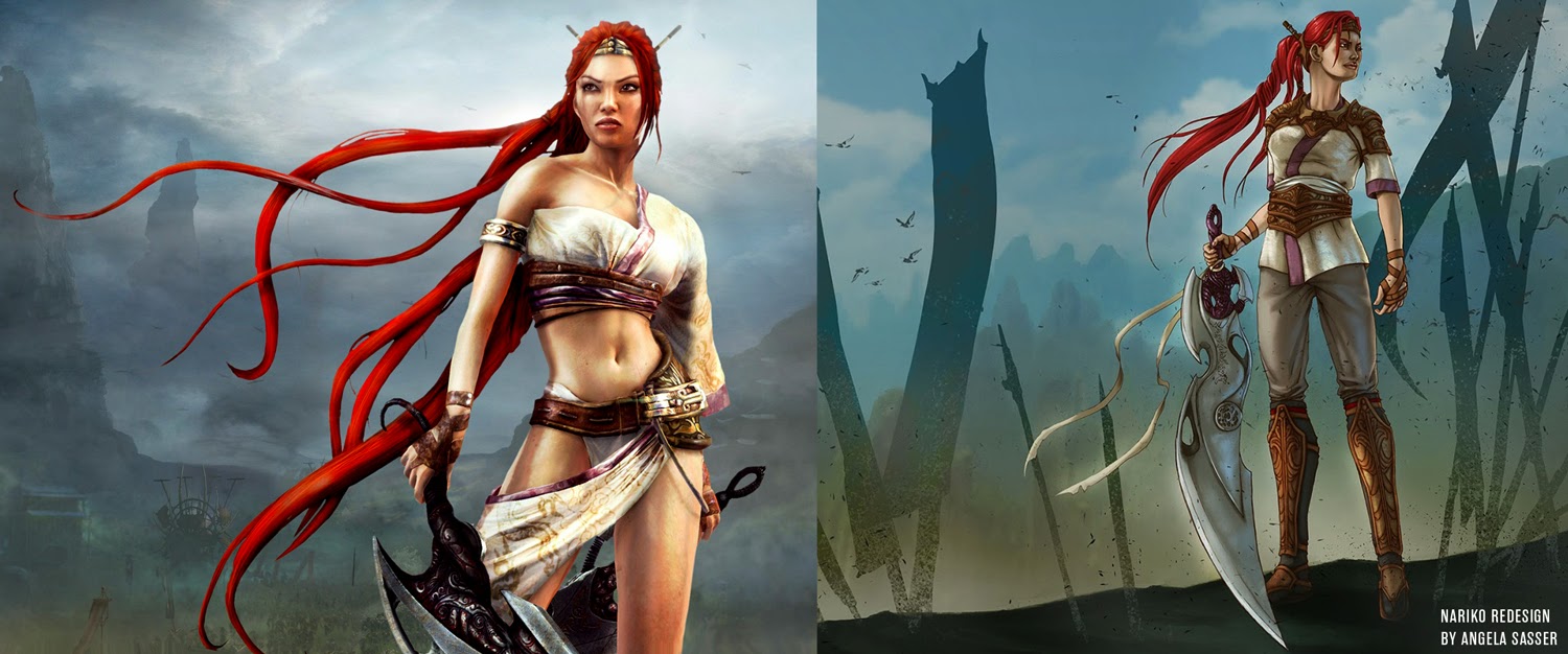
Found about 90% of them dreadful.

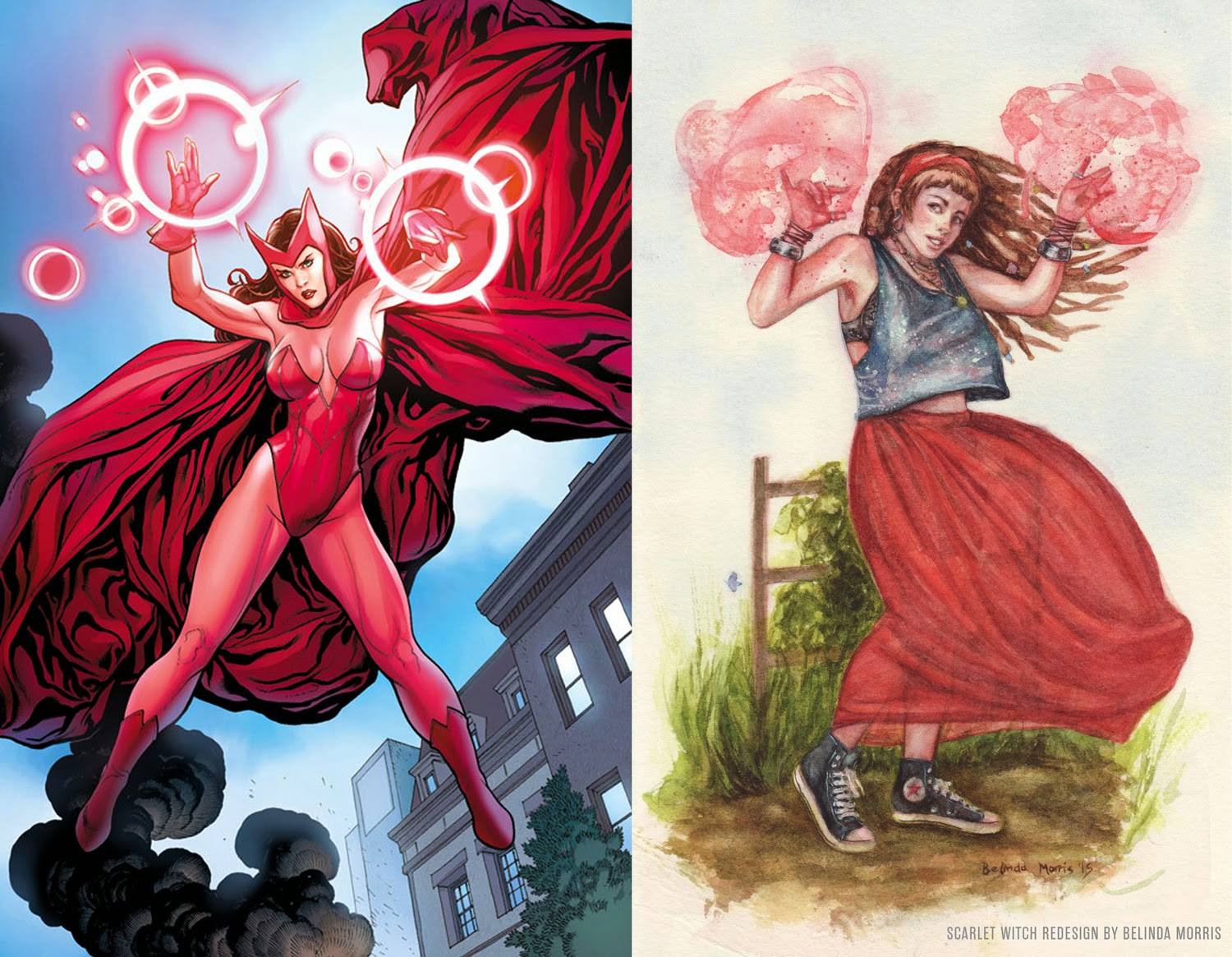
Good ones extended to Emma Frost and Power Girl. A lot of others were "change for changes sake", none more exemplifying that than obligatory GRITTY MARIO BROS to start things off.

Bonus points for deliberately picking a lot of "worst we could find" before images.
 

strafer

member
so how would they redesign her?

bGKsx57.jpg
 

Morrigan Stark

Arrogant Smirk
Every single one of those designs except Peach (which is just stupid) is an improvement. I guess we really do need more female artists...

I don't see a lot of differences besides the fact that they covered them up.
And that they tend to wear more practical, or at least comfortable outfits for their profession/context?

Almost as if women want female action heroines to be portrayed as powerful and badass and comfortable in their own skin instead of sex toys wearing thongs for the pleasure of males. I know, so very silly, right?

Actually, some of those designs like Samus look uglier.
That new Samus is awesome. Way better than the zero suit nonsense.
 

Shinypogs

Member
I like the redesign of storm.

That one and the Emma frost one are some of the best because they work with things already established about how the character acts and dresses etc.

As a woman there are character and costume designs of female and female identifying characters I find distasteful but a lot of these "fixes" do a disservice to the character in question.

I prefer stuff like that project where artists drew male comic characters in the sorts of poses comic women were often put in. It gets the point across much better about how silly and stupid some of the stuff is.
 

Jobbs

Banned
I like this, and for the most part I find their "sexy" concepts sexier than the original. A good example is Morrigan -- And Emma Frost.
 
Not all of the redesigns are that great. But that's fine. We can nitpick specific design choices all you want, I don't see that as the point.

Scroll down and only look at the left side and you'll notice that despite how different the characters may (or may not) be, the T and A for the most part really waters down whatever individuality they have. Now do the same thing and scroll down only looking at the right side, they actually look like individual characters and their design choices really stand out (again, not always the greatest design choices). It helps so much when a female's character design isn't "witch with her tits out" or "super hero with her tits out", etc.

And this is just coming from a male's view on character design. I'm not even really touching on the whole subject that's female representation in games.

Exactly. The point isn't "my new Peach is way better than normal Peach." It's just portraying visually different and distinct designs that women usually do not get without being sexualitied.

So many people are not understanding that.

Also, I love Samus.
 

LiK

Member
I think Morrigan from DA is the best redesign.

I don't like a lot of the redesigns for the other ones. Chun Li one is particularly awful. Might as well go back to the SF Alpha Chun Li instead. Sexy and more functional than those ugly shorts in the redesign.
 

Kyonashi

Member
But..why?

They are fictional characters, not actual human beings who need to be covered up from head to toe.

Because fictional characters have bearing on our opinions and how we see real people, they colour and skew our social views. A majority of female characters being sexy and in spandex vs. more regular clothing for men is an unhealthy standard to uphold, even in fiction.
 

AtticuSMT

Banned
Honestly most of these re designs don't spark any interest. But at the same time most of them are characters I don't care for much.. With 4 exceptions...

Peach redesign looks way too over the top...

Samus redesign looks... Weird... Maybe without the helmet/hat thing I would like it more but it just looks like it's trying to go for a gritty cyber punk look that came from the late 80's

Chun-li... Just no... (Coming from a long, long time street fighter fan.)

Powergirl actually looks awesome though!
 
I really like the Power Girl one. Peach and Samus were pretty lame "gritty reboot" type designs-- Peach has a rocket launcher, really? have they ever played a Mario game? Those started the gallery on a low note, but it got better from there.
 

hey_it's_that_dog

benevolent sexism
Love this one:

It's alright, but why did the artist shrink the breasts of a character that is portrayed by a specific human woman (i.e., not a drawing) who actually does have big breasts? That strikes me as a bit different from eliminating a ridiculous boob-window from an illustrated superhero's outfit.
 
I don't think the person who redid the Zero Suit understood the point of the Zero Suit. And that Peach is kinda dumb as has been pointed out.

The rest ain't bad though.
 

The Technomancer

card-carrying scientician
To summarise, more clothes then?

Basically? I mean, this isn't even "don't be sexy", which is something people misconstrue a lot of criticism as, its literally just "don't dress every woman in a bikini". A lot of the re-designs are sexy in their own right.
 
The samus one doesn't work at all. Her suit forms around the zero suit, she doesn't put it on, its part of her. Thats why the zero suit looks like it does.
 

Sephzilla

Member

While I'm not a fan of the traditional Scarlet Witch design, the proposed redesign in the article is worse - mostly due to the laziness of it. A loose fitting top and a red skirt? There's absolutely no imagination put into that what so ever. I want fictional superheroes to stand out (not necessarily in a sexualized way), not look like someone that just walked into Goodwill.
 

Camjo-Z

Member
Some of them are better (Power Girl in particular), most of them are just dumb like Peach and Betty Boop.

I agree female characters could stand to show a little less skin, but covering them up with drab and/or ridiculous costumes isn't the way to do it.
 
I like the Samus redesign, primarily because I find the ZS Samus design to be absolutely awful. Also hate the change Nintendo made to her face.

Metroid Prime Samus is best Samus.
 

dark10x

Digital Foundry pixel pusher
Hmm, I like a lot of those, actually. Very cool.

The only odd one is Samus - it doesn't make any sense knowing that the character, in Metroid games, fights in a suit. The zero suit isn't her combat gear (at least in proper Metroid games). You would expect something form fitting when wearing such a suit. Never really liked the zero suit to be honest, though.
 

SmokyDave

Member
I thought Peach was pretty badass and I quite liked the green mechanic chick. The rest, forgettable. I'd be interested to see more of these, along with some redesigned male characters.
 
Still wonder if we'll ever get an explanation why a soldier would be wearing a bikini and stockings.

Kojima said they're gonna give a reason that will make everyone "feel ashamed" for judging the design.

So I can only imagine it's gonna be really dumb.
 

Wulfram

Member
A lot of these seem like they're switching genre and style too much to be really comparable. I prefer the ones like Polaris that still have comic book superheroes looking like comic book superheroes.
 

Leunam

Member
I didn't like the Samus redesign at first, but I came around to it. Zero Suit is supposed to be just underwear or some kind of skintight interface (like Iron Man's Extremis), but if she's expected to fight and be combat capable outside of the Power Suit then it makes sense that she should be geared for it. Smash Bros. would tell you she can still brawl without the aid of her suits, even if it's not canon.
 

2+2=5

The Amiga Brotherhood
Most of those designs are not that good and some of them go against the world characters live in.

Other than Samus i like Emma Frost.
EmmaFrostRedesign-VladaMonakhova.jpg


Except that i don't understand why the artist didn't cover her but just inverted the bust-legs nudity lol.
 
I'd much prefer Samus' zero suit costume to look like re-drawn one in the article. She looks badass.

The point of the Zero Suit is that it goes under the armor. All that shit won't fit under the armor. It's a neat idea for something in between the two but as a replacement for the Zero Suit...no.

As for the Zero Suit itself, removing the dumb heels and changing the weird bit about how it molds to each individual breast would go a good way towards making it look less dumb.
 

Drencrom

Member
Kojima said they're gonna give a reason that will make everyone "feel ashamed" for judging the design.

So I can only imagine it's gonna be really dumb.

Oh you Kojima

"It's her only keepsake from her dead mother and she'll cry if anyone tells her to change into something more appropriate for combat operations. How dare you make her cry, shame on you!"
 
Top Bottom