• Hey Guest. Check out your NeoGAF Wrapped 2025 results here!

Worst Blu Ray Transfers

I never get sick of posting this image from the original blu ray release of Le Samouraï. It is just the worst. This is what happens when you set DNR to the watercolour setting.


This is, by far, the most egregious. Were they blind to release something like this?
 
They might not now, but they're definitely coasting off the days from when they did, and were known for that just as much (if not moreso) than the extras.

I think the fact people still just naturally assume that's what they're supposed to be getting when they pick up a Criterion release speaks to that.

I wish they'd go back to that.

For me they destroyed that reputation immediately on DVD by not doing anamorphic. Still not as bad as THX having their name on the absolute worst-looking DVD from a major studio at the time. (the first DVD release of Die Hard With A Vengeance.)
 
For me they destroyed that reputation immediately on DVD by not doing anamorphic. Still not as bad as THX having their name on the absolute worst-looking DVD from a major studio at the time. (the first DVD release of Die Hard With A Vengeance.)

The THX logo on a disc meant the equipment used to make the master was state of the art at the time. That's why DVDs using re-purposed, non anamorphic, Laserdisc masters (The Abyss for example) could have a THX badge. It did not necessarily mean the master was free from problems. Even the best equipment can be used to make crap if the wrong person is at the controls.

Not that anyone would know any of this from the marketing around it.
 
I think it looks the opposite of natural, but other than the color timing change it does indeed look better than before.

Yeah I read that blu-ray.com page. I just find it somewhat suspect since it's the only one of Leone's westerns that allegedly looks like that. Once Upon a Time in The West was shot by the same cinematographer and yet doesn't feature such an intense color timing. Maybe it's also missing the yellow tint? Maybe they're all missing a yellow tint? :P

edit: There's also an Italian release with yet different color timing, and I think it may look the best.

The yellow tint in the American re-release just overpowers the entire picture.

I think TGTBTU is the only one to get a recent remaster. I think they are doing his other westerns now. And the American rerelease isn't strictly American. It's the official remaster. The old Italian releases were simply not DNRed like the old MGM releases.

I think it's funny that people bring in the word "natural" when talking about how a film looks. Nothing else about the the TGTBTU is presented as natural or realistic. The time period is not accurate. The geography is all wrong. The acting is not natural. Morriconne's music is not period appropriate. The whole film doesn't use any sound from the set and the actors lips often don't match dialogue. Yet the colors are supposed to natural.

I don't have the remastered TGTBTU, so I can't really comment on it. Looking at the caps I prefer the less yellow color timing but the detail is stellar on the new transfer. But if they say this is how it's supposed to look, and the consulted people that worked on it originally, I'll accept it. I perfectly fine not loving every single aspect of a piece of art.

I do wish they released the original US edit of the film. I prefer that cut to the extended.
 
For me they destroyed that reputation immediately on DVD by not doing anamorphic. Still not as bad as THX having their name on the absolute worst-looking DVD from a major studio at the time. (the first DVD release of Die Hard With A Vengeance.)

You're absolutely right. I remember being kinda confused at seeing a 4:3 widescreen transfer on the back of... I think it was Silence of the Lambs Criterion? Like "you're asking $40 for this and it's not even..."

The THX logo on a disc meant the equipment used to make the master was state of the art at the time. That's why DVDs using re-purposed, non anamorphic, Laserdisc masters (The Abyss for example) could have a THX badge.

And yeah, I forget where I learned this for the first time, but I remember learning it made a ton of fucking sense. THX was basically being marketed as this one-touch button that made everything sound great (they mastered it at THX? They mastered it with THX? Look, it says THX at the bottom. I have that on my reciever. I just hit the THX button and all the THX will come out of the disc it'll be awesome) when all it really meant was it mastered with/at some vague standard that most homes were never going to have a shot at replicating.
 
The Killer and Hard Boiled come to mind.

A bunch of really wonderful Hong Kong movies from the 80s and 90s have really bad transfers. There's a whole bunch that are just up-resed from 480p. Most if not all from a company, fortunestar.
 
You're absolutely right. I remember being kinda confused at seeing a 4:3 widescreen transfer on the back of... I think it was Silence of the Lambs Criterion? Like "you're asking $40 for this and it's not even..."

The early days of Criterion on DVD were checkered, to put it kindly. The DVDs for Branded to Kill and Tokyo Drifter were especially bad for how good the films were and how breathtakingly visual they're supposed to be, and even largely great stuff like their amazing Brazil set was marred by a non-anamorphic transfer. I think that everybody was still trying to figure out how the hell any of that shit worked back then, but for a company that prided themselves as being a cut above the rest, they were flailing just as much.

They got better, though, and how! Maybe that desperate Michael Bay money really helped turn things around for them.
 
What a depressing thread. Glad I didn't go in hard on blurays as I did with DVDs.

Seriously. I had no idea so many movies were treated this bad. I have about 5 blu Ray movies, most of them are the dark knight trilogy and sunshine. I wonder how those are perceived? The seem pretty good.
 
I bought Land Before Time for my son and thought it was the most god awful transfer of all time. Any scene that is dark (ex: intro in the water) is almost unrecognizable.
 
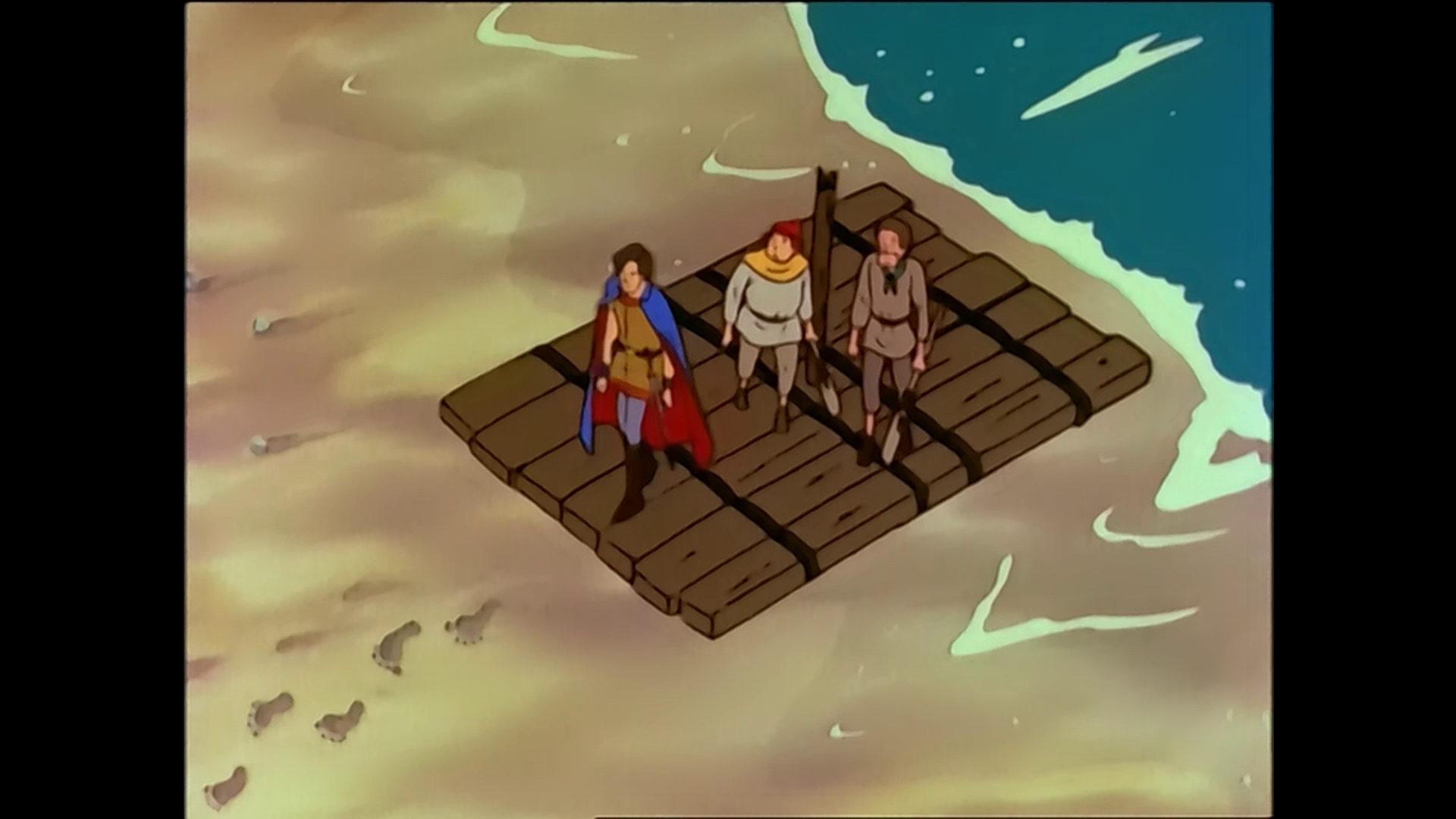
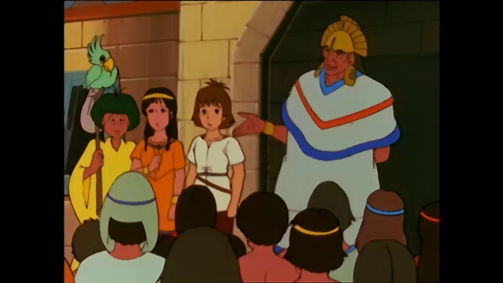
The great french/japanese anime The Mysterious Cities of Gold (my avatar is from it) had one of the worst Blu-Ray. They didn't have the master celluloids from the 1980s so they removed the noise and destroyed details. Apparently it was for economic reasons, they didn't want to spend too much time in retrieving the masters or getting details back, and thought most people won't care about it.

mco_coffret_blu-ray_kaze_screenshot3.jpg


mco_coffret_blu-ray_kaze_screenshot4.jpg


It had documentary-educational parts at the end of each episode with real life images, they applied DNR to it too :

mco_coffret_blu-ray_kaze_screenshot5.reduc.jpg


If you can find it in English (DVD) it's a great 39 episodes-series in South America with a monomyth structure, great characters, mysterious steampunk civilizations and beautiful design. The soundtrack is one of the best I've heard too. Don't watch, or don't let your kids watch the second season, it's garbage.
 
Top Bottom