


-
Hey Guest. Check out your NeoGAF Wrapped 2025 results here!
You are using an out of date browser. It may not display this or other websites correctly.
You should upgrade or use an alternative browser.
You should upgrade or use an alternative browser.
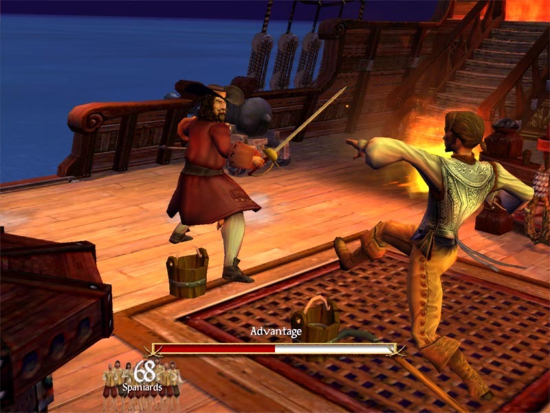
You had one job, Ubisoft...
- Thread starter Gaiff
- Start date



Gaiff
SBI’s Resident Gaslighter
This looks so much better. I really hope they fix the awful colors in the cutscenes.


semiconscious
Member
i'm also losing interest. as with dead space, i still enjoy playing the original, so it's no big deal, but these 'clean' remakes've been turning me off since shadow of the colossus...the more I see the less interested I become this looks awful

R6Rider
Gold Member
So I guess every violent anime is wrong with their art style then.Except it doesn't. These are violent pirates, not Peter Pan and the lost boys.
Oh wait...


Gaiff
SBI’s Resident Gaslighter
What kind of counter-argument is this? This isn't a freakin' anime.So I guess every violent anime is wrong with their art style then.
Oh wait...

Solarstrike
Member
Wtf lmao? Those are cutscenes taken from a potato camera obviously for sure!

Last edited:

kevboard
Member
modern engines with their seni-automated way to light everything and to add reflecions via SSR with a simple mouse click made game artists complacent and worse.
there's a reason people think Arkham Knight looks better than most modern games. the amount of tricks Rocksteady had to apply, and the amount of UE3 engine tweaks they did to get the results you see in Arkham Knight far outnumber the work anyone at Ubisoft did in this remake.
there's a reason people think Arkham Knight looks better than most modern games. the amount of tricks Rocksteady had to apply, and the amount of UE3 engine tweaks they did to get the results you see in Arkham Knight far outnumber the work anyone at Ubisoft did in this remake.
kevboard
Member
how much you wanna bet that all the reflections there are SSR in the remake? meanwhile the original had planar reflecions, meaning even if you move the camera down nothing disappears.

R6Rider
Gold Member
Your repsonse was ridiculous, so I gave one equal.What kind of counter-argument is this? This isn't a freakin' anime.
That being said, it fits perfectly within the logic of your statement.
You were directly relating vibrancy of colors to a mediums theme of violence. Nothing to do with art style.


TGO
Hype Train conductor. Works harder than it steams.
This.This is a big problem across all of media. A lot of people pointed this out comparing shots of Devil Wears Prada and the sequel. The sequel looks like a made for TV movie from the 1990s, just everything lit very flat and evenly, no contrast, no staging, no use of shadows to emphasize different parts of the scene, just light that shit up. Apparently this cancer has infested games.
I've been complaining about this for ages.
A film or TV show from the 90's/00's in HD looks absolutely amazing on modern TV's when it 4K It's striking.
The lighting, blacks, skin tones etc.
Everything is everything just pops, and I don't mean vivid or anything like that, it's reaching the right values you expect it to look like.
Shit I was surprised by warm sunlight beams shattered dynamically across actors as they moved, it looked like they was in a real place.
But nope, a set
Then we get this modern wash out crap.
And it's intentional too, because apparently how it looks on their iPhones is realistic.
Last edited:

uncreativename
Member
And it's intentional too, because apparently how it looks on their iPhones is realistic.
I don't think this really applies to computers anymore considering how far monitors have come, but watching films on your phone is still retarded, and it always will be
uncreativename
Member
That's not to say that I think all modern film and TV looks terrible. Rewatching Better Call Saul atm and I think it looks great, and I don't really watch superhero movies and stuff so I can't speak to that.
Could you point me to a couple examples if you can think of anything off the top of your head of really bad lighting in modern films/tv, so I can get a look at what you mean? TGO
TGO
Could you point me to a couple examples if you can think of anything off the top of your head of really bad lighting in modern films/tv, so I can get a look at what you mean?
TGO
Gaiff
SBI’s Resident Gaslighter
No, I was saying it's a gritty pirate game where vibrant rainbow colors make no sense without contrasting with the darker tones. The original nailed this perfectly. Bright and sunny but still somber. This one looks like a damn carnival.Your repsonse was ridiculous, so I gave one equal.
That being said, it fits perfectly within the logic of your statement.
You were directly relating vibrancy of colors to a mediums theme of violence. Nothing to do with art style.
TGO
Hype Train conductor. Works harder than it steams.
It's everywhere, there's a few that's okay butThat's not to say that I think all modern film and TV looks terrible. Rewatching Better Call Saul atm and I think it looks great, and I don't really watch superhero movies and stuff so I can't speak to that.
Could you point me to a couple examples if you can think of anything off the top of your head of really bad lighting in modern films/tv, so I can get a look at what you mean?
Here this video explains it pretty good.
uncreativename
Member

Bernardougf
Member
Yes you really are>Jarvis I need more gaf karma points.
>Whats it going to be Today master? Something woke? Xbox did something stupid?
>Nah, lets go with hating Ubisoft
>Alright, here you go:
>But, Jarvis, that's how realistic lighting and shadowing works, theyre in the Caribbean, ofc the sun is fucking hot and powerful
>Nah dont worry, gaf loves to hate Ubisoft for the dumbest reasons.
>Alright gotcha, Imma post this topic!, hopefully that Cockatrice guy doesnt come here with common sense or else I'll just use his tag to show him!!!!
semiconscious
Member
i'd recommend the author's first book, confessions of an ugly stepsister, which's very good. the rest are just subpar iterations of that book's premise...lmao, I was especially never going to watch Wicked, because I even hate the books, so thanks
edit: i'm wrong! wicked was published before stepsister. but i still think it's stepsister that gets it right...
Last edited:


The Cockatrice
I'm retarded?
Like clockwork how stupid people fall for it every time. Its ok buddy. I love you.Yes you really are

Skifi28
Member
Seems like I'm in the minority, but I mostly like how it looks and the lighting changes considering the setting. It also seems to look much better in motion and during gameplay than screenshots from cutscenes. In the end that's the great things about remakes, the original is always there so you can try and do things a little differently including the mood instead of just trying to recapture exactly what the original did.

John Bilbo
Gold Member
Heh. I used to own the physical copy. It was a fun game. I don't remember finishing it. Was there an end goal or did the game go on forever?It's pretty much the greatest pirate game ever made, still, even though it's a bit old now. Highly recommend it on PC.
https://www.gog.com/en/game/sid_meiers_pirates

Gonzito
Gold Member
What people dont know here apparently is that Resynced now has real time lighting during cutscenes, that means you can do most main missions at any time of the day. So the footage in OP could be from a moment in the day where the lighting isn't as appealing as the original which just had one particular time of the day with fixed lighting
So this is important to keep in mind as well but I do agree that the game lacks some shading at times. On pc this will be fixed very quick with RenoDx lol but hopefully Ubisoft does somethings about it
 Gaiff
I think this information I just wrote might change your mind btw
Gaiff
I think this information I just wrote might change your mind btw
So this is important to keep in mind as well but I do agree that the game lacks some shading at times. On pc this will be fixed very quick with RenoDx lol but hopefully Ubisoft does somethings about it
Gaiff
I think this information I just wrote might change your mind btw
Last edited:
John Bilbo
Gold Member
Resynced seems to go for a pina colada summery vibes thing

Radical_3d
Member
See you in September with your identical Halo Campaign Evolved thread. Since everyone and their mothers are replaying Uncharted 4 for its 10th anniversary yesterday I indulged myself too. And after a few chapters of 2016 tech this is my very warm-room-temperature take:No contrast, everything is just overly bright and colorful to the point of looking like a damn Disney movie. Where's the grime, where's the soot and the dirt? They messed with the color grading when no one asked them to and the end result is the lighting is completely devoid of style or direction. They just slapped on RT without worrying about scene composition or how inaccurate shadows can still add some much needed flair and atmosphere to a scene.
FUCK RAYTRACING. The moment you see the cristal clear-32 bit era trick of a planar reflection you realise how devs have been fools spending most part of this generation with their blurry "let's try RT on something other than a 4080" approach on their games. I get that not everyone have the budget of Naughty Dog, but still RT is a waste of sand. Came two generations too early and we're all going to pay for it in the next generation games as well.
uncreativename
Member
I don't think you actually ever die of old age, but eventually you get so old that you lose sword fights basically instantly, and also you get a higher score depending on your retirement age, number of goals accomplished and amount of money.Heh. I used to own the physical copy. It was a fun game. I don't remember finishing it. Was there an end goal or did the game go on forever?
Solarstrike
Member
I think it looks stunning.
Looks and sounds amazing! Day 1 locked in!
Last edited:

Even if they are they look better. The planar reflections in the original looked crap and you've got a floating island on the left in the original.how much you wanna bet that all the reflections there are SSR in the remake? meanwhile the original had planar reflecions, meaning even if you move the camera down nothing disappears.

I preferred the MSDOS version. Never really like the art style change when it went 3D.It's pretty much the greatest pirate game ever made, still, even though it's a bit old now. Highly recommend it on PC.
https://www.gog.com/en/game/sid_meiers_pirates
This does look a lot nicer than those cutscene shots
I think the cutscenes in the orginal probably used a specific lighting setup to simulate bounce lighting and with the introduction of RTGI they never adjusted the values of or removed the additional unneeded fake bounce lights and so the cutscens are literally drowning in light.
It could also be the issue seen in alot of games with retrofitted rtgi where they dont rebalance the camera's exsposure. Hmmmmm.....
Last edited:


From Gaf or Ubisoft?Fucking engagement farming, why do people fall for it so easily?

xrnzaaas
Member
I've seen a cool meme (in the woke slop thread?) about the lighting and shadows in modern remakes/remasters, but can't find it now. Batman Arkham remasters were pretty big examples of that and this is looking like another one.
Or maybe that's on purpose and following current trends since new movies or shows from giants like Netflix suffer from similar issues.
Or maybe that's on purpose and following current trends since new movies or shows from giants like Netflix suffer from similar issues.

Baemono
Gold Member

uncreativename
Member
Yeah the Gold Plus version definitely has better art so I can understand liking that version better. But I really like the added features in the remake and the more modern controls are nice, too.I preferred the MSDOS version. Never really like the art style change when it went 3D.

Vick
Member
how much you wanna bet that all the reflections there are SSR in the remake? meanwhile the original had planar reflecions, meaning even if you move the camera down nothing disappears.
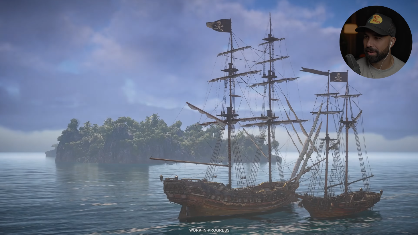
This is by far the worst instance I've seen in hours of footage, though.
The game does use RT reflections.. we'll see at launch.

GymWolf
Gold Member
The water actually has worse physics than origins...Looking at the footage of Edward slowly walking around, I'm completely unmoved. I'm not gonna pretend it looks terrible or something but I'm just bored to death by it's visuals. The water looks the same as AC Shadows which is fine in itself but I expected more, way more. Same animation (and issues), same physics bugs, same overall look as every other Assassin's Creed since Origins. Just with better shaders and textures, with RT slapped on top of it.
I'm going to play it because I think AC Shadows is one of the best looking game on PC, so I'm sure this one will be a looker too and as opposed to Shadows, the story is actually interesting.
But I do hope though that they'll change their overall art direction and animation blending for the next few entries in the series. They really need to.


I kid of course, I only have love for you <3
The frontal ripples when he swim are absent in bf.
No idea how a pirate game in 2026 doesnt make water tech their first absolute priority, their water get absolutely raped by rdr2, hfw and crimson in pretty much all the aspects.

John Marston
GAF's very own treasure goblin


No contrast, everything is just overly bright and colorful to the point of looking like a damn Disney movie.
I don't see it in that cutscene.


diffusionx
Gold Member
I think the PSP version is the best. Perfect portable game.It's on Xbox too and available through backwards compatibility.