Hellgardia
Member
B! No doubt in my mind
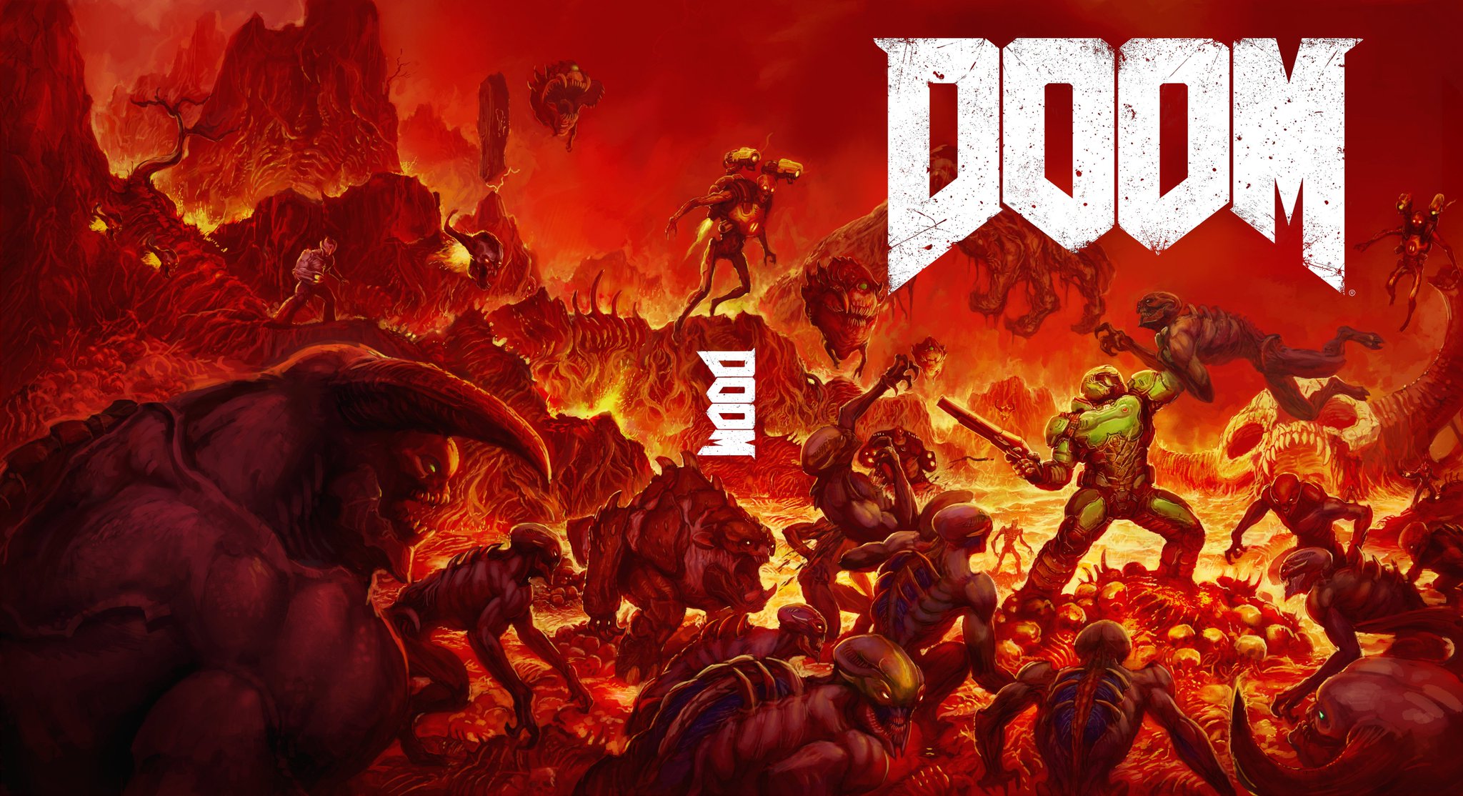
MOOD
B should be the main cover and A the reverse.
Agreed.ummm both. But really, OPTION B!!!!!
Option B should just be the main cover, and Option A should be reverse
Seriously, this.I'm assuming this was made after the main cover was selected because otherwise how in the fuck could this have happened
Still better than the original cover.
B looks amazing, but A is fuckin metal. I'd be happy with either of them.
Marketing team likely focus tested it to hell and back. Pun intended. In terms of getting people's attention, Option A all the way. In terms of speaking to the fans, Option B, no contest. In terms of instantly telling potential customers "I am a gritty FPS like the ones you know and love, so you should totally ask your Mum to buy me", the official one does it best.I wonder why they're being so stubborn about the box art. Majority of people hate it and much prefer these two options; particularly option B. I hope they change their minds.
I don't care if it's pandering to nostalgia, option B is just one million times more appealing to me than the original, and better than option A (I understand the minimalist nature, but damnit, I like detail and colour and big monsters to look at!)
Im not good with Twitter I clicked A to see it and it got my vote oh god B is a billion light year better
I dare you. I double dare you! Say you prefer the official cover over the ones posted in OP.
I think so. I asked them on Twitter the day the old boxart came out if they could look into a reversible cover and they said they would try.Where these made in response to the criticism? I can't believed someone saw these and decided not to use them.
It even looks like B is the real cover and A is for special edition... Is this all a weird troll?
Yeah Im confused. Did the boring piss yellow original one really did perform that much better in focus groups or something?Why didn't they go with B in the first place!???
There is. By WOOTinator @ Reddit.I wish there was a high res version of B without the Doom logo. Would make for an even better wallpaper.
I wish there was a high res version of B without the Doom logo. Would make for an even better wallpaper.
") They have some artifacting though, considering the source material. 1920x1200.
They have some artifacting though, considering the source material. 1920x1200.A for collector's edition, B for standard.