• Hey, guest user. Hope you're enjoying NeoGAF! Have you considered registering for an account? Come join us and add your take to the daily discourse.

id Software shows alternative cover arts for DOOM, are 100x better than the default.

dark_chris

Member
A for collectors
B for default.

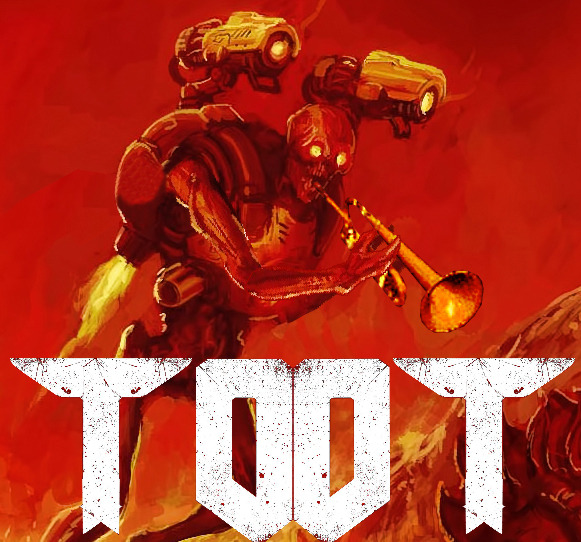
How could they have not done this instead of the generic gritty dude in front covers of games that we are used to?
 
I want B for standard cover, and as a Giant Poster, A fits the bill for a steel case.

B is so good, all that nostalgia, wrapped into gorgeous cover art.
 

MiguelItUp

Member
I totally agree on A being the steelcase / collector's box. B being the normal. I'm sure some retailers would be unhappy with that cover, but that could always be fixed with a slipcase! :D
 

Apathy

Member
That B cover had me thinking all yesterday about doom, and how much fun and how amazed I was when I first played it. So much so that I had to go back and listen to At Doom's Gate. It's a song that is so iconic to me and a lot of other people, and I hopE that the new doom can do that again.

https://www.youtube.com/watch?v=BSsfjHCFosw
 

antitrop

Member
That B cover had me thinking all yesterday about doom, and how much fun and how amazed I was when I first played it. So much so that I had to go back and listen to At Doom's Gate. It's a song that gets is so iconic to me and a lot of other people, and I hop that the new doom can do that again.

https://www.youtube.com/watch?v=BSsfjHCFosw

I think it would be cool if the ending credits of DOOM 2016 were set to a remix of E1M1 or something like that.
 

Dai101

Banned
tumblr_o3hs4byTHq1r2to8go1_1280.jpg

tumblr_lpg3so4bvm1qiy6q1.gif
 

forrest

formerly nacire
Voted for B, thought I do prefer it with the original logo.

Also, I really need a cropped 3440x1440 of B without the text.
 

Ixion

Member
Voted for Option A. It feels like a sinister warning for something that we're not prepared for. I like the mystery. It's also something new for the series.
 
Wow, both covers are so much better. I like option b but they really should just have that as the default and a as the reverse. I can't imagine anyone would prefer the current cover over either of these.
 
I really hope some of the marketing employees over at Bethesda are reading this thread. Hell, I live like 15 minutes away from their HQ in Rockville, I should just knock on their doors and show them personally lol

Kidding Bethesda, don't sue me
 

A-V-B

Member
Didn't this exact same thing happen to Bioshock Infinite?

Internal artists come up with awesome covers, but marketing department actually controls the scenario and puts out a super generic cover of "man with gun".
 
I never use reverse side covers because they don't have the "Playstation 4" (for example) banner across the top liek the other games on my shelf. Makes it look out of place. Am I crazy?

Voted for A by the way
 

Apathy

Member
Didn't this exact same thing happen to Bioshock Infinite?

Internal artists come up with awesome covers, but marketing department actually controls the scenario and puts out a super generic cover of "man with gun".

Yeah, luckly we got the amazing cover on the back.

I never use reverse side covers because they don't have the "Playstation 4" (for example) banner across the top liek the other games on my shelf. Makes it look out of place. Am I crazy?

Voted for A by the way


Yes
 
Option A cover is my favorite thing I've seen about this entire game at this point.

EDIT: It's still mind-boggling to me that companies nowadays are actually TRYING their hardest to be as generic as possible. It used to be about standing out, being unique and that cover grabbing prospective buyers from the shelf, how the fuck could that be a bad thing???
 

iroquoispliskin

Neo Member
Both look awesome. However, I think that option B captures the essence of Doom better than A. Will definitely have to print it out (if I buy a physical copy)
 

timmyp53

Member
they should probably keep the one they had before and make the one that wins the reversible cover.
why?
because the average consumer is lame and won't give it the time of day.
 

ike_

Member
Option B is winning by a landslide at the moment (70/30). Rightly so, that is some very well done callback artwork.

But I had to show some support for that sexy sinister understated Option A artwork.
 

MiguelItUp

Member
Option B is winning by a landslide at the moment (70/30). Rightly so, that is some very well done callback artwork.

But I had to show some support for that sexy sinister understated Option A artwork.

Right? I do still love that A very much looks like a band shirt. I mean, if that was a shirt I'd own it hands down.
 

A-V-B

Member
Option B is winning by a landslide at the moment (70/30). Rightly so, that is some very well done callback artwork.

But I had to show some support for that sexy sinister understated Option A artwork.

They're both really awesome.
 
Top Bottom