-
Hey, guest user. Hope you're enjoying NeoGAF! Have you considered registering for an account? Come join us and add your take to the daily discourse.
You are using an out of date browser. It may not display this or other websites correctly.
You should upgrade or use an alternative browser.
You should upgrade or use an alternative browser.
Orioto art thread - New VG wall every thursday!
- Thread starter orioto
- Start date
After much debate, this 20% deal convinced me to get the Metroid Prime one. That makes 4 total I've bought. I'm finally buying a house so I will be displaying them proudly in my nerd/media room.
I love to hear that

UnluckyKate
Member
Hey Orioto. I love your last pieces, some are just drop dead gorgeous. The Pikmin one, reminds me of your earlier masterpieces (Sonic, Metroid, Mario) I also love the FFVI one, the details are insane and I like the change of perspective.
And this is something I couldn't put my finger one but now I see it. You always use the very same kind of perspective, always using the same framing, and lots of symetry. And no matter how gorgeous your colors and details can be, I feel your work is somehow, feeling a bit too similar ?
Thinking of Sonic, Mario and Metroid, I was wondering why you don't change the perspective again, to a sidecrolling, like you used for these and it struck me : you always use the perspective of the game, either side scrolling, top down or if free camera, you put your characters in the bottom center back to the camera like any third person game.
But I still think it does feel redundant especially because you use very symetrical framing (if that makes sens ?) And it's why FFVI town looks so unique, because it's framing is unique in your last 9 works.
I don't want to undermine your work because you are clearly a god with your colors and I'm not capable of doing 0,1% of what you do, but as a fan of your work, I wouldn't mind to see you try more audacious framing or asymetrical compositions, as long as you don't feel it betrays your trademark style.
Lots of love Orioto,
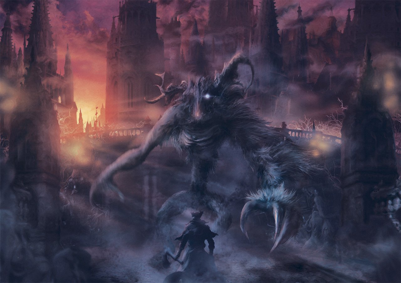
Can't wait to see that Cleric Beast and Yharnam rooftops done !
And this is something I couldn't put my finger one but now I see it. You always use the very same kind of perspective, always using the same framing, and lots of symetry. And no matter how gorgeous your colors and details can be, I feel your work is somehow, feeling a bit too similar ?
Thinking of Sonic, Mario and Metroid, I was wondering why you don't change the perspective again, to a sidecrolling, like you used for these and it struck me : you always use the perspective of the game, either side scrolling, top down or if free camera, you put your characters in the bottom center back to the camera like any third person game.
But I still think it does feel redundant especially because you use very symetrical framing (if that makes sens ?) And it's why FFVI town looks so unique, because it's framing is unique in your last 9 works.
I don't want to undermine your work because you are clearly a god with your colors and I'm not capable of doing 0,1% of what you do, but as a fan of your work, I wouldn't mind to see you try more audacious framing or asymetrical compositions, as long as you don't feel it betrays your trademark style.
Lots of love Orioto,
Can't wait to see that Cleric Beast and Yharnam rooftops done !
Hey Orioto. I love your last pieces, some are just drop dead gorgeous. The Pikmin one, reminds me of your earlier masterpieces (Sonic, Metroid, Mario) I also love the FFVI one, the details are insane and I like the change of perspective.
And this is something I couldn't put my finger one but now I see it. You always use the very same kind of perspective, always using the same framing, and lots of symetry. And no matter how gorgeous your colors and details can be, I feel your work is somehow, feeling a bit too similar ?
Thinking of Sonic, Mario and Metroid, I was wondering why you don't change the perspective again, to a sidecrolling, like you used for these and it struck me : you always use the perspective of the game, either side scrolling, top down or if free camera, you put your characters in the bottom center back to the camera like any third person game.
But I still think it does feel redundant especially because you use very symetrical framing (if that makes sens ?) And it's why FFVI town looks so unique, because it's framing is unique in your last 9 works.
I don't want to undermine your work because you are clearly a god with your colors and I'm not capable of doing 0,1% of what you do, but as a fan of your work, I wouldn't mind to see you try more audacious framing or asymetrical compositions, as long as you don't feel it betrays your trademark style.
Lots of love Orioto,
Can't wait to see that Cleric Beast and Yharnam rooftops done !
We've discussed that here before
I don't center when there is a way to do otherwise, like i did with shenmue, nights or FFVI here. But i mostly center. Cause i'm doing a specific type of poster, which is basically that. A small character on the bottom center and a large epic background above it. That's the style i want for now. That's also the style that works. That's how people like their posters on their walls, mostly. That's contemplative and classy. That's how most alternative movie posters are done for exemple.
My older posters looks like widescreen screenshots. That's not how you design a poster. A small hardcore gaming minority will like the fact that they really look like videogames, but i've started selling good when i understood that's not videogames people want on their walls. That's more about stories, movie like, dreamy, contemplative scenes.
By the way the FFVI pic is exactly the same except not centered but it's still a small character in the bottom and a ray of light vertically on top of him, which has been my mantra for a year. The thing is i'm ctualyl trying to achieve something as an artist. That's why i WANT something recurrent. I'm not just a fanart machine i mean i want that, beyond each game i'm working with, there is something common to all those pictures.
UnluckyKate
Member
We've discussed that here before
I don't center when there is a way to do otherwise, like i did with shenmue, nights or FFVI here. But i mostly center. Cause i'm doing a specific type of poster, which is basically that. A small character on the bottom center and a large epic background above it. That's the style i want for now. That's also the style that works. That's how people like their posters on their walls, mostly. That's contemplative and classy. That's how most alternative movie posters are done for exemple.
My older posters looks like widescreen screenshots. That's not how you design a poster. A small hardcore gaming minority will like the fact that they really look like videogames, but i've started selling good when i understood that's not videogames people want on their walls. That's more about stories, movie like, dreamy, contemplative scenes.
Could you still achieve the large epic background without centering characters on the bottom ? Remain the contemplative scene but alter a bit the composition ? Or is it something you really want to keep as a trademark / serial work ?
Could you still achieve the large epic background without centering characters on the bottom ? Remain the contemplative scene but alter a bit the composition ? Or is it something you really want to keep as a trademark / serial work ?
It really depends, i don't center when i prefer something else like for the FFVI art. But for exemple the bloodborne works like that. Cause i don't want the fighting, i want the pose.
falconxcrunner09
Member
How is the Bloodbourne piece coming along? Excited to see the finished product.
How is the Bloodbourne piece coming along? Excited to see the finished product.
Hmmm, with difficulty.. It'll be finished tomorow i guess.. Not really happy with it yet.

Let see what you fans of the game think of it. I need some cheering up lol.
I don't have the game yet but it looks beautiful. Think I need that one to sit beside my Dark Souls Sif.
Thx i needed that^^ I finally finished it! That blue/orange tone lol
50 Prints HERE
Wallpapers HERE
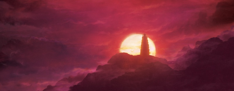
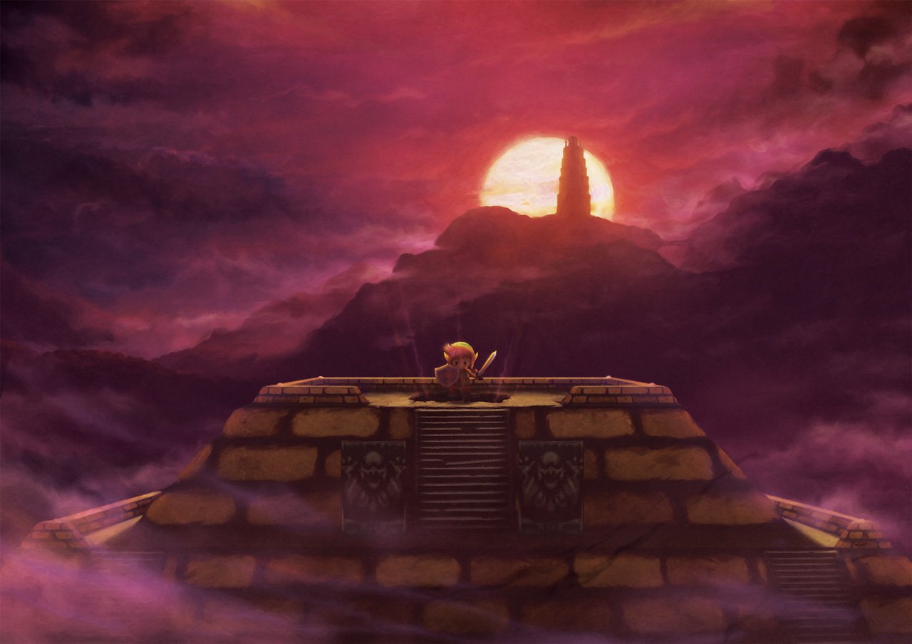
So next week, ALTTP, pyramid. I have to see how i can add to that scene cause there is not a lot to it visually in first place..
So next week, ALTTP, pyramid. I have to see how i can add to that scene cause there is not a lot to it visually in first place..
Maybe something like skewing the game camera/view to add more background?

Lucent
Member
Holy shit! That fog added so much. The final piece is awesome. =D
I want this and the FF6 one you did. But thinking of waiting for this LTTP piece to see if I should order 3 again. Lol.
TheMoon
Member
Maybe something like skewing the game camera/view to add more background?
Yea, that seems like the obvious solution. Death Mountain with the Ganon's Tower an maybe even Turtle Rock in the background. Or from the other side overlooking the Skeleton Forest.
Just reproducing the in-game view would be boring for this set piece, imo.
Maybe something like skewing the game camera/view to add more background?
Yeah but i don't know cause it's meant to be dark behind it lol,

That montage you found is kinda wrong. Also i don't want to draw the whole map behind it
I think i'll do a mix. Back lighted landscape that shows more of the world but not too much.
GwyndolinCinder
Member
This is incredible.
Thx!
So, after some thought on it, i decided to it like that.

With the mountain less far and way bigger, cause it's actually like that on the map, versus the background in that scene in the game. I'll do some sort of sunset light but less contrasted than in the the game so we can see some of the forest on the left and more details on the mountain, but not too much.
Also i want to play with the pink clouds behind the death mountain.
Lucent
Member
Thx!
So, after some thought on it, i decided to it like that.
With the mountain less far and way bigger, cause it's actually like that on the map, versus the background in that scene in the game. I'll do some sort of sunset light but less contrasted than in the the game so we can see some of the forest on the left and more details on the mountain, but not too much.
Also i want to play with the pink clouds behind the death mountain.
What I'm seeing and reading is awesome so far. I can't wait to see the final product
Benzychenz
Member
Moved in to my new place and have room for 4 posters in my room, so gonna get my Dark Souls and Kingdom Hearts ones framed and put them up with the Persona 3 and Ico ones I have.
Will take pics once it's done
Though saying that, I really want the Xenoblade one you did so maybe I can put two above the TV and fit 5
Will take pics once it's done
Though saying that, I really want the Xenoblade one you did so maybe I can put two above the TV and fit 5
Moved in to my new place and have room for 4 posters in my room, so gonna get my Dark Souls and Kingdom Hearts ones framed and put them up with the Persona 3 and Ico ones I have.
Will take pics once it's done
Though saying that, I really want the Xenoblade one you did so maybe I can put two above the TV and fit 5
That sounds like a plan
Other thing, i've made an announcement on my facebook about old sold out pieces. Now i'll do something funny. Every 500 followers, i'll do a poll to put an old one back for 50 more prints. Starting at 3000 (i'm at 2906 now).
In some other News the Okami piece has 5 left and the beware with the Xeno one, it's selling faster than usual, already 12 left only.
Lucent
Member
Wip, purple sunset + pinkish clouds to match the ingame death mountain.
That looks amazing.
Here's my current Orioto setup to show my support (will eventually frame these). Planning to expand by another 3 because his latest work is literally too damn amazing to pass up.

Here's my current Orioto setup to show my support (will eventually frame these). Planning to expand by another 3 because his latest work is literally too damn amazing to pass up.
Thx! I can't say i love those tacks on it
But that's more for you. They are too expensive to be nailed like that i think! So still some things to do for the ALTTP one, will be finished tomorow.

The tacks kill me too, but that's why I put them in the white area. So when I eventually do frame them no one will ever knowThx! I can't say i love those tacks on it
Thx! I can't say i love those tacks on it
So still some things to do for the ALTTP one, will be finished tomorow.
This is looking real good. I think the perspective you went with works very well, and I love the ominous purple clouds and the sunlight/shadow contrast - It really captures the feeling of the dark world.
Lucent
Member
Want.
Good job, Orioto. Lol. I wonder if that 10% off code I got for subscribing to redbubble still works.
Fantastic work, Orioto. How about Super Mario RPG for the next one? =p
That's an idea but not sure i can find a memorable scene enough for that..
What about the Banjo & Kazooie one you talked about at the MIA ?
I'll do this one definitely yeah
I'm not sure this week.. hmm why not.. Sales are dying i need big things..falconxcrunner09
Member
Can you expand to any other websites besides rebubble to sell your items? Maybe to a more popular website like amazon where your work can be more exposed?I'll do this one definitely yeah
Can you expand to any other websites besides rebubble to sell your items? Maybe to a more popular website like amazon where your work can be more exposed?
Redbubble print them, i can't use amazon
It's been selling pretty good on a regular basis since end of the year but last week was dead except from some bloodborne sales. Maybe it's nothing but that makes me paranoid lol, i need to find a more comfortable balance.I just understood why i'm not selling this week i think.. Redbubble has a bug and it's in german only -___- Also i still didn't chose the art of this week, fuck. Someday i can't think straight.
Redbubble print them, i can't use amazon
I just understood why i'm not selling this week i think.. Redbubble has a bug and it's in german only -___- Also i still didn't chose the art of this week, fuck. Someday i can't think straight.
What's the bug?
Also I have no issue with redbubble. They have good shipping rates and I can't complain about the quality.
Punished_Snake
Member
My first post in this thread, amazing art. But I didn't see Bloodborne art yet, can someone post it/them again?
immortal-joe
Member
Orioto correct me if I'm wrong, but you've never done a Metal Gear piece right?
What's the bug?
Also I have no issue with redbubble. They have good shipping rates and I can't complain about the quality.
It seems the site was all in german for some times but it's fixed apparently. I'm fine with redbubble to
it could be better but yeah it's ok. My first post in this thread, amazing art. But I didn't see Bloodborne art yet, can someone post it/them again?
It's here
Orioto correct me if I'm wrong, but you've never done a Metal Gear piece right?
I did for a Konami exhibition, an official one. I'll do one for my store sometimes yeah. First boss or something like that.
I love your art Orioto! was wondering if you will ever make some classic ps1 rpgs like Xenogears. I think your art style can make it work with Fei main character and his final mech (Gear) standing in the background (maybe in the middle as your focus point).
Continue what you are doing! great stuff.
Continue what you are doing! great stuff.
potatohead
Member
That Bloodborne one is just amazing.