• Hey, guest user. Hope you're enjoying NeoGAF! Have you considered registering for an account? Come join us and add your take to the daily discourse.

Amazon redesigning the cast of Breakaway to be more unique. Weekly tests are coming.

For those not in the know this is Amazon Orange County's (which includes Double Helix/ "the KI kernel is behind this game"") Team Battle Sport game aimed at Twitch. The theme is changing as well from "Warriors of Myth and Legend" to "Ascend to Immortality" and weekly tests are coming.

Previous cast

headerl6s9g.png

current (not everyoen has been revealed)


https://playbreakaway.com/news/post/breakaway-alpha-preview

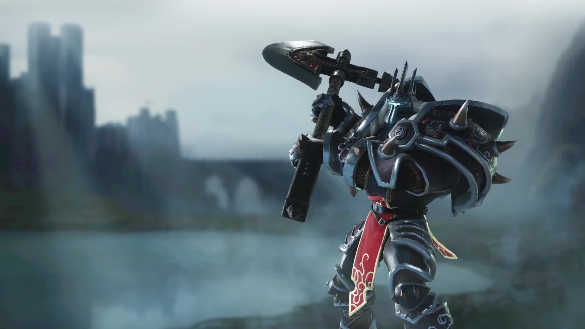
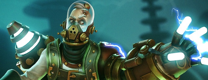
Warrior Artwork and Character Design Changes
One consistent piece of feedback we heard from gamers who checked out Breakaway was that the artwork and character design for our warriors weren’t quite hitting the mark yet. Our aspiration is to create awesome, powerful, diverse and memorable characters that will appeal to all sorts of gamers, and we weren’t yet satisfied with our starting lineup of warriors we had when we announced Breakaway back in September.

So we’ve unleashed the creativity of our artists and designers to reimagine our original characters. Some have changed quite radically (even their names!), and some have just been pushed into more unique and interesting territory. In the spirit of building Breakaway transparently with the community’s feedback, we’re introducing six of our updated warriors that are ready for the June 15th alpha weekend. We’re still working on updates to the remaining original warriors, and you’ll hear about them soon.
Here are the six updated warriors that you’ll see this weekend:


https://forums.playbreakaway.com/topic/2586/breakaway-developer-q-a-responses-6-19-2017

What was the original intention behind the redesign of the warriors in terms of their art direction? I personally wasn't involved in the tech alpha, but hearing some of the previous warrior names (Morgen/Korryn for example) I like the old names better. Was the resdesign due to player feedback or more so a decision on the part of the art directors?

Regarding the warrior redesign, the original premise of the game was "Warriors of Myth and Legend", which brought together historical and mythical characters to fight in an arena. We heard clear feedback that players found these characters uninteresting and resembled characters they'd seen in other games. We wanted to give players an experience with Breakaway that was unique and memorable, so we pivoted to our new theme, which we call "Ascend to Immortality". Look for more backstory and content along those lines in the weeks ahead

will we have to wait as long as we did for the june alpha?
  • Nope! We're planning to have weekend playtests more or less every weekend until we go 24/7 (there may be exceptions, but our current plan is every weekend).
  • Nope! With the June Alpha test, we're moving into weekly tests, so make sure your clear up those summer plans and save yourself having to purchase all that sun screen!

update 06.23.:

https://twitter.com/PlayBreakaway/status/877979009937580032

Starting today: ��Breakaway��Every��Weekend��. Alpha servers are live 5PM Thursdays through 10 AM Mondays Pacific Time. Time to get warmed up.

update.:

The latest change


https://playbreakaway.com/news/post...ansformation-introducing-merrick-the-devourer

update2:

Next one:https://playbreakaway.com/news/post/victor-becomes-sai-the-mad-lightning-sage


Update3:

And the next one: https://playbreakaway.com//news/post/rawlins-the-gunslinger-warrior-update

 
Well... I really dont like the design. Why is everyone going for the "colorful adult cartoon" design ? It only works when you're really good at it, cf Overwatch or Team Fortress 2. Otherwise, it gives you Battleborn, Dauntless or this...
 

Alrus

Member
Should have kept the Pirate girl, she looked way better. The whole vibrant colors scheme makes the game look even more generic too.
 

hotcyder

Member
Apart from the purple witch and the mayan girl (where all they really did was make the colours pop a bit better) - they all look worse?

And by worse I mean harder to read and more "generic" looking then when they were based on stock archetypes.
 
Well... I really dont like the design. Why is everyone going for the "colorful adult cartoon" design ? It only works when you're really good at it, cf Overwatch or Team Fortress 2. Otherwise, it gives you Battleborn, Dauntless or this...

I liked neither, but my first impression is the same as the following two posts. This seems to be more generic than the previous. As for the "why?", well they want to have a broader appeal and think this is the way to go. Also it's usually easier on the system recs.
 

Skux

Member
New designs look overdone. That sniper character is fucking ridiculous - there are so many elements you don't know what to look at.

The mage is better though.
 

2+2=5

The Amiga Brotherhood
I don't like the designs, they went from generic myth/ancient designs to generic moba designs.
At least the old ones had a clear theme that tied them together, the new ones are just... generic.
 

llien

Member
This doesn't look like an improvement to me.
I also do not see anything original in neither versions of artwork.
 

danmaku

Member
Well... I really dont like the design. Why is everyone going for the "colorful adult cartoon" design ? It only works when you're really good at it, cf Overwatch or Team Fortress 2. Otherwise, it gives you Battleborn, Dauntless or this...

Isn't this true for any style?
 

Clawww

Member
Hackneyed uninspired crap with a fundamentally boring concept. The game itself is going to have to pull a lot of weight relative to the character designs.
 

jett

D-Member
What I learn from this is that this team does not have strong character designers. How strange to change your entire art and thematic direction based on fan feedback. This isn't even an improvement, now the game looks like an assortment of mismatched weirdness.
 

ViviOggi

Member
New pirate and viking designs are messy af, overall it's no different from any other game employing the Random League Skins style
 

Kinyou

Member
We heard clear feedback that players found these characters uninteresting and resembled characters they'd seen in other games.
I'm not sure they achieved that. They remind me very much of bootleg Blizzard characters now, but this also doesn't look like the type of game I'd be interested in anyway, no matter the design.
 

stryke

Member
Don't really care for the new or old designs.

Then again I thought Paladins was uninspired as well but they found their own audience so what do I know.
 

Airan

Member
I actually quite like the new Spartan, looks much more interesting than the old design.

Unfortunately the sniper looks like a mess. Not entirely sure how to improve upon the viking, but the new design isn't particularly captivating either.

The rest just look like they had their colour palette saturation turned up to 11. Can't see anything different on the Witch nor Mayan. Feral girl had her claws changed to some generic rune stone thingy and her bear hat has glowing tattoos, but that seems to be about it?

It really is a struggle to design a memorable character. The latest success I feel has to be ARMS, even without their stretchy arms gimmick I think they're distinctive enough from anything out there to leave an impression on me.
 

Ambient80

Member
So, what IS the game? Is it an Overwatch/TF2 sort of thing? Arena shooter?

I agree with some tho, the characters look bland. Like, just not at all memorable.
 

PaulloDEC

Member
I feel a little bad for the team, because neither the old nor the new designs look particularly interesting or distinct to me. As others have said, if you're targeting this particular art style right now you're tussling with companies like Blizzard and Valve.

I think a safer bet would be going with a different overall look. I thought the toon-like style of Gigantic was a breath of fresh air, personally:


Steel

Banned
Well... I really dont like the design. Why is everyone going for the "colorful adult cartoon" design ? It only works when you're really good at it, cf Overwatch or Team Fortress 2. Otherwise, it gives you Battleborn, Dauntless or this...

Same reason why everyone went gray or piss filter last gen. Gotta follow the market leaders....
 

LordRaptor

Member
Looking at the redesigns...

We heard clear feedback that players found these characters uninteresting and resembled characters they'd seen in other games

did you hear that feedback clearly?
 

Fuchsdh

Member
Got to echo the sentiments. There were some stronger designs in the previous version, and either way they don't seem substantially different than League or Smite.
 
I feel a little bad for the team, because neither the old nor the new designs look particularly interesting or distinct to me. As others have said, if you're targeting this particular art style right now you're tussling with companies like Blizzard and Valve.

I think a safer bet would be going with a different overall look. I thought the toon-like style of Gigantic was a breath of fresh air, personally:

Yeah Gigantic has fantastic character design and artstyle. Instead of going for the cool, edgy, mature animated style so many games seem to be chasing, they went full oncrazy fantasy kids animation and it is so much more expressive and effective.
 

Rocketz

Member
Yeah I like the older style better.

If someone told me the new designs were characters from Smite I'd believe you.
 

Kasper

Member
So they went from a pretty decent looking pirate design to some terrible I-don't-know-wtf-it-is teal mess with a squid helmet? Great rework.
 

Navid

Member
What do they have against Pirates and Roman soldiers?

Honestly though, feels like they just exchanged a generic looks for a different generic look that is a bit less stereo-typical.
 

taoofjord

Member
Unfortunately they're still uninspired designs. But I'm also in the minority that doesn't love Blizzard's character designs for Overwatch either (which are fine but super tropey). Gigantic's designs are nice, though.
 

Somnid

Member
Looks like a MOBA to me. Maybe move away from the Saturday morning mythology cartoon style that literally everyone has done to death?
 
I'm not seeing much improvement here and at the same time I'm not sure what they could do to make the characters seem...cooler.
 

Beartruck

Member
Should have kept the Pirate girl, she looked way better. The whole vibrant colors scheme makes the game look even more generic too.

Yup, they went from too simple to overdesigned. Half the characters in that splash image are "woman with floofy headdress". The visual distinctness has been lost.
 
Top Bottom