-
Hey, guest user. Hope you're enjoying NeoGAF! Have you considered registering for an account? Come join us and add your take to the daily discourse.
You are using an out of date browser. It may not display this or other websites correctly.
You should upgrade or use an alternative browser.
You should upgrade or use an alternative browser.
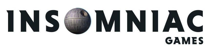
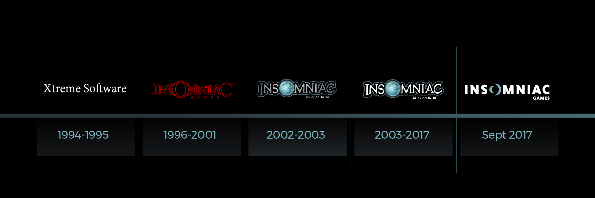
Insomniac gets a new logo
- Thread starter Zukkoyaki
- Start date

I was going to make this post verbatim. Like we were totally on the same wavelength with this one.
AgentChris
Member
Fuse of logos.
I like the new one better
omg if you look long enough, it turns into.. some kind of space station D:
That's no moon.
omg if you look long enough, it turns into.. some kind of space station D:
New one looks soulless. Like their recent R&C game
Yep
Lmao what
Doomshroom
Member
i hate it.
adversarial
Member
It looks more clean cut and less goofy. Is that intentional?
Enigmatic Rainbow
Member
While not a huge fan of the new logo, I prefer it over the old design. The old design looks like something that belongs in the era of JNCO Jeans and Pogs.
Captain.Arabia
Member

AstroNut325
Member
I like the new one. The moon just needs emphasis.
Not everything has to be flat design.
Actually everything does
")
Logos have to be versatile and work in a variety of formats. Including black and white, full color, imprints on metal, it needs to be easily readable both as a huge banner and tiny font, etc, etc. Plus they need an identifiable symbol logo when the letters are not fully displayed, and the new O is more distinct than just a picture of a moon.
I'm sure there are gamers who think that it would be cool if Spyro and Sunset people were skateboarding across the letters as part of the logo. But logos need to serve a specific purpose, and minimal logos are generally far better at achieving that purpose.
New logo is a big improvement by the way!
Continental 0p
Member
I like the new one, but I'll still miss the old one. Especially the old moon.
Spring-Loaded
Member
I wish the new one looked like a moon, just in the same simplified style
QisTopTier
XisBannedTier
About as much personality as the cover of Fuse, maybe that's what made them want to change. That fun quirky Insomniac logo didn't match the rest of the dull shit on the cover
Fuse 2 coming soon or something LOL

Fuse 2 coming soon or something LOL
sloppyjoe_gamer
Gold Member
I like it!
If i recall they have two main studios right....their main one and a NC or SC one. Assuming that the main one is full bore on Spiderman, can we assume the other is working on or at least starting the next R & C Title? Please?
If i recall they have two main studios right....their main one and a NC or SC one. Assuming that the main one is full bore on Spiderman, can we assume the other is working on or at least starting the next R & C Title? Please?
Not bad, not bad. I kinda like it, and I usually don't like logo redesigns.
Looks great on black background.
CarbonFire
Member
Old logo was a bit cartoony, new logo looks clean and still invokes the imagery of the moon in a clever way. But whatever, it's just a logo. Announce new games!
FunkyDealer
Banned
I was never a big fan of their old logo. I don't like how it had two very different fonts.
But the new one is dull and modern-business-generic as can be.
But the new one is dull and modern-business-generic as can be.
Bronetta
Ask me about the moon landing or the temperature at which jet fuel burns. You may be surprised at what you learn.
Actually everything does
Logos have to be versatile and work in a variety of formats. Including black and white, full color, imprints on metal, it needs to be easily readable both as a huge banner and tiny font, etc, etc. Plus they need an identifiable symbol logo when the letters are not fully displayed, and the new O is more distinct than just a picture of a moon.
I'm sure there are gamers who think that it would be cool if Spyro and Sunset people were skateboarding across the letters as part of the logo. But logos need to serve a specific purpose, and minimal logos are generally far better at achieving that purpose.
New logo is a big improvement by the way!
Except no ones saying that. The old logo was better, plain and simple.
Shivvy_NTL
Member
Should have kept the old moon with the new font
Sailent
Banned
Ew.
Change the font, but keep the moon. 🌒
Ew indeed.
BLOODED_hands
Member
The 'O' is a genius idea. When in a black background, you can definitely see how good it is. A good logo! I like it. Simple and clean.
stan423321
Member
Actually everything does
Logos have to be versatile and work in a variety of formats. Including black and white, full color, imprints on metal, it needs to be easily readable both as a huge banner and tiny font, etc, etc. Plus they need an identifiable symbol logo when the letters are not fully displayed, and the new O is more distinct than just a picture of a moon.
Are you drunk? The moon and the slacky font were highly distinctive, this thing isn't.
I understand flat coloring and reduction of detail clutter has multiple practical advantages, but you don't need this level of lining in for reaching them. If Insomniac is entering gamer T-shirt market they could stick to the moon. This is just following the stupid trend.
Omnii-chan
Member
Boring. Old one had more personality.
This. Why are so many companies making their logos simple and boring.
Brainfreeze
Member
What identity did the old logo have that this one lacks?
And for that matter, why does a company logo need to have a distinct identity...
I don't think you understand the point of company logos.
Do people really think this type of logo design is a new trend? Look up any logo redesign from the last half decade at least. This is them catching up with the times.
Fantastic redesign, btw. Professional, unique, and the O is a great concept giving them a simple icon to identify with, that also calls back to the old moon.
Do people in this thread miss the old iPhone skeuomorphism too?
Fantastic redesign, btw. Professional, unique, and the O is a great concept giving them a simple icon to identify with, that also calls back to the old moon.
Do people in this thread miss the old iPhone skeuomorphism too?
David Ricardo
Member
First post does it for me. I like the old one better.
BibiMaghoo
Member
The old one looked like they made video games. The new one looks like they distribute pharmaceuticals.
Not bad, not bad. I kinda like it, and I usually don't like logo redesigns.
I like the new one, but on black it reminds me of something else but i cant think what it is?