-
Hey, guest user. Hope you're enjoying NeoGAF! Have you considered registering for an account? Come join us and add your take to the daily discourse.
You are using an out of date browser. It may not display this or other websites correctly.
You should upgrade or use an alternative browser.
You should upgrade or use an alternative browser.
The Legend of Zelda: Skyward Sword |OT| Home of Punkin' Chunkin' Champion 2011
- Thread starter Amir0x
- Start date
Watch Da Birdie
I buy cakes for myself on my birthday it's not weird lots of people do it I bet
I also love how every NPC, even the individual Kikwi, have their own names and designs. A cute touch that Wind Waker did as well.
95% consistency demonstrated in that video, not 40%, nor 80%.that video of the guy controlling the game is very cool.
100% fun factor
Nexus Zero
Member
Apart from recentering the pointer, which happens for me constantly, I've had no problems with the controls yet.
I have had my first "fuck it" moment though, after being sent back to
for what is probably the fifth(?) fetch quest in a row. It's such terrible padding, I want to rip my fucking head off. After such a great third dungeon this is a real shame. I don't have a lot of time to play video games these days and at times like this I feel like I'm wasting valuable Skyrim time.
I have had my first "fuck it" moment though, after being sent back to
the first dungeon
InvincibleAgent
Member
Is anyone else playing this with the original Wii Remote + the Motion Plus Dongle in the condom like I am? It's pretty heavy after an hour or two, to the point I'm wondering if it's worth buying a new controller with M+ built in.
That's my setup. Just rest it on your knee unless you need to aim down.
3rd temple spoilers:
Also, is i just me, or was the boss of the Desert temple ridiculously easy? Just hit his eye things a bunch with your sword. Dead. Done.
I also agree/think that some of Fi's comments may be just on purpose, a little sarcastic maybe. Remember that to Fi; Link is just a "lol human" so even with the text box saying "you got this!"; she comes again to remind you that "you got that".
Look at the scene were Link gets (after 3rd dungeon spoiler)
So, things from the text and from Fi shouldn't be taken that serious. Even something like the chests, which many hate in this game. The whole "big chests having lame stuff inside" I kinda like it; because it adds to the "you never know what's going to be inside" aspect. So now it could be either a rare item used to upgrade/sell; or a new item/weapon to move around in the dungeon (and the game in general).
Look at the scene were Link gets (after 3rd dungeon spoiler)
the harp. Zelda gives the harp, Link strikes the pose like he always does to pick an item and the text box describes it quickly..and also notes that there's no time to admire it"; because of what's going on in that moment. It also has been done in the previous games.
So, things from the text and from Fi shouldn't be taken that serious. Even something like the chests, which many hate in this game. The whole "big chests having lame stuff inside" I kinda like it; because it adds to the "you never know what's going to be inside" aspect. So now it could be either a rare item used to upgrade/sell; or a new item/weapon to move around in the dungeon (and the game in general).
ShockingAlberto
Member
I just noticed a neat little touch flying around the sky.
If you follow the other knights, they tend to take the fastest routes between the drop zones and show you how to gain speed quicker.
If you follow the other knights, they tend to take the fastest routes between the drop zones and show you how to gain speed quicker.
Lord_Byron28
Member
Was anyone else rather underwhelmed with the 3rd dungeon boss? I loved the 3rd dungeon and everything pre and post 3rd dungeon but the boss was rather meh.
The Technomancer
card-carrying scientician
Was anyone else rather underwhelmed with the 3rd dungeon boss? I loved the 3rd dungeon and everything pre and post 3rd dungeon but the boss was rather meh.
I felt the same way, and the same about the Second Boss as well. Boss fights aren't impressing so far outside of the first.
Refreshment.01
Member
Then you are not paying attention Effect, FI intrussions are not a matter of opinion, is just something factual. She either points out the superfluos and the obvious or down right goes to ruin some puzzles in various situations.She hasn't been a problem at all for me. She's appeared a few times automatically during cut scenes that's really it. Any other time I have to manually summon her and she isn't annoying at all. I don't really understand the hate some have for her. Then again I also never understood the hate for Navi as well and wasn't bothered by her in the slightest.
Had she did that when manually summon her, then you wouldn-t hear much complains at all.
You are doing some wrong withouth realizing it then, those swings are the ones that the game has little problem picking up.My horizontal slashes are often interpreted as diagonal. Same goes for vertical slashes.
As a matter of fact, its possible to be consistent with the game controls if one make some practice runs just to figure out the correct gestures. Some guys in this threads make excellent suggestion regarding the stab, spin attacks and the guile slash.
Foliorum Viridum
Banned
I liked it. Simple, but fun.Was anyone else rather underwhelmed with the 3rd dungeon boss? I loved the 3rd dungeon and everything pre and post 3rd dungeon but the boss was rather meh.
Not every boss has to be huge and epic.
InvincibleAgent
Member
Was anyone else rather underwhelmed with the 3rd dungeon boss? I loved the 3rd dungeon and everything pre and post 3rd dungeon but the boss was rather meh.
See my post above, lol
Alexios
Cores, shaders and BIOS oh my!
I liked it if u mean the
, despite having seen the videos over and over, in its own element instead of the tech demo stuff it was great, loved the use of the item too. It felt like a fight rather than a puzzle at least, even if it was pretty simple.
scorpion
That, I agree.Was anyone else rather underwhelmed with the 3rd dungeon boss? I loved the 3rd dungeon and everything pre and post 3rd dungeon but the boss was rather meh.
Everything was so awesome and loved how the music changed with the look..but the boss felt kinda out of place. Was expecting something ..with a similar look as the rest. Though at the same time, kinda liked it because it gave me a vibe from Twilight Princess battle with Stallord (no spoiler-tag, since is nothing alike; just a "vibe"
 ).
).I liked boss #2 though..looked really nice too and was cool how the whole fight took place (i.e.
just one long corridor and bombs
Lord Ghirahim
Member
I wish they had taken the time to prettify Link for all the cutscenes. There are several segments where he goes in with his regular model only to be replaced by a better one seconds later. It's very jarring.
InvincibleAgent
Member
I wish they had taken the time to prettify Link for all the cutscenes. There are several segments where he goes in with his regular model only to be replaced by a better one seconds later. It's very jarring.
I never notice... What are you looking at?
Quite a feat that Nintendo actually managed to create a companion more annoying than Navi

It's amazing really.
Lord Ghirahim
Member
I never notice... What are you looking at?
The problem is there until the very end of the game. You will not miss it.
Watch Da Birdie
I buy cakes for myself on my birthday it's not weird lots of people do it I bet
There are two Link models? Didn't even notice yet, maybe the benefits of SD
I think the first time I noticed it was when the tornado hits at the beginning. The graphics look totally different.
Pretty sure the dream sequences use a different model as well, but maybe it's just the lighting?
Also, another Fi moment I enjoyed was how she points out the Bokoblin's taste in undergarments.
Lord_Byron28
Member
I felt the same way, and the same about the Second Boss as well. Boss fights aren't impressing so far outside of the first.
Agreed although I do like the (I'm not sure how far you are yet but it's not much farther past the 3rd dungeon)
The Imprisoned boss battle
I agree but the 2nd and 3rd dungeon were both kinda simple and fun not super exciting or epic like TP's boss battles.I liked it. Simple, but fun.
Not every boss has to be huge and epic.
Also, this is what I mean about inconsistent input lag on the stabs:
http://www.youtube.com/watch?v=QEge_2Vuft0&t=28s#t=0m36s
Notice his stab at 0:39, it's significantly delayed compared to the rest. This is really annoying when you're trying to time the stab against a swinging spider. Having it delayed like that results in you getting hit by the spider.
Out of all of your complaints about the Motion+, the stabbing is the one with the most merit. I find that many times my stabs weren't being registered and required 2 more motion of it. Everything else is fine.
Lord Ghirahim
Member
Need comparison screens, I saw nothing different in that scene but maybe I hadn't taken his look in yet at that point to notice differences. Aren't there lots of official screens of that particular scene? You'd think we'd have noticed before...
Focus on the eyebrows and lips. And GAF has noticed before, we just thought the models were from different builds of the game at the time.
Metroid Killer
Member
The further you progress into the game the darker the shade of green on one of the Link models will become, until the big final twist will reveal that one of the Links was this guy all the time!There are two Link models? Didn't even notice yet, maybe the benefits of SD

I want to gag reading comments about how impressive the visuals are in this game, technically and artistically. I just can't agree on any level.
Skyloft is vast, bland and boring aesthetically, most especially when flying around. The first wooded area on the surface almost couldn't be more generically green and woodsy, it has no character. Textures are a nightmarish blur wherever you look. The greasy, muddied up depth of field looks like Sunday morning post-club vomit smeared across half the screen (watercolor/Impressionism? lol), and the visual defect present in those jarring vertical lines thg creep in during every dark scene completely mar the overall image.
Link looks just about the same as his TP incarnation, which feels a bit lazy. Zelda was the highlight of character design so far, and she promptly disappeared. (Ghirahim looks like he was transplanted from rejected animé fan artwork into a universe he just doesn't belong in, and the bully/villains in Skyloft were tragically boring and bland).
I dig that we can all have different opinions about design and art in the game (it's frankly terrible for my tastes), but the technical issues are just brutal, and I feel like people are glossing over it all because of how beloved Zelda is as a franchise. It just looks unacceptably bad on a decent HDTV, which I've never found true of a Wii title, save RE4 because of the zoomed in, poorly scaled image in that game. Top tier Nintendo titles didn't look like this; Galaxy, Twilight Princess, you name it.
And because I can already smell all the Zelda-hater comments coming, there's plenty I love about this game. The soundtrack is beautiful, and I really dig the new swordplay, even if it has its issues; it's ambitious and I almost can't imagine going back to button presses for slashes.
Oh, and (I promise I'm not saying this to be contrarian, but) I really....like, Fi? Like really dig her design, her animation, her garbled speech audio effect). Navi was an order of magnitude more annoying. As usual, I never agree with the GAF hive mind lol.
guys, how awesome was the 4th dungeon boss? just watched this and was reminiscing: (obvious 4th dungeon boss spoiler!) http://www.youtube.com/watch?v=RD7OKhyrPlY
so good
so good
Alexios
Cores, shaders and BIOS oh my!
Doesn't seem like you actually do given the rest of your post but sure. I too want to gag reading posts like yours that to me personally seem completely clueless and detached from reality, but the main difference is I'd probably not even mention something like that if you hadn't tried to put the opinions of others' down as some sort of fanboy eyesight condition in order to elevate your own opinion into "fact" status above theirs or whatever.I dig that we can all have different opinions about design and art in the game
ShockingAlberto
Member
It just looks unacceptably bad on a decent HDTV, which I've never found true of a Wii title, save RE4 because of the zoomed in, poorly scaled image in that game. Top tier Nintendo titles didn't look like this; Galaxy, Twilight Princess, you name it.
So if it doesn't look bad on my TV, that means my TV sucks?
Huh.
InvincibleAgent
Member
Skyview temple and boss were surprisingly easy, though my arm does hurt now.
The next two bosses are much easier, even combined, compared to Skyview's.
The_Darkest_Red
Member
Yeah, we are definitely in opposite camps if you think this game looks worse than TP on an HDTV. You wanna talk about messy textures and bad aliasing...Top tier Nintendo titles didn't look like this; Galaxy, Twilight Princess, you name it.
I want to gag reading comments about how impressive the visuals are in this game, technically and artistically. I just can't agree on any level.
Skyloft is vast, bland and boring aesthetically, most especially when flying around. The first wooded area on the surface almost couldn't be more generically green and woodsy, it has no character. Textures are a nightmarish blur wherever you look. The greasy, muddied up depth of field looks like Sunday morning post-club vomit smeared across half the screen (watercolor/Impressionism? lol), and the visual defect present in those jarring vertical lines thg creep in during every dark scene completely mar the overall image.
Link looks just about the same as his TP incarnation, which feels a bit lazy. Zelda was the highlight of character design so far, and she promptly disappeared. (Ghirahim looks like he was transplanted from rejected animé fan artwork into a universe he just doesn't belong in, and the bully/villains in Skyloft were tragically boring and bland).
I dig that we can all have different opinions about design and art in the game (it's frankly terrible for my tastes), but the technical issues are just brutal, and I feel like people are glossing over it all because of how beloved Zelda is as a franchise. It just looks unacceptably bad on a decent HDTV, which I've never found true of a Wii title, save RE4 because of the zoomed in, poorly scaled image in that game. Top tier Nintendo titles didn't look like this; Galaxy, Twilight Princess, you name it.
And because I can already smell all the Zelda-hater comments coming, there's plenty I love about this game. The soundtrack is beautiful, and I really dig the new swordplay, even if it has its issues; it's ambitious and I almost can't imagine going back to button presses for slashes.
Well my TV displayed the jaggies until I put the resolution down to 480i. And some of us are playing it on Dolphin.
I can't agree with you on the artistic side, sorry. This game is just so beautiful to look at and all of architecture are colorful and full of charm. It's hard to find any other game out there right now with a similar art direction. Save for some Japanese RPGs.
I hope your mind changes when you see some of the later levels. Especially the desert.
You're also wrong on TP looking better. I mean, have you seen it lately? It looks more dated than Ocarina of Time Remake.
Agree with the motion controls. I find it hard to play another adventure game that doesn't utilize motion controls. It's just so much more immersive. And isn't that the point of all of this technology. Better graphics and sound to better immerse? Well better motion controls immerse me moreso than any hi-res texture ever did.
Alexios
Cores, shaders and BIOS oh my!
Not the weapons but the items on - can be re-arranged when you go to the storage girl.Is there any way to rearrange your items on the wheel?
Doesn't seem like you actually do given the rest of your post but sure. I too want to gag reading posts like yours that to me personally seem completely clueless and detached from reality, but the main difference is I'd probably not even mention something like that if you hadn't tried to put the opinions of others' down as some sort of fanboy eyesight condition in order to elevate your own opinion into "fact" status above theirs or whatever.
So I'm fabricating the depth of field grease effect, the vertical line glitch, and the massive blur effect I see on surfaces?
I don't know, I've tried the game out on a number of different sets and setups now at the store, and I'm just surprised at how dissonant my view of the game is (visually) with others on GAF.
Among first party games Zelda definitely has the worst image quality and textures:Yeah, we are definitely in opposite camps if you think this game looks worse than TP on an HDTV. You wanna talk about messy textures and bad aliasing...
TP and SS both look bad in my opinion
Galaxy (1&2) and Prime 3 look amazing
NSMB:Wii looks good
Yeah, we are definitely in opposite camps if you think this game looks worse than TP on an HDTV. You wanna talk about messy textures and bad aliasing...
Fair enough. Strangely, aliasing issues don't bother me at all, lol. It's seriously the cloudiness of the overall image that strikes me as so repulsive.
People really hate Fi, eh? Man, she might be my favorite part of the game, from an art point of view. I love just how much she looks and feels like a sword come to life.
Refreshment.01
Member
The cinematic scenes use a more polygon rich model. Also i think in some instances theres a another type of shading that looks more "heavy" in some scenes.Need comparison screens, I saw nothing different in that scene but maybe I hadn't taken his look in yet at that point to notice differences. Aren't there lots of official screens/vids of that particular scene? You'd think we'd have noticed before...
InvincibleAgent
Member
The vertical lines and greasiness are real. Also low color count. Or is that the same thing?
So I'm fabricating the depth of field grease effect, the vertical line glitch, and the massive blur effect I see on surfaces?
I don't know, I've tried the game out on a number of different sets and setups now at the store, and I'm just surprised at how dissonant my view of the game is (visually) with others on GAF.
Again, opinions. I think the DOF effect looks great and I generally dislike DOF in games.
Also, I have no idea what the vertical line problem you guys are talking about is.
It looks ok on my Samsung plasma, but I saw it at a friend's on his videoprojector and it looked bad. Didn't help we were playing Rayman on PS3 minutes earlierIs there anyone who is playing Skyward Sword on a plasma that thinks it looks bad? Remember now this is the Wii we are talking about, so keep your expecations realistic.
InvincibleAgent
Member
Again, opinions. I think the DOF effect looks great and I generally dislike DOF in games.
Also, I have no idea what the vertical line problem you guys are talking about is.
Go to a dark area like Skyview Temple, look at flat textures in the dark, there are vertical lines that follow the tv.
And yes I'm playing on a Sylvania plasma.
I was playing it on a 55" Panasonic G20, and it looked like jaggy garbage. I downsized to my trusty old 21" P1110 CRT monitor, and it looked better but still had bad jaggies and weird IQ issues (screen door effect with some filters they use, odd vertical lines mentioned above that almost look like analog noise, and some color banding) I switched to Dolphin today.Is there anyone who is playing Skyward Sword on a plasma that thinks it looks bad? Remember now this is the Wii we are talking about, so keep your expecations realistic.
I'm absolutely confident that both Galaxies looked better on both of these sets (the plasma and the CRT), and I remember TP looking better on the CRT but I haven't played it since launch.
Edit:
Someone posted this in the Dolphin thread, and the top image is pretty much what it looks like on my plasma if you pretend that the poster took the photo better.so i transferred over my save and did some direct comparisons. it's laughable how bad SS looks on my HDTV running on the Wii. painful even.
i took close ups of Link.
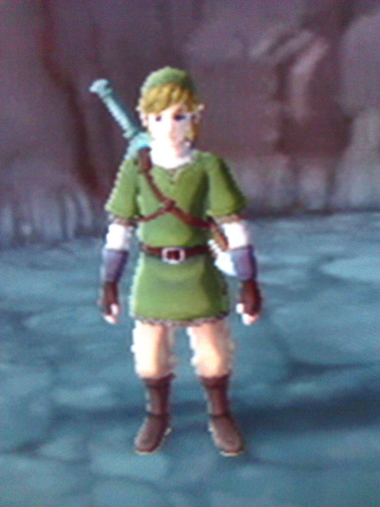
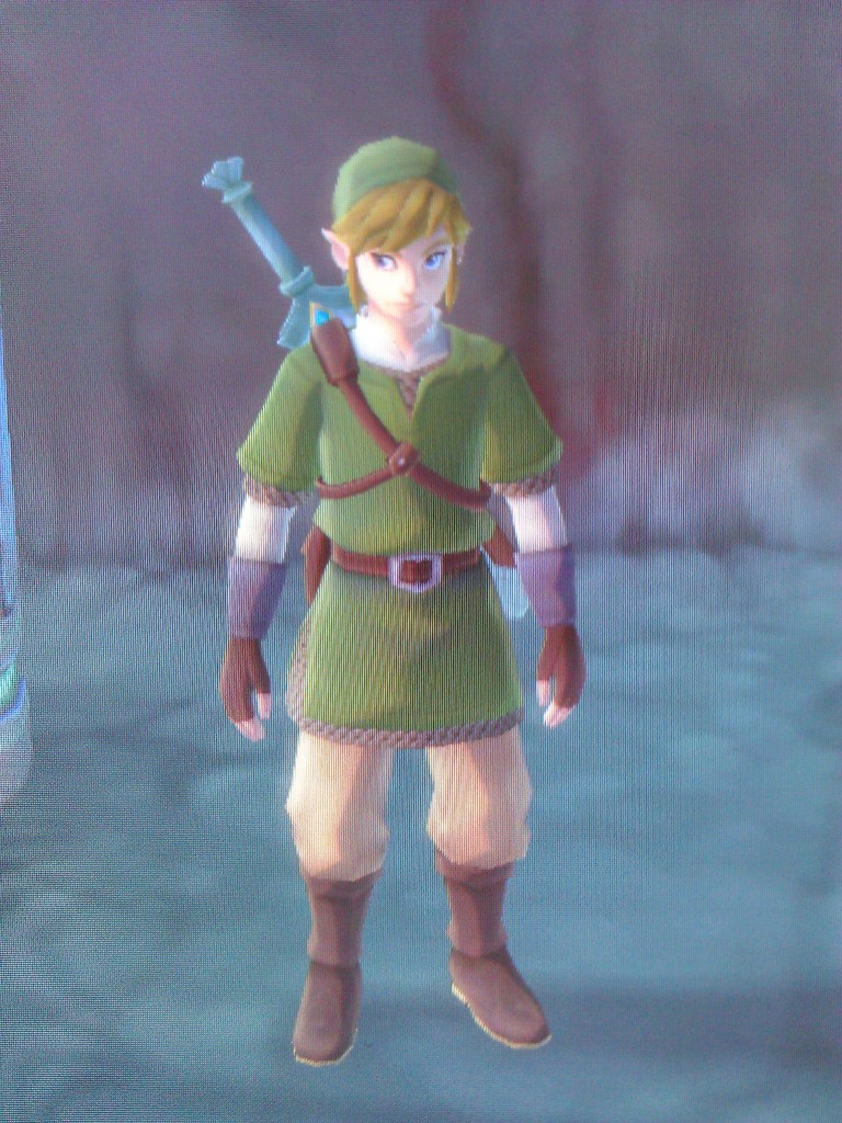
so, yeah. i'm going to keep playing it on Dolphin. at least i know now that if i hit a glitch or something unpassable on the emulator I can just transfer my save file over.
ShockingAlberto
Member
Patrick leads sky-land expert Jeff through what could be the reason to dust off your Wii.
Oh, Giant Bomb.
Alexios
Cores, shaders and BIOS oh my!
No, you're fabricating that your opinion of it being bad is more than just an opinion which makes those that actually like the effect (grease though? maybe that's a fabrication too actually), the impressionism inspired textures, etc, fanboys. The objective things you can mention are things like the vertical lines and the jaggies given the resolution, all of which have nothing to do with the art and world design you criticised so objectively, all of which are of course known by all and easy to overcome for many.So I'm fabricating the depth of field grease effect
I've noticed the different shading, like when you speak to the fortune teller, it's a neat effect, not something I'd liken to actually switching out a model though.The cinematic scenes use a more polygon rich model. Also i think in some instances theres a another type of shading that looks more "heavy" in some scenes.
One dungeon to go, I guess. I don't know what to think about this game anymore. Sometimes I love it, sometimes I hate it.
Dungeons and items are the best in the series, there are a few cool characters and interesting music. Motion+ feels awesome and swinging the sword is amazing. But there is a good chunk of filler/uninteresting stuff to do, the story is barely there. I know it's a Zelda game, but this is what happened in ~50 hours
And I really hated
. I can't think of a worse bossfight in a Nintendo game ever, and
.
I don't know, I'll finish this game and let it rest for a while to make my mind about it, but right now it's a love/hate situation.
Dungeons and items are the best in the series, there are a few cool characters and interesting music. Motion+ feels awesome and swinging the sword is amazing. But there is a good chunk of filler/uninteresting stuff to do, the story is barely there. I know it's a Zelda game, but this is what happened in ~50 hours
Really slow introduction, Zelda is abducted by the dormant creature, Girahim tries to get her and fails because Impa saves her. NOTHING happens story wise until 30 hours later, then you find out Zelda is in the past. NOTHING happens again for 20 hours. And I'm at that point right now.
And I really hated
the dormant
you have to go through it THREE FUCKING TIMES
I don't know, I'll finish this game and let it rest for a while to make my mind about it, but right now it's a love/hate situation.