• Hey, guest user. Hope you're enjoying NeoGAF! Have you considered registering for an account? Come join us and add your take to the daily discourse.

Images of new PS4 interface

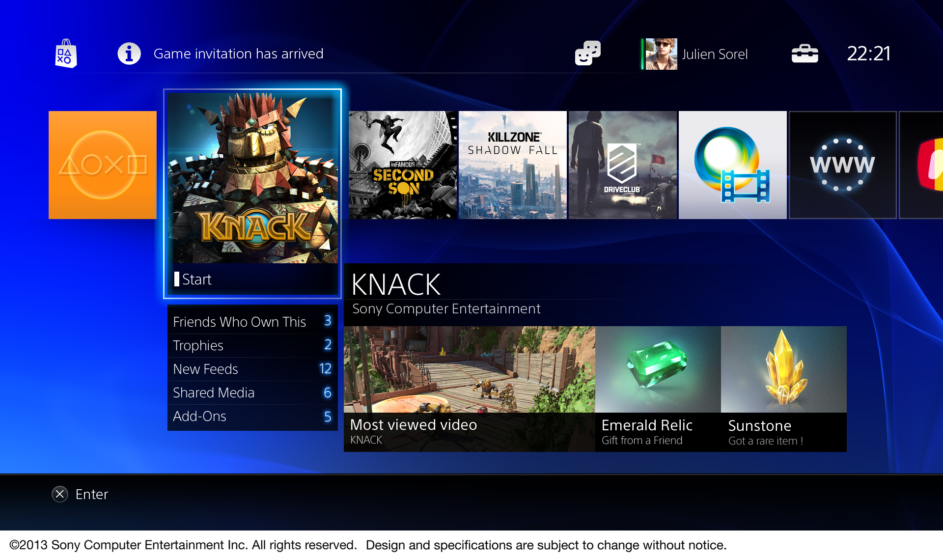
I wish the UI was somewhat customizable. Would love an option for a menu you can slide out from the left or bottom with 4 or 5 apps you can designate as your favorites - like Netflix, your last played game, etc. Those things should be no more than 2-3 clicks away when you boot up.
 
Love the lack of ads (hope that stays on the main pages)
Love that the content is gaming focused (vs TV/Music/App focused)
Not a fan of boxes, but not bad for a box-type navigation
Looking forward to seeing it in motion. Have high hopes it is clean and easy and fast!
 
Does it support Dynamic themes?, this looks to plain and boring, very xbox looking to.

I would be absolutely shocked if it didn't. Dynamic themes are a hit on the PS3 and obviously you can customize the Vita background too, so no reason to believe they'd suddenly stop their trend of allowing for customization there.
 
Still looks pretty awfull compared to xmb, but you can't get everything perfect.


Edit: Oh thread is pretty old, thought those were new ones.
 

Trogdor1123

Member
Calendar looks really good, if you can form guilds and stuff in games and you can set up events on certain datesthat it will track and let you know when its happening would be fantastic.
 

IT Slave

Banned
Thank you. Shit- I thought I was going crazy. I knew I saw squares and rectangles in a UI before.

You're wrong. Apple invented rectangular phones and Microsoft invented UIs with four sided polygons.

It looks to Facebooky to me and I can't stand Facebook.
 
Does Knack have online coop?

I think only offline coop
null_zps6d510bc7.jpg
 

nib95

Banned
Aside from the overuse of that blue, it looks pretty good. I do think the metro look is also being over done now though. But I suppose it's the current design and UI fad.
 
They still going with the floating ribbon I see. Also - the blue.

What's with this ribbon anyways? Does it appear in any other PlayStation branding or exist in any other setting other than the background on the UI?

It's horrible and uninspired. It looks like they just asked an intern to make something generic. It's just disappointing considering they have so many other great visuals that tie into the brand really well. The shapes pattern on the back of the Vita is incredible. They can't utilize something like that? Hell, even making the UI the same shade of blue gradient or look that they have on console packaging would be a start. This just looks like crap.
 

VanWinkle

Member
Most everything in this new pictures looks good except those Trophies screenshots. just seems kind of cluttered and not well in line with the eat if the interface.
 

Melchiah

Member
Hopefully you can set a different avatar than your FB profile pic. It's annoying, that Google united YouTube and G+ profile pics.
 

taoofjord

Member
Sadly, I don't like the look of it at all. Not the way they've used the font or that shade of blue used for the default background. The first thing I'll be doing is changing that background color.

I also think they overdid the text size in effort to make it living room friendly. Shrink that down a little, Sony!
 

IT Slave

Banned
The one thing that would make any UI look better is the ability to add a photo or picture as a background.

Just a plain blue background makes it look lifeless. I like UI's that make it look like you're entering into a bustling place that feels alive.
 
Yikes. Not a big fan of the design at all. Pretty ugly.

We'll have to see if they can make it snappy and responsive though. That's what matters most.
 

Alx

Member
Aside from the overuse of that blue, it looks pretty good. I do think the metro look is also being over done now though. But I suppose it's the current design and UI fad.

I'm pretty sure images like the one above break several rules of the "metro" design language (even without being a designer, it's obvious that having 6 or 7 different font sizes on screen, mix of text, pictures and icons, is far from what "metro" is trying to do). There's no reason to label the PS4 UI "metro" except for the fact that it sometimes uses squares.
 

twobear

sputum-flecked apoplexy
This whole blue swoosh graphic design thing Sony have got going on at the moment is so fucking ugly. It looks like those ropey PowerPoint slide backgrounds from like Office 97.
 

Bitmap Frogs

Mr. Community
Anyways are we getting soon a full video demo of the UI?

We are just 7 weeks away from launch, shit should be looking quite solid already.
 

Yoday

Member
Any clue what the numbers in white squares (11 for Killzone) are meaning?
I was wondering the same thing. It could be the number of friends that have also played the game.

I really like that trophy UI personally. I like being able to see a large group of games all at once like that.
 

Hoo-doo

Banned
I agree that the trophy screen looks like ass. Needs work.

The rest looks fantastic though, coupled with a sleek background it will be beautiful.
 
These aren't official images, but since so many of you seem incapable of using your imaginations and seeing past the blue ribbons that you will be able to customize into oblivion, here:

ii1R2HNmCp2qw.jpg

ib0hpXF4k3L7BJ.jpg

ibk8dmyTSw9fb6.jpg


Now, how does everyone feel? Better? Worse? The same? Indifferent?
 

GribbleGrunger

Dreams in Digital
I also believe that this is going to be the store AND the UI. The online store section will just update when you turn the console on and give you up to date information like deals and new game additions. For those not online, perhaps new Sony games will update that page from the disc to refresh what's available.
 

ckohler

Member
GUYS! I'M PRETTY SURE THE CALENDAR AND TROPHY SCREENSHOTS ARE FAKES

The rest appear to be official but I think you're mixing up some fan/speculation mockups with the real ones.
 

twobear

sputum-flecked apoplexy
Good thing almost all Sony PlayStation products allow you to change the background.
Yeah, but it's a design motif they're using across all their marketing and packaging on the PlayStation line, the blue swoosh with the naff looking 3D PlayStation shapes.
 
Top Bottom