-
Hey, guest user. Hope you're enjoying NeoGAF! Have you considered registering for an account? Come join us and add your take to the daily discourse.
You are using an out of date browser. It may not display this or other websites correctly.
You should upgrade or use an alternative browser.
You should upgrade or use an alternative browser.
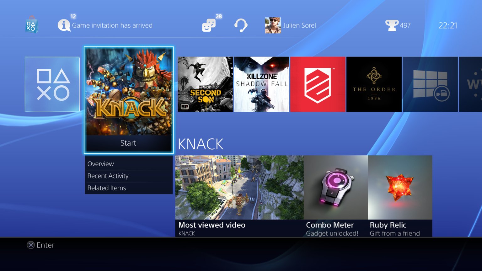
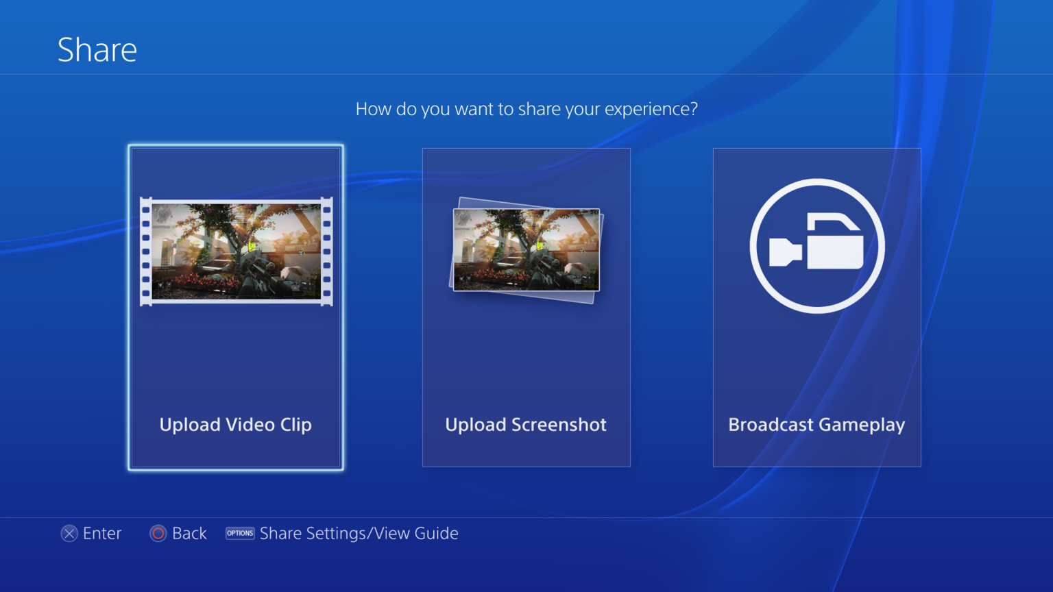
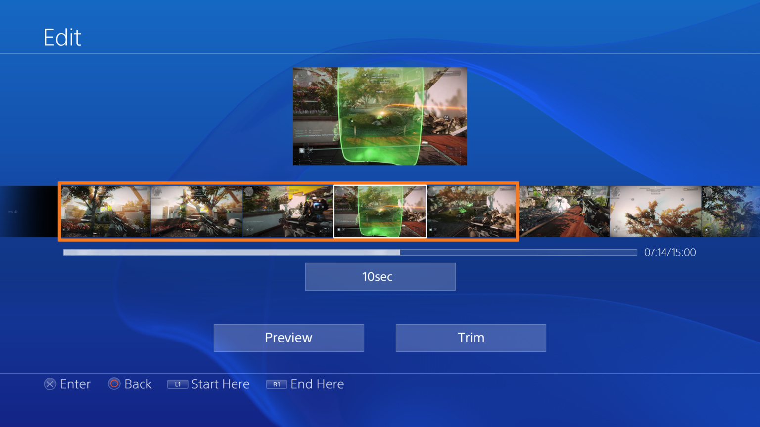
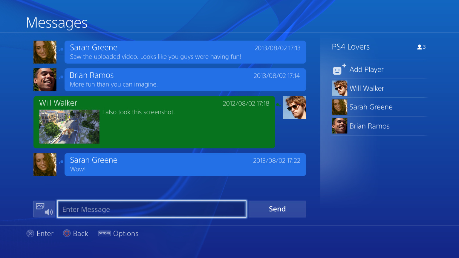
Images of new PS4 interface
- Thread starter Kazerei
- Start date

Mrcapcom
Member
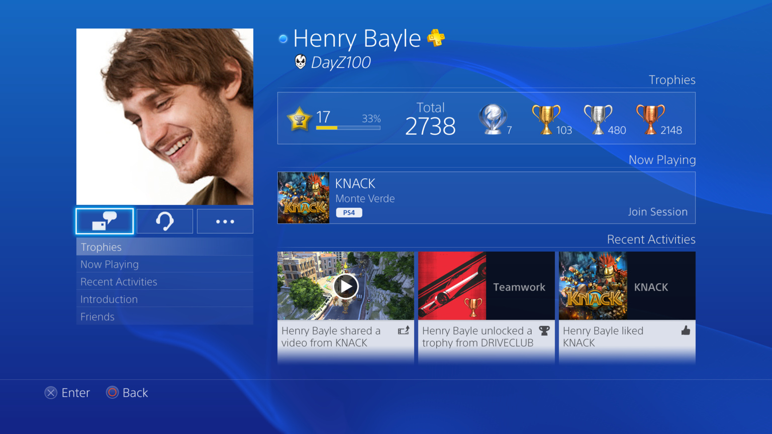
Yes, you can use your real photo and name if you want, and pick which friends are able to see it, others will only see the normal PSN avatar and ID.
Thanks so much #HYPE
TheRealTalker
Banned
just to be clear for other people being confused with the fake mockups
these are the real new images
these are the real new images
the others like the calender and the trophy list are indeed fakes... which where pointed out by our fellow gaffers
pharmboy044
Member
Are you sure it's that configurable? I thought it was either or and not selectable by user?Yes, you can use your real photo and name if you want, and pick which friends are able to see it, others will only see the normal PSN avatar and ID.
just to be clear for other people being confused with the fake mockups
these are the real new images
the others like the calender and the trophy list are indeed fakes... which where pointed out by our fellow gaffers
I assume the last one is a mockup too, unless that guy somehow replied from a year ago.
TheRealTalker
Banned
I assume the last one is a mockup too, unless that guy somehow replied from a year ago.
nope since my original post had the playstation eu in its image url while the fakes did not
of course these exact pics from my current update post I got from pushsquare.com instead of copying my original image post....
why you ask? I'm not sure myself
elementalsin
Member
Assuming these are a mix of real and mockup.... I'm still not sure how I feel about it. I can't honestly put my finger on it but it just 'feels' weird I guess is the only way I can put it. I'm curious how customizable it will be, like if they've kept folders/grouping/how editable the background and color schemes are. I think that type of thing would go a long way to making this a really 'special' for lack of a better word dashboard experience. Excited to see the 'real' end result though.
Shpeshal_Ed
Banned
Really really excited about the jump in remote access feature.
biggersmaller
Banned
I liked the XMB, I don't need to navigate large dialogue windows with giant graphics to launch a game, listen to music, chat a friend, or access Netflix.
In the minority here - I know, but I really enjoyed having the ability to pick my wallpaper image and icon style to an overall minimalist tone when navigating the PS3.
In the minority here - I know, but I really enjoyed having the ability to pick my wallpaper image and icon style to an overall minimalist tone when navigating the PS3.
Compared to Metro and the PS4's Dynamic Menu, the Blades were a fugly, skumorphic, convoluted mess of confusion. They also lacked any kind of ability to change or be customized. Take off those rose tinted glasses; the blades were crap. There, I said it.
Also, how is this or Metro not made for a controller when the blades somehow were? You move up, down, left, right and click a button. The control is exactly the same for either, except the blades just had stuff in different areas of the screen.
I got called out by a friend who said I was being a fanboy for saying the Blades were "fugly" and "crap". I should clarify. What I meant was that the Blades are, by comparison, fugly and crap compared to what we have today on Xbox 360, the Xbox One and the PS4. And yes, the PS4 UI is clearly inspired by the Microsoft Metro design. I'm glad. I like Metro a lot. I even liked the Blades back in the day. Today, however, I prefer the more modern, simple designs we're getting and going back to something like the Blades would be a step in the wrong direction.
That's my opinion. It is not fact.
Confusatron
Member
Those people are so pretty. I wish I was pretty when I played video games. Instead I look more like this:

TetraGenesis
Member
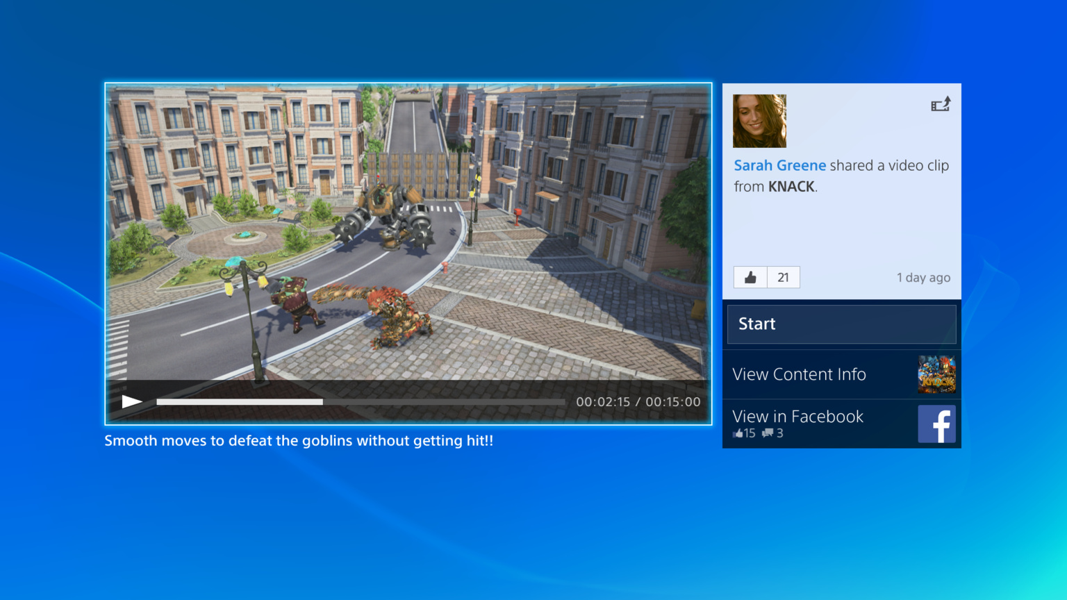
Where is my Sarah Greene?

Hahahaha, I thought the same thing.
"THAT'S NOT SARAH GREENE!"
Latvian Hitman
Member
just to be clear for other people being confused with the fake mockups
these are the real new images
Not very realistic, though. It will look more like this on your screen starting November 15th:

Not very realistic, though. It will look more like this on your screen starting November 15th:
ROFL!
The XMB is still there. These are pictures from each section of the XMB you enter.
Thank fuck, I've seen those and it's the only redeeming thing about the UI to me.
I liked the XMB, I don't need to navigate large dialogue windows with giant graphics to launch a game, listen to music, chat a friend, or access Netflix.
In the minority here - I know, but I really enjoyed having the ability to pick my wallpaper image and icon style to an overall minimalist tone when navigating the PS3.
It's sad how convoluted and shit people want user interfaces. The XMB is fucking amazing to me. I hope the PS4 one with a blend of shitty flat metro and XMB somehow works out pretty good, I hope.
From a design standpoint, it looks like a fairly amateurish attempt to ape pinterest and metro.
It also smells of mockups, so its probably a pretty long way off.
[edit] I should add, though, that I thought the PS3 UI was decent, but severely restricting. Also the PS Store UI was absolute garbage.
This is where I'm at as well.
NTIETS13A_Superiority
Banned
Are you sure it's that configurable? I thought it was either or and not selectable by user?
Yes it is configurable, but to what degree is bit of a ?. If I Remember correctly you can at least: choose to connect/bring fb profile and/to psn profile, but do not have to. Choose If only friends see your real name/avatar or everyone. I expect more options, but remember that these were at least options.
so this is the change of the main menu?
old:
new:
Personally the new one is a lot better. But that might have to do with the change in background wallpaper.
Wouldn't be surprised if it is like the PS3 and that the colour changes depending on time and date, the wave is the same, the colour has just gone from purple to blue.
We can use our own pic for our avatar? Thank you, Sony, I've already got something in mind.

As far as I know, you have two, a typical avatar that is what everyone sees that is next to your username on the profile screen, and your real name that only friends can see that also gives you the option of uploading your own picture.
makingmusic476
Member
I love how it looks. I hope they update the Vita's UI to something similar.
Bubbles are bad enough on a regular Vita, but they'd be especially terrible for Vita TV.
Bubbles are bad enough on a regular Vita, but they'd be especially terrible for Vita TV.
lazer_bean
Member
Julien Sorel sounds like a villain from Alias.
he's a protagonist in the book "The Red and the Black" by Stendhal
I don't see anything in these shots that is really anything like Metro, at least that is unless anything that is box or rectangle with a bit of text is now considered "Metro", lol. Microsoft didn't invent interfaces made up of simplistic shapes, "Metro" relies on typography more than anything else, and Sony using graphical images and effects goes pretty much against the principles of Metro in the first place.
Metro is nice and all for certain things, but not everything under the sun is now Metro or copying Metro.
Metro is nice and all for certain things, but not everything under the sun is now Metro or copying Metro.
TheRealTalker
Banned
Not very realistic, though. It will look more like this on your screen starting November 15th:
dead... poor Will
Not very realistic, though. It will look more like this on your screen starting November 15th:
If you aren't going to inlude "I fucked your sister" and change the faces then you just aren't trying dude.
It just feels a bit 'crowded' to me. And that home screen with recent games across the top, more details spilling out below, and tons of icons across the top. I guess you have to use it to get a feel for it, just seems a bit overwhelming at the moment - especially compared to the relative simplicity of the XMB
GribbleGrunger
Dreams in Digital
Are you sure it's that configurable? I thought it was either or and not selectable by user?
Yes, it's been said on numerous occasions.
as I mentioned earlier, they're fake and pretty bad ones.
I know they are mock concepts but i really really hope there's a Calendar app planned for PS4. It would be extremely useful if it's synced with official release dates of upcoming content.
TechnicPuppet
Nothing! I said nothing!
I like it, looks like the Xbox which isn't a bad thing.
Not very realistic, though. It will look more like this on your screen starting November 15th:
]
That Sarah Greene chick looks like someone I would like to know. What's life without someone opposing you?