-
Hey, guest user. Hope you're enjoying NeoGAF! Have you considered registering for an account? Come join us and add your take to the daily discourse.
You are using an out of date browser. It may not display this or other websites correctly.
You should upgrade or use an alternative browser.
You should upgrade or use an alternative browser.
Alpha from the Power Rangers reboot revealed
- Thread starter Lashley
- Start date
- Status
- Not open for further replies.
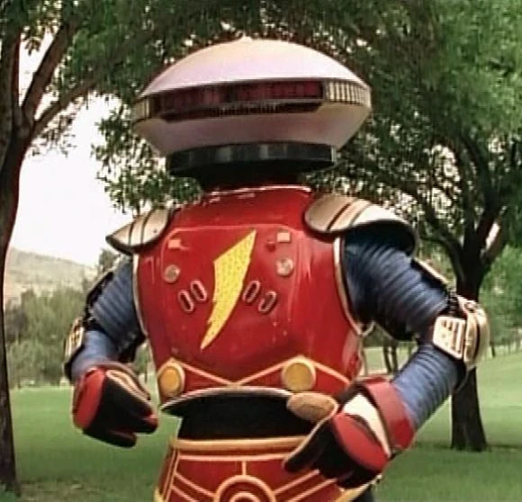
As I usually do just for fun when these designs come out, here is a version of Alpha pushed a little more toward the original:

I still haven't actually decided what I think about the movie design but I like doing these for fun.
Edit: After some more thought I've decided that really the main thing bothering me about the design is the big gut. I think it's a step too far.
I see what they're doing for with the big eyes. They sort of fit Alpha's silly personality and they probably want to try to make him, to a certain degree, dopey. Removing those eyes as I did in the photoshop above makes him look a little intimidating due to his giant cyclops glare. I'm okay with keeping the googly eyes.
The gut, though. It's another choice to make him appear dopey and silly. While the eyes accomplish this without interrupting the aesthetic, the gut just seems out of place among all the thin metal limbs and complicated alien textures. I'd be happy to see that changed to something more robotic. Right now it looks like he's about to birth an alien baby.
Beyond that I'm pretty okay with their design. After staring at both the front and back views for a while and getting a feel for how this will look in 3d, I actually think it will look a lot better in motion in the movie than you guys realize. I can already imagine those big googly eyes waving around with his silly voice. If you dont like the overall aesthetic theyre going for with this movie as a premise that's another conversation, but considering how this design fits into their current aesthetic goal, I think it's alright. Just put Alpha on a diet for a couple months.
1000x better
Red Liquorice
Member
ayy
I'm into it. You can't honestly expect them to wheel out this fucker for a big budget action movie in 2016, right?
It's not one extreme or the other. There are smart ways to redesign a character without creating a hideous, weirdly shaped abomination.
BewareTheBatsie
Member
Why couldn't they just embrace the cheesiness and just shove Bill Hader into a robot costume. Or at least CGI it to look more robotic then alien.
I'm into it. You can't honestly expect them to wheel out this fucker for a big budget action movie in 2016, right?
In the era of talking racoon and Deadpool films, these kinds of excuses for film makers deviating from the source material as much as possible in order to be successful don't work anymore.
Forsaken82
Member
In the era of talking racoon and Deadpool films, these kinds of excuses for film makers deviating from the source material as much as possible in order to be successful don't work anymore.
Holy shit... the "Source material" is over 20 years old... Things change. That's not to say this is the right change, but what the fuck man? They don't need an "excuse for deviating from the source" they SHOULD deviate from the source. This isn't 1990, and this isn't the same low budget hokey spliced together wtih random Japanese live action power rangers you remember from your youth.
Amazing how people liked the new look of Rita who looks absolutely NOTHING like she did in the show, but the second you give Alpha 5 googly eyes, WHY'D YOU RAPE MY CHILDHOOD SABAN! I really hope Zordon appears as a Fetus... just so I can see the reactions.
Huge Succeeded
Banned
That old low budget design still looks 10000x better.
not really
I mean, the new one isn't the best, but still
Holy shit... the "Source material" is over 20 years old... Things change. That's not to say this is the right change, but what the fuck man? They don't need an "excuse for deviating from the source" they SHOULD deviate from the source. This isn't 1990, and this isn't the same low budget hokey spliced together wtih random Japanese live action power rangers you remember from your youth.
Amazing how people liked the new look of Rita who looks absolutely NOTHING like she did in the show, but the second you give Alpha 5 googly eyes, WHY'D YOU RAPE MY CHILDHOOD SABAN! I really hope Zordon appears as a Fetus... just so I can see the reactions.
I think Rita looks like shit myself. Looks like an angry asparagus.
Salty Rice
Member
Alpha has a right to have eyes too.
Holy shit... the "Source material" is over 20 years old... Things change. That's not to say this is the right change, but what the fuck man? They don't need an "excuse for deviating from the source" they SHOULD deviate from the source. This isn't 1990, and this isn't the same low budget hokey spliced together wtih random Japanese live action power rangers you remember from your youth.
Amazing how people liked the new look of Rita who looks absolutely NOTHING like she did in the show, but the second you give Alpha 5 googly eyes, WHY'D YOU RAPE MY CHILDHOOD SABAN! I really hope Zordon appears as a Fetus... just so I can see the reactions.
Calm down and try selectively quoting again.
deviating from the source material as much as possible
You see "as much as possible"? Now try responding again to what I actually said, if you really feel the need to.
Holy shit... the "Source material" is over 20 years old... Things change. That's not to say this is the right change, but what the fuck man? They don't need an "excuse for deviating from the source" they SHOULD deviate from the source. This isn't 1990, and this isn't the same low budget hokey spliced together wtih random Japanese live action power rangers you remember from your youth.
Amazing how people liked the new look of Rita who looks absolutely NOTHING like she did in the show, but the second you give Alpha 5 googly eyes, WHY'D YOU RAPE MY CHILDHOOD SABAN! I really hope Zordon appears as a Fetus... just so I can see the reactions.
Didn't stop Japan from updating Goldar

SuperStiltzkin
Member
I really don't like the bio-organic scaly aesthetic of this movie. From the suits to the zord to this. Although honestly this is probably the best design weve seen from this movie so far. Just lose the eyes
kunonabi
Member
Holy shit... the "Source material" is over 20 years old... Things change. That's not to say this is the right change, but what the fuck man? They don't need an "excuse for deviating from the source" they SHOULD deviate from the source. This isn't 1990, and this isn't the same low budget hokey spliced together wtih random Japanese live action power rangers you remember from your youth.
Amazing how people liked the new look of Rita who looks absolutely NOTHING like she did in the show, but the second you give Alpha 5 googly eyes, WHY'D YOU RAPE MY CHILDHOOD SABAN! I really hope Zordon appears as a Fetus... just so I can see the reactions.
To be fair people should be dumping on the new Rita too.
To be fair people should be dumping on the new Rita too.
Many have. That costume is ugly.
Baroquemantic
Member
Lmao, what the hell. I was not expecting something that goofy looking.
Edit: oh, concept art. Still, hilarious.
Edit: oh, concept art. Still, hilarious.
MHWilliams
Member
Who are they making this for?
The Twilight/Hunger Games/Maze Runner crowd. The movie, from outright inception has been built to hit the young adult crowd. Not kids, not adults with fond nostalgia for the property.
I'm into it. You can't honestly expect them to wheel out this fucker for a big budget action movie in 2016, right?
It does look alien at least instead of some 90's shit.
And somehow they managed to make it worse.
As I usually do just for fun when these designs come out, here is a version of Alpha pushed a little more toward the original:
I still haven't actually decided what I think about the movie design but I like doing these for fun.
Edit: After some more thought I've decided that really the main thing bothering me about the design is the big gut. I think it's a step too far.
I see what they're doing for with the big eyes. They sort of fit Alpha's silly personality and they probably want to try to make him, to a certain degree, dopey. Removing those eyes as I did in the photoshop above makes him look a little intimidating due to his giant cyclops glare. I'm okay with keeping the googly eyes.
The gut, though. It's another choice to make him appear dopey and silly. While the eyes accomplish this without interrupting the aesthetic, the gut just seems out of place among all the thin metal limbs and complicated alien textures. I'd be happy to see that changed to something more robotic. Right now it looks like he's about to birth an alien baby.
Beyond that I'm pretty okay with their design. After staring at both the front and back views for a while and getting a feel for how this will look in 3d, I actually think it will look a lot better in motion in the movie than you guys realize. I can already imagine those big googly eyes waving around with his silly voice. If you dont like the overall aesthetic theyre going for with this movie as a premise that's another conversation, but considering how this design fits into their current aesthetic goal, I think it's alright. Just put Alpha on a diet for a couple months.
A little better, but still not good. The head sort of resembles a sombrero.
Is that really goldar ?Didn't stop Japan from updating Goldar
CloudyTuba
Member
Is that really goldar ?
Well, it's a powered up clone of him created by a later villain. He's called Neo-Goldar.

The villain who created him had a grudge against dino ranger teams so to fight the newer Dino Charge rangers, he recreated a couple baddies who had fought dino rangers in the past. Goldar who fought the original rangers and Zeltrax who fought the Dino Thunder rangers. Of course I'm stating this all from the perspective of the american show for ease of understanding, but this did not happen in the american show as far as I know.
The Twilight/Hunger Games/Maze Runner crowd. The movie, from outright inception has been built to hit the young adult crowd. Not kids, not adults with fond nostalgia for the property.
Bold move cotton, especially in a post divergent world.
KazenY2J
Member
Can't unsee.And somehow they managed to make it worse.
A little better, but still not good. The head sort of resembles a sombrero.
Jesus Hussein Christ...
Look, I'm not a fan of the ranger costumes, but at least you could argue that they're grounded in something.
However, this new Alpha 5 is a goddamned abomination. It's just completely bizarre, and looks nothing like the source material.
Look, I'm not a fan of the ranger costumes, but at least you could argue that they're grounded in something.
However, this new Alpha 5 is a goddamned abomination. It's just completely bizarre, and looks nothing like the source material.
MagnaderAlpha
Member
Gotta be honest, as far as artistic taste goes, I've NEVER been fond of techno-organic designs that weren't H.R. Giger. It's the same reason I don't like the new Transformers design, nor was fond of the overall art direction of Final Fantasy XIII.
Frozenprince
Banned
Who are they making this for?
That's my question.
This shit isn't pulling in the nostalgia money from Millenials/gen X'ers. And, well, ain't no god damn kids going to see this tire fire.
FireBeaver
Banned
I didn't know H.P Lovecraft was working on the Power Rangers movie.
onadesertedisland
Member
Was too old to get into Power Rangers, but holy hell that's almost worse than how they fucked up the Transformers designs.
Frozenprince
Banned
The Twilight/Hunger Games/Maze Runner crowd. The movie, from outright inception has been built to hit the young adult crowd. Not kids, not adults with fond nostalgia for the property.
But, that audience for those movies died off, just like the Twilight and "Not-Twilight" movies died like five years ago.
Hunger games ended and none of them make money anymore.
It just screams "missed the point".
I'm into it. You can't honestly expect them to wheel out this fucker for a big budget action movie in 2016, right?
Agreed. Although they could drop the headlights and I wouldn't complain.
Dunedain_Ranger
Member
Hey guys member the 90s alpha i member ..........
Frozenprince
Banned
Even if I didn't have the Sentai one as a reference point, I'd still hate that design. It's way too busy, the eyes serve no purpose other than to just make it look "weird", it's gonna be like 3 ft tall and I'm sure it's gonna waddle because the only way these kinds of design sell comedy is through physical comedy.
It's just a lazy design.
It's just a lazy design.
Even if I didn't have the Sentai one as a reference point, I'd still hate that design. It's way too busy, the eyes serve no purpose other than to just make it look "weird", it's gonna be like 3 ft tall and I'm sure it's gonna waddle because the only way these kinds of design sell comedy is through physical comedy.
It's just a lazy design.
Alpha is never in the Sentai; it was created 100% for Power Rangers.
Even if I didn't have the Sentai one as a reference point, I'd still hate that design. It's way too busy, the eyes serve no purpose other than to just make it look "weird", it's gonna be like 3 ft tall and I'm sure it's gonna waddle because the only way these kinds of design sell comedy is through physical comedy.
It's just a lazy design.
just because you are built weird doesn't mean you can't move
https://www.youtube.com/watch?v=JhQzBhsGv5I
ginger ninja
Banned
Isn't Bryan Cranston in this ? Hope to God they don't make him look like a clown. Have a feeling he will be the only saving grace of this movie, like Godzilla.
GuitarAtomik
Member
Its bonkers. I love it.
Isn't Bryan Cranston in this ? Hope to God they don't make him look like a clown. Have a feeling he will be the only saving grace of this movie, like Godzilla.
He's Zordon.
We have no idea what Zordon will look like.
NightShift
Member
Speechless.
But blueHe's Zordon.
We have no idea what Zordon will look like.

Man. I gave the wack suits a pass because it's Hollywood. But what the hell man. Why is Alpha all organic and shit? He's supposed to be a robot.

Can they just get someone else to do the designing please? Did they watch the show at all? He's more C3PO than ET. He looks like he hangs out with Daft Punk.
Yeah. The eyes have got to go. At the most he should project some 3D shit in front of him and that's it. Other than that the design isn't too bad, but like the suits it's kinda bland.
But we haven't seen the zords yet right? Maybe it'll make sense. Lets give it more time. Still cautiously stoked.
Can they just get someone else to do the designing please? Did they watch the show at all? He's more C3PO than ET. He looks like he hangs out with Daft Punk.
Even if I didn't have the Sentai one as a reference point, I'd still hate that design. It's way too busy, the eyes serve no purpose other than to just make it look "weird", it's gonna be like 3 ft tall and I'm sure it's gonna waddle because the only way these kinds of design sell comedy is through physical comedy.
It's just a lazy design.
Yeah. The eyes have got to go. At the most he should project some 3D shit in front of him and that's it. Other than that the design isn't too bad, but like the suits it's kinda bland.
But we haven't seen the zords yet right? Maybe it'll make sense. Lets give it more time. Still cautiously stoked.
MHWilliams
Member
Bold move cotton, especially in a post divergent world.
But, that audience for those movies died off, just like the Twilight and "Not-Twilight" movies died like five years ago.
Hunger games ended and none of them make money anymore.
It just screams "missed the point".
I don't necessarily disagree, but yeah, that's their aim.
The director is Dean Israelite, the dude guy behind Project Almanac, which was pretty much Chronicle adjacent. Executive producer is Allison Shearmur, who executive produced the last three Hunger Games films.
From the very first press release:
"Lionsgate is the perfect home for elevating our Power Rangers brand to the next level," said Saban. "They have the vision, marketing prowess and incredible track record in launching breakthrough hits from The Hunger Games to Twilight and Divergent. In partnership with the Lionsgate team, we're confident that we will capture the world of the Power Rangers and translate it into a unique and memorable motion picture phenomenon with a legacy all its own."
What this movie was has been clear from the beginning if you looked hard enough.
- Status
- Not open for further replies.