RoboGeorgeForeman
Banned
spreeendaz said:

Fuck this blue and orange shit!! How long has Squirtle been part squirrel!?!?!? I always assumed it was just part of the whole weird Pokemon naming convention.
spreeendaz said:
Shit! Double mindfuck!RoboGeorgeForeman said:Fuck this blue and orange shit!! How long has Squirtle been part squirrel!?!?!? I always assumed it was just part of the whole weird Pokemon naming convention.

OnPoint said:
The text! Sorta...
TheNiX said:The guy on the left looks like he'd punch you in the dick and then chop you in the neck. Or the other way around.
Jet Grind Radio! said:Basic color theory. Complementary colors.
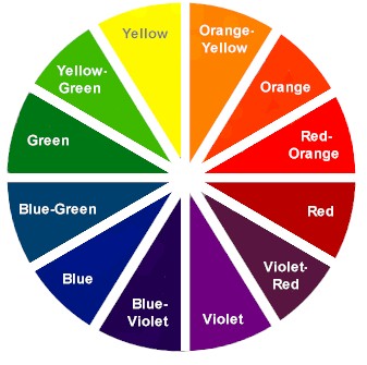
mac said:Yep. Colors from opposite sides of a color wheel just look good together.
In recent years there may have been an upswing of blue/orange but that would be the fault of orange. It was a popular color for corporations to use in the early 00's. Companies such as Ananova, Home Depot and even Burger King swapped it's template.
Squirtle = Squirt + TurtleRoboGeorgeForeman said:Fuck this blue and orange shit!! How long has Squirtle been part squirrel!?!?!? I always assumed it was just part of the whole weird Pokemon naming convention.
I gather that Purple and Green not being complimentary colors has something to do with it.Ether_Snake said:Green looks ugly with purple, nice with yellow.
Color theory FAILS.
Skittleguy said:

Ether_Snake said:Green looks ugly with purple, nice with yellow.
Color theory FAILS.
Ever notice that in the supermarket they match the meats (beef) with a green frilly border? Hmmm.mac said:Yep. Colors from opposite sides of a color wheel just look good together.
In recent years there may have been an upswing of blue/orange but that would be the fault of orange. It was a popular color for corporations to use in the early 00's. Companies such as Ananova, Home Depot and even Burger King swapped it's template.
Slayer-33 said:my youtube chan is red+green for a reason :lol

BlueTsunami said:Yellow/Violet needs to be rocked more. I've always liked the color yellow when its not used as some pussified passive color.
Ether_Snake said:Green looks ugly with purple, nice with yellow.
Color theory FAILS.

Save us from this tyranny DinoGAF! I CAN'T TAKE THE CONTRAST ANYMORE, ONLY YOU CAN STOP THIS PHENOMENON!MrHicks said:
NOOOOOOOOOOOOOOOOOO
Ether_Snake said:Green looks ugly with purple, nice with yellow.
Color theory FAILS.
mac said:Yep. Colors from opposite sides of a color wheel just look good together.
In recent years there may have been an upswing of blue/orange but that would be the fault of orange. It was a popular color for corporations to use in the early 00's. Companies such as Ananova, Home Depot and even Burger King swapped it's template.

layzie1989 said:warm/cool split, DAMN YOU TO HELL!!!
Roi said:Really GAF? They already knew this in the 16th century..
Basic lesson on painting in art school.

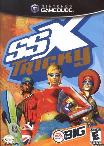
It's tricky! It's tricky!Stormwatch said:
Youtube channel maybe?mac said:I'm getting old. I don't even know what a Youtube Chan is.