-
Hey, guest user. Hope you're enjoying NeoGAF! Have you considered registering for an account? Come join us and add your take to the daily discourse.
You are using an out of date browser. It may not display this or other websites correctly.
You should upgrade or use an alternative browser.
You should upgrade or use an alternative browser.
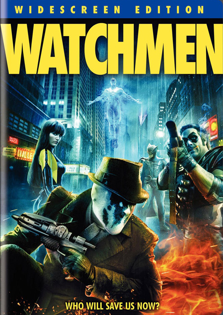
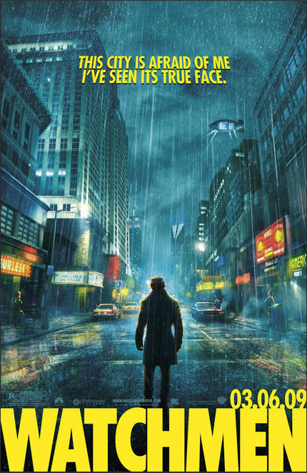
can't unsee the orange/blue movie posters!!!
- Thread starter TheDoppelganger
- Start date
- Status
- Not open for further replies.
Ignatz Mouse
Banned
LoneWolf296 said:^^^ Goku is seriously the epitome of this thread in one character

Hi GAF I'm here to ruin your lives some more:
http://www.youtube.com/watch?v=t87QKdOJNv8
Now, turn back and look at all the movie posters & covers you can find, after watching this.
http://www.youtube.com/watch?v=t87QKdOJNv8
Now, turn back and look at all the movie posters & covers you can find, after watching this.
Tony Rocky Horror
Member
Awww.. come on. Stop it!Osaka said:Hi GAF I'm here to ruin your lives some more:
http://www.youtube.com/watch?v=t87QKdOJNv8
Now, turn back and look at all the movie posters & covers you can find, after watching this.
:lol
Osaka said:Hi GAF I'm here to ruin your lives some more:
http://www.youtube.com/watch?v=t87QKdOJNv8
Now, turn back and look at all the movie posters & covers you can find, after watching this.
Wow, this is really intrigueing.
duracell017
Member
Osaka said:Hi GAF I'm here to ruin your lives some more:
http://www.youtube.com/watch?v=t87QKdOJNv8
Now, turn back and look at all the movie posters & covers you can find, after watching this.
If not that font it will be Bank Gothic Font used in Sci-Fi Movies.
Scythian Empire
Member
Oh god, make it stop.
FUCK! FUCK! FUCK!

FUCK! FUCK! FUCK!
Escape Goat
Member
Its amazing how the concept of contrasting colors has blown so many m inds
MMaRsu
Banned
LoganKnight4949
Member
Yep. Even back in the day.


fistfulofmetal
Banned
Teh Hamburglar said:Its amazing how the concept of contrasting colors has blown so many m inds

*mind blown*
Scythian Empire
Member
Snytbaggen
Member
Mind blown again :lolOsaka said:Hi GAF I'm here to ruin your lives some more:
http://www.youtube.com/watch?v=t87QKdOJNv8
Now, turn back and look at all the movie posters & covers you can find, after watching this.
Osaka said:Hi GAF I'm here to ruin your lives some more:
http://www.youtube.com/watch?v=t87QKdOJNv8
Now, turn back and look at all the movie posters & covers you can find, after watching this.

layzie1989
Member
Osaka said:Hi GAF I'm here to ruin your lives some more:
http://www.youtube.com/watch?v=t87QKdOJNv8
Now, turn back and look at all the movie posters & covers you can find, after watching this.
This makes me laugh since i used Trajan as a font in a book i designed, purely coincidentally :lol
layzie1989
Member

FFFFUUUUUUUUUU
Medalion said:
Good example of purple and yellow actually. My second favorite complimentary colors.
Ether_Snake
å®å®å®å®å®å®å®å®å®å®å®å®å®å®å®
That Coraline poster rules for actually contrasting purple and blue, which is extremely uncommon and, at least for me, immediately jumps out as not being a typical movie poster or maybe not even a movie poster at all until you look at it closely.
The Babylon Vin Diesel poster somewhere earlier in this thread represents the exact opposite of this.
fake edit: Actually, check out the posters for nearly every film Tim Burton either produced or directed for awesome posters that do not rely on the Orange/Blue contrast.
The Babylon Vin Diesel poster somewhere earlier in this thread represents the exact opposite of this.
fake edit: Actually, check out the posters for nearly every film Tim Burton either produced or directed for awesome posters that do not rely on the Orange/Blue contrast.
Ignatz Mouse
Banned
Apparently, both red = orange and yellow = orange, according to examples here.
Lots of good examples being drowned out by the lame ones.
Lots of good examples being drowned out by the lame ones.
SpeedingUptoStop
will totally Facebook friend you! *giggle* *LOL*
My god, that cover art is so bad.:lol :lolEther_Snake said:
EmCeeGramr
Member
seriously gaf
They're colors that go well together and the combination occurs all the time in real life. Half of these are just pictures of orange dirt with a blue sky, or something called a freaking sunset. You know, that thing that happens every night and has been used in art for thousands of years?
I expected something more mindblowing, like when you first realized that every comedy movie in the last 10 years has used BIG RED TEXT.
ShallNoiseUpon
Member
You people claiming Color Theory have no proof that these colors are ACTUALLY complimentary. It is just a theory.
:lol
Like evolution
Houston3000
Member
Complementary Colors are everywhere...

The overall saturation levels, contrast, brightness/darkness, etc.. play a role in subduing the obviousness of it sometimes but it's common. Coraline is using a lot of Split Complementary colors in the poster, that's why it's rather unique.

The overall saturation levels, contrast, brightness/darkness, etc.. play a role in subduing the obviousness of it sometimes but it's common. Coraline is using a lot of Split Complementary colors in the poster, that's why it's rather unique.
BlueTsunami
there is joy in sucking dick
Houston3000 said:The overall saturation levels, contrast, brightness/darkness, etc.. play a role in subduing the obviousness of it sometimes but it's common. Coraline is using a lot of Split Complementary colors in the poster, that's why it's rather unique.
I was going to post about the Coraline one. I love how its split and is tied together by the orange title. Just cool attention to detail, just like the movie.
Ignis Fatuus
Banned
The Take Out Bandit
Member
ALaz502 said:Yep. Even back in the day.

Back in the day?

Are you dense, retarded, or just born in the 80's? </GODDAMNBATMAN>
Ignis Fatuus said:
Okay well, that has nothing to do with anything presented in this thread, but FUCK if I don't want that as my wallpaper right now.
Nose Master
Member
Gaf really needs an emoticon with a nose being in the air, cause, half the thread could just be that picture.
now THAT is a movie poster.The Take Out Bandit said:
BAD ASS
no need to be a dick about itThe Take Out Bandit said:Are you dense, retarded, or just born in the 80's? </GODDAMNBATMAN>
RevenantKioku
PEINS PEINS PEINS PEINS PEINS PEINS PEINS PEINS PEINS PEINS PEINS PEINS oh god i am drowning in them
OH LORD HOW I NOW REGRET MOCKING THE COLOR SCIENTISTS IN COLLEGE.
dragonlife
Member
Goddamn it.
- Status
- Not open for further replies.


