So I decided to have a mess about with my own concept...
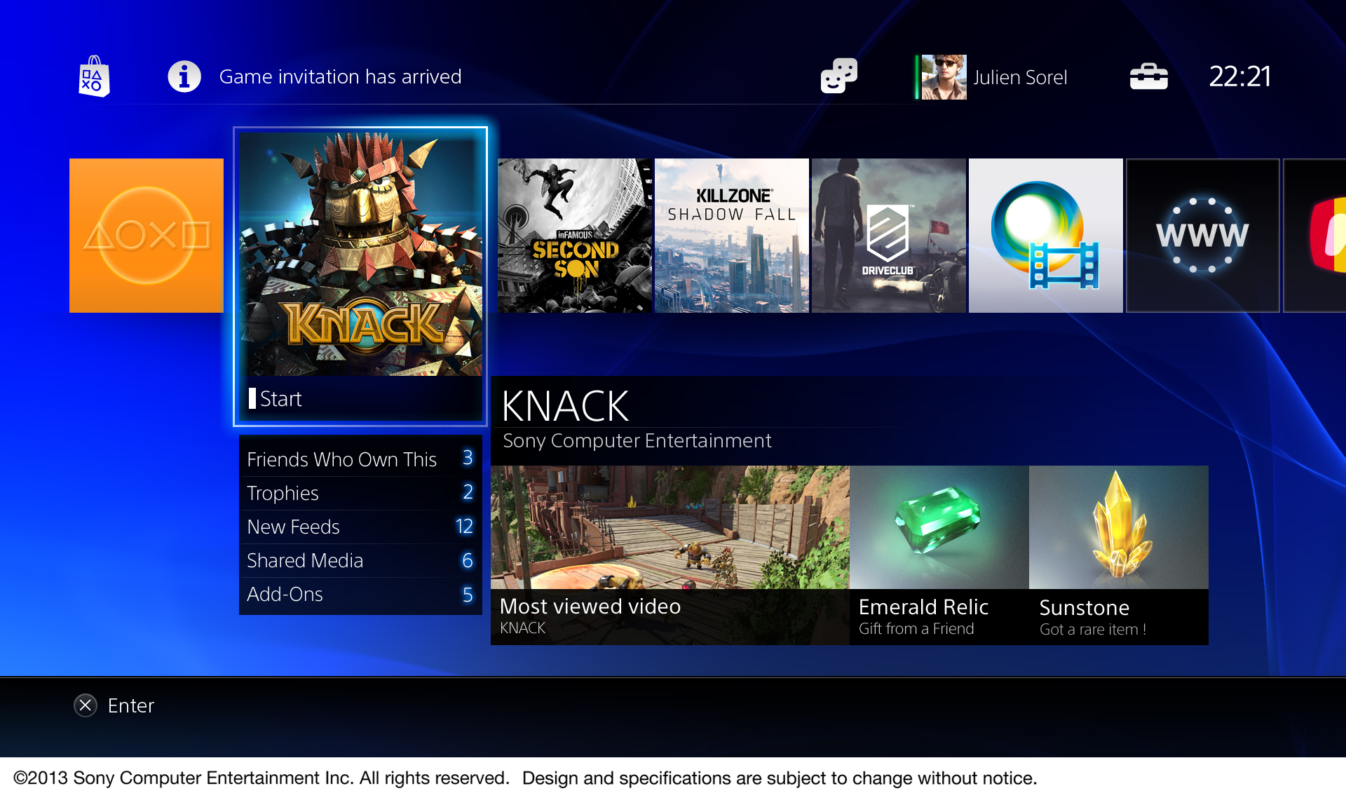
The Home screen.
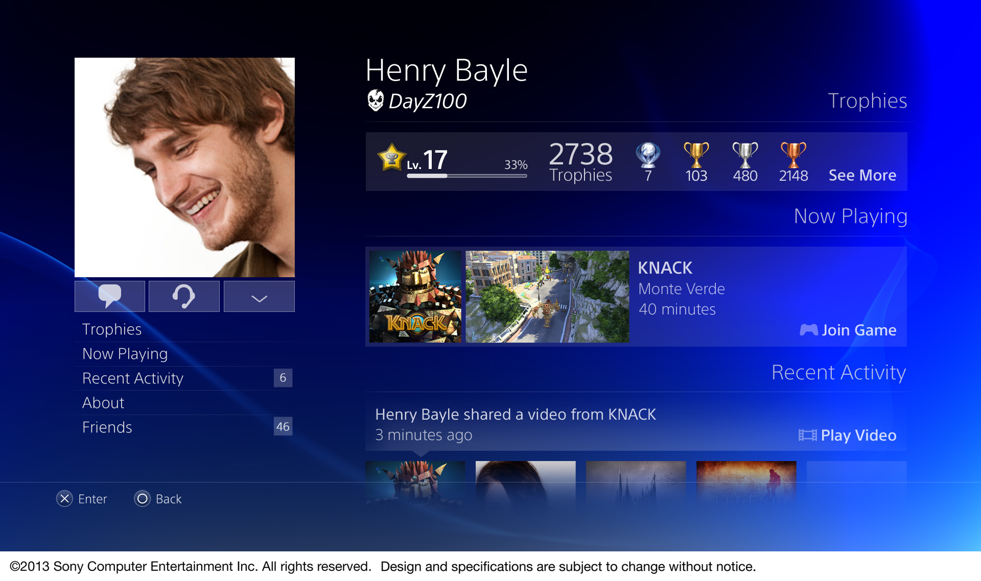
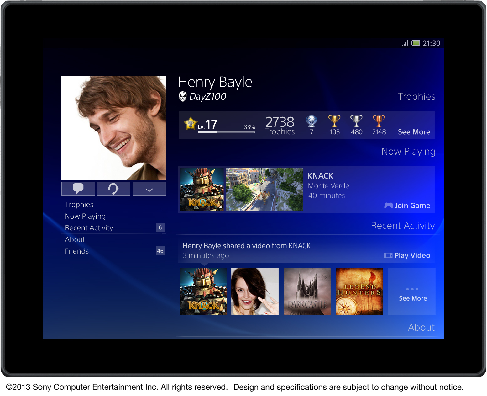
Everything available in one of the dynamic panes at a glance. Have Trophies update on the fly in the background and instantly viewable, even without clicking through. Games, music, photos and share all showing the last played/uploaded media. As well as showing who's online at a glance and the latest Store offers as it updates in real time. Your profile at the top takes you to your account where you customise and access your information as well as send/receive messages.
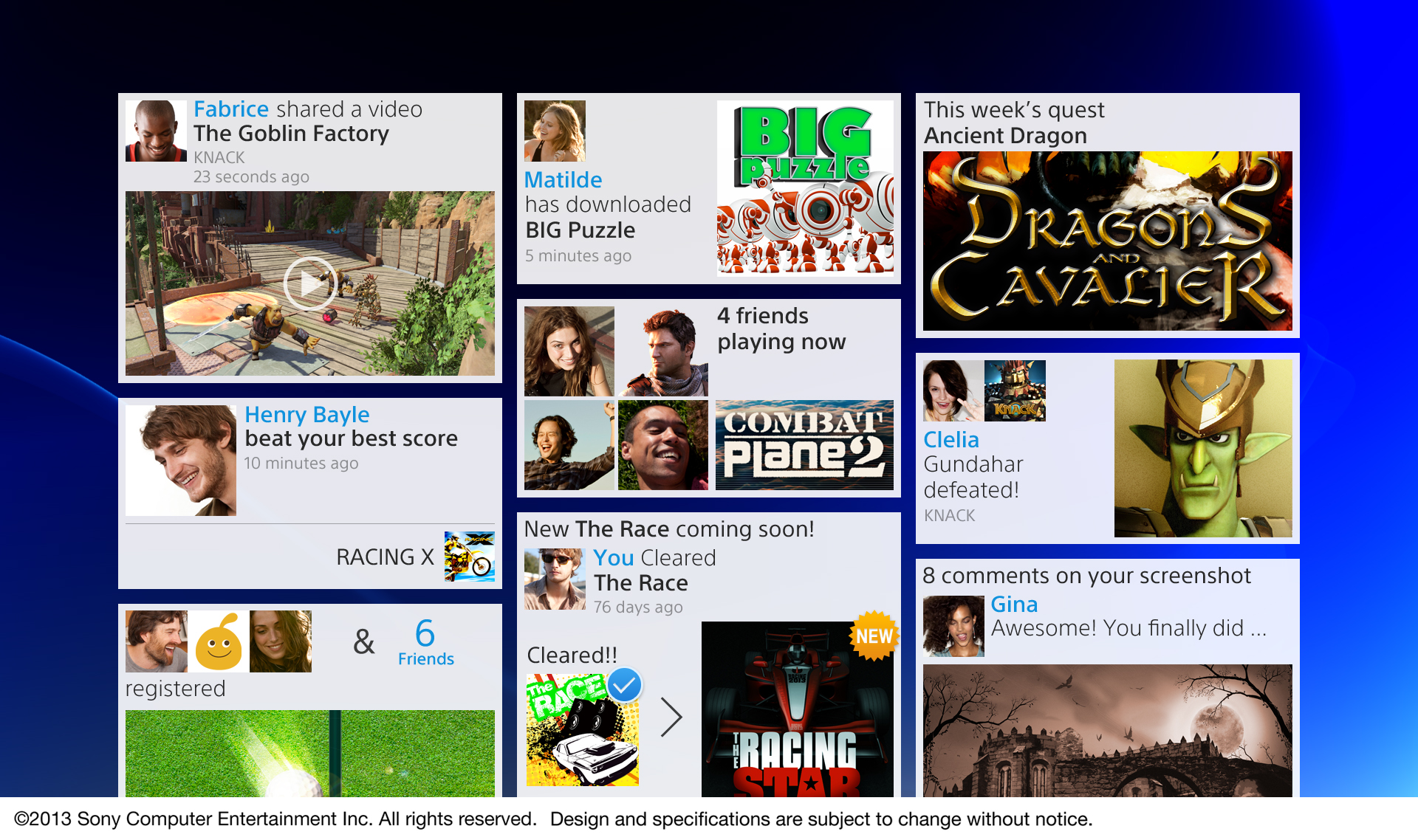
Your News Feed.
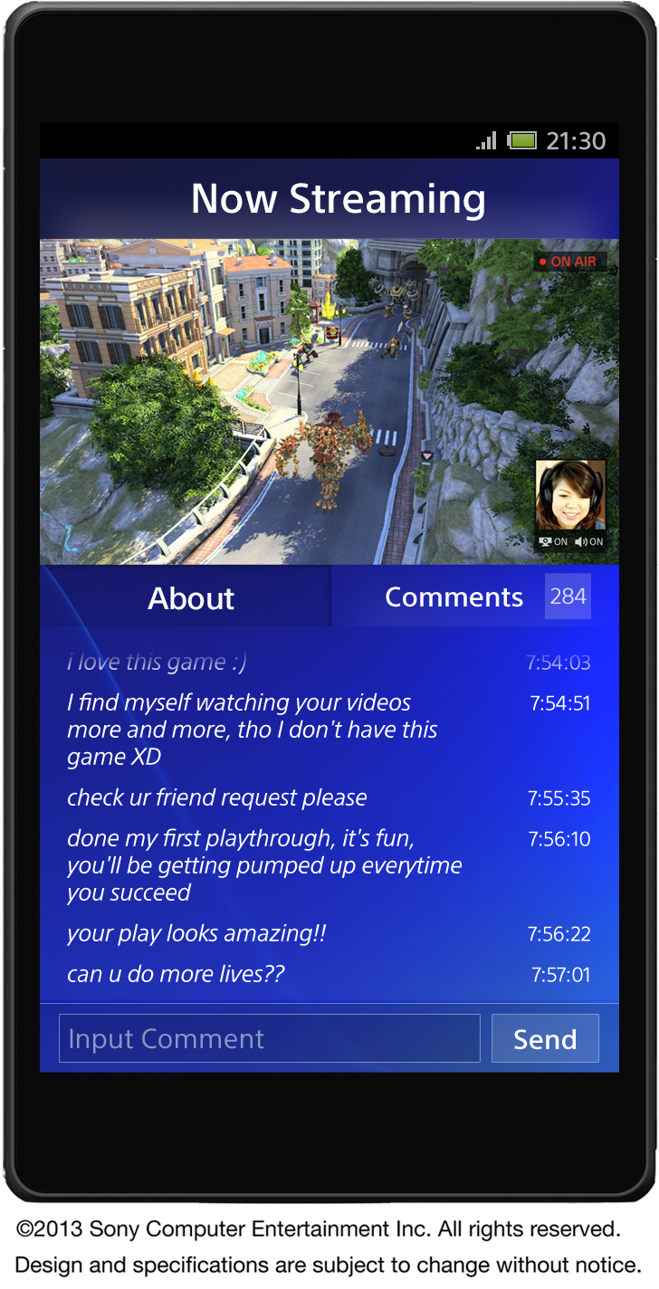
Basically where all your notifications go, so you don't miss a trick. Short press the PS button and it takes you here. The shortcuts will either take you straight to the game or to where ever the action is happening. Can also be accessed in-game, where the web browser may be brought up.
The Games tab.
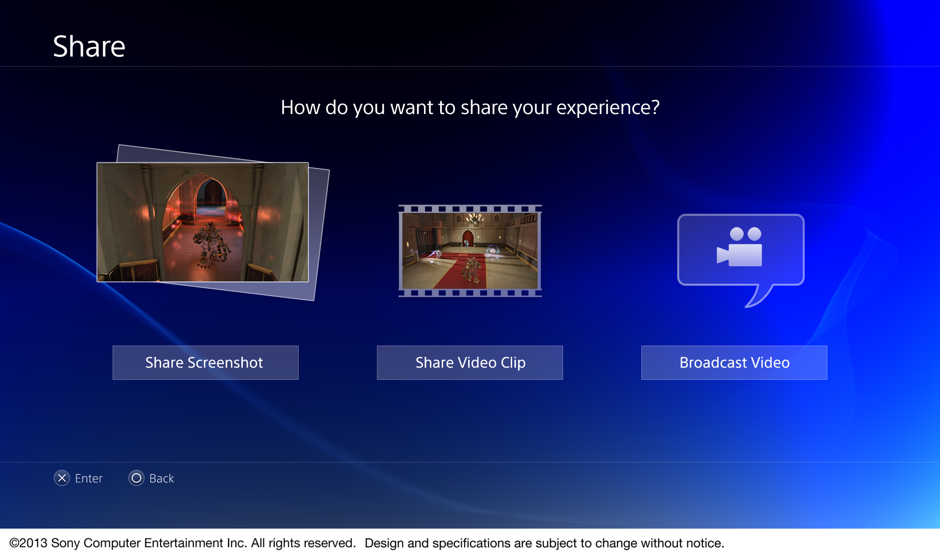
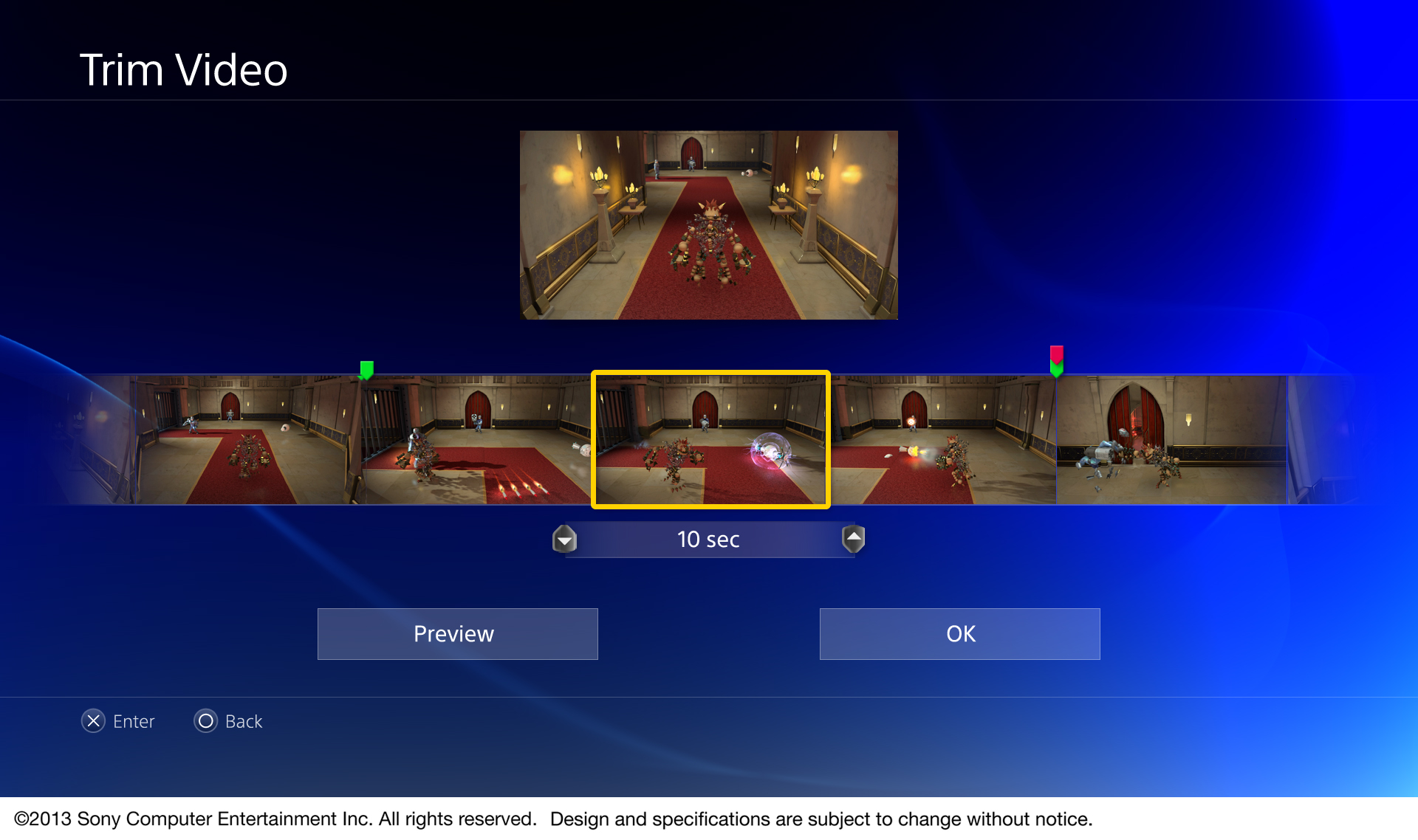
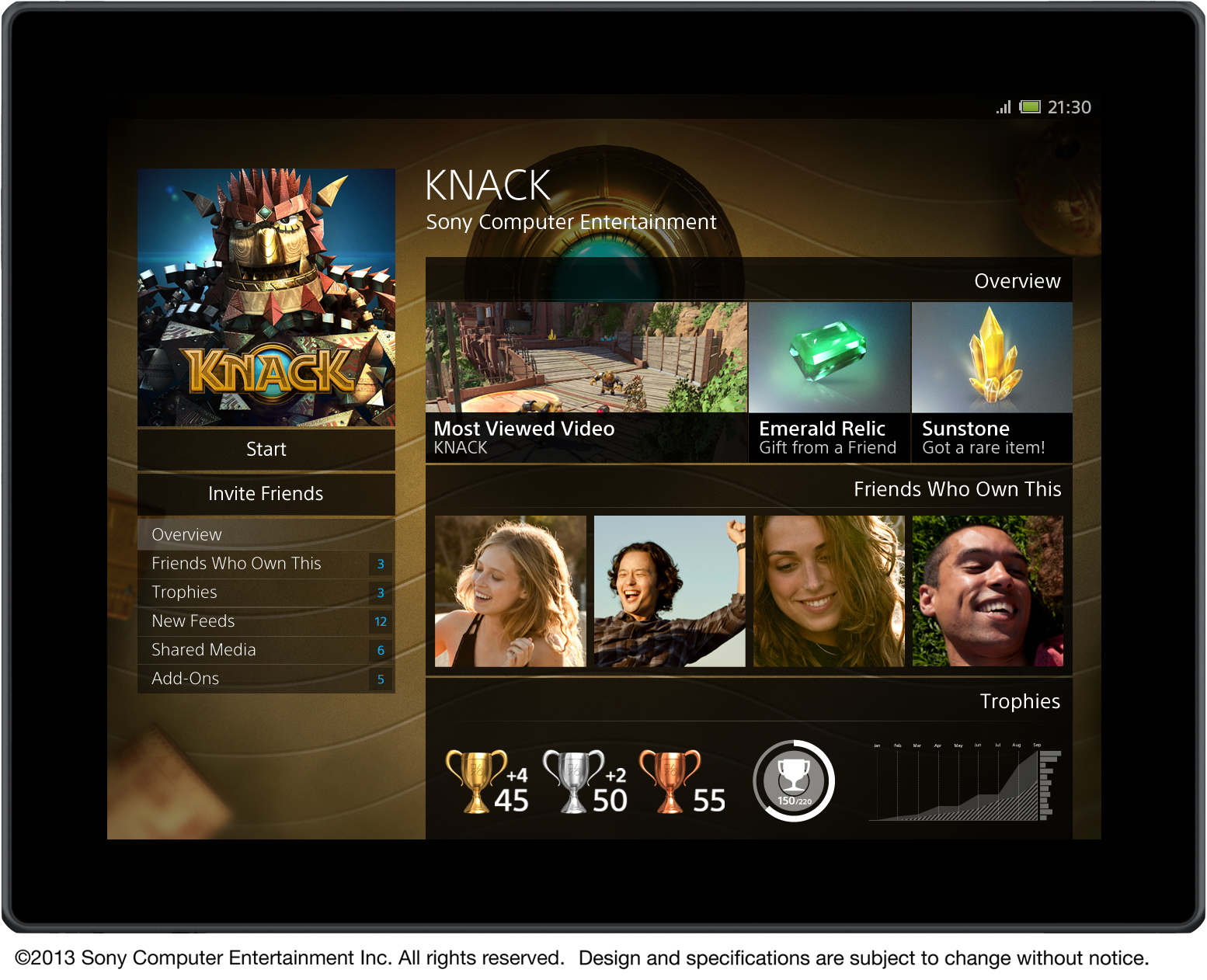
Where all your downloaded games will go and can be sorted into folders. Will also show your last played game as the main focus where, if available, you can resume and jump straight back into it. Provides basic information such as game progress as well as Trophies and people playing, all at a glance. Shows if you have Shared content as well as the newest Store content/updates for your games. Also whether it's a downloaded game or Blu-ray disc. You can also rate your games and see your friends' ratings for their games.
The Photo and TV/Video tab.
The place where all your media is located including the Music tab, your media can again all be put into special folders. Also shows any services such as Play Memories and Netflix where you can go in and watch your favourite content.