RedAssedApe
Banned
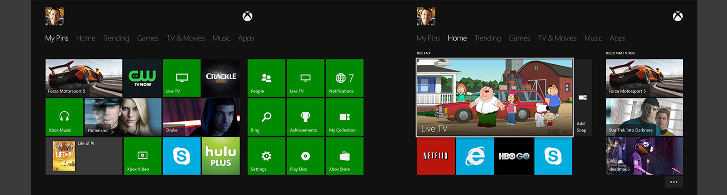
My Xbone is going to start looking like my Windows desktop with all the unorganized pins 
MS owns Skype, so probably won't see it on the PS4 - just a guess. Besides, you people are bitching about avatars, Skype will show the REAL you.
I can just see the insecure combing their hair before sitting down in front of the Kinect...
It's better to showcase some of this social info because some of us care what our friends are doing.That image looks like a clusterfuck to me, shit is all over the place.
Same goes with the friends feedback page or whatever, I totally dislike how messy it looks.
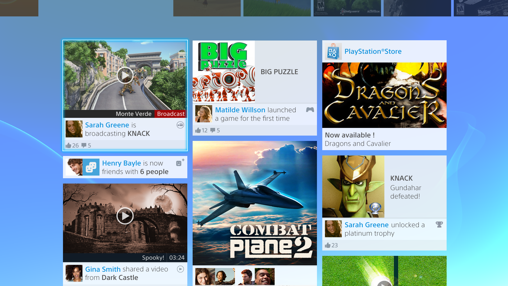
Seriously now. I know it's marketing and what not but this makes me gag. Does Sony really think gamers look like that?
Does Sony really think gamers look like that?

Wait, is that pins-tab real? And we're complaining about PS4 showing too much?My Xbone is going to start looking like my Windows desktop with all the unorganized pins
Yup. Still ugly.

My friends list is going to look just like that!
Seriously now. I know it's marketing and what not but this makes me gag. Does Sony really think gamers look like that?
S¡mon;72437041 said:Wait, is that pins-tab real? And we're complaining about PS4 showing too much?
Because they aren't customisable at all.S¡mon;72437041 said:Wait, is that pins-tab real? And we're complaining about PS4 showing too much?
My friends list is going to look just like that!
Seriously now. I know it's marketing and what not but this makes me gag. Does Sony really think gamers look like that?
As a graphic designer, who does a lot of UI work, that motherfucking blue is simply WRONG.
Reminds me of my old MP3 player.
My friends list is going to look just like that!
Seriously now. I know it's marketing and what not but this makes me gag. Does Sony really think gamers look like that?
In that it has a similar blue background to what the PS3, PSP, Vita, and now the PS4 have?
It's all those freaking boxes. Why is throwing a grid of icons all over the screen now considered good design?
It's all those freaking boxes. Why is throwing a grid of icons all over the screen now considered good design?
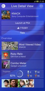
Correct me if I'm wrong, but does that "Launch at PS4" along the top mean I can turn on my PS4 and launch a game using my phone/tablet? Not that I can see any real use for that, but it's cool nonetheless.
XBox One

PS4

They are both essentially the same... boxes on a black or blue background
Correct me if I'm wrong, but does that "Launch at PS4" along the top mean I can turn on my PS4 and launch a game using my phone/tablet? Not that I can see any real use for that, but it's cool nonetheless.
This is atrocious. What is the appeal of giant tiles? I. don't. get. it.
This is atrocious. What is the appeal of giant tiles? I. don't. get. it.
Google+


New Facebook

All I'm saying is that you can't like one and hate the other - they are too similar. Now, having a preference is fine, but hate? Just shows you to be a biased fanboy
Bloody hell, in the other Sony can't design OS's thread practically everyone hates the XMB and everything it stood for, now everyone prefers it over this new OS. I for one prefer the xbone OS design.
It's a social feed, so just like facebook. Each update can be different shapes and sizes depending on the format and content.This mismash of tile sizes is horrible. Same garbage as the new PSN store.
Looks terrible and difficult to navigate.
I just don't get what all the hullabaloo is about anyway. I know the PS4 (and I assume the Xbone) has that "instant on" feature, where you pick up right where you left off at the tap of a button. So how often are you looking at this screen anyway?All I'm saying is that you can't like one and hate the other - they are too similar. Now, having a preference is fine, but hate? Just shows you to be a biased fanboy
Comparison with similar backgrounds. PS4 all the way.
I just don't get what all the hullabaloo is about anyway. I know the PS4 (and I assume the Xbone) has that "instant on" feature, where you pick up right where you left off at the tap of a button. So how often are you looking at this screen anyway?
Just because you are ugly, don't assume the rest of us are.
What is everyone's opinion of what a UI should look like?