BoZhangles
Member
Fatghost said:Besides, Zangief is a loyal Communist party member. Remember how he dances with Gorbechov?
Best
ending
ever
Fatghost said:Besides, Zangief is a loyal Communist party member. Remember how he dances with Gorbechov?
GrayFoxPL said:The select screen is a crime! I agree that Revival's art hadoukens it's saggy balls.
Here, I bastardized it even more.

I know. I'm childish and crappy at any gfx editor. But come on. It was bad to begin with.

BitchTits said:Yeah, the first thing I looked for was how Cammy and Chun-Li looked, and from what I can tell, they look terrible
On the upside, Zangief's portrait looks great, and most of the others are fine too.
Splatt said:You people will never be satisfied :lol
With that said, i'd love to see SFIIHD being made by some of the Udon poopers here.
mr_nothin said:I don't get GAF sometimes...
This is an OFFICIAL THREAD, for a game that's...
NOT A WEEK away, but it's...
STILL OPEN
Someone explain to me
haunts said:Nice shadows...
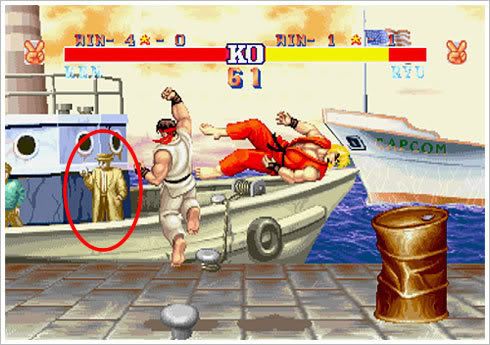
Where did Q go though????
Yeah I was sad to see him go.RyanDG said:IIRC Q's not in the background of Ken's stage in the arcade version of Super Turbo.
Hcoregamer00 said:Why is Cammy so flat in these pictures.
:lol
Now this is more like it.haunts said:
Rottweiler said:Yeah I'd love to see ythe same morons who claim the art is bad to make one themselves. So far none of the guys who posted art in this thread, have done a better job than Udon..
Sapiens said:That's a really moronic argument, if you really think about it.
Should Roger Ebert be required to make a better movie than Deuce Bigalow 2 just because he gave it a bad review.
Rob Schneider actually called Ebert out in a way, and Ebert pretty much destroyed him.
I'm pretty sure you realized how stupid your argument was a a moment after you posted it, right? Because we all know you're really not that dumb.
knee said:Thread Title change! Isn't it just 'Street Fighter HD' now?
Also, the screenshot above looks like a mockup-- look closely at the corners of the dock. Notice how the dock ends on BOTH sides of the image? I won't take it for a real screenshot yet.
Never heard that before...I think it was the pinnacle of Street Fighter 2Pterion said:I wish it was based on Super SF 2, and not Super SF 2 turbo. The latter game was the beginning of the decline in SF games imo. Characters seemed ''floaty and lighter and runnier'' all of a sudden. Argh. *sighs*
carlos said:I was watching those tutorial videos mentioned a few posts back, and it seemed everything could be linked into a combo; Turbo let you have 2in1's and maybe a bit more, but not to the extent of Super.
As for reversals, I meant escaping from throws with 1/2 damage, which was new to Super.
Not to mention the bunch of other techniques in those videos ( that piano thing mentioned, the attack to break lower guard. etc )
I'm sure it made the game better for tournaments and for many SF2 fans, but the cat and mouse/rock paper scissors/ yet simple gameplay of Turbo is better, IMHO.
ThatCrazyGuy said:The man with the grey beard rocks. I bet he owns the boat.
Wouldn't you? ...wooden shoe?haunts said:I bet he makes pornos on the boat too.
ShinAmano said:Wouldn't you? ...wooden shoe?
GrayFoxPL said:I'm a big fan of "The Flaming Man" in SF2 and I don't know. The new version seems "off" somehow. Maybe it's the colors maybe the outlines, but I noticed it in the videos that something in it doesn't look 'right'.
There could be big money in thatThatCrazyGuy said:I know I would. And host fights. Fights and porn.
knee said:Thread Title change! Isn't it just 'Street Fighter HD' now?
Also, the screenshot above looks like a mockup-- look closely at the corners of the dock. Notice how the dock ends on BOTH sides of the image? I won't take it for a real screenshot yet.
GrayFoxPL said:The select screen is a crime! I agree that Revival's art hadoukens it's saggy balls.
Here, I bastardized it even more.
I know. I'm childish and crappy at any gfx editor. But come on. It was bad to begin with.
I'm a big fan of "The Flaming Man" in SF2 and I don't know. The new version seems "off" somehow. Maybe it's the colors maybe the outlines, but I noticed it in the videos that something in it doesn't look 'right'.
Other then that. I can't wait for it! This and SF4 will be awesome shit. It's like "Sentimetal: The return of fighting games!"
Jim said:Everyone's just getting too lazy to type out SSFIIHDR.
And also, if you watch the videos of the game in action (like here), the floors are pretty messed up at the moment. They appear to be flat polygonal surfaces that clip off like that on the edge of the screen, just like the pic. So it's not a mock... just incomplete.
_dementia said:
Xav said:

That's in my opinion how Ryu & Ken should look like.

Are you blind? They obviously are not.shagg_187 said:You call yourself a SF fan, yet you don't know that these are exact traces of original character screen, with slight touches to make em all HD and shit.
CurseoftheGods said:
Rottweiler said:Yeah I'd love to see ythe same morons who claim the art is bad to make one themselves. So far none of the guys who posted art in this thread, have done a better job than Udon..
ezekial45 said:Did anyone else notice that 'Q' was removed from background? :lol
shagg_187 said:You call yourself a SF fan, yet you don't know that these are exact traces of original character screen, with slight touches to make em all HD and shit. And even then, these aren't final shots and doesn't resemble the final game..
Please....
No the clit is real the female orgasm is the mystery..._leech_ said:That's a myth, that's not Q.
It'd be cool if it was.