Shao Kahn Brewing a Stew
Banned
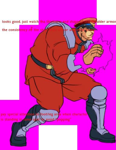
Holy shit Sagat looks great!
Now if only they fix his neck :/
Now if only they fix his neck :/
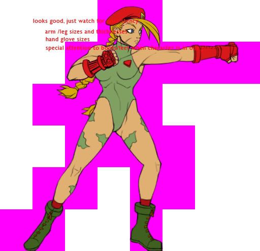
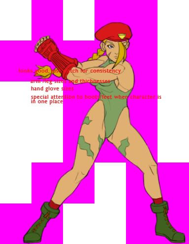
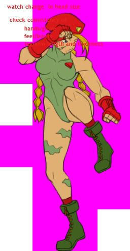
It is me, or is Blanka's foot on backwards? Looks like his biggest toe is on the outside, and that the toes rake from right to left rather than from left to right.OatmealMu said:Blanka:

OatmealMu said:There's definitely some weirdness going on in a few of the drawings, Dhalsim, in particular.
Here's the archive
pass: Dali_needs_to_learn_to_have_some_fucking_patience

OatmealMu said:There's definitely some weirdness going on in a few of the drawings, Dhalsim, in particular.
Here's the archive
pass: Dali_needs_to_learn_to_have_some_fucking_patience
Description: Dali is an ungrateful bastard
Darkpen said:are the pink supposed to represent collision boxes or are they just there for transparency? D:


joaomgcd said:The layer in the PSDs is called "Tile boundaries", so it may be the collision boxes.
Darkpen said:are the pink supposed to represent collision boxes or are they just there for transparency? D:
Don't give me that shit.PBMax said:Am I the only one who thinks the original sprites looked much better?
OatmealMu said:There's definitely some weirdness going on in a few of the drawings, Dhalsim, in particular. Here's the archive[/URL][/U]
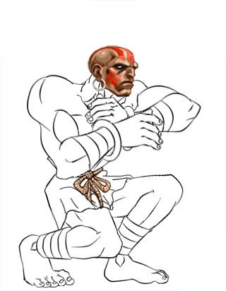
shagg_187 said:AHH WTF IS UP WITH HIS NAILS!
PBMax said:Am I the only one who thinks the original sprites looked much better?
spoon! said:Yes, you're the first person in this entire thread to complain about the sprites. Thank you for bringing this point up for all of us to consider.

Propagandhim said:Remember when Capcom said they were supposed to have a direct-feed video of this but their "equipment" screwed up or something. I just think it's really unfortunate that Capcom has to order custom-built parts from Antarctica. They must've spent at least a week looking for Ostrich blood to power their magic electro machine to build a transfer cable. Oh wait, they're a bunch of fucking LIARS.
PBMax said:Am I the only one who thinks the original sprites looked much better?

galactus_eat_world said:Damn, looks like i am to late to download the archive. Would any one mind to PM me a link to the archive
You don't deserve to play this game.rance said:Any more than 800 would be too much to be honest.
camineet said:oh shit! LOL :lol that win face!
:lol :lol :lol :lol

:lol :lolMicVlaD said:
Geezer said:You don't deserve to play this game.
rance said:Aww
In all seriousness, it's basically just a re-skin isn't it? $10 sounds just fine for that.
Icarus said:If you think it's just a reskin, you haven't been reading this thread for long have you? Think of what the costs on this thing must be. 2D art is expensive (more so than 3D these days).
MicVlaD said:
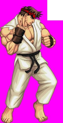
rance said:But Ryu looks so damn happy! That's cheering me right the fuck up.
bigben85 said:as a 2d animator, some of this animation is a little jumpy for me...some of the details/forms aren't transitioned very well between frames...
TAJ said:3fps animation is jumpy? I'm shocked.
bigben85 said:read what I said.
even if it is just KEY frames, it still be consistent and not so jumpy...if you have not studied 2D animation..shut up. I have.
TAJ said:They have to match the hit boxes from the original game. At best, the animation can only be as smooth as the original's. What, you didn't read the thread? Yeah, STFU.
They've added a rebalanced version of the game, which is pretty damn intriguing.rance said:Nope, haven't been reading the thread until recently actually. Are they adding new stuff other than the obvious facelift?
Though telling me how development is expensive isn't really going to convince me that it's worth more than $10 really. I'm sure the PoP XBLA game was expensive to update as well but that was still priced at a nice 800 points.
Icarus said:2D art is expensive (more so than 3D these days).
Raging Spaniard said:That is incorrect.
2D art as, lets say the latest Castlevania for the DS is cheaper and faster than 3D.
Now, High-res 2D with next-gen level of animations IS more expensive, but this remake doesn't qualify for that. Its not so making the sprites, snce if its low-res its not so expensive to do, 3,4 drawings per move and 15 or so for a walking cycle, its making them fluid that makes it all so expensive, because the required number of frames to draw jumps trough the roof, and so does the cost.
This project, given the fact that the number of animations is small and there arent many inbetweens between poses, makes it pretty cheap. If they were going to give 3RD Strike the same treatment, then it would be very, VERY expensive.
By the way I still maintain that the old sprites looked better for their time. The new stuff is sharp and big, and thats nice, but for its time, the original SF2 stuff was much more impressive.