Blackthorn
"hello?" "this is vagina"
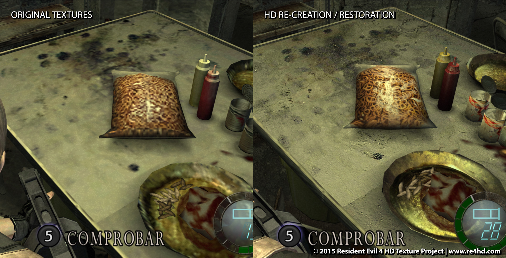
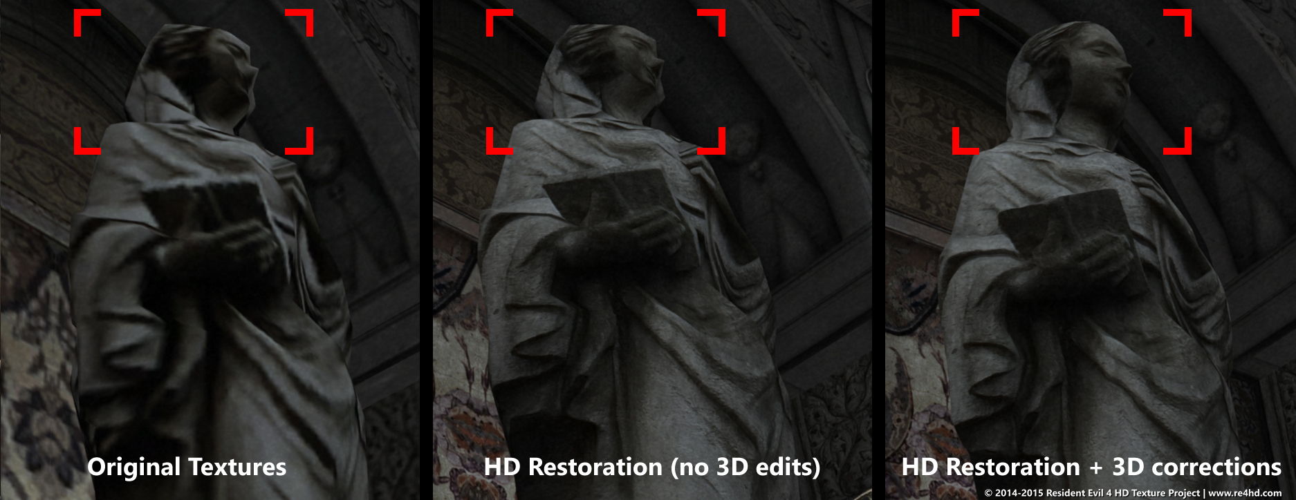
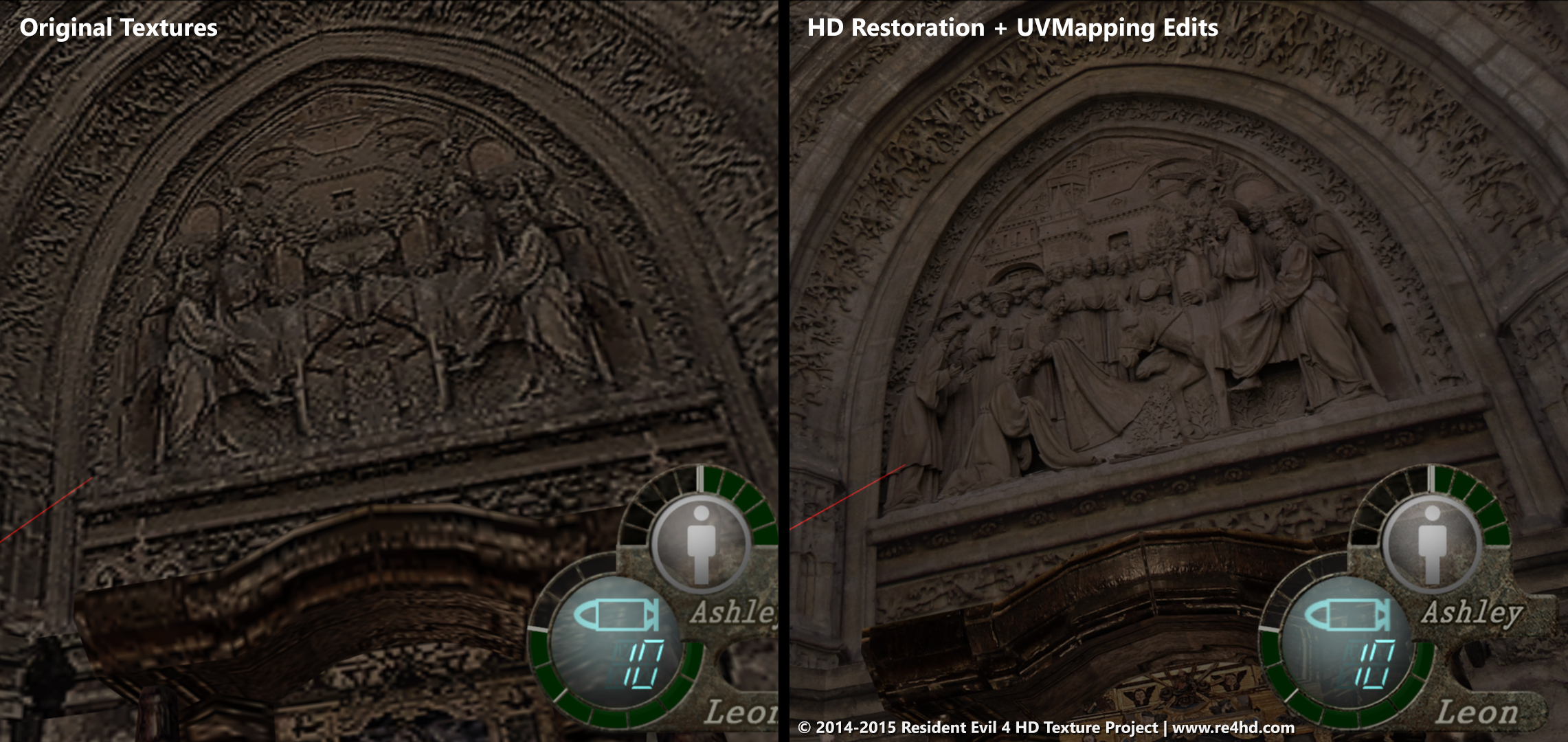
It's hilarious that in the original you can see they used the same image but just mirrored it down the middle to save memory. Poor horse!
Donkey, horse, pony. Does it really matter? It's Beautiful!It's a donkey tho.
The nice thing is Albert recently registered for GAF, so once the account is activated, he'll answer these last few questions.
And really, the credit for finding the real-life sources goes to him and his efforts going back to around 2008.
Donkey, horse, pony. Does it really matter? It's Beautiful!
Excuse me, but itt: pretzels are not Cheerios. Therefore a donkey is not a horse. I rest my case.
Excuse me, but itt: pretzels are not Cheerios. Therefore a donkey is not a horse. I rest my case.
")
It's hilarious that in the original you can see they used the same image but just mirrored it down the middle to save memory. Poor horse!
http://www.re4hd.com/wp-content/gallery/0081-lava-pre-room/091406.jpg[/MG][/QUOTE]
Jesus, this game...
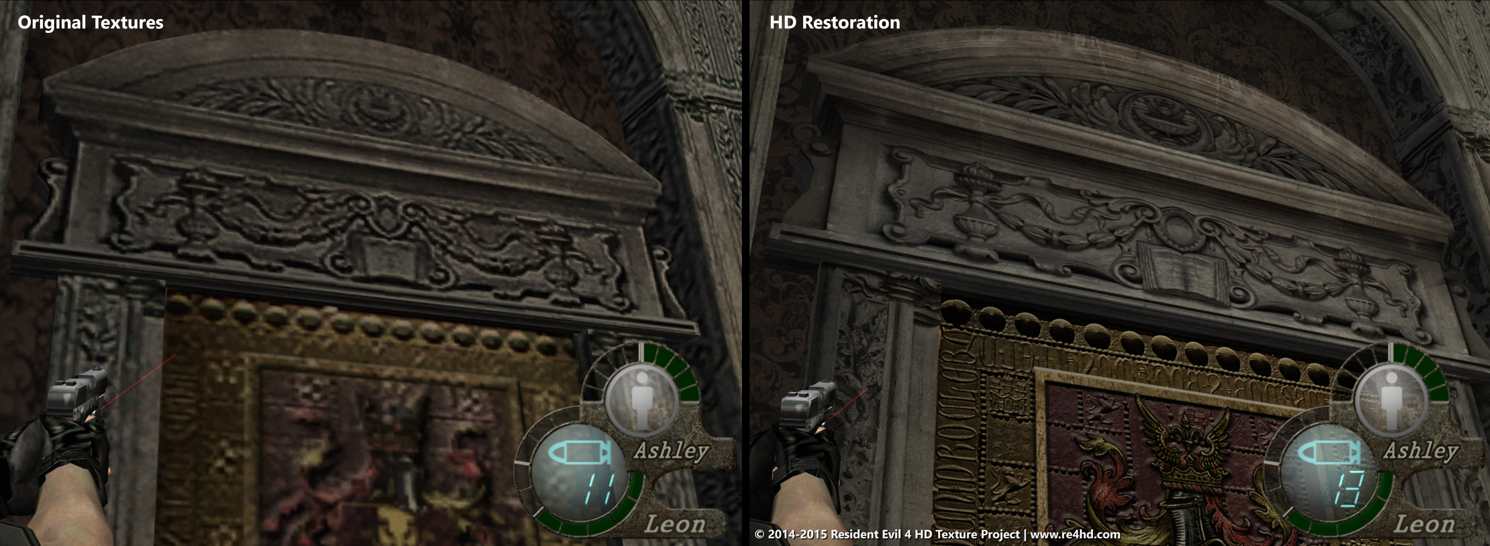
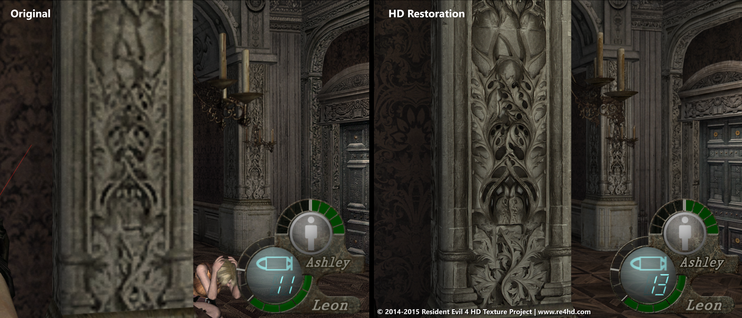
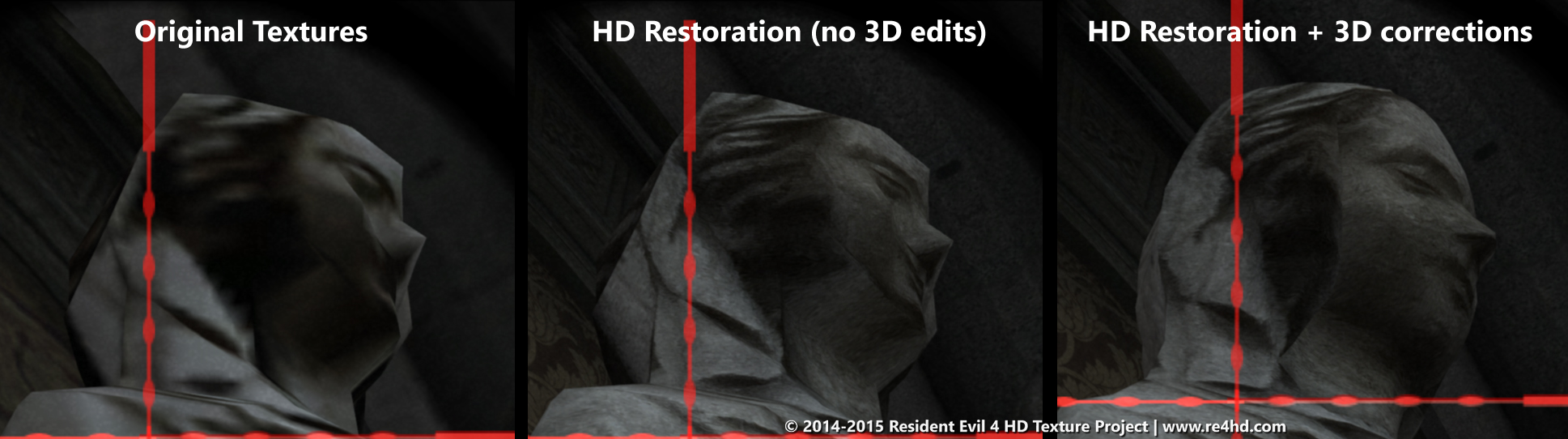
Ha, the original is amazingly bad. Wonder if it was due to GC memory limitations or just lack of time.
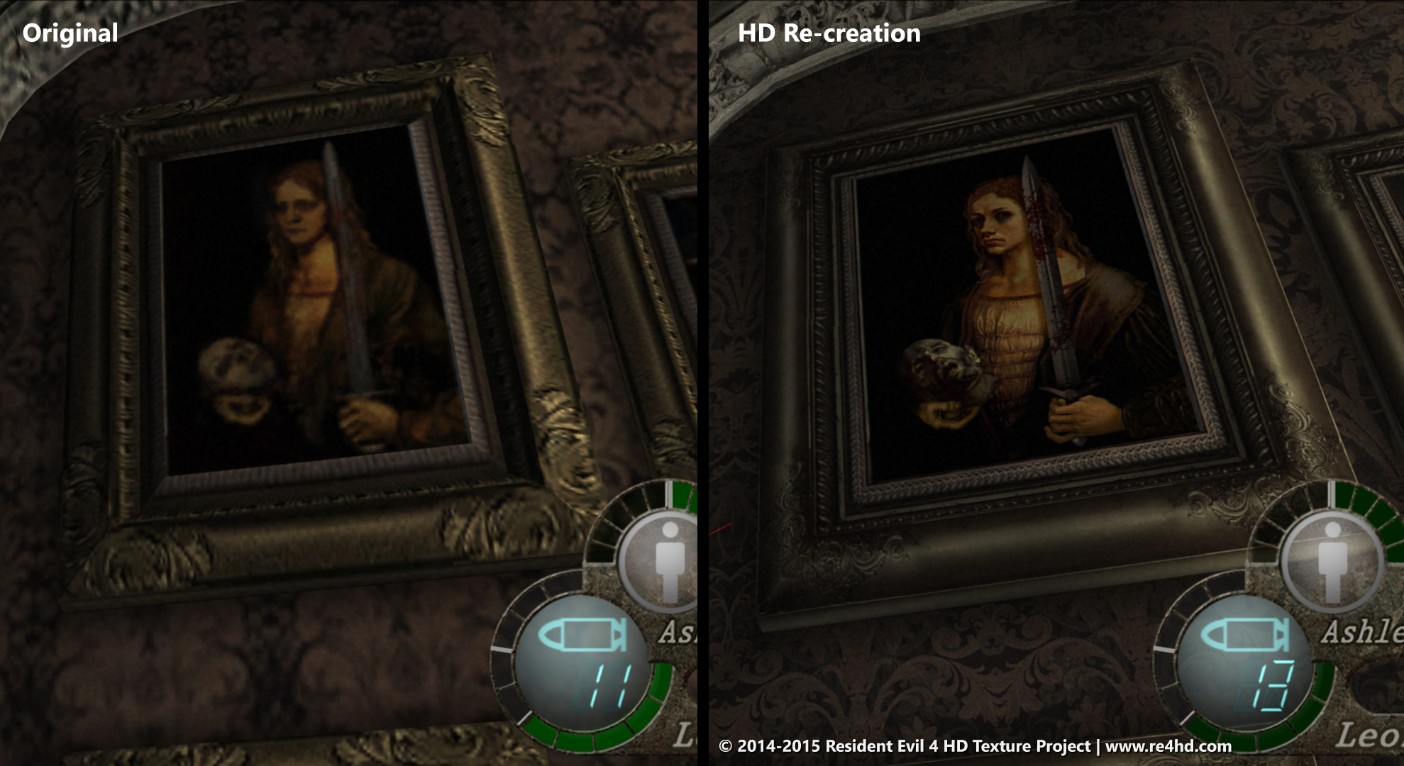
The HD painting is slightly different, it isn't exactly the same picture only in higher resolution. Did you redraw it from scratch or did you find the original painting and it is Capcom that modified it before using in RE4?
Exactly right.Restoration means it's the original source whereas Re-creation means he did it from scratch attempting to stay true to the original look, so some things may look a little different.
Thanks!The best way to keep tabs on overall progress is on this page: http://www.re4hd.com/?page_id=1656How much % is done ?
It appears to be a composite of a young Albrecht Durer self portrait and Géricault's 'The Severed Heads'. Not sure where the sword is from. Seems close enough, if a bit funky in pose and proportion. It's mashing two totally different eras and styles together, but without knowing what Capcom was referencing (or if it was an original asset) I guess there's only so much you can do without someone creating a new texture from scratch. The time and effort put into plucking from existing paintings reflects the level of commitment put into this project though.The HD painting is slightly different, it isn't exactly the same picture only in higher resolution. Did you redraw it from scratch or did you find the original painting and it is Capcom that modified it before using in RE4?
It appears to be a composite of a young Albrecht Durer self portrait and Géricault's 'The Severed Heads'. Not sure where the sword is from. Seems close enough, if a bit funky in pose and proportion. It's mashing two totally different eras and styles together, but without knowing what Capcom was referencing (or if it was an original asset) I guess there's only so much you can do without someone creating a new texture from scratch. The time and effort put into plucking from existing paintings reflects the level of commitment put into this project though.
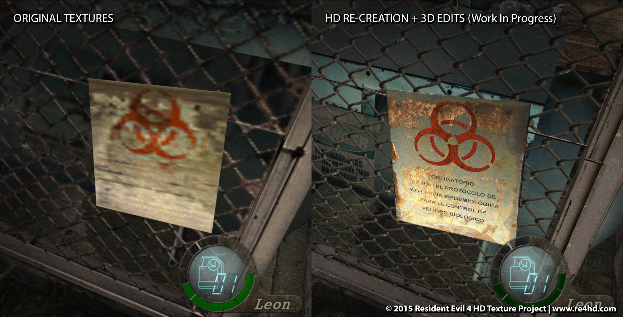
I think it may be interesting for folks that know a bit of art to figure out the original sources. There are many paintings where the originals have been found, but there are also many where it's either original creation by Capcom or we simply can't find it. In those instances, it becomes a matter of finding other works to work from.More images and a demo video up at the site: re4hd.comHi everyone! Today Im showing you the hallway leading to the operating, sub-zero, and waste rooms. It took me ages to complete this area! It had plenty of 3D inaccuracies everywhere and the textures were not precisely simple to re-create.
As you know, this part of the game is full of weird panel controls and machinery Im guessing Capcom didnt stay consistent to real life devices because Im seeing that some textures have obvious evidence of mixing and matching of various elements in Photoshop. In the end, the important thing is that the place should have a realistic look overall.
So, feel free to share your thoughts about this work in progress re-creations. Honestly, some times I had no idea what the hell I was re-texturing!
This made me lol so you winExcuse me, but itt: pretzels are not Cheerios. Therefore a donkey is not a horse. I rest my case.
Today an update from Albert's work:
More images and a demo video up at the site: re4hd.com
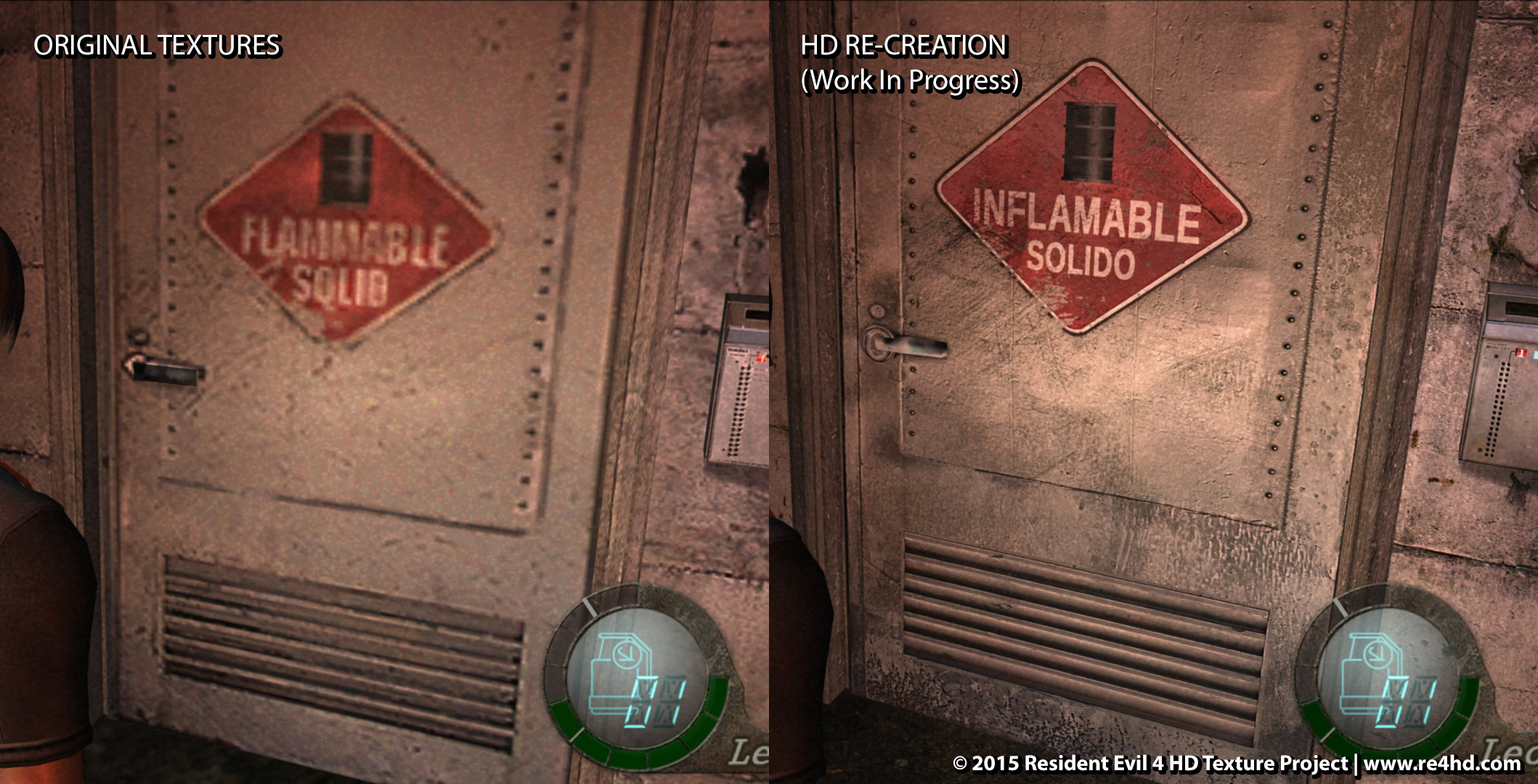
Not sure I follow. In all the HD-version screenshots they're in Spanish, no?Looks great as always! But what's the reasoning behind having one warning text being in Spanish, and one in English? In the first image, it's in English, but in the third (on a different object) it's in Spanish (switched from English it seems)?
Looks great as always! But what's the reasoning behind having one warning text being in Spanish, and one in English? In the first image, it's in English, but in the third (on a different object) it's in Spanish (switched from English it seems)?
No, that's spanish too.
Flammable solid is English. I find it weird too to change it into Spanish.
Flammable solid is English. I find it weird too to change it into Spanish.
Looks like he's translating everything in english to spanish. I think it makes sense that the warning and room signs are in spanish. These places look old as hell, so maybe they didn't have dual language signs like most places these days.
Ahh, now I understand! I didn't see that one - we'll be addressing that.Looks great as always! But what's the reasoning behind having one warning text being in Spanish, and one in English? In the first image, it's in English, but in the third (on a different object) it's in Spanish (switched from English it seems)?
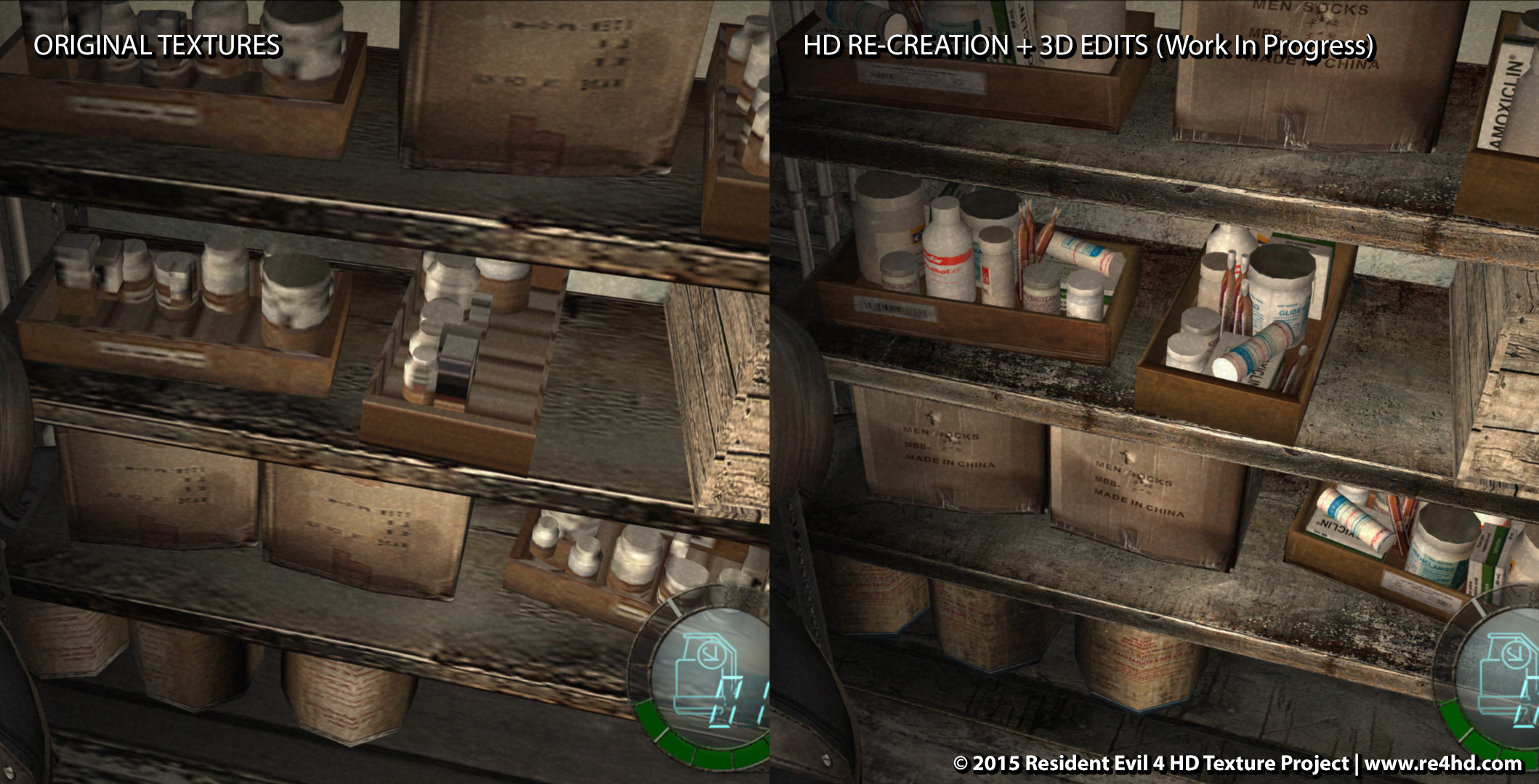
I appreciate you sharing this. I think it's worthwhile to lay out some thoughts on my end that might clarify.I thought they wanted to stay true to the original/source. At least, as close as possible. Cause they were trying so hard to recreate and or find the original source for a lot of the textures. But it seems lately they have taken a lot more creative freedom. Like the redrawn painting, men socks, pills/medicine and changing English signs into Spanish.
I'm not complaining though, cause this fan mod will make me play RE4 again for the 100th time. Just an observation.
I have very much captured the feedback that gogogow and another user provided and as time allows I may revisit). Or the bottles - the original texture was really a non-descript mess. Choosing to interpret them as medicine or drug bottle supplies seems rather reasonable.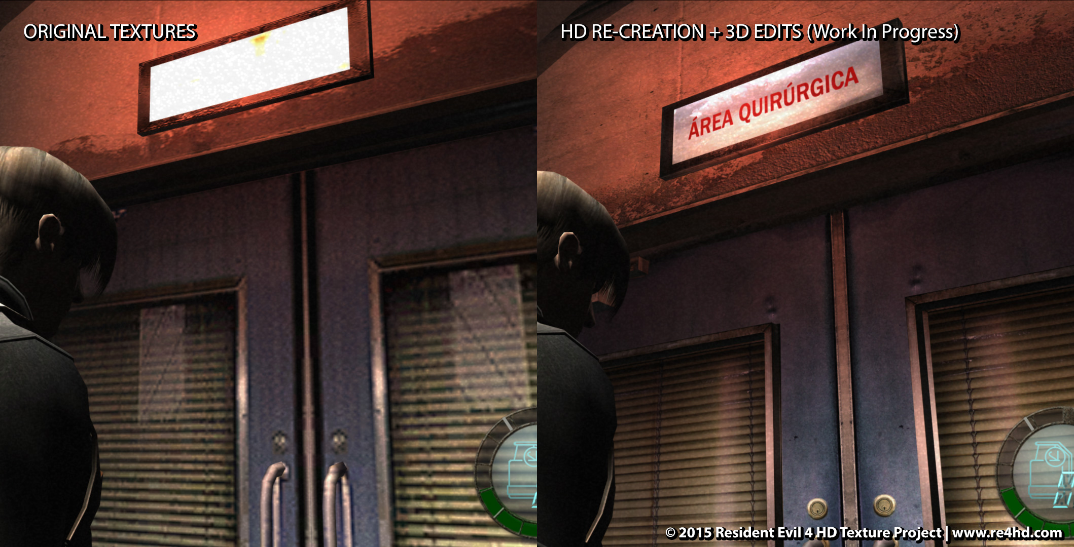
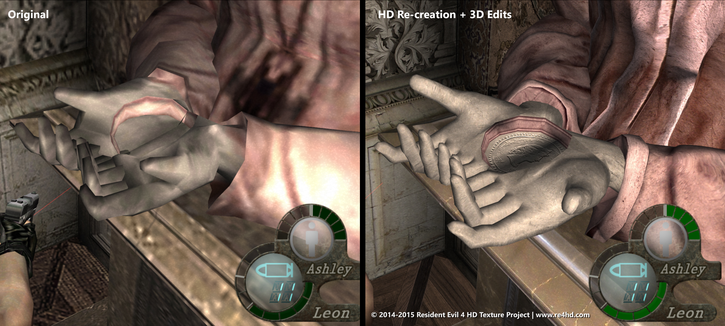
4. What if some sort of "trick" was used originally due to system limitations (like mirroring paintings) - should you improve on it?
In this case we tend to correct those "tricks" by restoring the complete ornaments that were originally used. A recent "trick" that I came across is in the room with the novistador nest in the castle (where Ashley is bug-napped). Below the nest there is a large red pool. The source for that pool of sludge was a tiny portion of the texture for the red leather of a chair that appears in the same room. So, instead of keeping that, I created a better looking sludge / slime texture that, to be honest, doesn't look like the original texture, but it certainly looks more true to that room in the game.
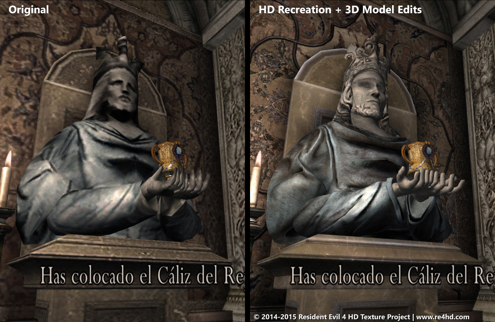
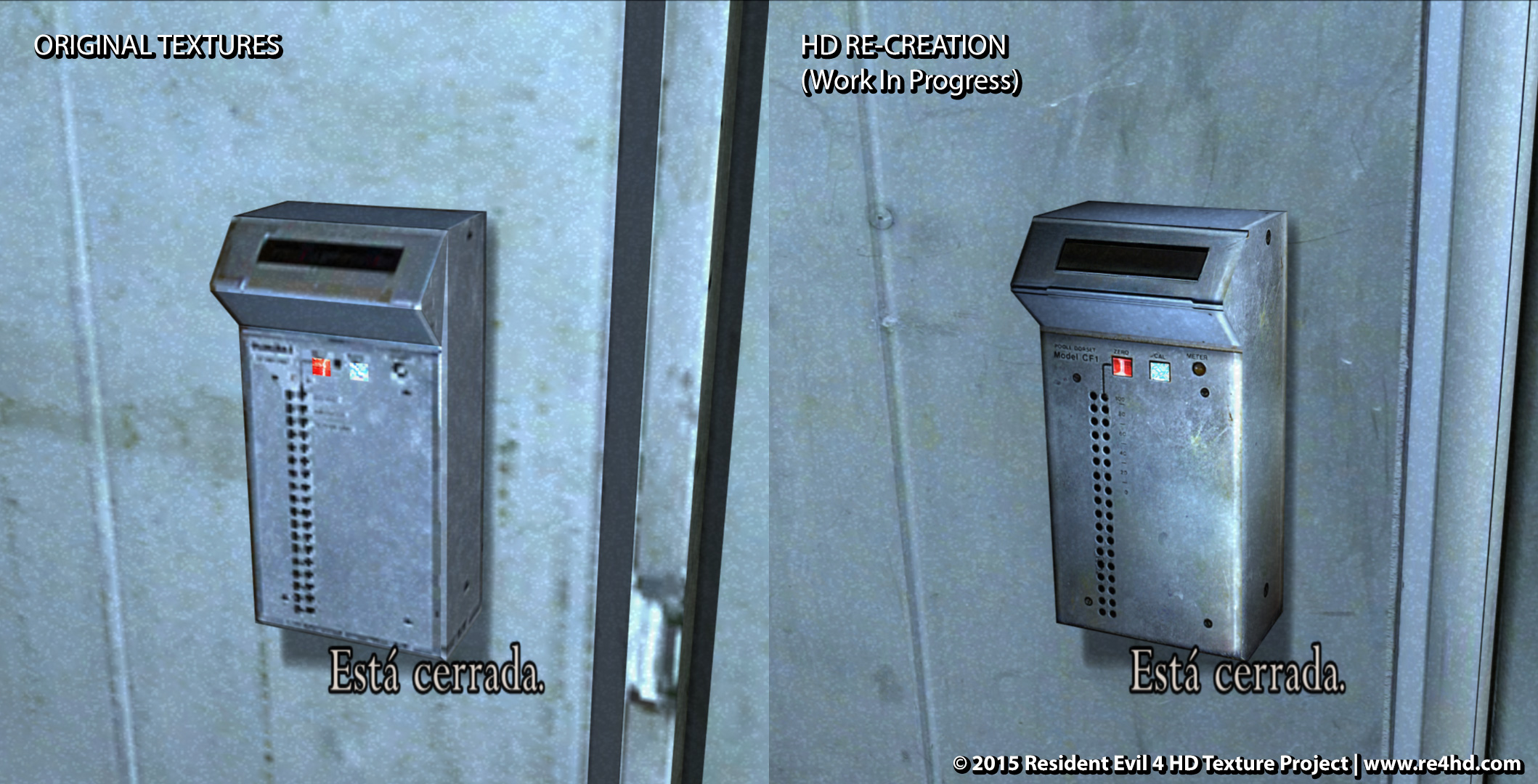
5. What if there isn't enough detail to discern what was intended in the original texture?
In this case, we try to choose details that fit the overall room. So, "mens socks" on the cardboard box should be considered a work in progress and we'll be correcting that. But "made in china" is probably reasonable -- who knows how those boxes got there.
Of course, this is probably the "fuzziest" area, and that's why we welcome everyone's feedback!!
Thanks for taking the time to give feedback!A small oversight, don't know if it's worth it for you gentleman to correct.
Capital letters should not have accents.
This one is not an error but a matter of fitting better in the game's world.
The small amount of rust near the display in the original looks "better", the edit looks too pristine in that area.
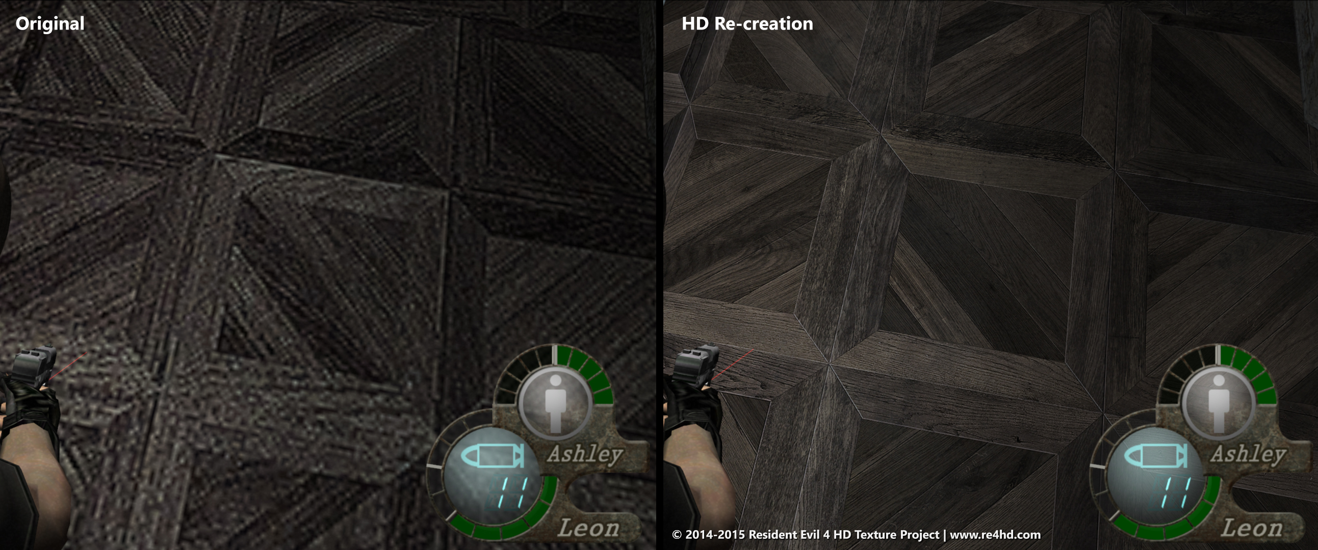
Absolutely loved the increased texture fidelity for the soft materials, it really makes a ton of difference.
Thanks again!As a Spaniard I can definitely confirm that this is the case.Re: the accent, I did a bit of digging and found that the RAE (the official "rule book" for Spanish usage) says that the use of a capital letter does not exempt putting the accent mark when the rules call for it and that it should be used -- see: https://es.wikipedia.org/wiki/Acentuación_de_las_mayúsculas
This is my take also knowing Spanish. i know about the rule but i don't see it been put in practice.As a Spaniard I can definitely confirm that this is the case.
Ahh, now I understand! I didn't see that one - we'll be addressing that.
Ahh, now I understand! I didn't see that one - we'll be addressing that.
I appreciate you sharing this. I think it's worthwhile to lay out some thoughts on my end that might clarify.
Staying true to the original has been, and continues to be a foundational guiding principle. To that end, the search continues for the original source materials and locations. For example, last month Albert traveled to Wales to do additional photography at five castles that were sourced for the game.
However, as we navigate through each area, some interesting questions arise:
1. What if you can't find the original source for a texture?
2. What if you found a higher res version of a texture, but it's still not very good quality?
3. What if the original texture is inconsistent with the game world?
4. What if some sort of "trick" was used originally due to system limitations (like mirroring paintings) - should you improve on it?
5. What if there isn't enough detail to discern what was intended in the original texture?
6. What if there are mistakes that were made in the original (for example, a lamp floating above a table) - should we correct those?
Some of these questions are easier to answer than others, and we sometimes have to operate in a "fuzzy" space that doesn't have definitive right or wrong answers.
Here's how we've answered these questions so far:
1. What if you can't find the original source for a texture?
Then we should do our best to re-create it while staying true to the original. It won't always be perfect, but it should be very much in line with the look and feel of the original. Most of the textures you see in comparison shots (the ones that say "re-creation") fall into this category. My hope is that while we won't always be perfect, we will at least generally be excellent (haha the painting in my last post was my attempt at matching the original
2. What if you found a higher res version of a texture, but it's still not very good quality?
Then re-create it according to what was described in #1, and if there are any parts of the higher res version that can be salvaged, then great!
3. What if the original texture is inconsistent with the game world?
This has come up several times. For example, some of the notes that you find in the game are actually a slightly modified influenza notice:
In this kind of situation where something is inconsistent, we err on the side of staying true to the game world instead of the individual texture. For the note above, instead of using the original source, the overall tone was kept but the text was altered to reflect the content of the note.
Another scenario is that of what language to use. As you know, the game is set entirely in Spain, with Spanish-speaking enemies and characters. As a result, we find it more true to the game world to have text appear consistently in Spanish. There may be exceptions, but by and large this will be the case.
4. What if some sort of "trick" was used originally due to system limitations (like mirroring paintings) - should you improve on it?
In this case we tend to correct those "tricks" by restoring the complete ornaments that were originally used. A recent "trick" that I came across is in the room with the novistador nest in the castle (where Ashley is bug-napped). Below the nest there is a large red pool. The source for that pool of sludge was a tiny portion of the texture for the red leather of a chair that appears in the same room. So, instead of keeping that, I created a better looking sludge / slime texture that, to be honest, doesn't look like the original texture, but it certainly looks more true to that room in the game.
5. What if there isn't enough detail to discern what was intended in the original texture?
In this case, we try to choose details that fit the overall room. So, "mens socks" on the cardboard box should be considered a work in progress and we'll be correcting that. But "made in china" is probably reasonable -- who knows how those boxes got there.
Of course, this is probably the "fuzziest" area, and that's why we welcome everyone's feedback!!
6. What if there are mistakes that were made in the original (for example, a lamp floating above a table) - should we correct those?
We fix it!
I hope that's helpful background information for everyone. And everyone, please do continue sharing feedback! It has been a helpful source of guidance throughout!
This continues to look amazing. Is there a donation scheme going on for this hard work?

Weirdly the image link is broken, but the paypal donation is still functional on their site: http://www.re4hd.com/
Just click that.