-
Hey, guest user. Hope you're enjoying NeoGAF! Have you considered registering for an account? Come join us and add your take to the daily discourse.
You are using an out of date browser. It may not display this or other websites correctly.
You should upgrade or use an alternative browser.
You should upgrade or use an alternative browser.
StarCraft: Remastered - New vs Old Character Portraits Comparison Videos
- Thread starter AlexFlame116
- Start date
Banjotanooki
Member
Oh god, they really butchered Aldaris
Most of the Protoss look alike, tbh. :/
AlexFlame116
Member
I don't see a manic grin at all. Enhance time!I'm really bummed that the firebat doesn't have his manic grin anymore.
TheRedSnifit
Member

I miss the spooky lighting, but it looks pretty cool. Better than SCII's, at least.
I don't see a manic grin at all. Enhance time!
If you don't see it, in the video it's most noticeable right at the end when the lighting flashes. He's always showing all his teeth and the corners of his mouth turn up into a grin for a split second just before it fades into the new portrait.
Backfoggen
Banned
That booger is too 4K for me.
AlexFlame116
Member
Yes....you have the option to do so.Hope for the option to use the original portraits because half of them are terrible and simply deprived of the charm they had(SCV[*]), which makes me not even care for the other half ;/.
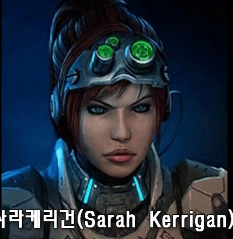
But she wasn't black in StarCraft 1? It was the lighting I believe.Sarah is not black in StarCraft 1 anymore. At least it is now consistent with her human appearance in StarCraft 2.
I think it's him blowing smoke out of his mouth. I'll enhance again.If you don't see it, in the video it's most noticeable right at the end when the lighting flashes. He's always showing all his teeth and the corners of his mouth turn up into a grin for a split second just before it fades into the new portrait.
Enhance!
Also rememebr that not all of the movements that the characters has are present in the videos. I see some missing quirks in both original and remastered.
llien
Member
(Jim Raynor looks a little weird)
Yeah, and so does Kerrigan.
Sarah is not black in StarCraft 1 anymore. At least it is now consistent with her human appearance in StarCraft 2.
Did you even play the game? She never was black.
Why is Stukov a zombie now
I second that.
I think it's him blowing smoke out of his mouth. I'll enhance again.
Enhance!
Also rememebr that not all of the movements that the characters has are present in the videos. I see some missing quirks in both original and remastered.
The smoke comes right after the grin. Watch the left side of his mouth. You can't actually see his bottom lip until he starts talking.

AlexFlame116
Member
I see a smile! Curse these pixelated portraits! No matter how charming they are!The smoke comes right after the grin.
Oh well. I'm sure it's in the Remastered version too. I'm getting the game day one so I can check.
Maintenance
Member
D
Deleted member 59090
Unconfirmed Member
Named characters look terrible. Units are mostly OK.
Terran units: Good
Terran heroes: WTF? Reynor looks like Reynor but otherwise... fucking hell. Kerrigan looks like her SC2 version for no reason, and the rest don't look like themselves.
Zerg look OK though not sure what they were going for with the Cerebrates, why the transparent effect?
Not sure what to think of Zerg Kerrigan. It doesn't really look like the SC2 version, looks like they went for the Brood War Ending Cinematic look but... oh, well, better than Terran Kerrigan.
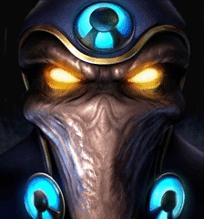
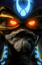
Protoss... WTF. Aldaris doesn't look like Aldaris and Raszagal most certainly doesn't look like Raszagal! EDIT Protoss units are OK for most part.
STOP USING THE FUCKING SC2 DESIGNS FOR PROTOSS!
They're over-designed for most part. Artanis is a good example (though i gotta say they should've fixed Artanis nerve cords, it was a production mistake he lacked those in SC1!).
Terran heroes: WTF? Reynor looks like Reynor but otherwise... fucking hell. Kerrigan looks like her SC2 version for no reason, and the rest don't look like themselves.
Zerg look OK though not sure what they were going for with the Cerebrates, why the transparent effect?
Not sure what to think of Zerg Kerrigan. It doesn't really look like the SC2 version, looks like they went for the Brood War Ending Cinematic look but... oh, well, better than Terran Kerrigan.
Protoss... WTF. Aldaris doesn't look like Aldaris and Raszagal most certainly doesn't look like Raszagal! EDIT Protoss units are OK for most part.
STOP USING THE FUCKING SC2 DESIGNS FOR PROTOSS!
They're over-designed for most part. Artanis is a good example (though i gotta say they should've fixed Artanis nerve cords, it was a production mistake he lacked those in SC1!).
TatteredHat
Member
As tends to happen, remastering low res portraits takes away some of the mystery and opportunity for a player's own interpretation of what the art is supposed to be.
I prefer the more ambivalent nature of the old portraits, even if they were only like that because of the limitations of the tech. A lot of the new portraits look too clean.
Not a fan of the retcon on the looks of the units to fit with SC2 either, the protoss skin color changes in particular are rather egregious.
TyphoonStruggle
Member
The protoss look BAD. Like toy story fake and non intimidating. Their vehicles looks like toys and not high tech machines.
Monkeyball
Banned
They tried to make everything look badass. And lots in the OG version looked goofy. Meh!
woopWOOP
Member
I like 'em! The Zerg generally look less dopey and cute, but I'm pretty sure that was never their intention in the first place
And while they certainly changed up some units, apparently there were plenty of cases in Starcraft where I was looking at the portrait just wrong.
Apparently Goliaths don't wear yellow/black striped helmets, but just a strap.
What I thought were a pair of tiny eyes on the center of the Drone's head were just textures. The big glowy cheeks are actually its eyes, lol
And I never knew what the hell I was looking at with the Rhynadon critter. That updated portrait looks pretty cool.
Yeah I noticed that too. It's fitting for the nurse unit, but I don't remember the dropship lady doing that.I love how all the Terran Units look mean and menacing...excepf of the three female characters, excluding Kerrigan. Those are smiling and winking at the player. And with "love" I mean ugh.
You know I really should get around to buying Legacy of the Void, if only to play the campaign.
Anyways, these looks great... Il buy 10 of these if it means getting a Diablo 2 Remaster.
Please Blizzard.
This.
But not D3 art direction please.
Lord Phol
Member
They are all pretty well done but most of them them loose a lot of of character when compared to the originals. The protoss specifically really stand out with the change of lightning and them all looking the same now. That music though, still some of the best VG tracks ever created. Really adds to the game and atmosphere.
Dictator93
Member
I think most of the updates are fine model-wise. The problem is mainly in the lighting, which sometimes gives the portrait a rather different feel.
The High Templar one is most egregious.
The High Templar one is most egregious.
SchrodingerC
Member
The medic does. I don't see it on the Valkyrie though. She blinks a couple times and you get the flash, but there is no wink that I can see.
I'm really bummed that the firebat doesn't have his manic grin anymore.
They may of added the wink to Valkyrie to emphasis the sparkle.
Probably to draw attention away from her gigantic helmet.
I miss the spooky lighting, but it looks pretty cool. Better than SCII's, at least.
How come the smoke and lighting looks so much better in the original? How hard is it to align models and background for the new version?
To be clear I never have played SC 1 but even I can see how badly they've butchered any 90s CGI gaming aesthetics and replaced it with inferior, very loose modern interpretation.
AlephAlpha
Member
Did they render these in 20 fps? Looks like a stuttery mess to me
Phoenixazure
Member
How come the smoke and lighting looks so much better in the original? How hard is it to align models and background for the new version?
To be clear I never have played SC 1 but even I can see how badly they've butchered any 90s CGI gaming aesthetics and replaced it with inferior, very loose modern interpretation.
While I like most of the new portraits, I think the issue with the ghost is that it's not obscured in anyway (... Like a ghost) it's just a really sharp picture of the ghost which turns invisible every so often. In the old pixel version, the low detail makes it look like the smoke and lights are preventing a clear vision which fits the unit. In general it looks like it flipped the obscured/non obscured ratio for animations with a lot of the characters. U can make out the details way too much where I feel like keeping it obscured and giving flashes of the full look would be more in line with the previous art style
While I like most of the new portraits, I think the issue with the ghost is that it's not obscured in anyway (... Like a ghost) it's just a really sharp picture of the ghost which turns invisible every so often. In the old pixel version, the low detail makes it look like the smoke and lights are preventing a clear vision which fits the unit
Lighting is the least of the problems. The new ghost doesn't resemble the old model at all. They might as well put Sam Fishers portrait in there, since it apparently doesn't make any difference. Like I said I'm not a fan of SC to begin with but they should try to stick with the source material imo. The term remaster implies that to me at least.
The new portraits have no quality or faithfulness to the original. Hell, those new portraits look like they were done by some random Source Filmmaker artist.
I'll always see the prettying up of Kerrigan as a the primary signifier of Starcraft's descent into being milquetoast bullshit
Like, she looked like a space weirdo with red braids to me. That was kind of emblematic of the franchise's nature as being a weird hodgepodge (like all Blizz IP) but slightly grittier than Warcraft. But then they took Nova's design, turned the hair red, and gave it to her (making Nova blonde, and the two of them are the only ghosts who look like that)
Excellent point. It always felt weird how they changed Kerrigan's character from 'a joking inquisitive cyberpunk agent turned powerful alien queen' in SC1 to a white damsel in distress in a skintight suit.
Maybe Chris Metzen went through something with his wife or something.
Official:
Fanmade:
So, FTR, you guys just want a port of the original, untouched, right?

I'm fine fine Kerrigan's new look, she's much better that way. But why the hell did they butcher the protoss so much. They used to all have a very distinct look, now they all look the same. They even removed Aldaris' cool face armor.
I'm all for new additions and slight changes, but at least respect the original material. Aldaris switched from being a badass to a nobody.
I'm all for new additions and slight changes, but at least respect the original material. Aldaris switched from being a badass to a nobody.
Terran looks mostly fine, but Zerg lost most of their disgusting alien insects vibe, which is such a shame. And all protoss look generic as fuck.
It's Definitely the lighting that fucks this up.
Edit; what Jinroh said.
Also, I can't unsee the old Protoss scouts' lil frown, haha.
It's Definitely the lighting that fucks this up.
Edit; what Jinroh said.
Also, I can't unsee the old Protoss scouts' lil frown, haha.
entremet
Member
Gosh, I love that Terran theme music.
One of the bests.