-
Hey, guest user. Hope you're enjoying NeoGAF! Have you considered registering for an account? Come join us and add your take to the daily discourse.
You are using an out of date browser. It may not display this or other websites correctly.
You should upgrade or use an alternative browser.
You should upgrade or use an alternative browser.
Vietnamese skincare company "Medcare" choose interesting logo to plagiarise
- Thread starter Shotgun Kiss
- Start date

SuicidalSteve
Member
Complete Global Moisturization
Wasn't there a story about a head transplant doctor that turned out to be viral marketing for MGSV? Or something... Am I remembering that wrong?
Why would you transplant a hand, if you can transplant a whole body, to a hand?
texhnolyze
Banned
Lol, I saw this on Facebook earlier.
Saint of Killers
Member
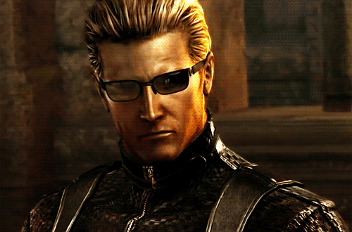
This even looks like a photo you would find in a RE game.
Holy shit, you're right. It's just grainy enough, with bad white balance.
heh.
TransTrender
Gold Member
Hah!Complete global moisturization
I don't need to be Wesker. A Tyrant, or hell, even a Licker will do.
I want wesker
And in realife I can't save scum untill I get the outcome I want
SinCityAssassin
Member
Ugh, goddamn it my cousin works there.
Ugh, goddamn it my cousin works there.
Warn them before it's too late!
SinCityAssassin
Member
Warn them before it's too late!
YO ABOUT YOUR BOSS WESKER NGUYEN.
OK, this has to be viral marketing, right?
T-Viral Marketing
travisbickle
Member
It's literally the first image when you google search "umbrella logo".
Guess that was the phrase in the brief.
Guess that was the phrase in the brief.
Sgt. Kabukiman
Banned
I'm okay with a zombie apocalypse as long as I get to meet Leon S Kennedy at least once.
Cave Johnson
Member
I knew what the logo was before I clicked the thread. Wondering when Capcom will make its move.
PjotrStroganov
Member
I really thought/hoped it would be the neogaf logo.
eso76
Member
Wasn't there a story about a head transplant doctor that turned out to be viral marketing for MGSV? Or something... Am I remembering that wrong?
Yes. It wasn't viral marketing or related in any way to MGSV.
This may be, though.
Because I just can't understand how a skincare company would want a logo with a "grunge", scratched texture otherwise.

KormaChameleon
Member
Let's hope a helicopter doesn't go missing a few days after...
gaming_noob
Member
Nice find OP.
Sorry for the OT but I don't think my material is thread worthy but is somewhat related to this.
https://www.robert.ca/en/
Check out this company's logo. Looks like Rockstar Games' colours and the 'R' symbol + Fedex's "arrow" pointing to the right. It's a transport company and I see their trucks on the way home almost every day. From their site it's indicated they recently rebranded so the logo is pretty recent.
Benzychenz
Member
Nice find OP.
Sorry for the OT but I don't think my material is thread worthy but is somewhat related to this.
https://www.robert.ca/en/
Check out this company's logo. Looks like Rockstar Games' colours and the 'R' symbol + Fedex's "arrow" pointing to the right. It's a transport company and I see their trucks on the way home almost every day. From their site it's indicated they recently rebranded so the logo is pretty recent.
That's an R with an arrow in it.
Stead Fast
Banned
Wow!
I went in thinking, well Nintendo's logo looks like it would translate well, maybe a graphic like PlayStation's, but WOW that is good.
I went in thinking, well Nintendo's logo looks like it would translate well, maybe a graphic like PlayStation's, but WOW that is good.
eso76
Member
That's an R with an arrow in it.
Basically.
If anything the colour scheme and overall aesthetics

may look a bit like RRT4 but that's a stretch.
That R does remind me of something, though
YO ABOUT YOUR BOSS WESKER NGUYEN.
The first thing to understand about Wesker is that you mean nothing to him.
Stead Fast
Banned
This is the weirdest E3 leak I've seen.
RE8 set in Vietnam confirmed.
RE8 set in Vietnam confirmed.
OfTheOverflow
Member
Lmao this cannot be real
Google translated from their Facebook page:
The pics on their site make it look 100% like viral marketing for a Resident Evil title though.
They absolutely do. I thought they were some unseen viral ads at first. That's crazy.
Complete global moisturization
lmao
I'd let him massage my back all dayYeah, I know them already. Love their massage therapy and spa

AuthenticM
Member
Complete Global Moisturization
lol

sixteen-bit
Member
Wow, is this real or Resi 8 viral marketing?
IronicSonic
Member
This more than REmake 2 it's seemsRE8 viral marketing
Weltall Zero
Member
But what if you become an awesome super zombie?
My GF's response to this as I was reading the thread to her.
"A super zombie with beautiful skin, to boot".
MissCauthon
Member
Lol omg
I'd let him massage my back all day
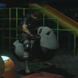
I wish I was that panda...