There are 5 basic principles of flag design and we can't even respect one of them.
But who cares about a flag? Well, our racists are starting to adopt the red ensign. And by our racists I guess I mean a US group reminiscing about British colonialism.
Further, if we had a decent flag people might actually use it.
But how do we get a better flag? For this too, I turn to 99% invisible.
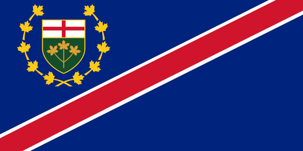
There, you've got Ontario's colours of green and gold representing the Great Lakes and Hudson Bay. Was that so hard?
How do we get this to actually happen? Well, there's a provincial election coming up. A letter writing campaign timed to get the topic into "the conversation" at such a time that all 3 parties say something about it ought to get the idea enough attention. From there we just hope the idea catches on, maybe it becomes some sort of lame wedge issue between the OPC and the OLP.
Anyway, here's some other flag ideas.

- Keep it simple. What's this tiny triple maple leaf bullshit, how's a kid supposed to draw that in a scene?
- Use meaningful symbolism. Oh good, let's put a bunch of English stuff on the flag so we can glorify genocide
- Use two to three basic colors. Five, fucking five
- No lettering or seals of any kind. mhm
- Be distinctive. A fucking red ensign
But who cares about a flag? Well, our racists are starting to adopt the red ensign. And by our racists I guess I mean a US group reminiscing about British colonialism.
Some in attendance said the men identified themselves as members of the ”Proud Boys," a U.S.-based ultra-conservative fraternity-like group that believes in ”reinstating a spirit of Western chauvinism during an age of globalism and multiculturalism."
...
”This was Mi'Kmaq territory. This is now Canada. This is Halifax, Nova Scotia," said one man who arrived holding what appeared to be a Canadian Red Ensign flag. ”This is a British colony."
Further, if we had a decent flag people might actually use it.
Before I moved to Chicago in 2005, I didn't even know cities had their own flags. In Chicago, the flag is everywhere. It's incorporated into all different aspects of city life and the design elements are used on businesses, websites, clothing and apparel. So when I moved back to San Francisco in 2008 I looked up our city flag and wondered why I never really noticed it before. Ugh, now I know.
But how do we get a better flag? For this too, I turn to 99% invisible.
Here's a trick: if you want to design a kickass flag, start by drawing a one-by-one-and-a half inch rectangle on a piece of paper.
A design at these dimensions held 15 inches from your eye looks about the same as a three-by-five foot flag on a flagpole a hundred feet away.

There, you've got Ontario's colours of green and gold representing the Great Lakes and Hudson Bay. Was that so hard?
How do we get this to actually happen? Well, there's a provincial election coming up. A letter writing campaign timed to get the topic into "the conversation" at such a time that all 3 parties say something about it ought to get the idea enough attention. From there we just hope the idea catches on, maybe it becomes some sort of lame wedge issue between the OPC and the OLP.
Anyway, here's some other flag ideas.


")