alexbull_uk
Member
Now the PS4 has folders, it gets my vote.
Never owned one but now I'm intrigued. I didn't mind the UI for my PSP.Like the Vita?
haha good act of memeing!!!!!!
Add Hulu, Netflix and whatever, as an app.
Add a web browser to those circular icons.
Is it less clean? No.
The design is clean.
Love the switch UI. It won't change much when Netflix, Hulu, etc are added so not sure why anyone is being dismissive.
Is there an option to turn this off?
I love my Switch, but there's no denying its UI is simple due to a paring back of features.

Notice that the PS4 UI is essentially the same, but with added features and information. I agree that the Switch has an overall more appealing look, but those features and most of the information provided in the PS4 simply isn't available at all on the Switch.
This made me notice that the background color of the Switch is exactly the same of Neogaf's dark theme lol
Please point to the exact part of my post, or their post, in where the PS4 is mentioned in any shape or formWhat is this? He's not wrong. I love the Switch's UI, but it's essentially the same as PS4's minus features and information.
Yes, you could argue that it's more visually appealing because of its lack of extraneous features. But there's no arguing that Switch achieves its minimalist UI by stripping down functionality. And it's not just about the apps.
All you have to do is make a folder. I have mine organized by physical and digital.
I do this, but it's an unnecessary pain and doesn't really solve the problem.
Please point to the exact part of my post, or their post, in where the PS4 is mentioned in any shape or form

None of the features under Knack need to be there, they can just as easily only show up if you press down on the D-Pad. The adverts for DLC, Season Passes and stuff you get for other games definitely don't need to be there. Essentially what I'm saying is that a UI with lots of features doesn't have to be cluttered.
haha good act of memeing!!!!!!
Add Hulu, Netflix and whatever, as an app.
Add a web browser to those circular icons.
Is it less clean? No.
The design is clean.
I remember the Xbox 360 menu being HORRIBLE. Like, if there are 9 icons on the screen, 6 or so would be ads.
Any recent pic of Xbox UI?
How bad is it?

I love my Switch, but there's no denying its UI is simple due to a paring back of features.
Notice that the PS4 UI is essentially the same, but with added features and information. I agree that the Switch has an overall more appealing look, but those features and most of the information provided in the PS4 simply isn't available at all on the Switch.
Person 1 says the Switch UI is the cleanest in their opinion.Dude, I'm using it as an example. This thread is about comparing console UIs.
I'd argue that none of those features justify polluting the screen like that, some of them seem to be there just to push you to social channels or the store, away from the actual game.
I like the PS4 over the Xbox but just wish you could turn off all the additional data and keep it clean.
What would you prefer? How else are you supposed to organize everything?
I don't want icons for games I can't even play because the disc isn't in.
Do you have a screenshot of this?
Notice how only 3 icons aren't ads, and they are small.

The new update is worse. A lot more icons on the left side and when you exit a game now, the top main box is more cluttered with stuff related to said game. It's just... messy.Googled this. It's not that bad
This made me notice that the background color of the Switch is exactly the same of Neogaf's dark theme lol
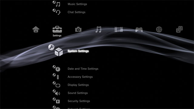
This is not the current PS4 UI. I don't think this specific UI ever saw the light of day.

Person 1 says the Switch UI is the cleanest in their opinion.
Person 2 says "sure it's clean, it doesn't have anything"
I say that the fact that "it doesn't have anything" is not the reason: the design would be as clean if more apps are installed on the system.
Now you say he's not wrong because of something-something-PS4, when his argument was solely that the reason the UI is clean is that "it doesn't have anything".
I still don't see your point.
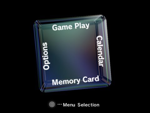
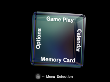
I always liked the PS3 xmb. It was clean and simple.
The only downside was that the menu for games could get a little bit overwhelming with all those PS+ games.
The PS4 one is also great, especially since we got folders.
Then delete the install?
The icon represents the game, which is on your harddrive. The disc is just required for authentication at that point.
But you're wrong. The design wouldn't be clean if it had more features. It's not just about apps. If it had as many features as other consoles, it wouldn't be clean.
But you're wrong. The design wouldn't be clean if it had more features. It's not just about apps. I brought up PS4 in a thread about comparing console UIs as a point of comparison. If the Switch had as many features as other consoles, it wouldn't be clean.
That's a laughably terrible solution.
I really liked the ps3's XMB menu. Looked clean and professional.
Ps2's towers representing memory card storage was pretty cool too, but a little off topic
some conclusion jumping going on here