-
Hey, guest user. Hope you're enjoying NeoGAF! Have you considered registering for an account? Come join us and add your take to the daily discourse.
You are using an out of date browser. It may not display this or other websites correctly.
You should upgrade or use an alternative browser.
You should upgrade or use an alternative browser.
New Fragile (Wii) characters and screens!
- Thread starter duckroll
- Start date
gantz85 said:Most next-gen games can only beg for this kind of atmosphere:
*click*
OM NOM NOM for me
*PUNCH*
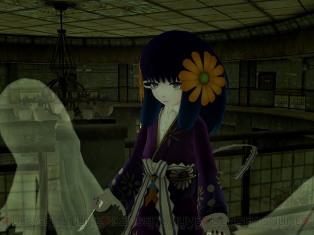
duckroll said:I'm not really seeing the "wow" here you know. The lighting is looking worse and worse, which is really worrying. Just compare any of the earlier screens where there's no UI, with any of the newer screens with UI. The art direction is really interesting, but I'm not feeling the game at all honestly. The more I see of it, the less interested I am in it.
Really? The game still looks incredible. I don't know what's up with the lighting, but in some shots it doesn't even look like the flashlight is on.
It's from tri-Crescendo and the Venus & Braves team. It's going to be good. Too bad their publisher sucks.
Black-Wind
Member
IDK about. I myself fond the early screens "Interesting" but the hard light of the FlashLight gave me the impression that it wouldn't really have the "feel" I was lookng forward to.duckroll said:I'm not really seeing the "wow" here you know. The lighting is looking worse and worse, which is really worrying. Just compare any of the earlier screens where there's no UI, with any of the newer screens with UI. The art direction is really interesting, but I'm not feeling the game at all honestly. The more I see of it, the less interested I am in it.
I prefer the newer screens to the older ones like in this case. .
http://usera.imagecave.com/pitt_norton/old.jpg
http://i35.tinypic.com/w8438x.jpg
Wat. The character designs fit perfectly. As for the lighting, get hyped for The Conduit instead if you like that better, lol. Honestly, I wouldn't worry too much about that. The older shots are still there and many of the new ones look as good as them.
Also, I demand the content of the official site and the developer blog to be fully translated! (p-please)
Also, I demand the content of the official site and the developer blog to be fully translated! (p-please)
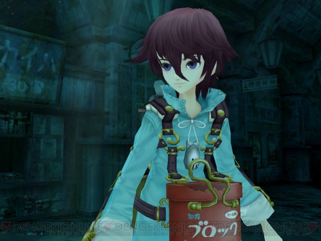
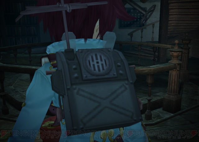
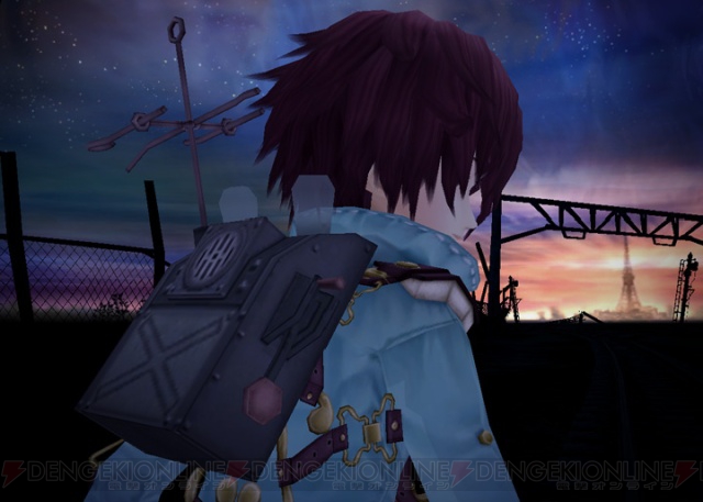
duckroll said:Seems that your backpack talks, like some voiced computer guidance system.

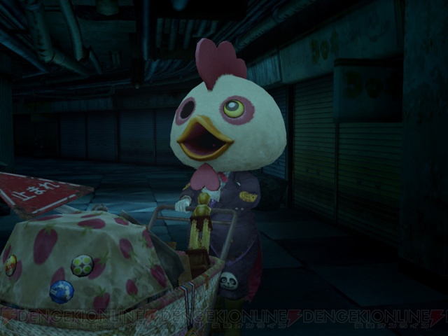
The protagonist fits, the enemies are ridiculous. I'm not sure what exactly the gameplay is like, but I imagined the game being mostly exploration and some sort of mystery solving--not "ZOMG JELLY, ZAP WITH MAGIC."Cosmozone said:Wat. The character designs fit perfectly. As for the lighting, get hyped for The Conduit instead if you like that better, lol. Honestly, I wouldn't worry too much about that. The older shots are still there and many of the new ones look as good as them.
Stormbringer
Member


thetrin
Hail, peons, for I have come as ambassador from the great and bountiful Blueberry Butt Explosion
USD said:
"I'm injured, but wearing protective clothing is the last thing on my mind."
Uuuuh...I think that might be a ghost, dude.
Stormbringer said:
This is becoming my most wanted wii game
Because you can run around half naked?404 said:This is becoming my most wanted wii game
Neo C. said:Because you can run around half naked?
yeah, what else looks interesting about it?
Regulus Tera
Romanes Eunt Domus
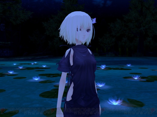
It looks gorgeous.
It's a Wii game and it seems like the developer is churning some quality in it.
404 said:yeah, what else looks interesting about it?
It's a Wii game and it seems like the developer is churning some quality in it.
Regulus Tera said:It's a Wii game and it seems like the developer is churning some quality in it.
it was a joke, absolutely love the atmosphere
Fantastical
Death Prophet
That is a beautiful screenshot.404 said:This is becoming my most wanted wii game
ivysaur12 said:Really? The game still looks incredible. I don't know what's up with the lighting, but in some shots it doesn't even look like the flashlight is on.
I'm wondering if the flashlight doesn't lose power the more you use it, as it would in real life (batteries winding down and all that)?
Anyway, looks great to me. Will pick this up day 1 if it makes it to NA.
Hopefully not - that will be pretty annoying for a game based on exploration.d+pad said:I'm wondering if the flashlight doesn't lose power the more you use it, as it would in real life (batteries winding down and all that)?
Anyway, looks great to me. Will pick this up day 1 if it makes it to NA.
John Harker
Definitely doesn't make things up as he goes along.
Who is actually developing this?
I worry that the screens are touched up or something, that it looks too clean/pretty and will be disappointing in motion
I worry that the screens are touched up or something, that it looks too clean/pretty and will be disappointing in motion
John Harker said:Who is actually developing this?
I worry that the screens are touched up or something, that it looks too clean/pretty and will be disappointing in motion
tri-Crescendo and the Venus & Braves/Seven team.
-WindYoshi-
Banned
This game continues to look amazing... mark my words: Fragile is going to end up being one of the most fondly remembered Wii games ever created.
Alaluef said:Hmm, I want to see the HUD.

Zoramon089
Banned
Am I the only one who thinks the lack of any lighting on character models is a stylistic choice? I mean, considering we've seen the flashlight cast lighting and shadows on the game's environments, not having those on characters seems intentional. A way to make them stand out..even more so considering they're essentially cell shaded (or have a very flat coloring) in a non cellshaded world
Thanks.wrowa said:
thetrin
Hail, peons, for I have come as ambassador from the great and bountiful Blueberry Butt Explosion
wrowa said:
I like the HUD, but they really could have saved space by taking out the vertical "hitpoint" text and moving the health bar farther to the left.
You mean like No More Heroes?-WindYoshi- said:This game continues to look amazing... mark my words: Fragile is going to end up being one of the most fondly remembered Wii games ever created.
EDIT: Hopefully after FF4, Suda and Co. are creating the next sequel or at the very least another game set in No More Heroes universe.
It seems its cell shaded and yes i think its a stylistic choice.Zoramon089 said:Am I the only one who thinks the lack of any lighting on character models is a stylistic choice? I mean, considering we've seen the flashlight cast lighting and shadows on the game's environments, not having those on characters seems intentional. A way to make them stand out..even more so considering they're essentially cell shaded (or have a very flat coloring) in a non cellshaded world
BlackTyrano
Member
Better example would be Megaman Legends
Stormbringer said:
I came. Looks like someone found the second Gamecube at last. :lol
Just playing, I love the Wii & these graphics do it justice.
BlackTyrano said:Better example would be Megaman Legends
Stop talking/reminding me about Legends dammit. ;_;
Mejilan said:I'm pretty sure it's not cel-shading (not cell-shading). It's just that the characters are purposefully done in a colorful, cartoon-like style. Much like Dark Cloud 2.
I was thinking more like Super Mario Sunshine...


BlackTyrano
Member
Farore said:I was thinking more like Super Mario Sunshine...

The chin on Roll is even looks exactly the same. Sad that I remembered that
AzureJericho said:Stop talking/reminding me about Legends dammit. ;_;
It only hurts more now seeing everything else getting a current gen restart. And I already said that it looks good, but it really shows in the art direction.
AzureJericho said:Stop talking/reminding me about Legends dammit. ;_;
Mega Man Legends 1 & 2 are very underrated games.
extremely underratedRedd said:Mega Man Legends 1 & 2 are very underrated games.