-
Hey, guest user. Hope you're enjoying NeoGAF! Have you considered registering for an account? Come join us and add your take to the daily discourse.
You are using an out of date browser. It may not display this or other websites correctly.
You should upgrade or use an alternative browser.
You should upgrade or use an alternative browser.
FFXV reversible cover revealed
- Thread starter Nibel
- Start date
The Etro (?)/goddess Amano art looks gorgeous. First time I'm seeing dislike for it in this thread.
I don't dislike it as much as I think it's just really weak compared to a long line of great logos. And Lightning Returns.
Are we losing out on tradition if it was never a tradition here?Sad for NA losing out on tradition. I'm happy with that Special Edition steelbook though.
CrimsonSquall
Member
Black all the way. Sets the tone for the color scheme of the costumes you will acquire throughout the game
Jimmyfenix
Member
Final Fantasy XV @FFXVEN
The #FFXV cover features a reversible sleeve so you can choose your cover!
(reversible cover will be black in NA/EU)
https://twitter.com/FFXVEN/status/753266745654251520
what the fuck square
They could really set the tone by adding a leather texture to it, for that extra pizzazz.Black all the way. Sets the tone for the color scheme of the costumes you will acquire throughout the game
PSY・S;209858595 said:lol


sure
wat
Even Japan, who has always kept the tradition of white background with a logo, is breaking that tradition and getting black background instead.
So now EU is confirmed to have black, every region is getting black background.
Seems like the right thing. I think it's a poignant change. Use the opposite colour and it's thematically strong.
Necron
Member
Classic FF font and logo over white background as it should be.
Yup.
EDIT: wait, what... it's black!? But...
EDIT: wait, what... it's black!? But...
as it should be.
YankeeDonB
Member
Black looks good, thematically consistent with versus origin.
People really will complain about anything :-(
People really will complain about anything :-(
GTR R35_Supra RZ
Banned
Our NA by a gawd damn mile.
Sep. Too far, and it had to be the 30th and not the 1st.
Sep. Too far, and it had to be the 30th and not the 1st.
Cornbread78
Member
I won't be playing or displaying the cover, so I'm good with whatever.
PSY・S;209856649 said:Nope.

and nope
Even the logo was better when it was Versus.
Man, the cover with the characters with the car is still the best...May import just for the cover lol
Thinking about that too if all languages are included.
Stilton Disco
Member
Black background even in the EU? What utter bollocks.
Honestly, it's like SE are going out of their way to make me have as little interest in this game as possible.
Honestly, it's like SE are going out of their way to make me have as little interest in this game as possible.
Black background even in the EU? What utter bollocks.
Honestly, it's like SE are going out of their way to make me have as little interest in this game as possible.
Are you really going to get upset about a boxart?
Blackleg-sanji1
Banned
You should know how things go by nowAre you really going to get pissy about a boxart?
You should know how things go by now
I know, but still.
So does EU have white background or not?
No, black backgrounds all around
Did anybody happen to save a copy of the white background? I'm sad they've changed their mind/ it was a mistake ;-;
I mean, it looks good on the black background too but with the rest of the EU logos on a white background (aside from XIV) I was excited for the white for a minute there. Nostalgia times etc.
I mean, it looks good on the black background too but with the rest of the EU logos on a white background (aside from XIV) I was excited for the white for a minute there. Nostalgia times etc.
Steelbook boxart is the worst because of the gigantic big blue letters that look like crap. Whoever designed that (not Amano's Art) is an imbecile.
Yeah, that's my one complaint about the steelbook boxart. It's hard to read the text.
I'm getting the Deluxe Edition, but only because I want a physical copy of Kingsglaive.
stargateheaven
Member
So first eu got the horrible american cover
Then the reverse is black
Then the reverse is black
Muffdraul
Member
NA is superior because the logo is centered the right way. You're not supposed to center the text of the logo like they've done with the EU one. See:
.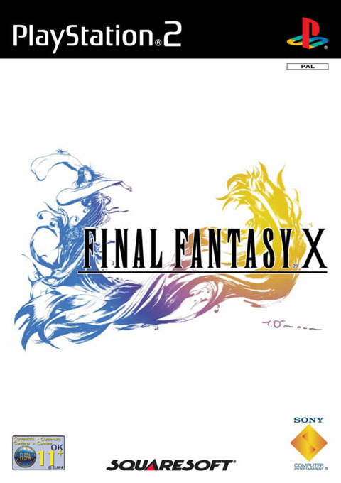
Agreed, but IMO this is the superior example:

I know, but still.
No, black backgrounds all around
Damn
Well I got the Deluxe Edition anyway.
BTW Does anyone know if the Deluxe Edition has A King's Tale too?
Edit: nevermind just checked my country's GameStop page, it got updated and it says that the Deluxe Edition contains everything the DayOne Edition has so it will contain A King's Tale too.
Agreed, but IMO this is the superior example:
Always loved this, especially as the back cover is just the Squaresoft logo. "We just made one of the most expensive, state of the art games ever, but all you need to know is who made it."
Muffdraul
Member
Always loved this, especially as the back cover is just the Squaresoft logo. "We just made one of the most expensive, state of the art games ever, but all you need to know is who made it."
Totally, one of the boldest and cockiest marketing moves in gaming history. But they couldn't have been more right to do it.
Steelbook boxart is the worst because of the gigantic big blue letters that look like crap. Whoever designed that (not Amano's Art) is an imbecile.
The text is not on the steelbook, that's a transparent slipcase.
Agreed, but IMO this is the superior example:
That's just exceptionally classy stuff.
Stilton Disco
Member
Are you really going to get upset about a boxart?
I barely give a shit, but I would have liked the classic logo on white background, if only for nostalgia.
It'd be a small, insignificant detail, but one I'd have liked, which is more than I can say about most of the rest of the game I've seen so far.
Nachtfalke
Member
So things are really changing since Eidos EU is doing the PR for all western Square Enix games? Someone here mentioned it.
I was always glad that previous EU titles were more similar to the japanese originals in terms of box art but it seems they will go full US for everything now. US box arts usually are the worst.
I was always glad that previous EU titles were more similar to the japanese originals in terms of box art but it seems they will go full US for everything now. US box arts usually are the worst.

Galactic Barret
Member
Is there a website where I can buy standalone boxart covers? That JP cover is the fairest in the land.
Welp, at least everyone else gets to enjoy the superior black background.
Welp, at least everyone else gets to enjoy the superior black background.