• Hey, guest user. Hope you're enjoying NeoGAF! Have you considered registering for an account? Come join us and add your take to the daily discourse.

FFXV reversible cover revealed

LMFAO. Hilarious.

No.

It's not a matter of opinions, or preferences.

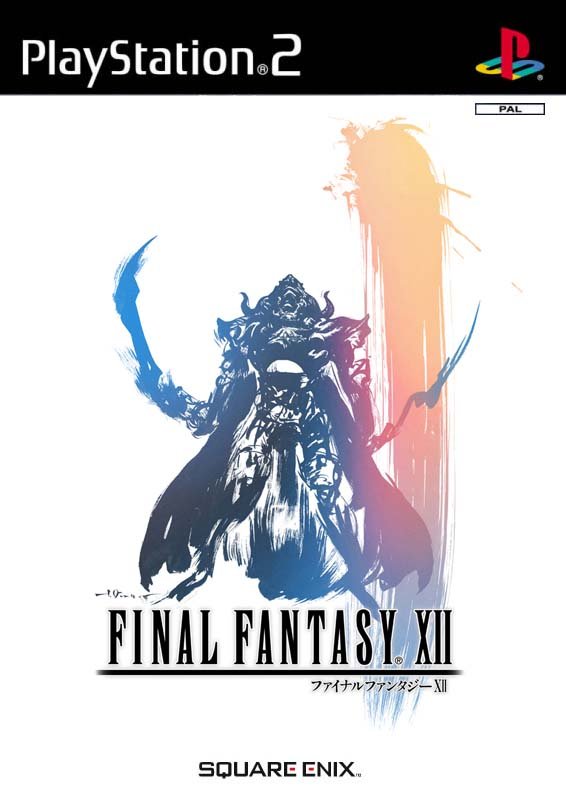
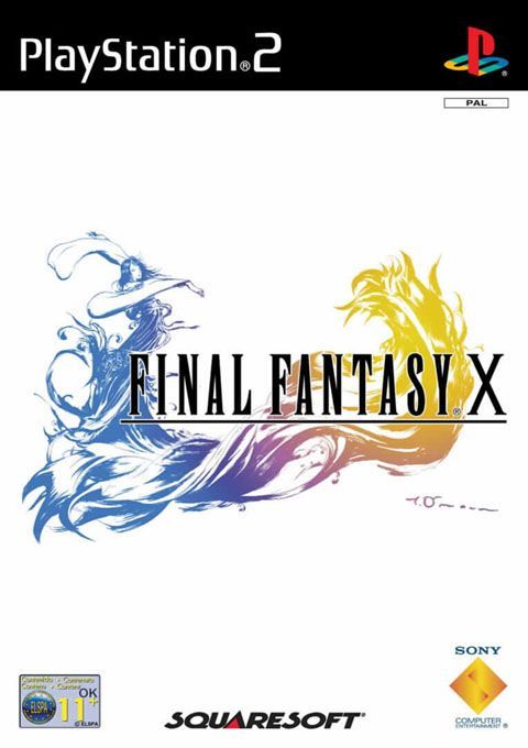
EU got the classic FF cover.

NA didn't. So NA didn't win anything.

I'm in the UK, I prefer the black and I've been playing FF since FF3 / 6. I will import for that black goodness. Black is beautiful.
 

Magusx

Member
I think the black background better fits the game and logo.
However I'm fine with the white background.
I dislike the normal cover with day one edition on it and the logo being too small and it doesn't have the picture.
 

horkrux

Member
The white background has always been boring as hell imo. It just doesn't look right. I prefer the NA covers and this is no exception.
 

LAA

Member
That should be the standard cover. Worked a treat for previous installments, so why they gotta change it up now?

Because you could say FFXV is a "change" from other FF's. I like both the white and black, don't particularly care which, but I wouldnt say black is more linked with FFXV than white.

Seriously I find it hard to read a lot of FF threads now. It just shows you can't please everyone, even when it comes to cover art. That thing you look at once and put on your shelf forever. I mean cover arts are fine to get a little excited about, but just finding it hard to take this stuff seriously and hope SE aren't either.
 

Byvar

Member
We've known for a while now that that cover art would be reversible, though it's nice to see that all the logos/banners are still included (except for the "day one edition" banner, thank god).
I still think they should have went with more nuanced background colors like these though: http://www.neogaf.com/forum/showpost.php?p=207063363&postcount=106
It's much easier on the eyes this way because it contrasts less with the logo.

Let's have a GAF poll. White or black?
I prefer black (and I'm from Europe). All previous FF logos have looked nice on white, because they used relatively light colors. This logo is pretty dark though and even fades into black at the bottom right, so it contrasts a bit too much with white IMO. The logo placement also looks really off on the EU cover compared to the NA cover - they centered the text but the logo sticks out on the left, leaving lots of empty space on the right and none on the left side of the cover.

So living in the EU and with both standard and reversible covers being hard on the eyes I'll probably switch to the deluxe edition.
 
Because you could say FFXV is a "change" from other FF's. I like both the white and black, don't particularly care which, but I wouldnt say black is more linked with FFXV than white.

Seriously I find it hard to read a lot of FF threads now. It just shows you can't please everyone, even when it comes to cover art. That thing you look at once and put on your shelf forever. I mean cover arts are fine to get a little excited about, but just finding it hard to take this stuff seriously and hope SE aren't either.
At first I thought the obsession that every ff has to have this style cover was silly but I mean it's reversible I'll be rocking the deluxe edition but if I wasn't I actually like the Na cover. Nice they gave the option tho nice callback
 
Sad for NA losing out on tradition. I'm happy with that Special Edition steelbook though.

Traditions change. This so-called "tradition" only started from FFVII and on. Prior to that, FFI-FFVI weren't "clean cover" and had art featured on the box. No one cared when THAT tradition changed, but feel oh-so-worried to see THIS one change. Meh.

That being said, I don't mind this.
 
It better be a proper cover with the rating logo, blurb on the back etc, otherwise it's worthless.

Bloodborne did it right:
o2Tvrso.jpg
 

JBwB

Member
But... I want the black cover :(

I'm happy with the white cover (it's classic after all!) but I would've liked the sleek look of the black one.
 
Awesome, will definitely be using these. Glad it actually looks like a real cover and not just an enlarged image like most other reversible covers.
 

ZeroX03

Banned
Europe stays winning, keeping that tradition alive. I forgive ARR because XIV was originally going to have the white background until the reboot. XIII and Lightning Returns, well... At least XIII-2 did it properly. That trilogy is a mess anyway.

I'll be buying this digitally.


10k

Banned
Classic. Should be the default cover. Always loved the clean white covers with the art and logo.
 
Europe stays winning, keeping that tradition alive. I forgive ARR because XIV was originally going to have the white background until the reboot. XIII and Lightning Returns, well... At least XIII-2 did it properly. That trilogy is a mess anyway.

I'll be buying this digitally.
Color-scheme wise, the PS FFs looked amazing with the white background.

XV, however, looks awful with it, especially the artwork. Tradition be damned if it doesn't look fantastic.
 

wmlk

Member
Looking at it like this, it makes sense why they opted for those front covers in different regions. People interested in FFXV and the classic logo would get the game anyway.

Doesn't make the NA boxart any better in my eyes, though. The JP one is perfect.

EDIT: At the same time, Amano's artwork I think does do enough to catch wandering eyes. I just don't how effective that would be in relation.
 

KupoNut

Member
As traditional as it is,i don't blame them for not choosing this as the standard boxart,it doesn't help to sell the game at all.
I appreciate as an old FF fan but i understand how unatractive/boring it looks for a casual customer.

This.

The logo on a white/black background is really unattractive to the casual gamer that's just looking at games without the intent to buy FFXV, it's really something which works well with fans, but not newcomers.

Imagine if Splatoon or Xenoblade X's box art was just the logo and not the catchy render, same thing here basically.
 
Looking at it like this, it makes sense why they opted for those front covers in different regions. People interested in FFXV and the classic logo would get the game anyway.

Doesn't make the NA boxart any better in my eyes, though. The JP one is perfect.
Classic marketing stunt yup. The jpn(superior one) and Na covers will catch the eyes of the wandering casuals.

Ff name will bring in people

And the traditional cover will entice older fans

Smart move
 

notaskwid

Member
This.

The logo on a white/black background is really unattractive to the casual gamer that's just looking at games without the intent to buy FFXV, it's really something which works well with fans, but not newcomers.

Imagine if Splatoon or Xenoblade X's box art was just the logo and not the catchy render, same thing here basically.

I imagine Xenoblade might've tricked someone into thinking it was a Final Fantasy and would have sold better because of it
 

ebil

Member
Glad we get the classic logo on white cover over here, even though I'll never actually look at the cover unless I need to sort out my discs or pack my stuff in the future.

The default cover doesn't look great (I was never a fan of NA cover designs for older FF anyway).
 
I'm from Europe and prefer the black background because this game has been stylised with a black background back in the Versus XIII days so I grew accustomed to that.

Oh well no biggy. Good that they're acknowledgding tradition and the fans.
 

KoopaTheCasual

Junior Member
Honestly never "loved" the logo on white background. Only ticks off a small nostalgia box, but I understand if people grew fond of it.

I actually would much rather have that one mock cover of Regis hold young Noctis and his sword. Seems way more thematically consistent with the game and narrative. And it looks way cooler than the standard "action shot" with everyone reaching for their weapons.
 

Jaymageck

Member
I'm sadly no longer Europe, but I'm glad its keeping the traditional at least.

It's funny how despite the fact Amano's logos have grown more complex and detailed, the global trend has moved away from the simple boxart design. If anything it would make more sense for more regions to use the white cover since the logo accomplishes more of the presentation on its own.
 
I just cancelled my Deluxe Edition for the regular version. XV has my favorite logo in the series and I definitely want it on the cover. Black or white background makes no difference to me, other than the possibility of the reverse image being visible through plain white.
 
It better be a proper cover with the rating logo, blurb on the back etc, otherwise it's worthless.

Bloodborne did it right:

It should look exactly like this with PS4 banner and all that stuff. But as a german (or australian) it should remove that huge ass rating logo. I always thought our "USK" logo is bad looking, but the australian ones are hideous aswell. They also ruin the spine. PEGI however is fine. At least for my taste.
 

Tyaren

Member
I just cancelled my Deluxe Edition for the regular version. XV has my favorite logo in the series and I definitely want it on the cover. Black or white background makes no difference to me, other than the possibility of the reverse image being visible through plain white.

Same here. The Amano design of the Deluxe Edition just isn't doing it for me. Actually I think it fugly. XD So I rather pay a bit less to get a much prettier cover.
 

sublimit

Banned
Ok so i guess the first thing i'll do when i buy the game is replace the cheesy main cover with the elegant white one and forget the CG one ever existed.
 

TGO

Hype Train conductor. Works harder than it steams.
They should change the logo colour on the black cover.
Black with black writing is a terrible design.
 
Top Bottom