-
Hey, guest user. Hope you're enjoying NeoGAF! Have you considered registering for an account? Come join us and add your take to the daily discourse.
You are using an out of date browser. It may not display this or other websites correctly.
You should upgrade or use an alternative browser.
You should upgrade or use an alternative browser.
Games with an absolutely HORRIBLE UI. Pics!
- Thread starter FINALBOSS
- Start date

ShockingAlberto
Member
Assassin's Creed III's UI is terrible.
It's not only bad, it's a massive step back from previous games.

A SEPARATE SCREEN FOR THE WEAPON WHEEL FOR NO REASON
It's not only bad, it's a massive step back from previous games.
A SEPARATE SCREEN FOR THE WEAPON WHEEL FOR NO REASON
thetrin
Hail, peons, for I have come as ambassador from the great and bountiful Blueberry Butt Explosion
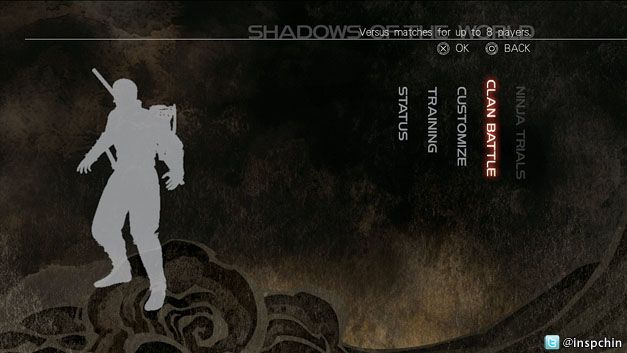
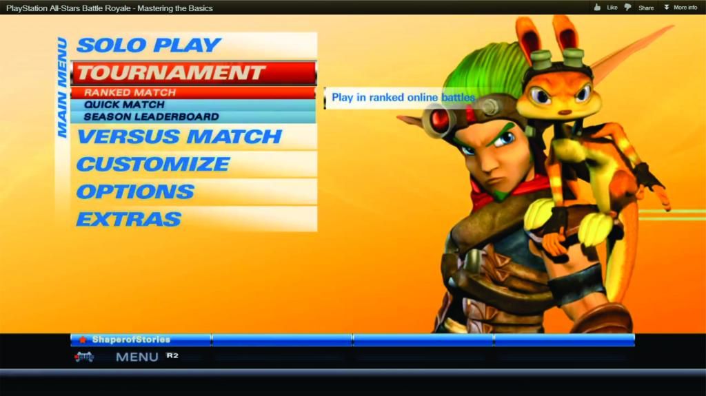
PlayStation All-Stars thread? PlayStation All-Stars thread.
Blandest menus ever.
Pretty much. There's nothing dynamic about them. The main menu is so incredibly boring. Nothing about the UI is exciting in any way. It's a shame, too, because the game is actually quite a lot of fun.
Assassin's Creed III's UI is terrible.
It's not only bad, it's a massive step back from previous games.
A SEPARATE SCREEN FOR THE WEAPON WHEEL FOR NO REASON
this. they also added too many steps when navigating the Animus database. Also, WHY DO WE NEED TO HOLD LB (on 360) TO OPEN THE ASSASSIN MENU? Just make it a click. It makes no sense.
Canis lupus
Member
PlayStation All-Stars thread? PlayStation All-Stars thread.
Blandest menus ever.
This, no effort in the menus and character select screens at all.
VeryGooster
Banned
Assassin's Creed III's UI is terrible.
It's not only bad, it's a massive step back from previous games.
A SEPARATE SCREEN FOR THE WEAPON WHEEL FOR NO REASON
I don't know what's worse, that or the map screen or the Animus database stuff.
PhantomOfTheKnight
Member
Is this about UI funtionality, UI aesthetics, or both?

Biggest waste of 30 dollars ever, you can't even pick items up. The sole reason I stopped playing this game. Well.. that and it ran like crap on my computer.
That actually looks much better than it did when I played it.
I don't know -- a bad UI and a bland UI are two different things to me. All-Stars' menus aren't much to look at, but they're functional and get the job done.PlayStation All-Stars thread? PlayStation All-Stars thread.
Blandest menus ever.
The Albatross
Member
All of the Madden games from the last 7 years. All of them. The menus are horrible, inconsistent, and items are burried behind bizarre loading/new screen walls.
NCAA Football's main menus are terrible, but their "game mode" menus are very clear and make sense. I don't know why Madden insists on having such terribly not useable menus. They aren't ugly, they look clear, but they are clunky hidden messes. This year's Connected Careers menu is the worst menu that the Madden team has ever put into one of those modes. Useful items are buried, useless items are given prominence, and ti makes managing a league very, very time consuming.
For the unawares, everything useful is under "More" and then a sub-navigation from there. Want "standings?" yeah like the key thing you actually want to check each week? More -> My League. Schedule? You have to go to like More -> Teams -> click on a team to view the schedule. Want to see if players have finished their gameS? More -> My League -> Teams. And it takes for ever for these to load... you also have to use the Right stick to navigate these menus... the RIGHT stick, and there is a noticeable delay when going from menu to menu.
God this thing sucks. It's one reason I've almost given up on madden's connected careers. Such a fucking pain to manage. The information on this screen in the screenshot is also sub-level info which is kind of useful, you have to navigate to it to take action. It's such a pain in the ass. The only thing that's worse is the website interface... which gives you NO useful information at all and hides anything of use.
NCAA Football's main menus are terrible, but their "game mode" menus are very clear and make sense. I don't know why Madden insists on having such terribly not useable menus. They aren't ugly, they look clear, but they are clunky hidden messes. This year's Connected Careers menu is the worst menu that the Madden team has ever put into one of those modes. Useful items are buried, useless items are given prominence, and ti makes managing a league very, very time consuming.

For the unawares, everything useful is under "More" and then a sub-navigation from there. Want "standings?" yeah like the key thing you actually want to check each week? More -> My League. Schedule? You have to go to like More -> Teams -> click on a team to view the schedule. Want to see if players have finished their gameS? More -> My League -> Teams. And it takes for ever for these to load... you also have to use the Right stick to navigate these menus... the RIGHT stick, and there is a noticeable delay when going from menu to menu.
God this thing sucks. It's one reason I've almost given up on madden's connected careers. Such a fucking pain to manage. The information on this screen in the screenshot is also sub-level info which is kind of useful, you have to navigate to it to take action. It's such a pain in the ass. The only thing that's worse is the website interface... which gives you NO useful information at all and hides anything of use.
davidsaurus
Member
Biggest waste of 30 dollars ever, you can't even pick items up. The sole reason I stopped playing this game. Well.. that and it ran like crap on my computer.
It's not great... but once you figure it out it makes perfect sense and is sort of cool. The whole opening your backpack etc. was a bit confusing at the start.
chalkitdown1
Member
Ninja Gaiden 3. Vertical fucking writing. When you have to tilt your head to read menus, it's not a good sign.
jediyoshi
Member
Biggest waste of 30 dollars ever, you can't even pick items up.
By not being able to pick up items, you mean..
Slightly Live
Dirty tag dodger

Franklinator
Member
Halo 4 UI. It's convoluted to navigate and it's a pain to find any information. I'll try to get a picture in a moment.
I think this post in particular sums up how bad it is
edit: Thanks, Slightly Live
I think this post in particular sums up how bad it is
edit: Thanks, Slightly Live
shadowsdarknes
Member
WAR recon zero
Banned

Most amateurish work I have ever seen
Graphics Horse
Member
Assassin's Creed III's UI is terrible.
It's not only bad, it's a massive step back from previous games.
A SEPARATE SCREEN FOR THE WEAPON WHEEL FOR NO REASON
dat Wii U advantage for real time weapon change.
*disclaimer* I haven't played Assassin's Creed 3 or genji 2.
Is this about UI funtionality, UI aesthetics, or both?
I thought it was going to be about ugly HUDs so I was ready to post Ocarina of Time, but it doesn't seem to be going in that direction.
Jawmuncher
Member
PlayStation All-Stars thread? PlayStation All-Stars thread.
Blandest menus ever.
Agreed I'm not one to complain about that sort if stuff but good God is it really terrible.
Is this about UI funtionality, UI aesthetics, or both?
I think it should be about functionality.
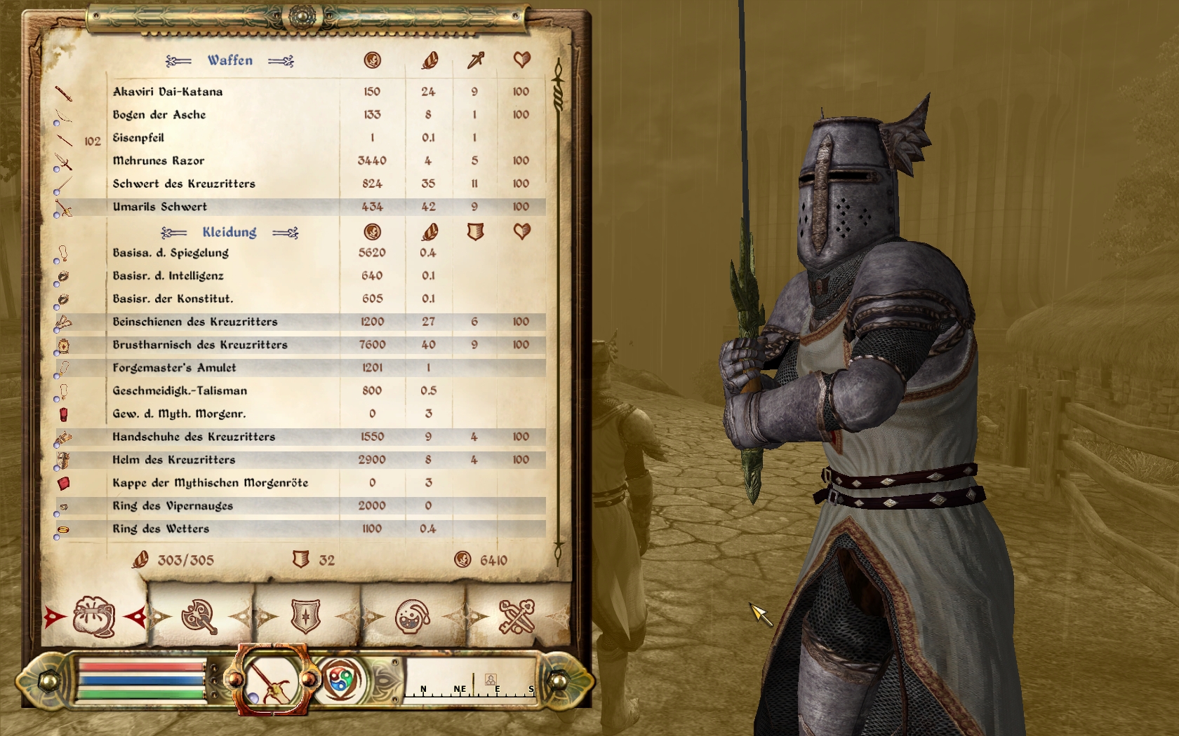
Morrowind has an amazing interface, though its nothing special to look at. Oblivion looks nicer but is utter shit.
Hero_of_the_Day
Member
Assassin's Creed III's UI is terrible.
It's not only bad, it's a massive step back from previous games.
A SEPARATE SCREEN FOR THE WEAPON WHEEL FOR NO REASON
Yep, wins because of this. Why would you possibly think this is better, Ubi?
Most amateurish work I have ever seen
This. Looks like it was made on paint. Really bad.

HigherLevel
Member
this right here
Yep, wins because of this. Why would you possibly think this is better, Ubi?
Maybe it's worse on consoles, but on PC, the speed difference between weapon swapping in Bro/Rev didn't seem so different from AC3.
/thread
Is this about UI funtionality, UI aesthetics, or both?
I'm not sure which one the OP wants, but here's an example of both

Blacklight: Retribution
This. Looks like it was made on paint. Really bad.
Lol ouch, looks better on Vita. I remember it didn't look that bad on PS3 either.
I wouldn't say horrible. Bland and plain maybe.
SMB Vita has a horrible UI.

Most amateurish work I have ever seen
oh shit :/ as if they didn't even try
ViewtifulJC
Banned
As bad as Halo 4's menu UI is(which somehow manages to be worse then the UI invented for Halo 2 in back in 200-FUCKIN'-4, a huge step back in organization, information, and flat-out usability)...Playstation All-Stars UI look like it was made by one guy who had to quickly throw together some pre-set templates and stock colors in the span of a hour.
NBA 2K13
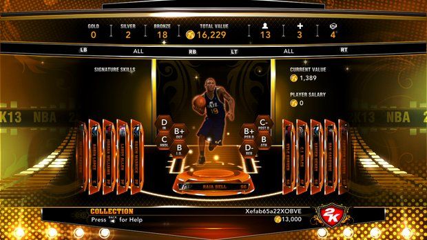
Tacky, stereotypical hip-hop, "Pimp My Ride" gold just because Jay-Z helped with the game.
Yup. Enjoying the game, but it is torture to navigate.
After playing the beta for several hours I still had no clue how to unlock a new weapon. Such a weird menu.Medal of Honor: Warfighter takes the cake. What a bag of shit menu layout.


Even though I love the game, Killzone 2's seizure inducing menu. Not the worst, but a good case of more is less.
Gran Turismo 5 stealth thread?
.
GT5 is great but fuck its UI is so so so so shit.
Dead Prince
Banned
PlayStation All-Stars thread? PlayStation All-Stars thread.
Blandest menus ever.
it has no personality
I haven't played the game, but judging by the GiantBomb quick look it looked clunky and unintuitive as all hell.NBA 2K13
Tacky, stereotypical hip-hop, "Pimp My Ride" gold just because Jay-Z helped with the game.
The PSASBR UI is ugly but at least it's easily navigable.

BomberMouse
Member
I don't know -- a bad UI and a bland UI are two different things to me. All-Stars' menus aren't much to look at, but they're functional and get the job done.
They are barely functional. Any menu that requires more than the analog, X and O is a mess.
Great game once you get past the awful, horrible presentation.
Graphics Horse
Member
I don't find that PSABRMRGM menu offensive, it's uninspired and not flashy in the slightest, but not wrong looking.
Oh do you have to press start to register or something weird? I can't remember what I did in the beta.
They are barely functional. Any menu that requires more than the analog, X and O is a mess.
Great game once you get past the awful, horrible presentation.
Oh do you have to press start to register or something weird? I can't remember what I did in the beta.