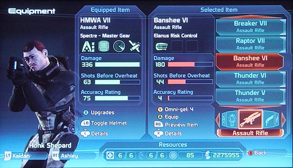
PS Store looks really nice and snazzy but it's a lot slower to actually use. COD has one of the worst looking in game UI's but it is usable. Halo 4 looks great and minimal but hiding stuff like matchmaking select and requiring a button press to see who is online actually makes things harder.
-
Hey, guest user. Hope you're enjoying NeoGAF! Have you considered registering for an account? Come join us and add your take to the daily discourse.
You are using an out of date browser. It may not display this or other websites correctly.
You should upgrade or use an alternative browser.
You should upgrade or use an alternative browser.
Games with an absolutely HORRIBLE UI. Pics!
- Thread starter FINALBOSS
- Start date
MmmSkyscraper
Unconfirmed Member
Skyrim until the modders fixed it.
I don't mind the Halo 4 UI honestly.
Skyrim's UI only really sucks if you're trying to play it with a mouse and keyboard. I still haven't tried.
Skyrim until the modders fixed it.
Skyrim's UI only really sucks if you're trying to play it with a mouse and keyboard. I still haven't tried.

Boss Doggie
all my loli wolf companions are so moe
Oblivion and Skyrim suffers from this.
Just wait til you select characters. It's pretty annoying when you pick opponents.
I don't find that PSABRMRGM menu offensive, it's uninspired and not flashy in the slightest, but not wrong looking.
Just wait til you select characters. It's pretty annoying when you pick opponents.
edgefusion
Member
PS Battle All Stars isn't horrible or bad, it's just bland. For a game that should be all about exuberance and excitement it's drab as hell.
I don't mind the Halo 4 UI honestly.
I don't think it's bad because it does give more shine to the customization, but I thought Reach was 10x more usable at a glance. In game I think all of the Halo games are great. I agree with Skyrim also. Plays decent enough with a gamepad and I prefer the minimal look to the crazy mishmash approach in the previous Elder Scrolls games.
BomberMouse
Member
I don't find that PSABRMRGM menu offensive, it's uninspired and not flashy in the slightest, but not wrong looking.
Oh do you have to press start to register or something weird? I can't remember what I did in the beta.
There's a separate menu that you can only access using the triggers.
As much as I like the game...PSABR
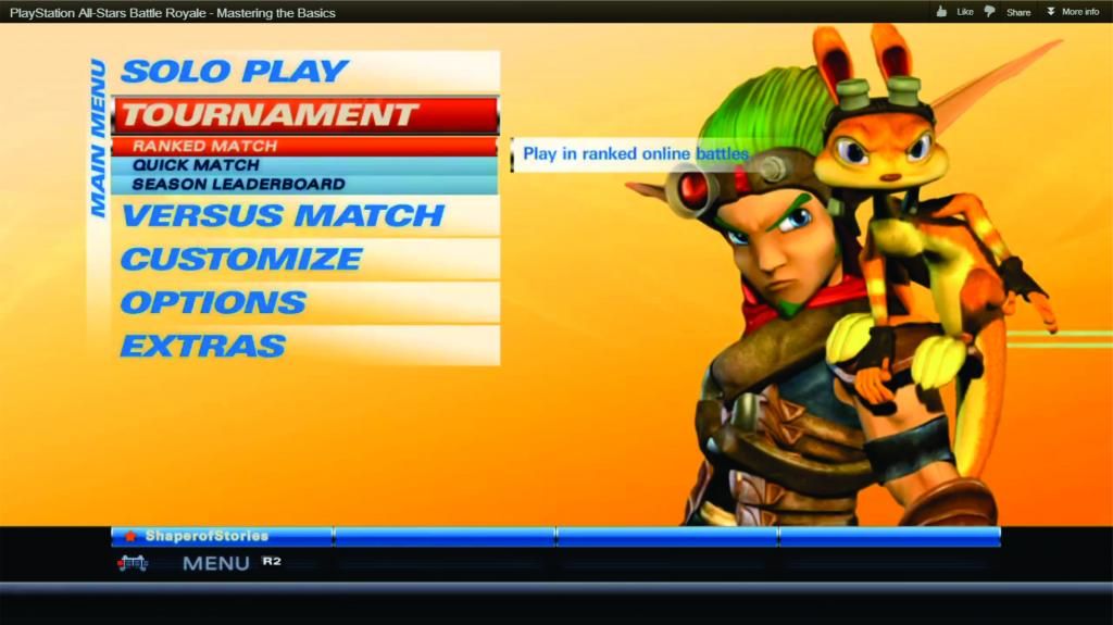
Its functional...but the barest of bones
Okay, whoa this looks horrible.
CambriaRising
Member
Fable III

Graphics Horse
Member
There's a separate menu that you can only access using the triggers.
wat. ok I take it back
Fable III
http://i.imgur.com/FrN8v.jpg[img][/QUOTE]
Was just going to post this.


Relaxed Muscle
Member

So that how it looks when it finally loads...
FF XIV UI
Not only looks bad for it was incredible slow even with all the patches:


Fable III
Yea nothing has ever come even *remotely* close to how indescribably awful Fable III's "UI" was.
There aren't enough languages on planet Earth to fully convey how very shit it is.
Deadly Cyclone
Pride of Iowa State
I agree with Halo 4 lobbies. The start menu box thing is fine, the lobbies are not.


Audioboxer
Member
Hated RE5 realtime crap, it doesn't add tension, simply complete frustration and annoyance.
This. Looks like it was made on paint. Really bad.
Thaaaat's Superbot!
CorySchmitz
Junior Member
This makes me want to design menus for more games 

xKilltheMx
Member
these PSBR mentions are weird to me.
Yeah they are bland as all hell. I mean I'm a big lover of the game and I can admit the UI is super bland with no personality but you can't say it's not functional.
It gets me to the match and all options are easy to follow.
Yeah they are bland as all hell. I mean I'm a big lover of the game and I can admit the UI is super bland with no personality but you can't say it's not functional.
It gets me to the match and all options are easy to follow.
I think it should be about functionality.
Morrowind has an amazing interface, though its nothing special to look at. Oblivion looks nicer but is utter shit.
Ya, I was going more towards functionality.
Like the AC3 one is a perfect example...an entire screen just for a weapon wheel. What a joke.
Fable III
I don't understand what I'm looking at here.

I don't understand what I'm looking at here.
the menu (yes)
Syphon Filter
Member
perfect,its what i thought of right away lol.

I don't understand what I'm looking at here.
The pause menu.
Assassin's Creed III's UI is terrible.
It's not only bad, it's a massive step back from previous games.

A SEPARATE SCREEN FOR THE WEAPON WHEEL FOR NO REASON
I'm convinced they did this only so they could sell a Wii U feature.
Relaxed Muscle
Member
I don't understand what I'm looking at here.
I think that's the start menu...yeah...
Syph Medwes
Member
That actually looks much better than it did when I played it.
Haha yup. I must've played an earlier build too because that looks way better than what I was used to. Still pretty shitty though, although the game more than makes up for it in my eyes. Would love to start playing again if I didn't have school...
Sapphire Dreams
Member
As much as I like the game...PSABR
Its functional...but the barest of bones
Holy shit, it looks like a PS1 sports game.
Here's PS All Stars Vita for comparison:
Vita Start Scren:
Vita Start Scren:
PS3 Main Menu:

Vita Main Menu:
PS3 Character Select:

Vita Character Select (well, the actual characters are selected on a different screen):

Vita loading screen:


PIMPBYBLUD
Member
Assassin's Creed III's UI is terrible.
It's not only bad, it's a massive step back from previous games.
A SEPARATE SCREEN FOR THE WEAPON WHEEL FOR NO REASON
Agreed. First thing I thought of
Pseudo_Sam
Survives without air, food, or water
MOrrowid and Oblivion what a mess.
lol at the NG3 vertical text
Dude, Morrowind's menu system was amazing. How you could access all the important stuff on one screen with one click AND you could resize all the sub-menus to your liking. Hells yeah.
Oh man I've been looking for this image forever, thanks.As someone mentioned earlier this year. Modern Warfare 2's UI is a mess. Dunno how BOII turned out.
Too much shit going on.


I don't understand what I'm looking at here.
This room is UI. From weapon room to treasury.
But it is at the same time stupid because it was actually functional and it was working well. You hardly need to use that room in first place.
Fable 3 is a long game and i don't remember at all making any complain about UI.
Significantly better. I haven't played DayZ in months, I had no idea they even changed it.That actually looks much better than it did when I played it.
grimshawish
Banned
Skyrim until the modders fixed it.
What I most hate about this is Bethesda probably just said 'well they can fix it'
All you have to do to make a great interface is:
- Make the most common tasks the easiest to get to
- Make it fast
Especially the speed. The UI needs to respond as fast as possible, and buffer inputs when it can't keep up. Even a half-second delay so you can do your cool SWOOSH effect is too much in something you need to access constantly.
I don't care how it looks. Just get those two things right and you're ahead of 75% of what's out there.
