
Okay this is driving me nuts, what does this mean!?
-
Hey, guest user. Hope you're enjoying NeoGAF! Have you considered registering for an account? Come join us and add your take to the daily discourse.
You are using an out of date browser. It may not display this or other websites correctly.
You should upgrade or use an alternative browser.
You should upgrade or use an alternative browser.
Nintendo going red - a rebranding in progress?
- Thread starter Zalman
- Start date
OrbitalBeard
Member
Man, we're really desperate for NX news, aren't we? lol
In all seriousness, I like the new (old?) look.
In all seriousness, I like the new (old?) look.
DXB-KNIGHT
Member
There will be blood!
Smiles and Cries
Member
why do they have a bush for their logo?
i see a cloud
You never seen Donald Duck der Nazi?Okay this is driving me nuts, what does this mean!?
You never seen Donald Duck der Nazi?
Doesn't ring a bell.
Doesn't ring a bell.
Donald Duck was a Commie.
Donald Duck was a Commie in one of the cartoons.
What does that have to do with vBulletin?
Edit: I have the feeling that is not what I should be seeing.
Diprosalic
Banned
well, called it
http://www.neogaf.com/forum/showpost.php?p=128426996&postcount=66
(sort of)
http://www.neogaf.com/forum/showpost.php?p=128426996&postcount=66
Nintendo slowly but surely abandons the sterile look they had during the Wii era and goes back to a more fun and colourful one.
I predict the logo will be red again very soon.
(sort of)
SinCityAssassin
Member
What does that have to do with vBulletin?
It wasn't?
Fucking commies
What does that have to do with vBulletin?
Edit: I have the feeling that is not what I should be seeing.
I get that image also on mobile for some reason lol.
OT: I look forward to red Nintendo.
Omnii-chan
Member
Good. Grey and white were sterile colours for their logo.
Nintendo logo is best as red, like it was.
Nintendo logo is best as red, like it was.
Most importantly, I kinda hope they use red boxes for their NX games.
Since the majority of Wii games were white, and Wii U were usually blue, would be a good way to differentiate them. Throw some Mario sticker for the Mario titles on the box.
Also a good way to pay homage to Mother Merica.
The time has come...
#NintendoRising
Jack Scofield
Member
That logo reminds me of Game & Watch man with Homer Simpson hair.
Pancake Mix
Copied someone else's pancake recipe
Red Dead Redemption
The white logo on red is interesting and an inverse of the red on white (or black) era which lasted a very long time. I don't know why Nintendo box arts still have grey logos, or if they'll ever go back to red logos for box arts. After all, Nintendo changed to grey basically 4 years into the DS' lifespan in NA at least so there's precedent.
It really does look like the grey era is coming to a close.
So.. red for Nintendo, blue for Sony, green for Microsoft..
What will you choose?
A lot of kids choose Charmander, so obviously they'll go for Nintendo.
Joking
Aztechnology
Member
I like my game companies like my Mass Effect endings.
CrimsonSquall
Member
Blue>Red>Green (PS4>WII U>XB1)
The three basic starters in color. But, most importantly the three starters in pokemon.
The three basic starters in color. But, most importantly the three starters in pokemon.
Zomba13
Member
I like my game companies like my Mass Effect endings.
Is PC where you shoot the ghost kid in the face?
DXB-KNIGHT
Member
The 80s rumors were true, Nintendo the Japanese company is turning American children into commies through subliminal brainwashing when they watch their Nintendos !!!!!
I will never understand the color selections Nintendo used with the Wii U, especially on their box template:
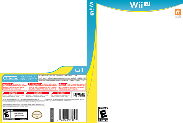
Why the blue and WHYYY the yellow stripe underneath? What's the yellow for? It's the ugliest combination of colors I've ever seen for a box template. It reminds me of your generic medicine pills you get on the drug store. Wii U was simply a mess in all aspects starting from it's selection of colors to represent it.
Why the blue and WHYYY the yellow stripe underneath? What's the yellow for? It's the ugliest combination of colors I've ever seen for a box template. It reminds me of your generic medicine pills you get on the drug store. Wii U was simply a mess in all aspects starting from it's selection of colors to represent it.
Aztechnology
Member
Is PC where you shoot the ghost kid in the face?
Yes and then Teabag lean dance on his body.
RichiRamjag
Member
You go get em Nintendo!
")
.Red Nintendo is best Nintendo.

TheGoddamn
Member
Red: a world about to dawn!
Red: I feel my soul on fire!

And this was the best Wii bundle, too:

This is the first time I've seen the My Nintendo logo. It's a Mario cap and a cloud. Kinda brilliant really.
That's a bush though.
NumberThree
Member
Good. I hope they release a red NX.
DXB-KNIGHT
Member
Wait a minute they removed the Console / Handheld logos from their YouTube video and replaced it with just Nintendo!
Wait a minute they removed the Console / Handheld logos from their YouTube video and replaced it with just Nintendo!
Yep!
Its a good thing though. Hardware brands are confusing. Putting everything under a single brand like Sony does with Playstation and Apple does with iOS is much better, it's much cleaner. Also puts Nintendo's name front and center, more will recognize the name Nintendo than they will the differently named hardware brands like 3DS and Wii U.
I do wonder about the naming conventions they'll choose to go with for the home console and handheld, because simplicity will be key. People know what a Playstation is, they know what the Playstation Portable is, they know what a Playstation VR is. People also know what iOS is and what it encompasses, they know what an ipad, iphone, itunes, ipod are.
MemoryHumanity
Member
I will never understand the color selections Nintendo used with the Wii U, especially on their box template:
Why the blue and WHYYY the yellow stripe underneath? What's the yellow for? It's the ugliest combination of colors I've ever seen for a box template. It reminds me of your generic medicine pills you get on the drug store. Wii U was simply a mess in all aspects starting from it's selection of colors to represent it.
Was this a North America thing? Never seen a Wii U box with that yellow in Europe.
American Wii U spines are white instead of blue. The yellow isn't actually there. I think he's referring to the curved line below the Wii U logo at the front.Was this a North America thing? Never seen a Wii U box with that yellow in Europe.
SinCityAssassin
Member
Only searched the first and last page for this, but I didn't see it:
"NOW YOU'RE PLAYING WITH POWER"
Yeah that was in-between. We even made it the Power segment in the Triforce, it was a lot of fun.
mocolostrocolos
Member
So.. red for Nintendo, blue for Sony, green for Microsoft..
What will you choose?
Of course Nintendo is Charmander.
havnt they always been red?
If youve lived in a cave for the last decade, yes
Well, it was red from the 70s to 2006 specifically.
D
Deleted member 465307
Unconfirmed Member
havnt they always been red?
They went gray around the time of the DS/Wii and it continued through those consoles' successors. It was likely part of the aesthetic, design, and branding they adopted with the DS (Lite) and Wii eras but also slowly lost as time went on.