• Hey, guest user. Hope you're enjoying NeoGAF! Have you considered registering for an account? Come join us and add your take to the daily discourse.

New concept art for Sonic & friends through the ages shown at 25th anniversary event

Catalix

And on the sixth day the LORD David Bowie created man and woman in His image. And he saw that it was good. On the seventh day the LORD created videogames so that He might take the bloody day off for once.
tumblr_o9benvFbhV1tu022ro6_1280.png
What project was this last pic from? It's like the perfect fusion of Classic and Adventure era. Almost like an early Adventure concept before they decided to push it further.
 
What project was this last pic from? It's like the perfect fusion of Classic and Adventure era. Almost like an early Adventure concept before they decided to push it further.

Looks close to what we got for Sonic Runners. I don't have a good eye for that stuff though.

zMVcpMB.png


EDIT: Yeah probably Sonic X. I'm going to bed, all these mistakes I'm making smh
 

Catalix

And on the sixth day the LORD David Bowie created man and woman in His image. And he saw that it was good. On the seventh day the LORD created videogames so that He might take the bloody day off for once.
Ah, it is indeed Sonic X. Always liked that design.

Edit: lol it's ok, beef. It does actually look pretty close.
 

Guess Who

Banned
Check my edit, I goofed. :p

Since I'm traveling down memory lane, this is the post I touched upon that explains the tumultuous history behind SA2. (TL;DR - blame the fans)

Honestly, I've never bought the whole "Tails/Rouge/Shadow weren't originally planned to be playable" stuff. The only real evidence for it is that 1) they weren't shown in the first trailer and 2) there's early footage of Sonic in Sky Rail instead of Shadow. Both can be attributed to them just not wanting to show all their cards in the first trailer, especially the Sky Rail thing, since they kept Shadow intentionally mysterious and hidden in the marketing for quite a while.

I especially don't buy it because the first trailer was only a year out from release, which would've given them extremely little time to readjust the game to include three new characters in both the story and the gameplay, plus the entire two-player mode is predicated on the fact that all three types of gameplay have two playable characters, plus the November 2000 demo of the game has unused data showing that all the playable characters were planned as of then (which was just six months after the first trailer).
 

Toxi

Banned
Everybody be talking about the Shadow designs, but it's the Silver designs that really get me. These are every Sonic fan OC.

tumblr_o9benvFbhV1tu022ro4_1280.png
 

TheOGB

Banned
Jesus christ Big

Blaze was basically always going to look cool, Shadow literally looked like somebody's OC and somebody else's parody of that OC, and Cream wss like 4 different animals including Marine before ending up as she is.

Ah, it is indeed Sonic X. Always liked that design.
And then he'd turn around and only have the same three quills, all awkwardly going to one side
 

Kneefoil

Member
Oh goodness, those early Shadows come off as super edgy. A couple of Silver's designs are pretty bad as well.

Some of the concepts for Blaze and Cream I actually like better than the finalized versions. I'm undecided on which Big I like the best.
 

Rlan

Member
Those Shadow designs. wew

I like this Sonic
Ke76Yjq.png


Blaze had a pretty interesting development. Not as varied as Silver's evidently, but I like the look of most of hers.

It's somewhat similar to the "Project Sonic" silouette used on the Saturn releases prior to Adventure.

160px-ProjectSonic_logo.png
 

bman94

Member
God I love the Japanese classic style sonic designs. They remind of me of a very timeless art style like Mickey Mouse. It's kind of clear that the Sonic Adventure design was more "Americanized" but I like that design too, it fits the era it was used. Any of blazes concepts would have been stellar. I wish she was used more in games, she has such a great design and character.
 

Sciz

Member
Jesus H. Christ what are those Shadow concepts.

Gamma's concepts look like they were dug back up as reference material for the new robot designs of Heroes and Unleashed.
 

Teknoman

Member
Is the art for "Sonic Project" new? it doesnt seem like Adventure era Sonic or Generations/Colors era.

EDIT: nevermind.
 

Exodust

Banned
God I love the Japanese classic style sonic designs. They remind of me of a very timeless art style like Mickey Mouse. It's kind of clear that the Sonic Adventure design was more "Americanized" but I like that design too, it fits the era it was used. Any of blazes concepts would have been stellar. I wish she was used more in games, she has such a great design and character.

Ironically, I'm pretty sure the Adventure games were meant to appeal to Japanese gamers more since Sonic was always bigger in the west and that infuriated Sega. That's why they added Final Fantasy like beasts, more cut scenes, and such.

I could be horribly wrong here but I'm sure I've heard it somewhere.
 

bman94

Member
Ironically, I'm pretty sure the Adventure games were meant to appeal to Japanese gamers more since Sonic was always bigger in the west and that infuriated Sega. That's why they added Final Fantasy like beasts, more cut scenes, and such.

I could be horribly wrong here but I'm sure I've heard it somewhere.

Ehh, I don't think so. Sega of America always marketed Sonic has being way more edgy and "cooler" than his Japanese renditions. Almost all American advertising had Sonic looking mad or smug while Japanese stuff was rather cutesy:

And Sonic Adventure in its earliest incarnation was going to be "Sonic RPG" so Sonic on a much bigger scale was the plan all along. But there was definitely friction between Sega of America and Sega of Japan.
 
Everybody be talking about the Shadow designs, but it's the Silver designs that really get me. These are every Sonic fan OC.

tumblr_o9benvFbhV1tu022ro4_1280.png
Silver's final design still looks like a Sonic fan OC.

Blaze's earlier designs are pretty neat looking, and it's neat to see the ruffles on her writs and ankles are a hold-over from when they were literally fire.
 

woopWOOP

Member
This is neat.
Love the crazy feral Big the Cat between all the cutesy Totoro designs.

Was hoping to see sketches of ferret/weasel/whatever Silver before they decided on another hedgehog. His Tron suit is pretty lol tho

All those Cream sketches are adorable and Blaze with harem pants would've been cooler tbh
 
I'd have been happy with any of those Cream designs, this includes the rabbit we got.

I'm also now realising how much I like Big's design in contrast to the usual Sonic character model, just look at that gormless goof!
 

MrBadger

Member
Wow, this is super interesting. I remember them mentioning how Shadow was originally going to be darker or a cyclops with scars or something. Didn't expect his original design to quite look like as much of a Deviantart fan character, though.

Also those early Bigs. My god

with a concept like "telekinetic hedgehog from the future" im surprised his earlier concepts arent more wacky and weird

I'm sure the concepts were less "telekinetic hedgehog from the future" and more "another cool hedgehog to recapture the reaction we got to Shadow"
 

dh4niel

Member
I miss short, tubby Sonic a lot. Shame all of the characters look like garbage when facing forwards. That's not good character design.
 

NeonZ

Member
YMHQm.jpg
91361fafb371d0ffda1655a74eda6d09.png


I'd be curious too. Funnily it seems like they got his egg shape and face down pretty quickly, but they alternated all different sorts of themes for him and his outfits.

This is just a complete guess, but Eggman seems to be based on this villain from Lupin III 2nd series. So, I'm not surprised that his face remained consistent and it was mostly his body they played with.


Even the nose shape is there, just without the red color.
 
Those Shadow designs. wew

I like this Sonic
Ke76Yjq.png

It reminds me a lot of some artwork found within the JP version of Sonic 3D Blast, the Saturn version that is.

ktMR3Scl.jpg


Sonic%203D%20Blast%20-%20Sega%20Saturn%20Version.png


3D Blast actually came out in Japan in 1999, well after Sonic Adventure's release. I guess they were trying to connect the old with the new, considering the above illustrations are basically strange combinations of the Sonic gang's retro and modern designs.
 

Ivan 3414

Member
Wow, Shadow could have been so much worse!

Edit: Also Blaze is probably the best character to come out of the modern era. They really should give her a larger role in the series.
 

CNCOMICS

Member
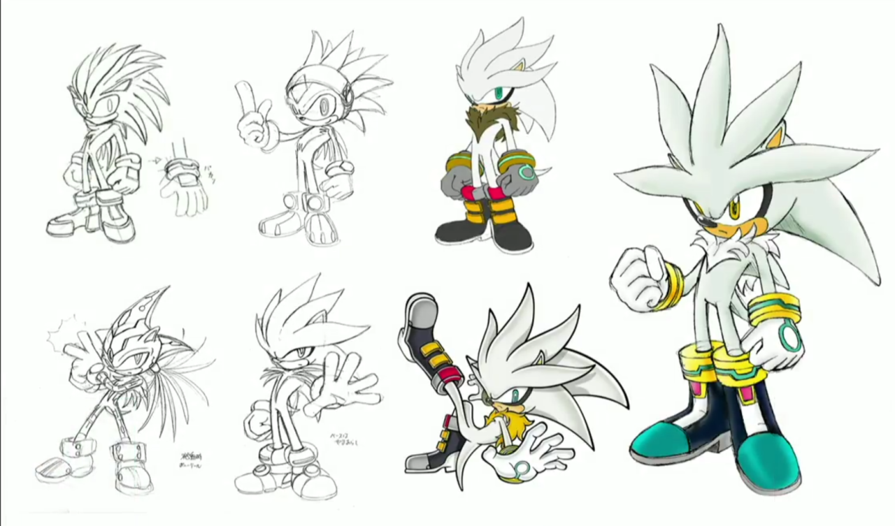
Shadow and Silver, LOL. I'm not surprised, seeing how these two seem to cause some kind of reaction in people, be it positive or negative.

Big's concepts are too cool for his dopey personality. Number 4 looks like a stoner, kinda makes sense when you're a big ass cat lazing about and your best friend is a "normal" frog that you have 1-way conversations with.

All of Cream's designs are just adorable. Kangaroo mouse Cream's feet caught me off gaurd, but then I remembered that Sonic Team haven't really nailed down bare feet designs outside of robots.
 
That second shot is from the very first footage ever shown for the game, haha. If there's anything earlier I neither remember it (despite following the game at the time) nor can I find it online.

Well, supposedly Shadow originally had only one eye and was named Terios. I can't remember if I ever saw any weird concept art of him back then, but the Terios name was later confirmed (I also remember him being referred to as "Dark Sonic"), and I do remember seeing seeing early artwork of Rouge on Sonic HQ, back when she was called Nails the Bat
 

Zubz

Banned
I like how Sonic has his pointer finger out in every single "Adventure" concept art. That must've been done as a way to bridge the designs.

Also, all of those Blaze & Big concepts are fantastic! And I know the "We got the best Shadow" had been discussed to death, but is it just me, or do those concept Shadows look like he's a robot?
 

WillyFive

Member
The Adventure Sonic is still the best design.

Those Silver concepts however look like they were drawn by a high schooler.
 
Top Bottom