-
Hey, guest user. Hope you're enjoying NeoGAF! Have you considered registering for an account? Come join us and add your take to the daily discourse.
You are using an out of date browser. It may not display this or other websites correctly.
You should upgrade or use an alternative browser.
You should upgrade or use an alternative browser.
Super Mario Odyssey Announced (Holiday 2017)
- Thread starter FireBeaver
- Start date
pixelation
Member
C'mon man.
Maybe not that bad, but they do look BAD.
ZombiePlatypus
Member
I'm still really excited for it, and no doubt gonna day-1 it when it comes out.
But man, something like this really makes me appreciate how carefully and thoughtfully Disney handles the treatment of its characters. Remember all the rules and talks Disney supposedly had with SE regarding how and when what characters could appear in what worlds? I honestly thought Nintendo had the same philosophy, but maybe not.
I understand and appreciate the "fish out of water" quality they seem to be going for in the city (and even forest) portions. I also get that the theme is traversing a bunch of a varied and different worlds on one big journey. I'm just not convinced that they couldn't convey this without making things look visually incongruous to this degree.
BigEmil
Junior Member
Think the main thing about the graphics is it's very low geometry and simple details, geometry reminiscent of PS3 360 era and some of the textures etc while the coloured shading on Mario and the sorts always look good any genMaybe not that bad, but they do look BAD.
Skel1ingt0n
I can't *believe* these lazy developers keep making file sizes so damn large. Btw, how does technology work?
I'm still really excited for it, and no doubt gonna day-1 it when it comes out.
But man, something like this really makes me appreciate how carefully and thoughtfully Disney handles the treatment of its characters. Remember all the rules and talks Disney supposedly had with SE regarding how and when what characters could appear in what worlds? I honestly thought Nintendo had the same philosophy, but maybe not.
I understand and appreciate the "fish out of water" quality they seem to be going for in the city (and even forest) portions. I also get that the theme is traversing a bunch of a varied and different worlds on one big journey. I'm just not convinced that they couldn't convey this without making things look visually incongruous to this degree.
Do you have any sources on this - for how SE was given rules by Disney for KH?
I'd just love to read that - sounds interesting.
NYC and dark forest portions look outright offputting to me.I'm still really excited for it, and no doubt gonna day-1 it when it comes out.
But man, something like this really makes me appreciate how carefully and thoughtfully Disney handles the treatment of its characters. Remember all the rules and talks Disney supposedly had with SE regarding how and when what characters could appear in what worlds? I honestly thought Nintendo had the same philosophy, but maybe not.
I understand and appreciate the "fish out of water" quality they seem to be going for in the city (and even forest) portions. I also get that the theme is traversing a bunch of a varied and different worlds on one big journey. I'm just not convinced that they couldn't convey this without making things look visually incongruous to this degree.
I'll try to spend as little time as possible in those areas.
Like, i don't know what the hell were they thinking, but it looks like a bad "Mario on UE4" tech demo.
I'm still really excited for it, and no doubt gonna day-1 it when it comes out.
But man, something like this really makes me appreciate how carefully and thoughtfully Disney handles the treatment of its characters. Remember all the rules and talks Disney supposedly had with SE regarding how and when what characters could appear in what worlds? I honestly thought Nintendo had the same philosophy, but maybe not.
I understand and appreciate the "fish out of water" quality they seem to be going for in the city (and even forest) portions. I also get that the theme is traversing a bunch of a varied and different worlds on one big journey. I'm just not convinced that they couldn't convey this without making things look visually incongruous to this degree.
I think Nintendo didn't have a great, new idea for Mario and a Mario game was needed to sell their new console so they landed on this weird idea. I'm sure the game itself will be good but Galaxy and 3D World's conceits were much more interesting. Of course, we've seen very little of the game.
Rygar 8 Bit
Jaguar 64-bit
I'm trying to even understand why there are regular ass people. I thought Mario, Luigi, Peach, Wario, etc were regular ass people cause this is a cartoon.
they are supposed to be
I think Nintendo didn't have a great, new idea for Mario and a Mario game was needed to sell their new console so they landed on this weird idea. I'm sure the game itself will be good but Galaxy and 3D World's conceits were much more interesting. Of course, we've seen very little of the game.
I think the idea is great. I like the contrasting humanoids.
Beyond the realistic city, i'm more concerned with the different art-styles (by that i mean every world has a different one it seems) and even more the fact that Mario doesn't seem to do a lot of interesting things in there. But Miyamoto said it would be more for gamers so.. I guess i'll have to trust him.
NYC and dark forest portions look outright offputting to me.
I'll try to spend as little time as possible in those areas.
Like, i don't know what the hell were they thinking, but it looks like a bad "Mario on UE4" tech demo.
Now that I look at it again it feels like they're copying Wreck-It Ralph where he travels through very tonally and aesthetically different worlds.
ZombiePlatypus
Member
Do you have any sources on this - for how SE was given rules by Disney for KH?
I'd just love to read that - sounds interesting.
I'm on mobile but it was mostly mentioned in small portions by SE/Nomura in interviews.
Solid SOAP
Member
Mario looks to be able to interact with the world in lots of different and fun ways. Swinging on poles, jumping off of car hoods, wall jumping from building to building.. looks awesomeBeyond the realistic city, i'm more concerned with the different art-styles (by that i mean every world has a different one it seems) and even more the fact that Mario doesn't seem to do a lot of interesting things in there. But Miyamoto said it would be more for gamers so.. I guess i'll have to trust him.
Now that I look at it again it feels like they're copying Wreck-It Ralph where he travels through very tonally and aesthetically different worlds.
Well yeah that's the thing, didn't anyone notice really ? There is a Low poly world for christ sake..
Mario looks to be able to interact with the world in lots of different and fun ways. Swinging on poles, jumping off of car hoods, wall jumping from building to building.. looks awesome
I'm more talking about level design. Even Mario 64 has platforming levels..
paragonpro
Banned
Why are you guys so negative on this it looks like a wonderful return to form for 3d mario. The realistic city clash is really neat and its only one world of presumably several.
WaterAstro
Member
Artstyle looks super bad.
Gameplay seems reminiscent of Mario 64, I guess?
Gameplay seems reminiscent of Mario 64, I guess?
ZeroGravity
Member
The art style is perfect for what they're going for. Mario is SUPPOSED to stand out, and they really nailed the happy medium between too realistic and too cartoony.
killertofu
Member
The quasi realistic NYC looks nasty.
pixelation
Member
Should be bigger given the extra power compared to the Wii-U.
Which leads me to my next question. Ignoring art style, do you guys think this looks like a decent graphical jump from SM3DW?
Not at all, and it pains me to say it... Nintendo sure know how to dissapoint

HappyBivouac
Member
Holy shit this is the best.
I'm not sure about them. If you look closer at the humans walking around in the city, they look like they're from the N64.

Ok i just wanted to use it.
Seems like they took the 3D World engine and made a 3D Mario game with it; but the lighting the engine provides didn't look that good in the realistic city environment. I'm sure they will fix it by launch, along with Mario's run cycle, which is really poor.
The 3D World engine is actually very good but it's not very apparent in 3D world because most levels were just comprised of simple cubical shapes. They really improved this on Treasure Tracker.
PanicFreak
Member
I'm trying to even understand why there are regular ass people. I thought Mario, Luigi, Peach, Wario, etc were regular ass people cause this is a cartoon.
I assume that one of the Mushroom Kingdom pipes took a left instead of a right and he ended up in 80's America.
More areas being shown after a few mushrooms:

Oh goodness gracious.
No live gameplay. Difficult to gauge a product at current state.
Art direction looks like heading toward Sonic 2006 hence a lot of anxious comments. Seems odd to add human figures resembling generic background characters in the Mario world.
I don't understand this at all regarding the art direction. Not all of the levels look like the city.
Why are you guys so negative on this it looks like a wonderful return to form for 3d mario. The realistic city clash is really neat and its only one world of presumably several.
Seriously. When has a 3D Mario not been amazing? People asked for a return to the Mario 64 type exploration game, that's what we are getting, and it isn't enough. People ask Nintendo to change, we get some weird NYC type level in a Mario game and people complain about the look of it. Some people are hard to please. I, for one, cannot wait to get my hands on this game.
I don't understand this at all regarding the art direction. Not all of the levels look like the city.
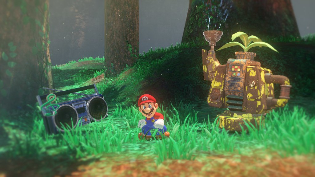
Yeah, the forest looks worse.
Humans walking/interacting with a popular mascot in game.I don't understand this at all regarding the art direction. Not all of the levels look like the city.
Of course people are anxious.
Again, there's nothing really to conclude since no live gameplay. We'll all have a better look at E3.
The least of Sonic 06's problems were its use of realistic looking human characters. Like holy shit guys.
It's one world of what should be many. Its not the Mushroom Kingdom. Its a world hopping adventure. Kingdom Hearts did this for example.
Of all of the many complaints about the Switch, this is the weirdest one.
It's one world of what should be many. Its not the Mushroom Kingdom. Its a world hopping adventure. Kingdom Hearts did this for example.
Of all of the many complaints about the Switch, this is the weirdest one.
ultrazilla
Member
The IQ in the city is appalling, just a jaggy, shimmery mess
And it's not due out until the end of this year basically?
Nintendo will clean this up nice. I think it looked fine but it *could* use some touch ups in certain areas. There's no way the graphics are locked down at this point. Not much to worry about IMO.

Humans walking/interacting with a popular mascot in game.
Of course people are anxious.
Again, there's nothing really to conclude since no live gameplay. We'll all have a better look at E3.
But we have Mario walking in a blocky vegetable garden with talking cartoony cooking utensils. That's not very realistic at all and it's a lot more closer to the aesthestic we're used to seeing of Mario.
I'm sticking by my comment that the devs really want to experiment this game with a variety of artstyles in a 3D environment.