There are some people on this forum that I think have very, very questionable opinions. That is probably the kindest way I can put it. I just watched the trailer again and it looks fucking mindblowing and worth the system alone. Yes, the human models are a bit shit, but everything else is insanely gorgeous and the variety in gameplay looks fantastic. The hat innovation is a really nice twist.
-
Hey, guest user. Hope you're enjoying NeoGAF! Have you considered registering for an account? Come join us and add your take to the daily discourse.
You are using an out of date browser. It may not display this or other websites correctly.
You should upgrade or use an alternative browser.
You should upgrade or use an alternative browser.
Super Mario Odyssey Announced (Holiday 2017)
- Thread starter FireBeaver
- Start date
Mario Adventure would be a better title
Yes, it's a world made out of crystals.Yes. I don't even know what I'm looking at. Crystal fruits? It looks like the engine bugged and the polygons got divided by at least 4, and textures haven't loaded yet. It's a mess.
That and the city and forest look horrendously out of place.
You guys are really overthinking the hell out of this. It's a game about Mario exploring the multiverse, shit is gonna look weird.
James Scott
Banned
Mario looks super hype. Gameplay wise it looks pretty perfect and I like that the game can look so different depending on the level even if the City level looks a bit rough.
Overall, i think it slightly surpasses Zelda as my most anticipated.
Overall, i think it slightly surpasses Zelda as my most anticipated.
pinkurocket
Member
Super Mario Odyssey featuring Danny Devito as Mario as Danny Devito.
cryptosporidium
Member
honestly thought it looked bad but the gameplay looked like it played right
I personally love the bizarre mix of art styles, it's something that you don't see much in video games. They could've just used the normal Mario art style for the entire game, but they wouldn't really be doing anything new. Even if you dislike the games art style, you have to commend the developers for tying something unique.
They are disappointed of the console and hate it now because it exists. Dont bother to give them a reasonable point, wont do anythingYes, it's a world made out crystals.
You guys are really overthinking the hell out of this. It's game about Mario exploring the multiverse, shit is gonna look weird.
")
people be grasping at straws to hateMakes sense that the most creative Mario game Nintendo's shown since SMG ends up being the most hated.
Nicktendo86
Member
The ability to use the hat to make your own platform looks ingenious on its own. This game will be packed with a massive variety of gameplay I am absolutely sure.There are some people on this forum that I think have very, very questionable opinions. That is probably the kindest way I can put it. I just watched the trailer again and it looks fucking mindblowing and worth the system alone. Yes, the human models are a bit shit, but everything else is insanely gorgeous and the variety in gameplay looks fantastic. The hat innovation is a really nice twist.
goldenpp72
Member
I like how the game is trying to be odd and place Mario in unusual, unfitting places, and then people complain that the art isn't consistent and that Mario is in weird and unfamiliar places.
It's fine to not like a concept but, it's not really worth bashing a game over something it's doing on purpose.
It's fine to not like a concept but, it's not really worth bashing a game over something it's doing on purpose.
I am excited for a Kong run New York...


If Donkey Kong doesn't make an appearance I'll shit. At least a cameo as Mayor.
Edit: Holy shit! Donk as in Donkey Kong?
forknknife
Banned
Is the team making odyssey the same that made the galaxy and 3D world games?
I keep seeing this statement... that certain areas are out of place and don't match the other art styles. Is that not the point of this game?? It seems like you travel through a variety of worlds, universes, dimensions, etc.
I love it, cannot wait to see more.
It being the point and it being hideous aren't mutually exclusive.
I'm not a Nintendo fan by any stretch, but I've long felt that Mario Galaxy is one of the best-looking games in the history of the genre. Nintendo overcame underpowered hardware with exceptional art that ticked every box; it was cohesive, it paid tribute to the past and it looked beautiful in isolation.
This just looks like a messy mash-up of ideas in comparison. I'm sure it sounded great on paper, but the execution just isn't attractive IMO.
Astral Dog
Member
Yes the main Kyoto team. Has been like three years since WorldIs the team making odyssey the same that made the galaxy and 3D world games?
Solid Raiden
Neo Member
Despite it being the first video game I played when I received my first console, the NES, the Mario games have never captured me in the same way as let's say Zelda. In addition, I have my fair share of reservations and issues with the switch. That being said, this looks like the most captivating Mario title since Mario 64. I haven't really enjoyed a Mario game since then but I find myself interested in this one.
SinCityAssassin
Member
Donkey Kong's subjugated humanity into his hands I bet.
Yes the main Kyoto team. Has been like three years since World
Yoshiaki Koizumi's team works in Tokyo, not Kyoto. 2D Mario is developed in Kyoto.
But yes, this is the same team that made Galaxy, 3D Land/World, and Captain Toad.
Aldric
Member
At this point l feel like discussing graphics of a Nintendo game is just a low hanging fruit. lt's a game based on 3D World's engine except the levels are big sandboxes instead of bit sized simple geometrical shapes floating in the void. You'll automatically take a visual hit.
l think the return to a more traditional gameplay approach after so many people on this forum and everywhere else swore Mario 64 was a mistake and 3D World was the perfect future for the franchise is far more interesting.
l think the return to a more traditional gameplay approach after so many people on this forum and everywhere else swore Mario 64 was a mistake and 3D World was the perfect future for the franchise is far more interesting.
forknknife
Banned
Yes the main Kyoto team. Has been like three years since World
I don't know, i really don't understand how the same team can make these two games. The video from 3d world you posted earlier looked amazing to me compared to odyssey... well, hope they end up convincing me somehow the next time they show the game.
I personally love the bizarre mix of art styles, it's something that you don't see much in video games. They could've just used the normal Mario art style for the entire game, but they wouldn't really be doing anything new. Even if you dislike the games art style, you have to commend the developers for tying something unique.
I mean, take this area for example:
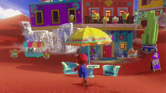
Looks different to anything we've seen in a Mario game before, but it does so without looking like someone's "Mario visits the real world!" fanfic come to life.
grim-tales
Member
Those dirt and grass textures look like they belong in a Wii game.
Hope they clean up all the aliasing too.
If the game is supposedly a year away I'm sure they'll fix that. It looks good in many ways already (imo).
Seeing the trailer makes me excited thinking of the possibilities for the game.
anothertech
Member
Those eyes doe
tenderbrew
Member
LOL @ the people doing a Digital Foundry quick look at these trailers.
Nintendo games on Wii U looked amazing despite that having less power than the Switch. Not worried about how it looks in motion. Nintendo delivers.
Nintendo games on Wii U looked amazing despite that having less power than the Switch. Not worried about how it looks in motion. Nintendo delivers.
Secret Fawful
Member
I am excited for a Kong run New York...
I don't understand. Why have all these references for no reason? I love it, I just hope the Kongs actually make an appearance.
Also, the people really make me think of the Wii Fit Lady.
grim-tales
Member
Not an exaggeration at all. Mario really looks fantastic, and better than many of the good looking PS3 games. I mean yeah, UC3 might looks better, and maybe a few more, but not much else.
If it runs at 60FPS then especially what he said is not an exaggeration at all - I would be hugely impressed if the game is really running at 60.
I apologise, I thought the poster was using that in a negative way (because they said "Good God" which sounds negative to me). I mean, PS3 is 10 years old now, right?
ForsakenLotus
Member
Looks cool, but the real world stuff reaaaallly is out of place. Its Mario so I'm sure it will be good, but that aspect sticks out like a sore thumb.
I don't understand. Why have all these references for no reason? I love it, I just hope the Kongs actually make an appearance.
Also, the people really make me think of the Wii Fit Lady.
New Donk City (Empire State Building?)
Scaffolding
Donkey Kong References
There's got to be a King Kong moment.
Simbabbad
Member
How's finding the game visually repulsive "overthinking"? Aren't the people that justify the visual clash precisely the people that are (over)thinking it? It just looks horrible and I don't care about any sort of justification, I'm not going to pay for a game that repulses me.Yes, it's a world made out of crystals.
You guys are really overthinking the hell out of this. It's a game about Mario exploring the multiverse, shit is gonna look weird.
It's so weird doing that sort of mistake after the Sonic 2006 debacle and after nailing the art style in 3D World and Mario Kart 8.
SuperEpicMan
Banned
I only just noticed the hat in the logo looks like a plane lol
Green Yoshi
Member
Calling it now, Mario's ship is actually a giant hat that a giant Mecha-Mario will wear near the end of the game.

Somebody at Nintendo must have seen "Up" by Pixar. ;-)
Secret Fawful
Member
I mean, take this area for example.
I just realized Mario has basically a Sonic spin.
New Donk City (Empire State Building?)
Scaffolding
Donkey Kong References
There's got to be a King Kong moment.
Yeah, that's got to be it.
DecoReturns
Member
Looks great, but who are we kidding? This won't come out until mid 2018 at the earliest judging by the frame rate hitches and Nintendo's track record.
Don't think so. 3D world was announced late and launched on time. Plus I have a feeling this is 1 of their Nov titles. They love releasing big games during the thanksgiving week
Solid SOAP
Member
I love it. Every area looks completely different to the last, I can tell that this is going to be fucking awesomeI mean, take this area for example:
Looks different to anything we've seen in a Mario game before, but it does so without looking like someone's "Mario visits the real world!" fanfic come to life.
illmatic22
Banned
Looks stunning. Way more interesting than 3D World to me. This and Zelda look like frontrunners for Game of the Year. Absolutely blown away.
PSFan
Member
I don't understand. Why have all these references for no reason? I love it, I just hope the Kongs actually make an appearance.
Also, the people really make me think of the Wii Fit Lady.
Maybe it's a hint that there's a new 3D DK game coming in the future. I'd love another DK64 type game.
forknknife
Banned
I mean, take this area for example:
Looks different to anything we've seen in a Mario game before, but it does so without looking like someone's "Mario visits the real world!" fanfic come to life.
That level looks aesthetically pleasing but... level design wise? It's just a street with some houses to the sides? That's not looking like the sort of big open sand box levels i was hoping for. Same with the city one as seen in that screen grab somebody posted before where you can see the level from high up. It's really not that big of a level, maybe 20-30 buildings.
I'm not really impressed by the level design of the game in the slightest and that's really worrying me because that's the most important thing in a 3d mario.
Maybe you should get more impression then a couple of secondsThat level looks aesthetically pleasing but... level design wise? It's just a street with some houses to the sides? That's not looking like the sort of big open sand box levels i was hoping for. Same with the city one as seen in that screen grab somebody posted before where you can see the level from high up. It's really not that big of a level, maybe 20-30 buildings.
I'm not really impressed by the level design of the game in the slightest and that's really worrying me because that's the most important thing in a 3d mario.
I personally love the bizarre mix of art styles, it's something that you don't see much in video games. They could've just used the normal Mario art style for the entire game, but they wouldn't really be doing anything new. Even if you dislike the games art style, you have to commend the developers for tying something unique.
Especially considering this is Mario we're talking about. Almost every Mario game on the Wii U and 3DS was very predictable from an aesthetic standpoint, and I think that point is proven by how much mileage this gif got-

That one creative map screen that breaks the mold right at the end of the story campaign, which stood out because of how predictable Mario games are.
And then we have this game trying out all these completely different artstyles within itself, I think that's incredibly exciting. We have no idea what the other worlds will look like, how the game's structured, what Bowser's deal this time is, etc.
Just noticed it's called New Donk CIty, oh please tell me Donkey Kong is involved and it's like a King Kong style city battle. It's the only thing that fits with the realistic aesthetic, plus it'll be cool to have Donkey Kong in a main Mario game as a Boss.
Damn, that would make sense at least.
This certainly looks like it might be just that.

Nah m8 sonic has always been a mixture of platforming and time-trial action and the generations/colours/unleashed style matches that far better than the dodgy gameplay of adventure.
The classic Sonic games have a broadly complimentary design and physics system that allows players of different gaming styles to place an emphasis on exploration and casual play, or on actual skillful speed-running by taking advantage of the physics and intentionally-placed platforms and slopes. The pacing of the games is more variable from moment-to-moment and from stage-to-stage, leading to one stage that can focus on more straightforward rolling and dashing while the next focuses more on timing jumps and more claustrophobic design, all within a physics system that can be most easily described as adhering to the animation principle of ease-in and ease-out. Level gimmicks also had the leeway to be unique per stage and could range from see-saws, ziplines, boost pads, magnets, centrifugal obstacles, and other things you could think of that fit within the physics system and the level's theme.
The boost games on the other hand leave the exploration part to the wayside (with the arguable exception of Unleashed due to its themes but different argument for a different day) by creating a rigid gameplay style and narrow physics system where speedrunning is the entire point, allowing most people to perform visually flashy feats of skill and feel like a badass through nothing more than rote memorization and twitch gameplay. The pacing of these games (at least the good ones because, again, fuck Colors) is more of a binary state: Sonic reaches top speed immediately, the slopes that exist have little discernible impact on acceleration and speed, and he moves at a constant until he is stopped by a platforming segment (smartly telegraphed most of the time with camera switches). As a result of how narrow the gameplay style is, level gimmicks tend to be more conservative and used throughout each stage to prevent any sort of confusion that would muddy the point of speed running- dash pads, rainbow rings, rails, and poles to swing from are in most levels regardless of whether or not they make sense to be there or are unique enough to the level's theme. You occasionally get something like Rooftop Run's balloons.
Classic and boosting gameplay are fun in their own ways but they're nowhere near close analogues to one another be worth comparing to, especially not compared to Sonic's actual gameplay in Adventure where the rolling and Spin Dash, ease-in and ease-out, a believable sense of gravity, and more contextualized design and level gimmicks like in the classic games actually still exist. You might as well say that Burnout and Forza are the basically the same because you can drive cars fast.
It also understands what setting sonic belongs in rather than trying to shove him awkwardly in the real world.
First, Sonic has always taken place in an analogue of Earth in the Japanese canon, which the Japanese Sonic Team was always going to favor. Second, the settings of the classics are disparate islands and statistically cannot be considered representative of the rest of the planet anyway. Third, the detail and realism of the classic games actually increased as time went on; Angel Island looks more like a real island than Green Hill does by placing a higher emphasis on detail and rendering versus sticking straight to abstract geometric stand-ins of real world locations and flora. Fourth, a human city is the third level in Sonic 1. And fifth, Sonic Adventure, despite its push for realism, nonetheless maintains a generally lighthearted color scheme and fantastic use of scale, set pieces, and otherwise nonsensical design that keeps the world from being perfectly representative of ours. SA1 is in ways a natural conclusion of what Sonic Team had always envisioned in the first place.
There's two weak points in your argument.
One, what sold well and had good reception at launch? Matrix bloody 2. And what a classic that was!
Two, don't use age to excuse SA's shoddiness. Crazy Taxi, Chu Chu Rocket and JSR all came out on the dreamcast and they all hold up to this day whereas SA1 is still fucking garbage.
What is your point? GoldenEye was fucking amazing back in the day but it's a piece of garbage now with modern FPS standards having supplanted it. So this doesn't serve to refute anything. The majority of games- nay, the majority of all media is nothing but a product of its time. For every decent-ish 3D game from 1997, I can find 15 more that would be outright unacceptable today regardless of their initial receptions. So what matters then in a reasonable conversation that takes history into account is comparing initial performance and cultural fallout when gauging the meaning and impact that any particular work had. And the fact remains that SA1 did far better than what "classic diehards" (and I put this in serious air quotes because you've displayed no reasonable working knowledge of how the classic games actually played) remember it did.
I'm not revising anything, SA was and always will be an absolute mess.
K.
I don't want to say you have bad taste,
Fuck this patronizing bullshit with a rusty fork?
That level looks aesthetically pleasing but... level design wise? It's just a street with some houses to the sides? That's not looking like the sort of big open sand box levels i was hoping for. Same with the city one as seen in that screen grab somebody posted before where you can see the level from high up. It's really not that big of a level, maybe 20-30 buildings.
I'm not really impressed by the level design of the game in the slightest and that's really worrying me because that's the most important thing in a 3d mario.
If it makes you feel any better, I think the later shots with the big floating inverted pyramid and riding the stone lion all take place in the same world as those scenes I GIF'd.
Zen_Arcade
Banned
I don't even understand how a 3D Mario game with worlds can be criticized as having "Visual clash" after the beloved 64 had no cohesiveness to its levels. That shit was all over the place.How's finding the game visually repulsive "overthinking"? Aren't the people that justify the visual clash precisely the people that are (over)thinking it? It just looks horrible and I don't care about any sort of justification, I'm not going to pay for a game that repulses me.
It's so weird doing that sort of mistake after the Sonic 2006 debacle and after nailing the art style in 3D World and Mario Kart 8.
Like if they showed a trailer of Lethal Lava Land, Whomps Fortress and Big Boos Haunt would people really be going "Yeah but it's not cohesive!"
It's one thing to think the levels look like they have bad art direction or that it's not impressive by some sort of technical standpoint, but the whole needing to be cohesive thing just screams nitpicky considering the history of the series.