Terbinator
Member
Looks like 343's Halo, that's for sure.
:/
It looks just as grim as the Reach concept art.
Looks like 343's Halo, that's for sure.
:/
Looks like Halo. Not much else I can say really.
Looks like Halo.
Looks like Halo. But Sparth is an amazing artist and it needs to be made clear anytime his work is posted.
Looks like Halo, I like Halo.
What does this even mean? If the OP didn't say it was Halo and the art didn't have the 343 logo in the corner, how would you know this is Halo concept art? It just looks like art for a sci-fi thing.Smells like halo


Thats the first thing I thought of when I saw it.
Maybe a Covie ship being repaired?
Or maybe it's Covie inspired human architecture.
Next-gen hardware, 60 frames-per-second, Sparth in control of art... can't freaking wait!
2014 is going to be an awesome year.
I could easily say that first picture is just some sort of sci-fi thing. Though from those two shots, it seems like Halo 1 is what looks like Halo for you. The art in OP is very similar to loads of art we've seen come out of the franchise post-Halo 3, not to mention it looks like the Infinity is there and there are some clearly Covenant-reminiscent structures which even date back to Halo 1 designs.What does this even mean? If the OP didn't say it was Halo and the art didn't have the 343 logo in the corner, how would you know this is Halo concept art? It just looks like art for a sci-fi thing.
What does this even mean? If the OP didn't say it was Halo and the art didn't have the 343 logo in the corner, how would you know this is Halo concept art? It just looks like art for a sci-fi thing.
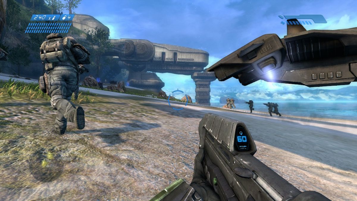
This looks like Halo to me:
[Images]
Rehosted so you don't have to download:

Looks like Halo, I like Halo.
Maybe a Covie ship being repaired?
Or maybe it's Covie inspired human architecture.
I'm pretty sure it's the latter. Look at the rehosted photo midway through the page.
There's also a similar structure in the background of the picture, you can see the curve is coming off a building, not a covenant ship.
Maybe Earth is being attacked and master chief needs to go gather allies in the galaxy.
What does this even mean? If the OP didn't say it was Halo and the art didn't have the 343 logo in the corner, how would you know this is Halo concept art? It just looks like art for a sci-fi thing.
This looks like Halo to me:
http://i.imgur.com/V2swzQP.jpg/IMG]
[IMG]http://i.imgur.com/MQ0bOiV.jpg[/MG][/QUOTE]
But those are pictures of Forerunner locales... This is a picture of a UNSC base or something.
But those are pictures of Forerunner locales... This is a picture of a UNSC base or something.
Its going to be glorious getting back into halo after some years.
(Basically skipped 4)
What does this even mean? If the OP didn't say it was Halo and the art didn't have the 343 logo in the corner, how would you know this is Halo concept art? It just looks like art for a sci-fi thing.
Halo 4 had tons of amazing concept art too.
Hardly mattered.
how does that ship stay afloat? if theyve invented something with that kind of anti gravitational power, why does it still use thrusters?
What does this even mean? If the OP didn't say it was Halo and the art didn't have the 343 logo in the corner, how would you know this is Halo concept art? It just looks like art for a sci-fi thing.
Seems pretty industrial. Hoping there's plenty of beautiful vistas and natural settings.
What does that even mean? Halo 4 looked amazing.
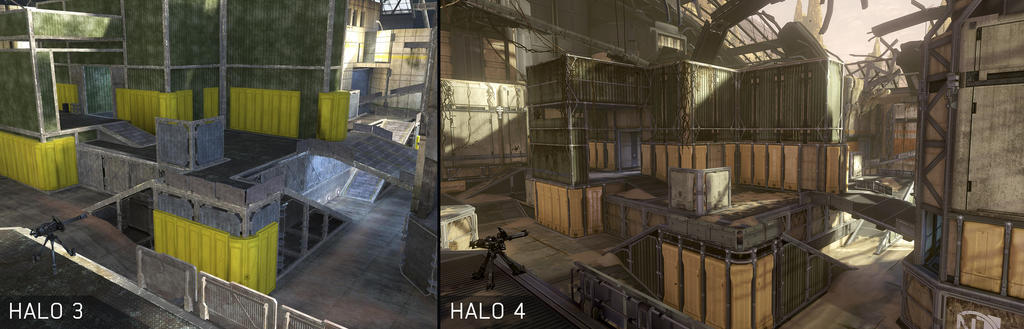
That the actual game art was filled with shitty browns and mottled greens and greys, sucking the life and vibrance out of a significant amount of the game's levels.
Here's a comparison of the de-colorification.
The gameplay designs also sucked too but whatever this is about art.