Kageshinzo
Member
I think Liefeld has an anti-foot fetish.
It's more like he can't draw feet.
I think Liefeld has an anti-foot fetish.
Thor

Is that chain so he doesn't lose Mjolnir? It seems a bit short haha.
there were bad designs, sure. but they at least seemed fun. the 00's gave us penance. no era can really call out any other in terms of designs
its the bunny slippers that bring it all together.
The ending the the Knightfall saga was all kinds of cool.
When Bruce comes back to regain his mantle and finds Azreal has become this violent, mechanised, madman.
Then Bruce defeats him using wits and intelligence, without ever throwing a punch.
To me it signifies the end of the 90s and the start of the modern age.
knightfall ended in 1994, right when the clone saga started, before age of apocalypse began, and during the return of superman. i do like the interpretation of it being at least some sort of rejection of 90s comics in a way, but the worst was yet to come.
knightfall ended in 1994, right when the clone saga started, before age of apocalypse began, and during the return of superman. i do like the interpretation of it being at least some sort of rejection of 90s comics in a way, but the worst was yet to come.
I fucking love the Ben Reilly Spider-Man outfit.

Spidey 2099 is fantastic as well.
Now this...this was the worst..
who's the idiot drawing this? from "excuuuse me" iron man to "broken neck" hulk to dull-faced thor and cap, it's surely a masterpiece
Eeep... I, uh, I really liked Age of Apocalypse. *hides*
Why do the Thing and Human Torch need guns?

I'm pretty sure this is a joke cover
who's the idiot drawing this? from "excuuuse me" iron man to "broken neck" hulk to dull-faced thor and cap, it's surely a masterpiece
Why do the Thing and Human Torch need guns?
Why do the Thing and Human Torch need guns?
i never made it past the first volume. i had no idea what the hell was going on.
the x-men cartoon made it seem pretty cool, at least.
Now this...this was the worst..
Somebody cracking the Avenger's varsity jacket?
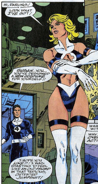
The Wasp

I'm pretty sure this is a joke cover

90-ies MJ Parker was also....interesting....for me as a teenage boy.


who the crap is in the bottom left? only one I can't recognize.Yea Modern super hero costume redesigns are totally better:

Because....Hulk smash not Hulk spam nadesBecause why not?
Why would you say this and then use Liefeld and a guy who co created Wildstorm as examples? Its like you're trying to prove 90s art sucks.Yea Modern super hero costume redesigns are totally better:

Sarcasm?Why would you say this and then use Liefeld and a guy who co created Wildstorm as examples? Its like you're trying to prove 90s art sucks.
who the crap is in the bottom left? only one I can't recognize.
edit: wait, that can't be sunspot on the far right either...
No. Was that the joke? I dont know who did the bottom picture so I dont know if its a running theme or something.Sarcasm?
WHY DOES ROB LIEFELD STILL THINK THAT GUNS HAVE TWO HOLES ON THE FRONT
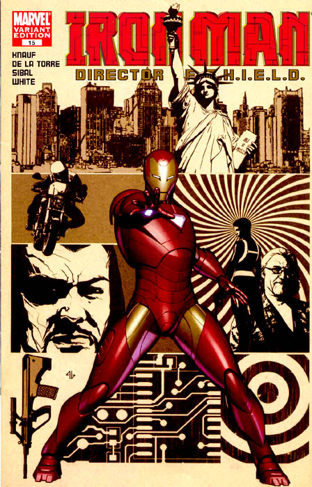
It always baffles me how fucking lame Iron Man looked before the movies.
")

No. Was that the joke? I dont know who did the bottom picture so I dont know if its a running theme or something.

The big thing that always bothers me about most drawings of Iron Man I see is that they always seemed to treat the armor like this skin-tight flexible thing that still allowed full flexure and contortion of limbs (before Extremis and the whole nanomachine thing)
I mean yeah, I get it, making him look stiffer would have taken more time to plan and illustrate, but it always bugged me
BOOOOOO
Ben Reilly is amazing. His Scarlet Spider costume and his Spider-Man costume are the best.
I loved Ben Reilly and the Scarlet Spider suit was cool as hell. How dare you.
Now this...this was the worst..
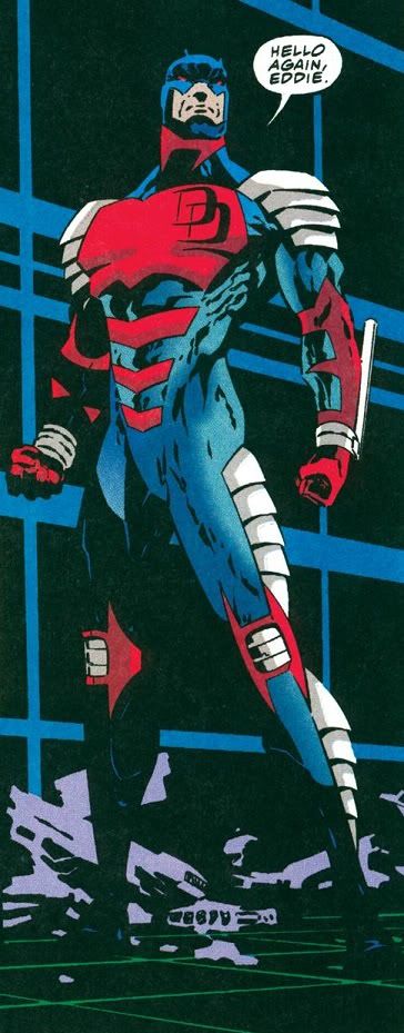
Armored daredevil was awesome