• Hey, guest user. Hope you're enjoying NeoGAF! Have you considered registering for an account? Come join us and add your take to the daily discourse.

Amazon.ca: THESE are real Wii U boxes

Ryoku

Member
And this. I like the gradient orange a lot tbh.

Still, the flat blue looks off.. Maybe a gradient for it would look better? Anyone up for the task of editing it so it isnt as flat?

It's actually not a flat blue. The detail is gone, but you can see in picture that Alr1ghtstart that it's not actually flat. There's a slight top-down gradient in the blue. Terrible JPEG compression killed the detail. But I've put a gradient, regardless.

untitled-2o6bse.png
 

Skiesofwonder

Walruses, camels, bears, rabbits, tigers and badgers.
Do you think unassuming parents have bought 3DS games for kids thinking the game would fit the old DS?
I wonder how often it happens

Probably. I've seen first-hand plenty of parents not understanding the full differences between the 3DS and DS (outside of 3D), which is understandable.

On another note, my Wal-Mart has the 3DS games mixed in with the DS games, and even I have trouble spotting them at times. It's like playing spot-the-difference or something....
 

Tathanen

Get Inside Her!
Once again the GAF Design Team decides they know best, and photoshops together an "obviously superior" item that is in no way superior in any universe to the original.

It's always the same shit in these threads. Isolate one aspect of one thing devoid of the entire unified branding effort, and decide that it's bad with zero context. The "blue and yellow" could be the whole Wii U brand, built into the packaging, built into the firmware interfaces, etc etc. Same thing happened with the new Comedy Central logo.

And it looks fine, even beyond that. There is nothing gross about blue and yellow together, and there is nothing gross about that blue and that yellow together. You people are NUTS.
 

enzo_gt

tagged by Blackace
Said in the other thread, looks absolutely terrible.

The white strip edit looks semi-acceptable though.
 
It's actually not a flat blue. The detail is gone, but you can see in picture that Alr1ghtstart that it's not actually flat. There's a slight top-down gradient in the blue. Terrible JPEG compression killed the detail. But I've put a gradient, regardless.

untitled-2o6bse.png

Well, at the very least they should look better in person. Even so, I'm not thrilled with the look.. That said, I really like the image you made, the gradient and the orange looks really nice.
 

IrishNinja

Member
i like it, yellow's not too big fortunately. more art on the cover is a good thing.

what's the avengers game? any chance id want that & its not another shitty marvel cash-in?
 
If these are real, I must write a review.

First off, it being DVD size is kinda of a bummer. Was hoping for a blu ray size or a unique size. The white Wii U logo is kinda odd since the official colors are grey wii and blue U and it feels like this will cause confusion among casuals and they may think Grey Wii and Blue U and White Wii U are separate systems. The worst offender is that the box itself is blue. We already have blue Vita boxes, they should've came up with a color thats not currently used like orange or even grey to different it. The blue is a dissapointment. The NiN logo is also in a odd position and should've been on the blue top border by the Wii U logo.

On to the positives. The throwback to Game Cube is really awesome. I loved the GC boxes and I am in love with the actual design of the top header. The side of the box displays a Wii U logo and the game's title is alright. The yellow doesn't bother me, and the top border is really cool. Nintendo's willingness to go back to the GC design is really cool since it shows that they ae willing to put a console's top border that sold so miserable right on their new system. It is very brave of them and I hope it doesn't backfire, making the Wii U sell only around 20 million untits at the end of its life.

Overall, I have to give this a 8.8 eShop Stars out've 10.
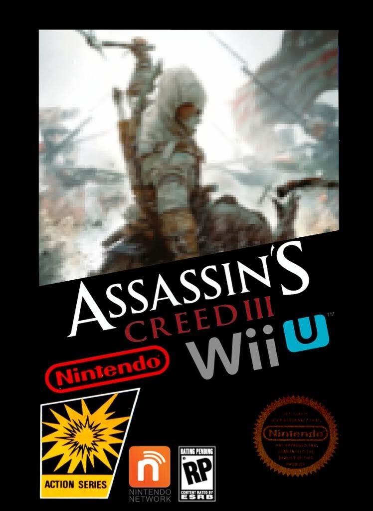
 
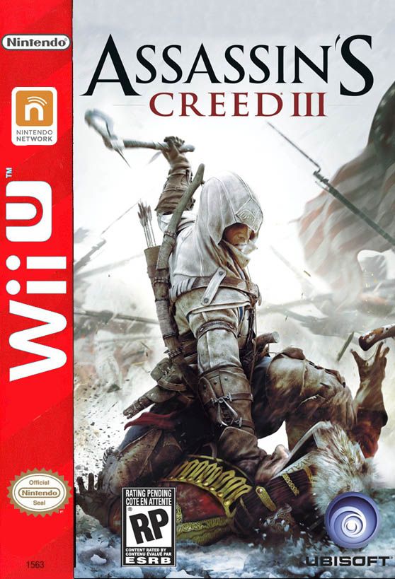
I refuse to believe that. It doesn't do a very good job presenting logos. All the covers are too busy. It could have been like the Xbox boxes where at least system-specific features are consistently visible.
 

richiek

steals Justin Bieber DVDs
For months, folks on GAF have been bitching about how people would confuse the WiiU with the Wii. The new design looks fine, and it definitely looks different compared to the Wii.
 
i like it. the blue curve(?) doesn't overwhelm the art, and the yellow makes for a nice eyecatch. not a fan of the Nintendo Network logo placement, though. it's like they have no idea where to put it.
 

10k

Banned
The Wii U box is going SSJ. I'm ok with the yellow, even though it has nothing to do with the Wii U colors we have seen so far.
 

MasterShotgun

brazen editing lynx
I don't have any issues with it except for that yellow line. The shape is different from the other two consoles' boxes and is a callback to the Gamecube, and that teal really stands out. But the yellow line somehow manages to cheapen the whole thing to me. It would be even worse if the boxes ended up being teal.


Now that would be perfect.
 
XBOX already stole green and Kinect took purple. What does Sony have? Indigo?

A red stripe would be too much American flag colors.

I think orange would be better.
 
Top Bottom