OchreHand said:something i am working on at the moment...

hopefully finish painting this soon..and figure out a color scheme
HOLY FUCKKKKKKK
OchreHand said:something i am working on at the moment...
hopefully finish painting this soon..and figure out a color scheme

") I hate summer vacations...
I hate summer vacations...We are not even in Summer yet.. lolzoukka said:Well the legs aren't too great. I mean Chun-Li has massive thighs, but those look straight ripped from a male bodybuilder. I can't excatly put my mind where the crucial difference is though. The upper body is too stretched from the pelvis and the face is ugly as hell.
Otherwise it's pretty good. I guess you've done a lot of american-styled comic characters and superhero poses?
Fuck I haven't done anything in ages
Mik2121 said:We are not even in Summer yet.. lol
zoukka said:Well the legs aren't too great. I mean Chun-Li has massive thighs, but those look straight ripped from a male bodybuilder. I can't excatly put my mind where the crucial difference is though. The upper body is too stretched from the pelvis and the face is ugly as hell.
Otherwise it's pretty good. I guess you've done a lot of american-styled comic characters and superhero poses?


The Take Out Bandit said:Joke post? Seriously.
Chun Li has always been muscular. She's a martial artist, not some ghetto camel from a rap video. Classic Capcom art, not that Udung shit, always depicted her with nice toned legs. So I'm working from that tradition in my visual approach.
The pose is taken from a SF2 sprite that I had to rotate in my head. It took quite a bit of under drawing; but at the end of the day to match the pose sans any photo reference I just had to go with what I had.
On the face, I probably could have done a bit better; but I only had one evening after work to get this done from pencils to inks.
I'm hard pressed to take this critique seriously, unless palsied monkey drawing with a pencil that's insert in it's anus is a style you're shooting for. If you were Dough Mahnke or Oh! Great I'd give you a pass on the brutish critique style, but you've got a long way to go judging from what you've been putting forth here.
soultron said:^word.
The detail on the boots is killer though. It sounds really dorky to like something so small, but the detail is appreciated.
Rorschach said:I still say that guy's leg is backwards.

there's a fine line between critque and criticism. Zoukka's comment was mostly critique except for the part where the face is ugly as hell. that's criticism.The Take Out Bandit said:Joke post? Seriously.
Chun Li has always been muscular. She's a martial artist, not some ghetto camel from a rap video. Classic Capcom art, not that Udung shit, always depicted her with nice toned legs. So I'm working from that tradition in my visual approach.
The pose is taken from a SF2 sprite that I had to rotate in my head. It took quite a bit of under drawing; but at the end of the day to match the pose sans any photo reference I just had to go with what I had.
On the face, I probably could have done a bit better; but I only had one evening after work to get this done from pencils to inks.
I'm hard pressed to take this critique seriously, unless palsied monkey drawing with a pencil that's insert in it's anus is a style you're shooting for. If you were Dough Mahnke or Oh! Great I'd give you a pass on the brutish critique style, but you've got a long way to go judging from what you've been putting forth here.
Not a few... more like 20-30. Look at where your dude's knee and shin. Still, you're right, Sagat isn't exactly realistic either.zoukka said:I can always say it's not meant to be realistic :lol
But yeah majority of my friends think so too.
EDIT: It's only a few degrees though rom the original sprite:
http://farm2.static.flickr.com/1045/666066960_d43927b21d.jpg


That's a constant problem whenever I use pencil. I think it looks alright until I stand back and realize that I'm not pushing the darks at all. I'll just keep practicing :lolzoukka said:I like the hand with the cloth image the most. Other drawings could use more contrast and they hover between accurate and wobbly linework, so choose one and ditch the other or something. And get yourself some inking equipment and ROCK THE FUCK OUT OF THOSE PAPERS!
Zoso said:That's a constant problem whenever I use pencil. I think it looks alright until I stand back and realize that I'm not pushing the darks at all. I'll just keep practicing :lol
zoukka said:Do that! And are you using an array of pencils? Softer ones give darker black. Also charcoal is something I think you would like.
And watercolours are awesome, cheap, quick and good for just shading something.
viakado said:^^i recognize your style from somewhere else. who do you work for? or any published works?
yeah, i've seen your works before. can't say where though. maybe conceptarg.org or cgtalk.Arcipello said:done stuff for Capcom and Activision although all that work is super polished.... theres a bunch of art on my DA www.arcipello.deviantart.com ....maybe your confusing me with someone else
I used to draw and this thread makes me legitimately sad, mostly since I ditched art to become an engineering student. I still have my tablet, but I'm so out of practise now and don't really know where to start. (Tips on where to start for someone who knows how-ish to draw, but wants to develop a solid hobbyist foundation? Program and book recommendations appreciated.)StormyTheRabbit said:I...wish...I...could draw.
depends on what direction you wanna head to. im assuming you'd like to be in professional level illustrator or animator?soultron said:I used to draw and this thread makes me legitimately sad, mostly since I ditched art to become an engineering student. I still have my tablet, but I'm so out of practise now and don't really know where to start. (Tips on where to start for someone who knows how-ish to draw, but wants to develop a solid hobbyist foundation? Program and book recommendations appreciated.)
Thanks for the awesome advice and recommendations.viakado said:depends on what direction you wanna head to. im assuming you'd like to be in professional level illustrator or animator?
for that you must have a strong observational skill. drawing exactly what you see. that means tons and tons of sketch books filled with life drawing. from objects, scenes and people.
from there you can start building your skillset by studying value, color theory, perspective. And in line towards animation, good understanding of the figure, motion, facial and body expressions, etc.
for foundation drawing check out books by loomis, vilppu, and barbara bradley.
Arcipello said:sketch i did today in photoshop.
zoukka said:That new sketch is pretty nice Arcipello! I would just ditch the bike-guys, because I get distracted by them and start thinking about what the guys are doing. also why would he ride a bike on that narrow bridge of death
The composition is really good as expected. The colour on the young characters coat is spot on.
zoukka said:Oh man you just downplayed my opinion by my submissions in here? Nice job getting pissed off for nothing. But I definately saw it coming when you look at this thread and the "be nice" atmosphere going on. This is why people don't give decent feedback to each other in here. I wasn't being hostile or anything :/
I'm pretty sure that's because of the reference material.
soultron said:To put zoukka's original critique in a nicer way:
-> the lips on the face are the only thing really "wrong with it."
-> the perspective on the chest makes it look like the torso is maybe rotated 20* from the vertical, making the boobs look like they're flying/flopping upwards because of the strange shadows on them.
-> there is a major disconnect between the torso and pelvis if you look hard enough.
The border and SF4 "paint swoosh" are nice stylistic touches.
Raging Spaniard said:Yeah Im with zoukka here, his comments were good, no need to take them personally.
I personally think her thighs are ok but her right one bulges out too much for my taste. Also both her leg muscles are flexing the same way even though each leg is doing a separate movement, but that's me being nitpicky. As a last comment her left foot should be a bit bigger since its closer to us due to the foreshortening.
viakado said:as for my own critique. seems like you're trying to mimic an artstyle. not something you should be aiming for at this juncture. it does more damage than development especially when it comes to figure drawing. proportions and angles are a bit off in some spots
btw, might want to stir clear of hard lines around lips.
edit: if your intention is to go for that style, i recommend picking up some of loomis' materials and study them.
StormyTheRabbit said:I...wish...I...could draw.
wagon said:I don't post much but I just want to say: Take Out Bandit your ego is getting in the way of your improvement as an artist.
Your post there reads like a laundry list of excuses -- Hogarth doesnt have enough poses in his book, Loomis is out of print, successful artists trace, etc.
The time it took you to quote all those people and reply, you could have been drawing.
[Laughs] Right, kick ass. Well, don't want to sound like a dick or nothin', but, ah... it says on your chart that you're fucked up. Ah, you talk like a fag, and your shit's all retarded. What I'd do, is just like... like... you know, like, you know what I mean, like...
The Take Out Bandit said:You're being boorish, not giving "decent feedback". Learn to articulate yourself in text without being boorish and you'll be less prone to butting heads with strangers.
Really, I'm a rascal and joker elsewhere on nGAF; but when I come in here I very much adhere to the old adage - "If you have nothing nice to say, say nothing at all."
Or be a paid professional who has companies come to him / her for jobs, then you can offer half assed critiques (oh wait, you're calling it "your opinion") like you're Alex Toth.
Practicality is boring. A sword the that's as tall as the person holding it and likely too heavy to be swung isn't very practical. Neither is a gun blade.zoukka said:Eh you call me boorish and then your first reply to my message was covered in saliva and indirectly laughing at my submissions with zero text to back it up.
I'm so sorry my master. I'll work hard, rise to the lowest levels of your ivory tower and one day I will be worthy to comment on your work. Which is craved by companies!
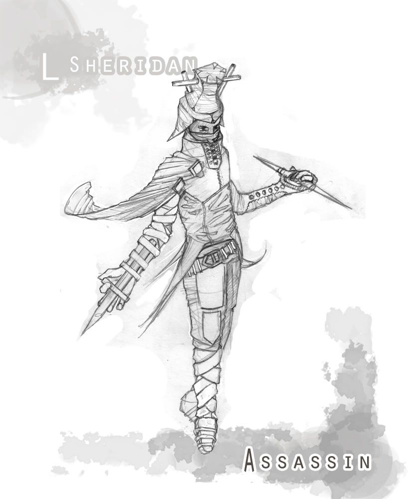
EDIT: Concept17, your assassin looks pretty nice. If you want to take it to the next level, I'd say you need to think the outfit and weapons more "practically". I'd like to see it in colours naturally.
Dali said:Practicality is boring. A sword the that's as tall as the person holding it and likely too heavy to be swung isn't very practical. Neither is a gun blade.
zoukka said:EDIT: Concept17, your assassin looks pretty nice. If you want to take it to the next level, I'd say you need to think the outfit and weapons more "practically". I'd like to see it in colours naturally.
sorry for trying to help, have fun with your day job.The Take Out Bandit said:You know what gets in the way of me drawing?
My day job.
I do the best I can with what I have available to me.
I can take an honest critique from a pro. I've done it. I've had my balls busted and given no excuses.
Concept17 said:Thanks. I'm not sure I understand it needing to be more 'practical'. Can you elaborate?
And yeah, almost done painting him.
Mr. Spinnington said:


