Wtf GAF. I'm shocked we are two pages in and no Razer

Almost all of my PC hardware is by Razer
It's a great design
nice jokepost
Wtf GAF. I'm shocked we are two pages in and no Razer
Almost all of my PC hardware is by Razer
It's a great design
Wtf GAF. I'm shocked we are two pages in and no Razer
Almost all of my PC hardware is by Razer
It's a great design
that's really cool. don't own a playstation so I never really noticed this when playing

EDIT: How am I the first person to post this?!
always wanted to know. is this some guy at Valve? Any explanation of who this guy is?
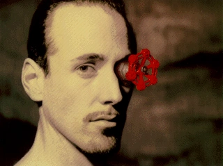
http://half-life.wikia.com/wiki/Mr._ValveValve's Ray Ueno stated he worked with Gabe Newell and their colleagues to develop the "guy in the logo" when they decided to call the company "Valve" around 1995-1996, and needed to develop the visual brand vocabulary to go along with it.
Back then, the casting agencies Valve was using to find models for the Valve Guy only proposed attractive models, while they were searching for "heavy-set", "normal" ones. They then asked their agencies to walk the streets of Seattle and find more interesting people. In Seattle's Broadway district, they took many Polaroids of the types of people Valve was looking for, and brought the shots back to them. The team then selected a bald, heavy-built man and a thin man with a goatee from the batches of "off-the-street" Polaroids.[1]
The two comprised the "Open your mind. Open your eyes." concept for Valve's initial brand, respectively for the heavily-built and goatee men. As of today, the identities of both the Valve guys appear to be lost, as Valve apparently did not keep any trace of their identities, the fact they are not professional models making it very difficult - if not impossible - to identify them.
also always dug this

but with that top text
Wtf GAF. I'm shocked we are two pages in and no Razer
Almost all of my PC hardware is by Razer
It's a great design
It's the word Nintendo with a stretched circle around it in red lettering. Sure, I love the company.. But the logo isn't exactly artistic or eye catching.


So dope
I'm fond of SE's logo:

R*... I went to work there because of their graphic design.
And my favorite incarnation
Or the US flag one I had with glitter all over.
You mean this one?It looks much better when animated with the multicolored stars moving inside it. Someone oughta gif that shit.

Definitely P-Studio

P for Persona, but then you have the shadow extending from it to exemplify the core element of the series, shadows.

You mean this one?


HAL Labs has a great one.
I'm fond of SE's logo:
HAL Labs has a great one.
You mean this one?
All of them except Wow.
Brings a tear to my eye seeing those. Man those were the days.
oh yessssss
the best right now. even better with animation

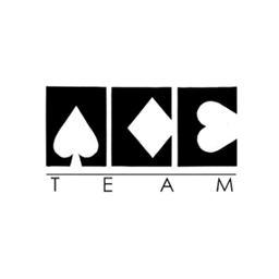
I don't have much experience with their games but I always liked Ace:
Holy fuck, I must be blind... I never noticed that there was a dog in this logo. I always saw a face. The dog as hair, the mat as a crazy beard, and the three white things as eyes and nose
.... How the heck did you see that?Holy fuck, I must be blind... I never noticed that there was a dog in this logo. I always saw a face. The dog as hair, the mat as a crazy beard, and the three white things as eyes and nose
The best.


")


