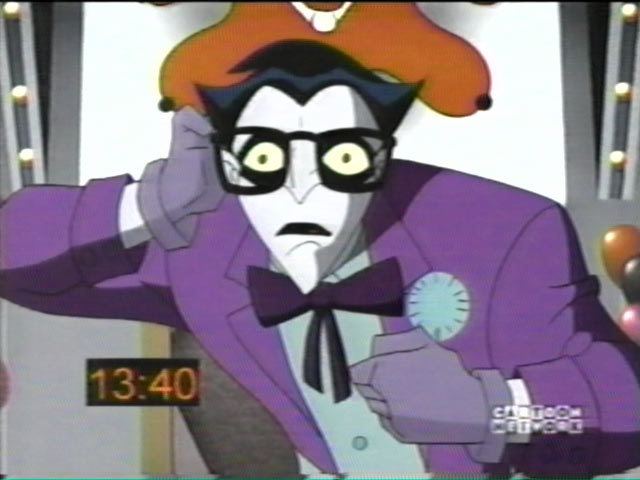
• Hey, guest user. Hope you're enjoying NeoGAF! Have you considered registering for an account? Come join us and add your take to the daily discourse.

Can we all agree that Joker's "Justice League" look is his best design?

Status
Not open for further replies.
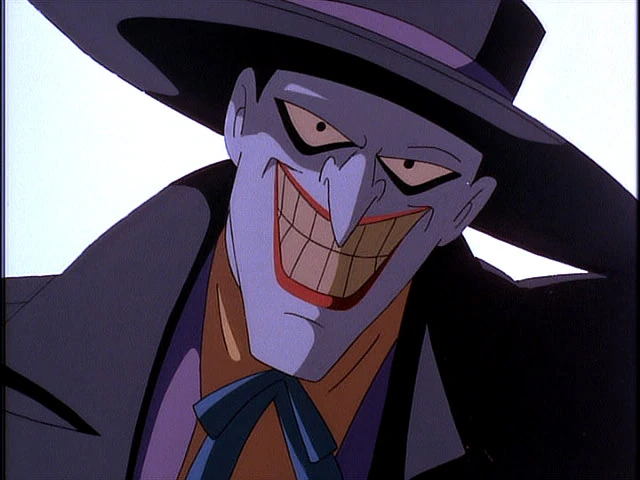
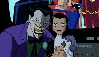
I'm talking about that design that basically squashes together the iconic TAS color scheme and the more ghoulish TNBA and makes him look like a genuinely scary motherfucker. The one that's in Justice League, Static Shock, and Return of the Joker.

joker_bruce_timm_style_new_look_by_noahlc-d9tfhn2.png
bamkapow.com_.jpg

tumblr_m7vrqxlSlk1qzs8r5o1_1280.jpg

joker2.jpg

4072c8cba1b6be72ae891adcb879123a.539x404x1.jpg

latest

tumblr_lumglyAsK61qa69wso1_500.gif


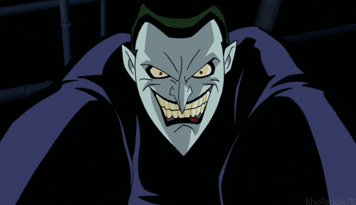
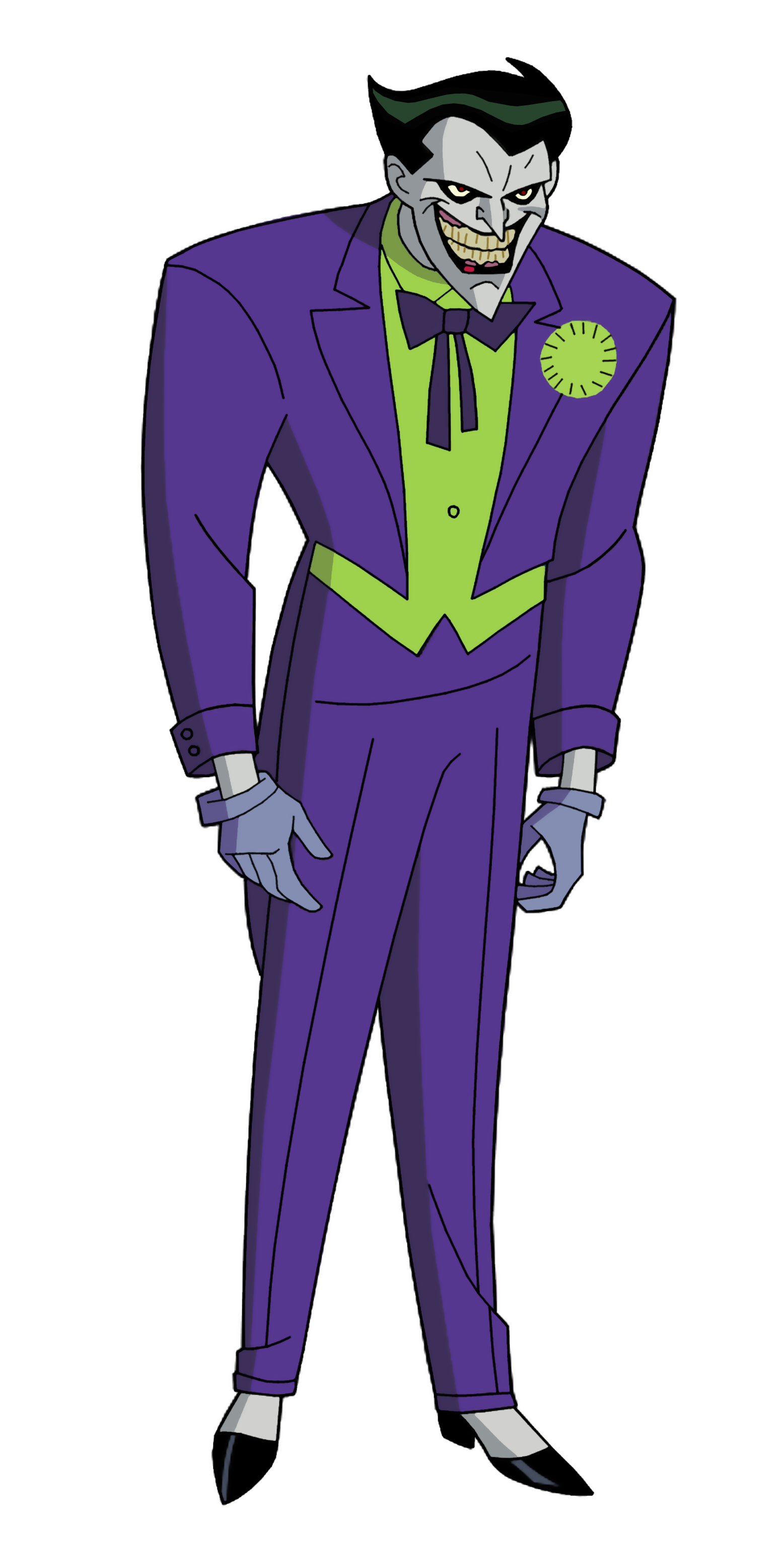
Yes, I think so. One of animation's greatest tragedies is that TAS didn't have this design. And that it only stuck for, like, two TV episodes and a movie before they redesigned him again for some reason.
 

Strimei

Member
I know there's a good number of people that like the original look he had in the animated series, with the black eyes/white pupils.

Never cared for that one as much myself.
 

Zelias

Banned
Yep, that's the GOAT design for me. The classic BTAS design is good too, though.

The New Adventures redesign, like a lot of the redesigns, was trash.
 

MattKeil

BIGTIME TV MOGUL #2
It's a little known fact that Joker is ripped. Dude is yoked as fuck. How do you think he can stand toe to toe with Batman.

That very much depends on the writer. Sometimes Joker can stand toe-to-toe with Batman, sometimes he can't even take a punch. Sometimes he's an excellent hand-to-hand combatant, sometimes he flinches like a coward as soon as Batman gets within arm's reach. Animated Joker wasn't really much of a fighter most of the time.
 

EdmondD

Member
That very much depends on the writer. Sometimes Joker can stand toe-to-toe with Batman, sometimes he can't even take a punch. Sometimes he's an excellent hand-to-hand combatant, sometimes he flinches like a coward as soon as Batman gets within arm's reach. Animated Joker wasn't really much of a fighter most of the time.


Yeah, battles between Joker and Batman are mostly a battle of wits. Not on the same level of someone like Riddler but Joker seems to possess some sort of insane genius. Animated Joker was definitely not a fighter.

I agree that this was a great look for Joker.
 
God I love Capullo's art.

Dude is GOAT tier. Looking forward to him and Snyder reuniting.

Shouldn't undersell the inking and coloring jobs tho, there's a reason Capullo's work on Batman outshone basically anything we'd seen from him prior. Shit's a team effort.
 

Tansut

Member
I like his classic, original look in TAS the best. I think him having more color that pops better juxtaposes his twisted nature. Scary clowns are usually far less creepy than the ones that are just wholesale wacky and cheerful looking.
 

Rhaknar

The Steam equivalent of the drunk friend who keeps offering to pay your tab all night.
*looks closely*

The non-highlighted part look black.

Its to emulate shadows, and the splash of red is there to tell you thats the actual color. Comics do the same. I remember thinking Spidey's costume was black and red because of how Mcfarlane used to color him

spider-man.jpg
 

Fj0823

Member
Dude is GOAT tier. Looking forward to him and Snyder reuniting.

Shouldn't undersell the inking and coloring jobs tho, there's a reason Capullo's work on Batman outshone basically anything we'd seen from him prior. Shit's a team effort.

Oh agreed, Plascencia is great too, I have Snyder's hardcoverd and they're great.

His faceless Joker was pretty scary too, its the dry dead lazy eye that makes it

Batman6.jpeg
 

MattKeil

BIGTIME TV MOGUL #2
Its to emulate shadows, and the splash of red is there to tell you thats the actual color. Comics do the same. I remember thinking Spidey's costume was black and red because of how Mcfarlane used to color him

spider-man.jpg

Originally it was black and red. Blue was used as a highlight color to be able to show detail on the black fabric, but eventually it sort of morphed into just being the color of the suit. A similar thing happened with Batman's cape over the years. You can also see this in action with Superman's hair in the Silver Age, but that managed to remain black because people generally don't have blue hair.
 

Tansut

Member
I like his classic, original look in TAS the best. I think him having more color that pops better juxtaposes his twisted nature. Scary clowns are usually far less creepy than the ones that are just wholesale wacky and cheerful looking.
Yes I'm quoting myself but I found the gif I was looking for that I think best illustrates my point.

tumblr_inline_oaadl1SgNv1r98lni_500.gif
 
Oh agreed, Plascencia is great too, I have Snyder's hardcoverd and they're great.

His faceless Joker was pretty scary too, its the dry dead lazy eye that makes it

Batman6.jpeg

Masked Joker was a step too far, honestly. I didn't really enjoy Death of the Family from a writing standpoint, so maybe that's coloring it, but honestly, wearing his own face as a mask? Over the top, even for the Joker.
 

Bravocado

Member
Oh yeah, agreed, it's the best of his DCAU interpretations by far Though I still have a soft-spot for his original BTAS look.

I think the only Joker designs I wasn't a big fan of are from The Batman (I appreciate what they were trying to go for, but it just turned out weird and messy) and from Young Justice (looks more like some emo dude cosplaying as Joker).

Heath, Cesar, Jack, all great designs. The Arkham games one ain't too shabby either, especially from City.

Oh and the retro-inspired one from Brave & The Bold kinda put me off at first, but I really grew to like it with time.
 

Fj0823

Member
Masked Joker was a step too far, honestly. I didn't really enjoy Death of the Family from a writing standpoint, so maybe that's coloring it, but honestly, wearing his own face as a mask? Over the top, even for the Joker.

Gotta agree there, still, the design itself is pretty cool and scary looking, even if a bit extreme for the character.
 
I like his classic, original look in TAS the best. I think him having more color that pops better juxtaposes his twisted nature. Scary clowns are usually far less creepy than the ones that are just wholesale wacky and cheerful looking.

Helps that the whole style of TAS was dark, so his more colorful look pops even more.
 
Yeah, battles between Joker and Batman are mostly a battle of wits. Not on the same level of someone like Riddler but Joker seems to possess some sort of insane genius. Animated Joker was definitely not a fighter.

I agree that this was a great look for Joker.

M8PmYP.gif


A lot of the episodes had Joker handily beat up Batman, only to get hit by a lucky punch and try to run away (or fall into a smokestack . . . ). Granted, he usually used something to club him.
 

pa22word

Member
Masked Joker was a step too far, honestly. I didn't really enjoy Death of the Family from a writing standpoint, so maybe that's coloring it, but honestly, wearing his own face as a mask? Over the top, even for the Joker.

Yep. Only time I ever felt Synder nailed Joker was Dick Batman. I always thought he was more of a Riddler kind of guy, and Zero Year pretty much confirmed that for me.
 
Oh yeah, agreed, it's the best of his DCAU interpretations by far Though I still have a soft-spot for his original BTAS look.

I think the only Joker designs I wasn't a big fan of are from The Batman (I appreciate what they were trying to go for, but it just turned out weird and messy) and from Young Justice (looks more like some emo dude cosplaying as Joker).

Young Justice Joker is by far the worst interpretation of the character that I've ever seen. The voice is terrible.
 
Yes I'm quoting myself but I found the gif I was looking for that I think best illustrates my point.

tumblr_inline_oaadl1SgNv1r98lni_500.gif

I'm not the biggest fan of original TAS Joker (I feel like a lot of the time it looked too goofy for its own good and undermined how creepy his actions were supposed to be), but he definitely had his moments.

tumblr_lo6xka9qza1qcay1ao1_500.gif


Makes you want to laugh . . . doesn't it, Arthur.
 

Nev

Banned
Anything is better than Arkham's joker. That's the worst ever, I can't stand his stupid design.
 
Status
Not open for further replies.
Top Bottom