-
Hey, guest user. Hope you're enjoying NeoGAF! Have you considered registering for an account? Come join us and add your take to the daily discourse.
You are using an out of date browser. It may not display this or other websites correctly.
You should upgrade or use an alternative browser.
You should upgrade or use an alternative browser.
Epic Mickey all encompassing info thread. First direct feed shots, London event.
- Thread starter lyre
- Start date


Rollo Lawson
Banned
i love how they use the old mickey with the button eyes
â Narayan
Member
I'm not really digging this anymore.
Eh, well, it's a year off.
Eh, well, it's a year off.
Calints Neos said:I must be the only one laughing that people thought this was going to be some sort of Grimdark-Steampunk mickey game and now are butthurt because it isn't:lol
If you release media and hype your game up to be a Grimdark-Steampunk Mickey game, people are probably quite right to expect a Grimdark-Steampunk Mickey game.
It's like Polyphony turning around next year and saying "What? Those renders? That's just concept art. GT5 is actually a football game played with a guitar controller."


beelzebozo
Jealous Bastard

call now, warren
NOW
ShockingAlberto
Member
Except they never released that art.Burai said:If you release media and hype your game up to be a Grimdark-Steampunk Mickey game, people are probably quite right to expect a Grimdark-Steampunk Mickey game.
It's like Polyphony turning around next year and saying "What? Those renders? That's just concept art. GT5 is actually a football game played with a guitar controller."
It's like someone found a Gran Turismo doodling of a car with eyes on a table and was annoyed Gran Turismo cars looked realistic still.


itsinmyveins
Gets to pilot the crappy patrol labors
jarosh said:more screens:
Yeah, not as exciting as the artwork, that's for sure. But oh well, there's still time to add a lot of stuff. I remember the first screens of Red Faction Guerilla coming out. Those didn't look that hot either.
silverbullet1080
Banned
This game being a year off makes me think those textures are not final. Or really anything visually in this game.
Taker666 said:
Damn straight. Although, it would be nice if we had both. Look at Galaxy and match that, Warren.
Actually, you know what would really be amazing? If they had done a full-on 2D Mickey Sidescroller like Warioland Shake it on the Wii, and if they were still interested in the other platforms, do Mickey 3D on the other 2 platforms.
Now THAT would have been awesome.
Yet they still release these screens.silverbullet1080 said:This game being a year off makes me think those textures are not final. Or really anything visually in this game.
To be blunt, I've never seen a more stupid marketing decision. You'd think even developers have some sort of insight as to what should be seen and what shouldn't.
timetokill
Banned
Well they should care that people are too picky about screenshots and aren't interested in the game mechanics, yes.
But I'm glad people are using this time to release some pent-up rage
But I'm glad people are using this time to release some pent-up rage
Thunder Monkey
Banned
Models and environments are probably completely finished. Textures, lighting, and any shader based effects would come later. But really not too long from now.silverbullet1080 said:This game being a year off makes me think those textures are not final. Or really anything visually in this game.
Pull a Spyborgs and then some >:Surgeon Rocket said:Maybe they'll pull a SpyBorgs.
Either way, you all have yourselves to blame for the hype.
Really, who would have thought that Warren Spector, along with the juggernaut wealth and selling power of Disney, would produce a (circa 2001) shovelware PS2 title. The fact that they deemed these shots worthy to release to the public is really disappointing after all the Gameinformer hype. As others have said, it's not even the power of the Wii that's holding it back. The superb animations are the only redeemable thing.
I really want to like this game, on paper it sounds perfect, but no lighting is going to polish this turd. Redoing the textures entirely at this point is also completely unthinkable. I'll wish upon a star for a miracle before winter 2010.
Zombie James
Banned
Thunder Monkey said:Models and environments are probably completely finished. Textures, lighting, and any shader based effects would come later. But really not too long from now.
Judging by the last Spector quote, there aren't going to be any shaders.
killer7ITA
Banned
I real love the artworks... but only that. 
SirPenguin
Member
upandaway said:Yet they still release these screens.
To be blunt, I've never seen a more stupid marketing decision. You'd think even developers have some sort of insight as to what should be seen and what shouldn't.
And I'm sure they do have that insight, which is why it's easy to assume these AREN'T some crazy early screenshots that will be improved ten fold by launch.
They simply would not release (and create a huge launch event with a ton of hype building the entire month) screenshots this bad if they were going to majorly change or improve in the future. They just wouldn't. And if they did, they would plaster "ALPHA VERSION" or "NOT FINAL PRODUCT" all over them.
BattleMonkey
Member
Game looked epic in concept art...... game looks nothing like the concept art
Thunder Monkey
Banned
There already is._leech_ said:Judging by the last quote, there aren't going to be any shaders.
The paint in the notoriously badly textured area with Mickey jumping. What I wonder is if they are going to add in anymore effects. Rim lighting and EMBM would do wonders for the game.
Looks like a lot of the "too good to be true" people were right in a way.
I dig the style and I still think we´ve seen nothing yet; but this reveal could have been much bigger.
The character models look fine as they are, but everything else just seems slightly off.
I mean in one shot you can see that there is no sky whatsoever.
But if the gameplay and the atmosphere hold up to the concept this will be a glorious play through. They were working hard for several years on this thing and if it doesn´t show in the graphics it will surely show in the gameplay.
Interfectum
Member
Looks horrid.
If there is one thing we should all have learned by now in this gen, is to never judge screenshots. We need to see this in motion to form an opinion either way.
Where is a gameplay trailer?
Oh, and one final note. Remember the outcry on these boards when Batman:AA was revealed. This is the same thing happening over again. Hopefully, they will hit it out of the ballpark like Batman did.
Where is a gameplay trailer?
Oh, and one final note. Remember the outcry on these boards when Batman:AA was revealed. This is the same thing happening over again. Hopefully, they will hit it out of the ballpark like Batman did.
DanteFox said:what a let down. from this glory:
images
Those were done in 2007 when it was still planned for PS3/Xbox 360, if I understood that interview correctly.
Pseudo_Sam
Survives without air, food, or water
Will wait for video to judge. When can we expect one of those?
Pseudo_Sam said:Will wait for video to judge. When can we expect one of those?
Hopefully later. Much later.
SecretBonusPoint
Banned
Yeah its funny to see Warren mention Zelda:

I just really don't understand a lot of Wii developers. The system forces them often to make a version entirely from scratch for that hardware. Here we have a game being made exclusively for it from the start. Rather than study what has worked best visually on the system and shape your game around that, we get this weird mid-PS2 era looking lazyness.
Especially here. Mickey Mouse is a CARTOON. He is a flat-shaded character(specifically retro black and white Mickey). Are there that many clueless art directors in the industry that have never heard about or seen cel-shading and all the gorgeous games that have used it? Okami must have been an influence for this game certainly and that also uses the technique. Red Steel 2 looks exceptional on the platform using that style as well.
But then, even if they've obvious declined that powerful visual style, that doesnt let them off the hook either:


(I see jett had the same idea above)
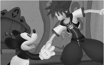
Say what you want about the absolute bullshit that is Kingdom Hearts story and setting, they NAILED the Disney stuff to such a degree its astounding. Now the Gamecube was more powerful than the PS2, and so obviously so is the Wii. Theres just no reason behind seeing these awful screenshots other than clumsy art direction and inexperienced texture artists and 3d modellers. The PSP Kingdom Hearts game comes out next year as well, and will no doubt look far more cohesive and smooth than this Wii effort, and thats ridiculous.
To go from some artists amazing concepts to the garbled mess presented in the direct-feed screens is heart-breaking. The "shoulda been on HD" argument doesnt even come into it either. The Wii is more than competent enough to display some amazing scenes. Hell Wind Waker, a fucking 2002 Gamecube game, still looks better than 98% of all Wii titles to date.
Find me these incompetent assclown art directors, drag them here and let me berate them
/rant
I just really don't understand a lot of Wii developers. The system forces them often to make a version entirely from scratch for that hardware. Here we have a game being made exclusively for it from the start. Rather than study what has worked best visually on the system and shape your game around that, we get this weird mid-PS2 era looking lazyness.
Especially here. Mickey Mouse is a CARTOON. He is a flat-shaded character(specifically retro black and white Mickey). Are there that many clueless art directors in the industry that have never heard about or seen cel-shading and all the gorgeous games that have used it? Okami must have been an influence for this game certainly and that also uses the technique. Red Steel 2 looks exceptional on the platform using that style as well.
But then, even if they've obvious declined that powerful visual style, that doesnt let them off the hook either:
(I see jett had the same idea above)
Say what you want about the absolute bullshit that is Kingdom Hearts story and setting, they NAILED the Disney stuff to such a degree its astounding. Now the Gamecube was more powerful than the PS2, and so obviously so is the Wii. Theres just no reason behind seeing these awful screenshots other than clumsy art direction and inexperienced texture artists and 3d modellers. The PSP Kingdom Hearts game comes out next year as well, and will no doubt look far more cohesive and smooth than this Wii effort, and thats ridiculous.
To go from some artists amazing concepts to the garbled mess presented in the direct-feed screens is heart-breaking. The "shoulda been on HD" argument doesnt even come into it either. The Wii is more than competent enough to display some amazing scenes. Hell Wind Waker, a fucking 2002 Gamecube game, still looks better than 98% of all Wii titles to date.
Find me these incompetent assclown art directors, drag them here and let me berate them
/rant
upandaway said:Yet they still release these screens.
To be blunt, I've never seen a more stupid marketing decision. You'd think even developers have some sort of insight as to what should be seen and what shouldn't.
You'd think.
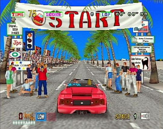
Tell that to D3 publisher who released these screens of PS2 OutRun:
http://videogamerx.gamedonga.co.kr/zbxe/news_videogame/462035

Which went on to look like this:
The fact that they're not letting journalists record the demo is also baffling. It may be just a case of safeguarding GI's exclusivity, but to stage a big reveal for a game like this with no videos and a lot of teasing ("lulz I'm not going to talk about this today n00bz") seems sloppy. That may mean that they just want to start building hype, though I think the final game won't look very different.
BTW, did Dr. Muto really look THAT bad :lol ?
BTW, did Dr. Muto really look THAT bad :lol ?
Confidence Man
Member
Epic indeed. :lol
Screens look doctored, too. Those rabbit things have no jaggies where everything else does.
Screens look doctored, too. Those rabbit things have no jaggies where everything else does.
dark_chris
Gold Member
I am disappointed after seeing the original concept art first then seeing the new concept art. Sadly disappointed. I still hold on the flicker of hope for this game by waiting to see it in action.
MirageDwarf
Member
With ONM quote, pretty safe to say leaked art was never intended for Wii. That is a source of disappointment. We all saw art and expected game to recreate that theme. But it seems it was never imagined that way for Wii by developers.
SecretBonusPoint said:/rant
I'd love to see you berate these people. I really would. 'Cause I don't get it either.
â Narayan
Member
It's really a damn shame that the initial concept wasn't used. It would have been amazing to see that stuff come to fruition.
timetokill
Banned
MirageDwarf said:With ONM quote, pretty safe to say leaked art was never intended for Wii. That is a source of disappointment. We all saw art and expected game to recreate that theme. But it seems it was never imagined that way for Wii by developers.
ORRR they changed the concept of the game during pre-production REGARDLESS OF PLATFORM? Maybe?
Milk Lizard
Banned
I am dissapoint.
FlashbladeGAF
Member
Is it alright for me to hate on these screens...?
I have a Wii ^_-
What happened to the fuckin' bar? Whats the point of raising the bar, If people are going to pretend it doesnt exist. Like the posters said above me, with CELda, Kingdom Hearts PS2 & PSP... hell even Kingdom Hearts DS there is no reason for Mickey's model and the rest of the world to look like that.
Did the computer vomit or was the levels randomly generated?
That might be nice to believe as a reason to explain the whole thing, but I honestly believe the game can be made to look better in the year to come, and if not, delay the fucking thing and make it look better. There is no reason for any developer or any marketer to pass them as acceptable.SirPenguin said:And I'm sure they do have that insight, which is why it's easy to assume these AREN'T some crazy early screenshots that will be improved ten fold by launch.
They simply would not release (and create a huge launch event with a ton of hype building the entire month) screenshots this bad if they were going to majorly change or improve in the future. They just wouldn't. And if they did, they would plaster "ALPHA VERSION" or "NOT FINAL PRODUCT" all over them.
timetokill
Banned
Seriously, what kind of model do you guys want? They're going for a retro Mickey that is going to animate really well. You haven't seen it animate.
Sure they could have used the KH Boring Mickey, but why?
Sure they could have used the KH Boring Mickey, but why?
InsaneZero
Member
schuelma said:I feel like we've had this conversation before..
Reminds me of the reaction to the GameInformer scans.
Catalix
And on the sixth day the LORD David Bowie created man and woman in His image. And he saw that it was good. On the seventh day the LORD created videogames so that He might take the bloody day off for once.
It really, really pains me to share this sentiment.Milk Lizard said:I am dissapoint.
How could they screw this up so bad?
silverbullet1080
Banned
I don't really like The Conduit, but it looked just as assy when the first video came out. The first CoD4-Wii screens are shitty too, yet it's supposed to look better than WaW.upandaway said:Yet they still release these screens.
To be blunt, I've never seen a more stupid marketing decision. You'd think even developers have some sort of insight as to what should be seen and what shouldn't.
It is a stupid marketing decision, but it's not something that's uncommon.