-
Hey, guest user. Hope you're enjoying NeoGAF! Have you considered registering for an account? Come join us and add your take to the daily discourse.
You are using an out of date browser. It may not display this or other websites correctly.
You should upgrade or use an alternative browser.
You should upgrade or use an alternative browser.
Final Fantasy XV european boxart revealed
- Thread starter Ydelnae
- Start date
Game is out in 4 months, and all of their promotional material are stills and images from things that we've already seen many times (some since 2013).
yeah, some screen shots have very old HUD. keeping using them is odd.
edit:sorry, double posted.
Dark_castle
Junior Member
Special edition has that pretentious Lion King moment. Deluxe edition artwork is too busy and uneasy on the eyes even if what it represents in the larger picture is cool with all the summons hanging around. Meh.
How do you know that? Amazon still has listings for both and Day One Editions usually just have DLC, not an entire Steelbook.
uhm no.
There's a Day One Edition AND a Special Edition ( also a collector's edition and an Ultimate collector's edition of course). The special edition (which includes this Regis holding Noctis steelbook) is exclusive to certain stores though.
Well, if this edition is exclusive to certain stores/territories then it would explain my confusion, since I contacted a retailer and they told me that the publisher in here still had to update the info but that this was pretty much the Day One edition.
To be fair you would have hated this regardless of what it was based on your post history.Special edition has that pretentious Lion King moment. Deluxe edition artwork is too busy and uneasy on the eyes even if what it represents in the larger picture is cool with all the summons hanging around. Meh.
birthbysleep
Member
yeah, some screen shots have very old HUD. that's odd.
It's almost as if the game isn't anywhere near being done.
The suspicious lack of English-voiced promotional material is a little concerning.
To be fair you would have hated this regardless of what it was based on your post history.

AgentLampshade
Member
This is the type of art that wouldn't look out of place in the main game somewhere. Imagine returning to the Citadel and seeing this framed painting all damaged and ruined by the occupation. It's a great piece of art, but as a cover art it's awful and wouldn't entice people to pick up the box in a shop. I suppose Final Fantasy has earned the right to not bother about that though, with it being such a massive franchise.
artsi
Member
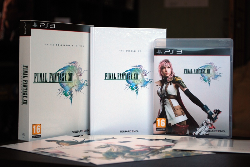
It's good, but normal edition should be logo on white.
It doesn't line up with all my other boxarts if it isn't.
XIII already pushed it with Lightning next to the logo, but at least the background was white.
Yep. I have the based Japanese box for XIII too

Disappointed if there's not a logo only version for XV.

Baleoce
Member
Tell me there's a regular edition with the plain white. What is this crap?
I miss the white background boxarts tbh.
rayman1900
Member
Why white? The theme of the game revolve around the color black. They even wanted to express that in the versus day to put a contrast between XIII which was white, and VersusXIII which was black
It's good, but normal edition should be logo on white.
It doesn't line up with all my other boxarts if it isn't.
XIII already pushed it with Lightning next to the logo, but at least the background was white.
Was actually thinking I liked FF XIII's cover for that actually. Maybe they could have a reversible cover for it, though I think black would be the better choice.
I don't think it really needs to line with other box arts tbh, I think we're growing away from box arts like that really. Like Zelda has been growing away from the gold covers, I used to like them, but looking at the likes of Wind Waker, Majoras Mask, Twilight Princesses art without the gold, I think it's the better for it.
As for this cover art, not really sure of the "significance" of the scene depicted right now, so can't really say it's a good choice or not right now.
Why white? The theme of the game revolve around the color black. They even wanted to express that in the versus day to put a contrast between XIII which was white, and VersusXIII which was black
Because it matches almost all of the other mainline Final Fantasy PAL releases which had a plain white background with the logo. It's iconic and classy af.
Dark_castle
Junior Member
To be fair you would have hated this regardless of what it was based on your post history.
I do have mixed opinions of this game true, but judging by the reactions here I'm not alone in not liking the boxart. Honestly would have prefer a simple white background with the game title and its trademark logo, and that's it. Either way, it's not a big deal, I'm still excited to see more of the game this E3, hopefully something that would blow us away in a good way.
What A Time To Be Alive
Member
Cover looks beautiful.
People who say the cover looks ass are crazy tbh
People who say the cover looks ass are crazy tbh
D
Deleted member 57681
Unconfirmed Member
At least the Special Edition had the classic look in EuropeIt's good, but normal edition should be logo on white.
It doesn't line up with all my other boxarts if it isn't.
XIII already pushed it with Lightning next to the logo, but at least the background was white.
Fake Edit:
FFXIII-2 as well

Personally I don't really care, but if I had the choice between the gaudy Amano or a white one, I'd take the white one. But eh, my collection already got disturbed by the fugly FFXII US steelbook.
mrmickfran
Member
Clashes with the Green Xbone banner.
Lé Blade Runner
Member
Special Edition's box art is amazing. The Deluxe Edition's... Even though it's Amano, it's way too busy. Don't like it as much.
NHarmonic.
Member
Looks like ass.
I want my simple white background Final Fantasy XV boxart.
Ugh, awful suggestion.
I think artistically this really works, though the amano rainbow vomit illustration is awful, sorry.
Feels edition
!!!!
Looks like ass.
I want my simple white background Final Fantasy XV boxart.
Pretty much. Someone in marketing must have convinced the right people that this is the way to go. But hey, it's just box art for a game. We'll survive.
SprachBrooks
Member
This artwork just looks busy and uninspired. It's a shame.
Possumowner
Member
Very nice.Was expecting it to look terrible,pleasantly surprised
Ugh, awful suggestion.
I think artistically this really works, though the amano rainbow vomit illustration is awful, sorry.
Awful suggestion? I just don't want to break the tradition that has been since the first game. It looks like ass to have a different game cover in all my other Final Fantasys.
hydrophilic attack
Member
Fuck that's bad.
Just give us the traditional artwork covers, it's not fucking hard
Just give us the traditional artwork covers, it's not fucking hard
ScriptedReality
Member
This looks terrific to me
Benzychenz
Member
I expected the 'standard edition' cover. This one has been up on Australian retailers for like 2 weeks now.
YianGaruga
Banned
They just took a piece of concept art we've seen a hundred times before and slapped a really boring FF XV logo on it. And what's up with that font design? It's just white. It looks unfinished.
Really not a fan.
Also this. If you know nothing about the game, playing as a boy band might come as a shock
At least the main character is featured
the car
Really not a fan.
Ah yes, Final Fantasy XV, the game where you play as a father of a small child.
Also this. If you know nothing about the game, playing as a boy band might come as a shock
At least the main character is featured
the car
Herb Alpert
Banned
Fuck that's bad.
Just give us the traditional artwork covers, it's not fucking hard
Don't worry you'll got that for the remaster
LiquidSolid
Member
Tell me there's a regular edition with the plain white. What is this crap?
That dream has been dead for a long time, Eidos killed the traditional covers when they were bought out and took over Square Enix Europe.